
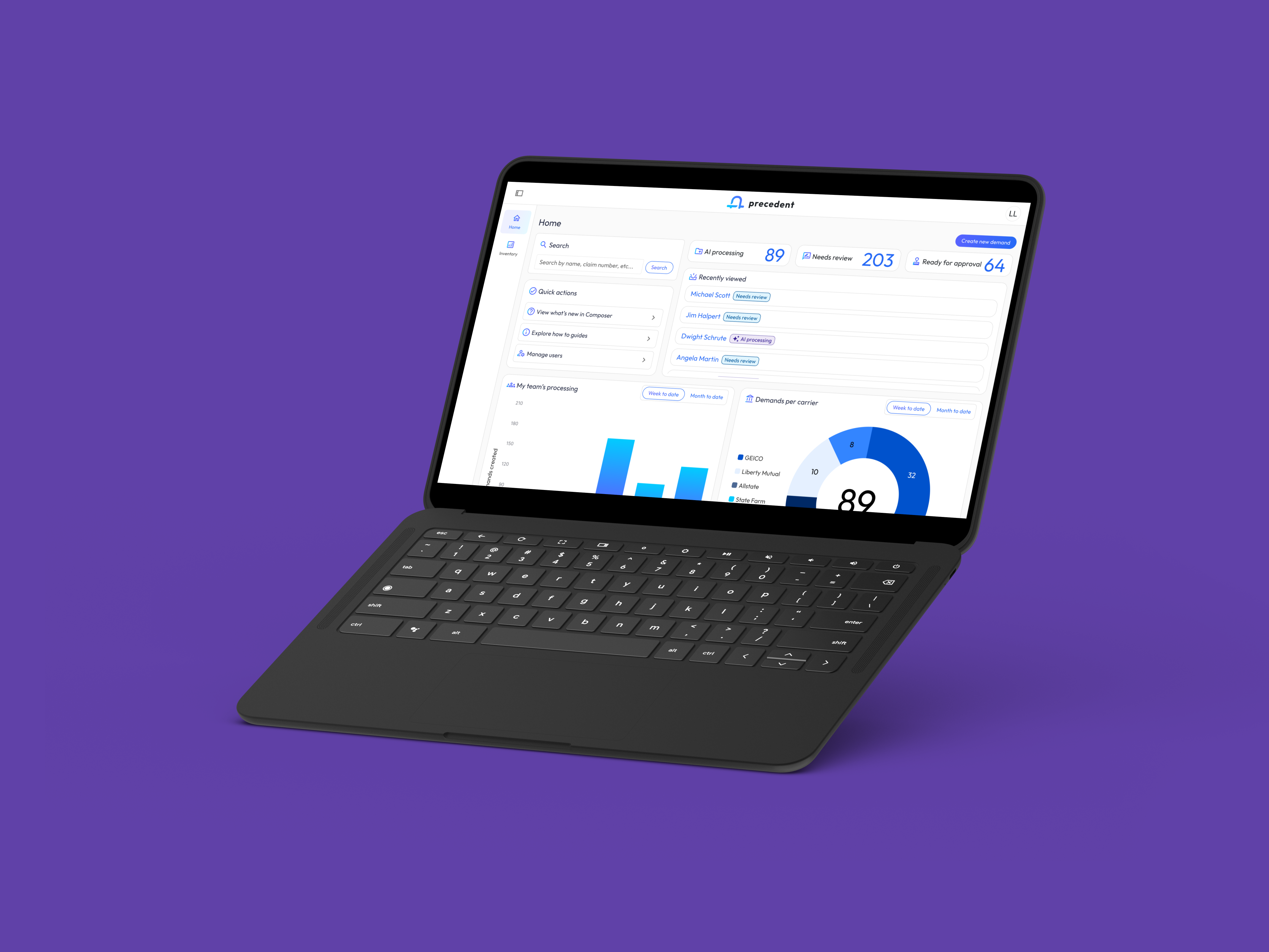
This is one of four Precedent case studies, the system-level view. For the AI Document Authoring, see AI Document Authoring; for the onboarding flow, see AI Ecosystem Onboarding; for data review flow, see Human-in-the-loop AI Review.
Precedent is a one-stop platform for personal injury law firms. The ecosystem pairs two purpose-built apps: Claim Companion, which handles the front-end of the case lifecycle (filing claims, verifying policy limits, liability workflows), and Demand Composer, which transforms hundreds of medical records into settlement-ready bodily injury demands through an AI data extraction pipeline. The stakes were existential for the two-app bet: if the ecosystem read as two disconnected products, every firm would feel the seams daily; the seams, not the AI, would decide whether they stayed.
My Role & Team
Role: Principal Product Designer
Scope: End-to-end experience design, UX engineering, and cross-app systems thinking
I was the sole designer across both apps, working with 6 engineers split across 2 squads, 2 product managers, and attorney advisors from partner firms. “Cross-app systems thinking” meant something operational, not aspirational: a shared Figma library both squads consumed and a weekly cross-squad design review I ran that engineering treated as source of truth. When the two apps agree on color, status, and navigation, it is because a working process forced them to.
The Problem
Law firms live between two worlds: administrative claim management and the high-stakes, AI-assisted composition of demand letters. The ecosystem had to feel like one product with two specialized modes, while honoring each app’s distinct rhythm of work.
That framing decomposes into three concrete design problems:
Context at volume. Paralegals, attorneys, and admins needed to move fluidly between apps and manage context across hundreds of documents per case, without losing their place or their trust in the system.
Trust in AI output. Attorneys had to confidently review AI-extracted medical data and author persuasive demands grounded in RAG-LLM content that maximizes settlement likelihood, with six- and seven-figure settlements staked on the result.
Coherence without uniformity. Two apps with genuinely different rhythms of work (queue-driven claim processing vs. deep-focus document authoring) still had to share one navigational grammar, or every context switch would cost the user reorientation time dozens of times a day.
The pain underneath all three was concrete and daily. On the claim side, firms burned hours on the phone with insurance companies: setting up claims, checking claim status, confirming receipt of faxed documents. On the demand side, drafting demand letters by hand consumed even more. And the tools firms cobbled together to cope were scattered across separate applications, fragmenting case context across touchpoints. For a law firm, the best version of this work is a single solution (one place to manage your cases), and that is the ecosystem Precedent set out to build.
Research & Process
The deep research for this ecosystem lives in the sibling case studies: usability testing of the authoring workflows in AI Document Authoring and the practitioner working sessions behind Human-in-the-Loop AI Review. What this page covers is how those findings were governed into a coherent system:
- Attorney advisors as a standing input. Partner-firm attorneys reviewed flows continuously, not as a one-off validation gate, which is how domain realities (an attorney’s reading order, a paralegal’s queue habits) shaped ecosystem-level patterns like the split-pane source preview.
- A shared Figma library as the single source of components. Both squads consumed the same library (see Atomic Design System), so cross-app consistency was the default output of normal work, not a review finding to fix later.
- Weekly cross-squad design review. I ran the session where the two squads saw each other’s in-flight work, the mechanism that caught divergence while it was still cheap to correct.
One strand of research was ecosystem-specific: sessions with existing power users on how law firms actually distribute and share casework. We studied firms’ pod systems (how paralegals hand work off to attorneys, and how teams share updates with clients) and modeled the ecosystem’s workflows directly on those rhythms. The handoffs inside a pod are the seams the ecosystem had to honor: who touches a case, when, and what they need to see at the moment it lands with them.
Flows
A case end to end, across both apps. It enters as a claim in Claim Companion (filed, policy verified, liability worked), then crosses to Demand Composer through the Apps switcher handoff, context preserved. There, case data feeds the AI extraction pipeline, everything passes through the human review gate before it ships, and the delivered demand’s status changes route back through email notifications to close the loop.
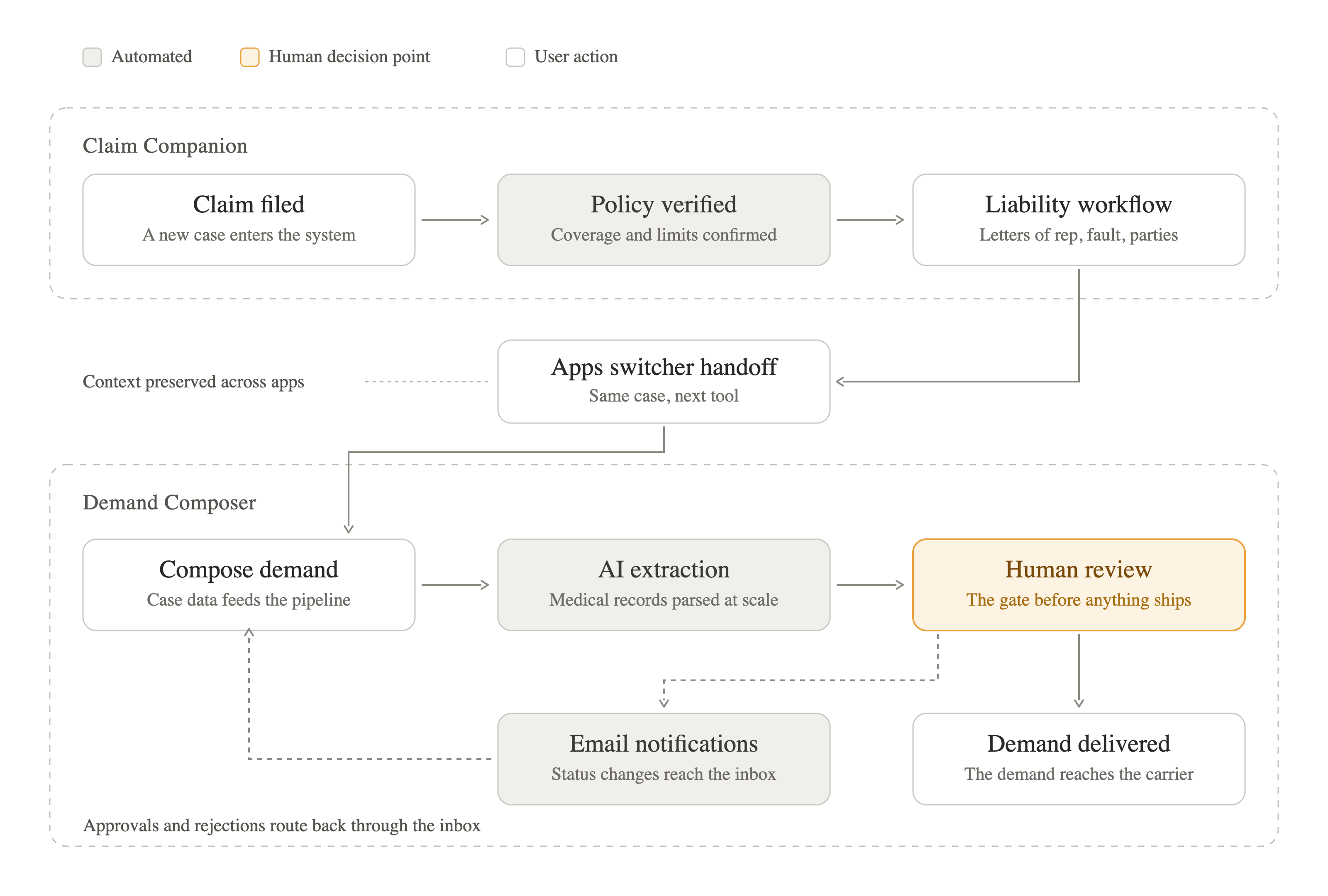
The flow is the argument for the two-app model: each app owns one rhythm of work, and the seams between them are designed surfaces (the Apps switcher, the shared status grammar, the email lifecycle), not gaps.
The Design
The walkthrough below is organized by the surfaces where the ecosystem’s coherence gets proven: each one a place where a user crosses between apps, between human and AI work, or between overview and detail.
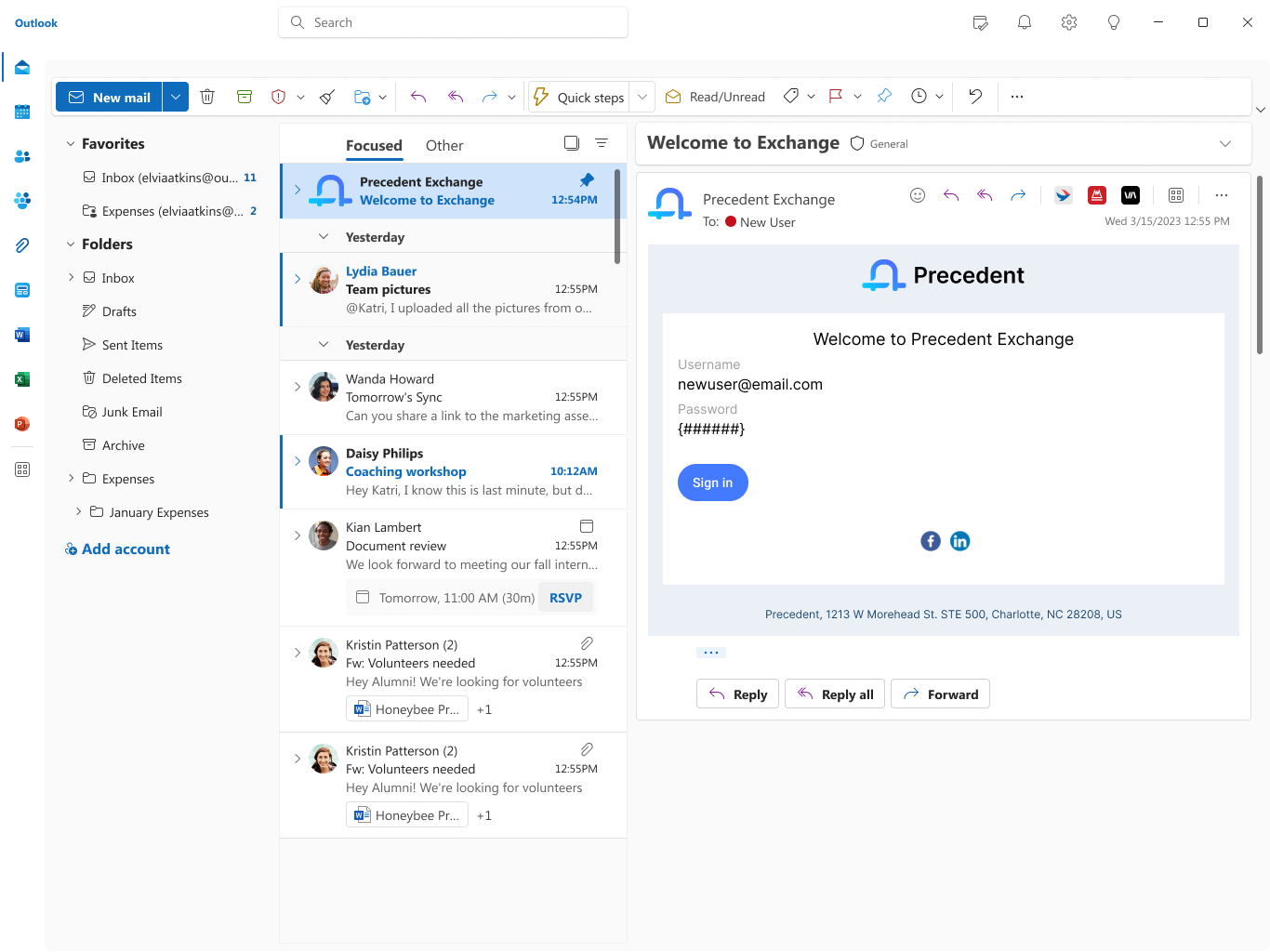
1. Onboarding Email Campaigns
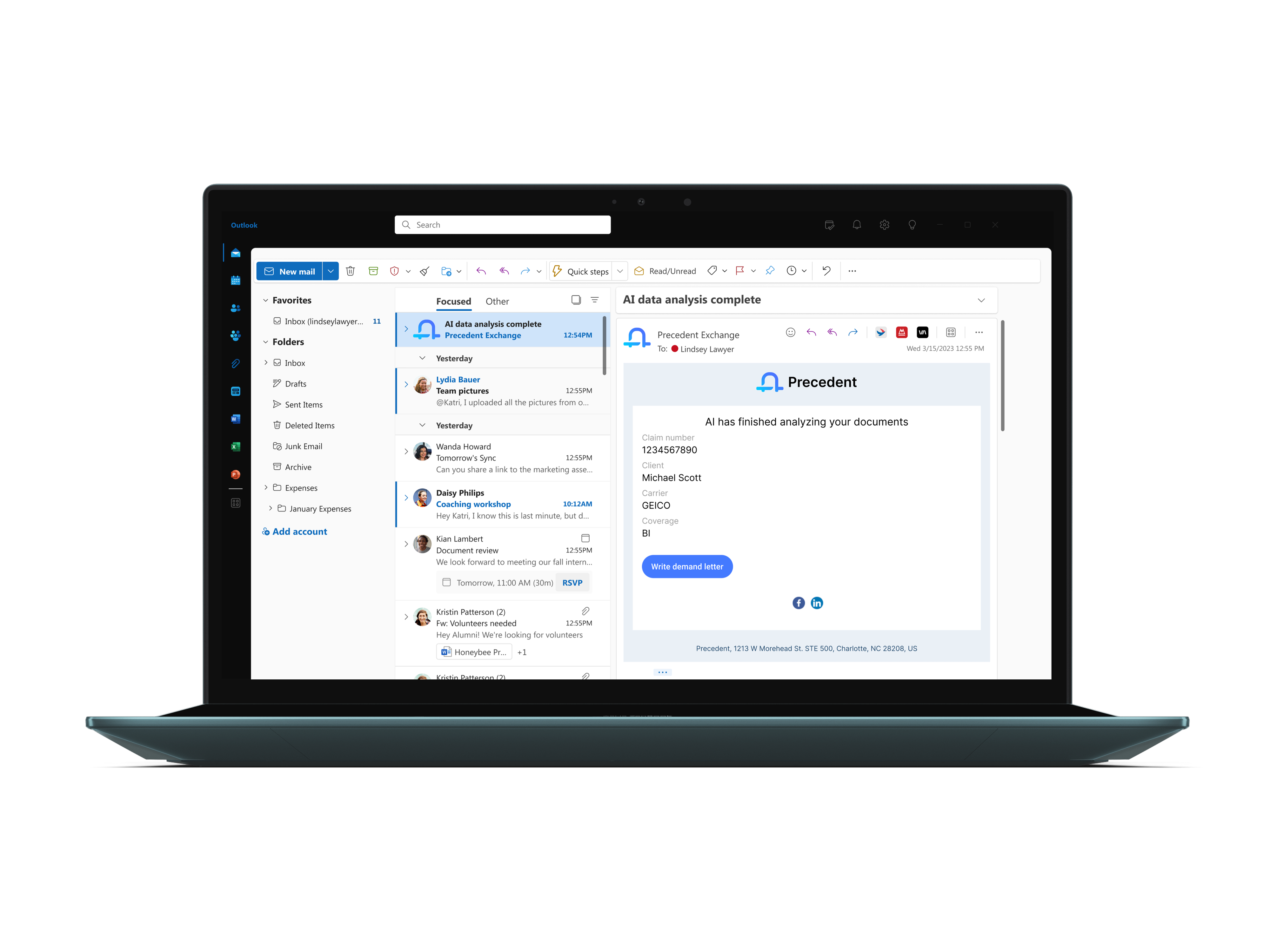
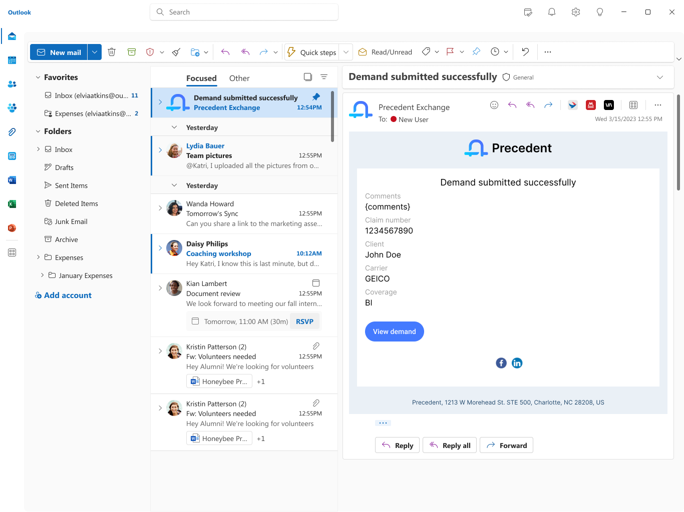
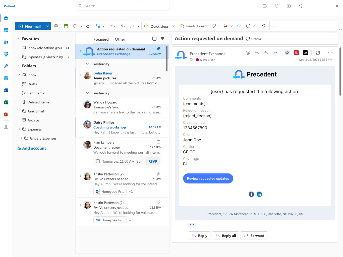
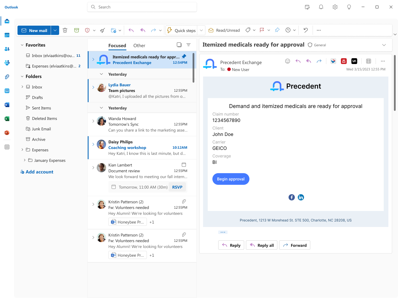
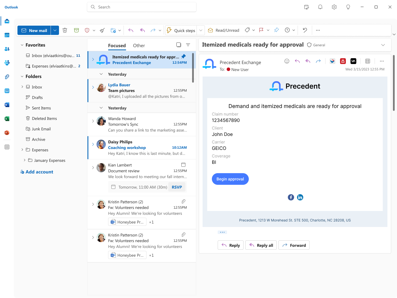
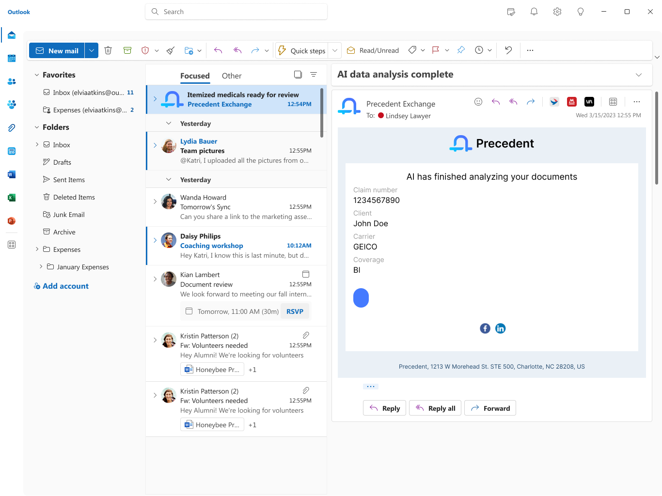
I designed the transactional and lifecycle email system that carries users through every meaningful state change in the ecosystem: from first welcome, to AI analysis complete, to demand submitted, to action-requested loops. Each email had to (1) respect Outlook/Gmail rendering constraints, (2) maintain brand parity with the web app, and (3) give the recipient one unambiguous next action.
I mapped the full lifecycle alongside product and engineering, defined the content hierarchy (case identifiers → status → single CTA), and authored templates that templatize dynamic fields like user, comments, reject_reason without compromising legibility.
2. Sign In Flow
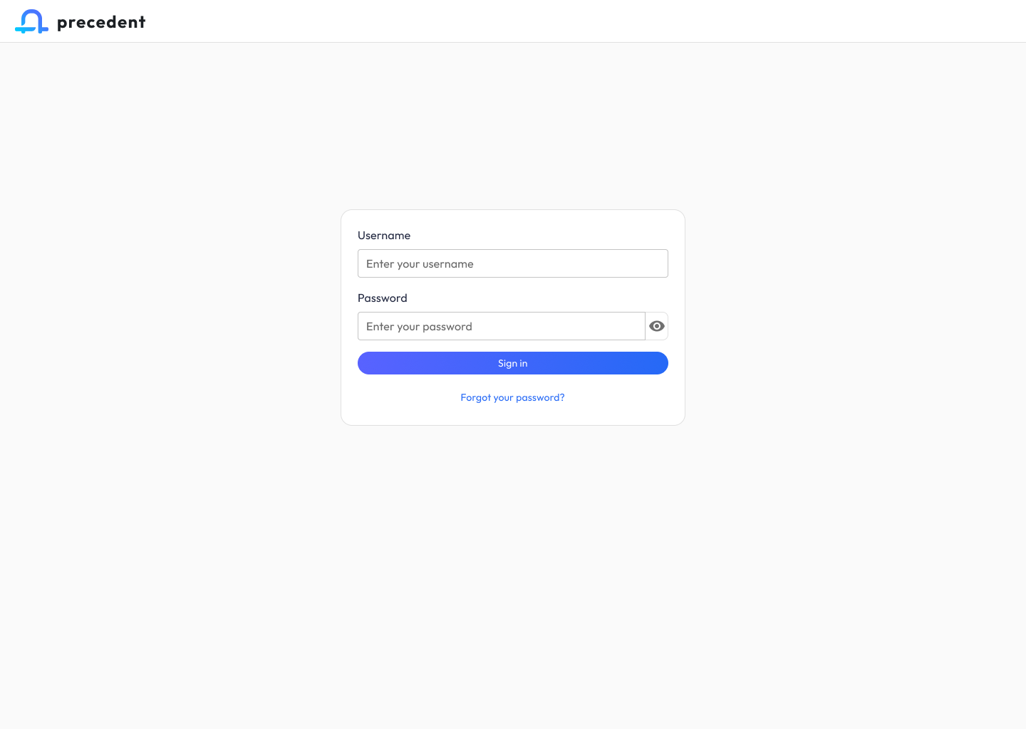
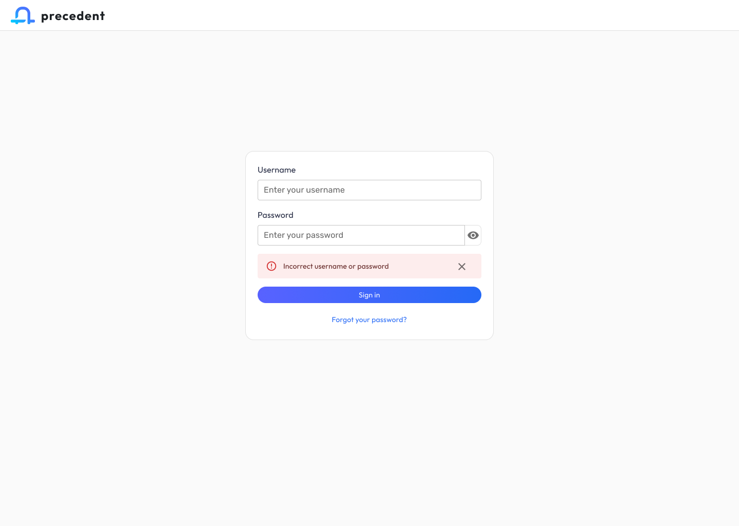
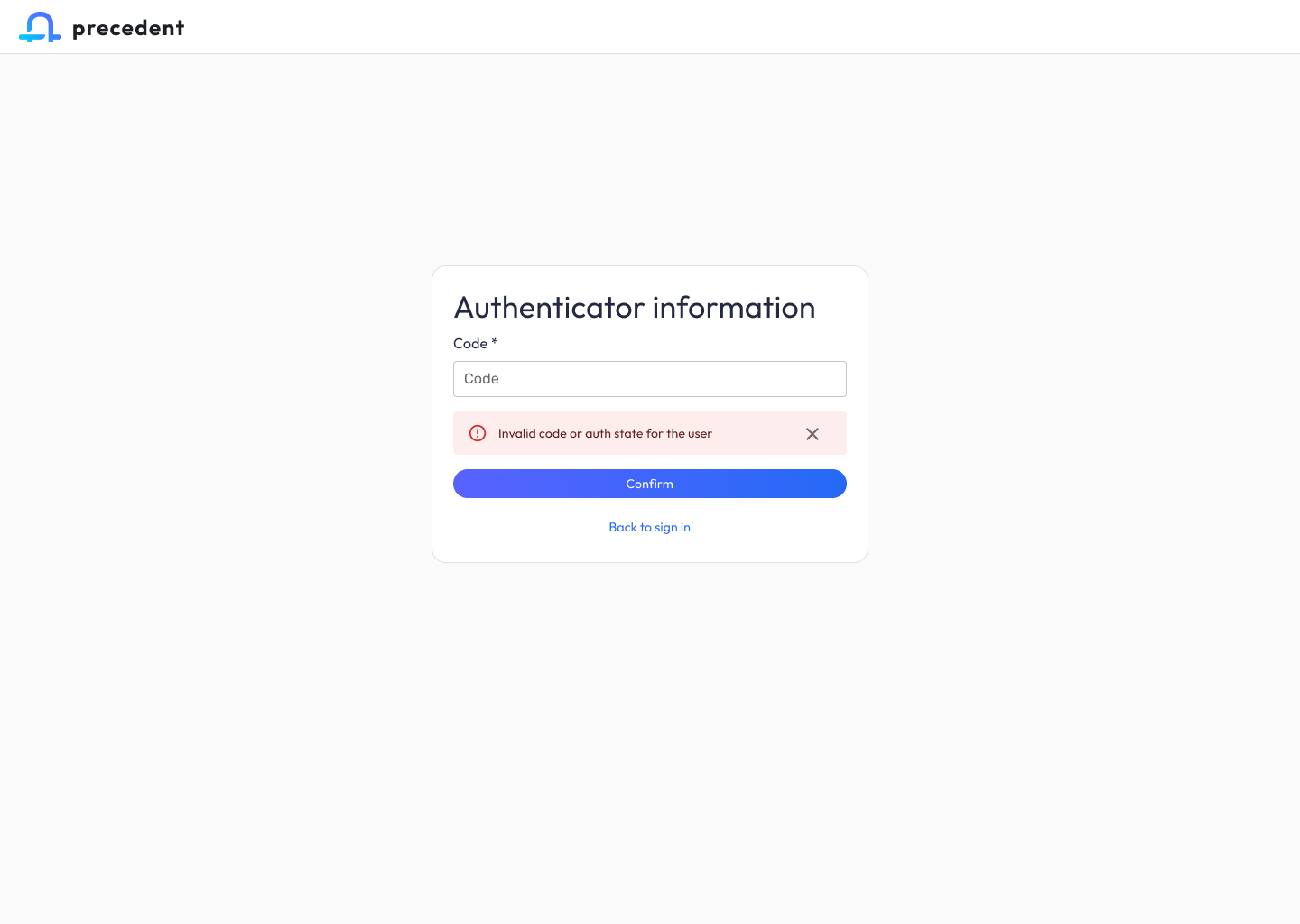
A focused, single-purpose authentication screen anchored by the Precedent wordmark. I tuned the form for speed (username + password, show/hide toggle, forgot-password recovery) and established the gradient primary button that became the ecosystem’s signature interaction affordance.
3. Claim Companion: Inventory View
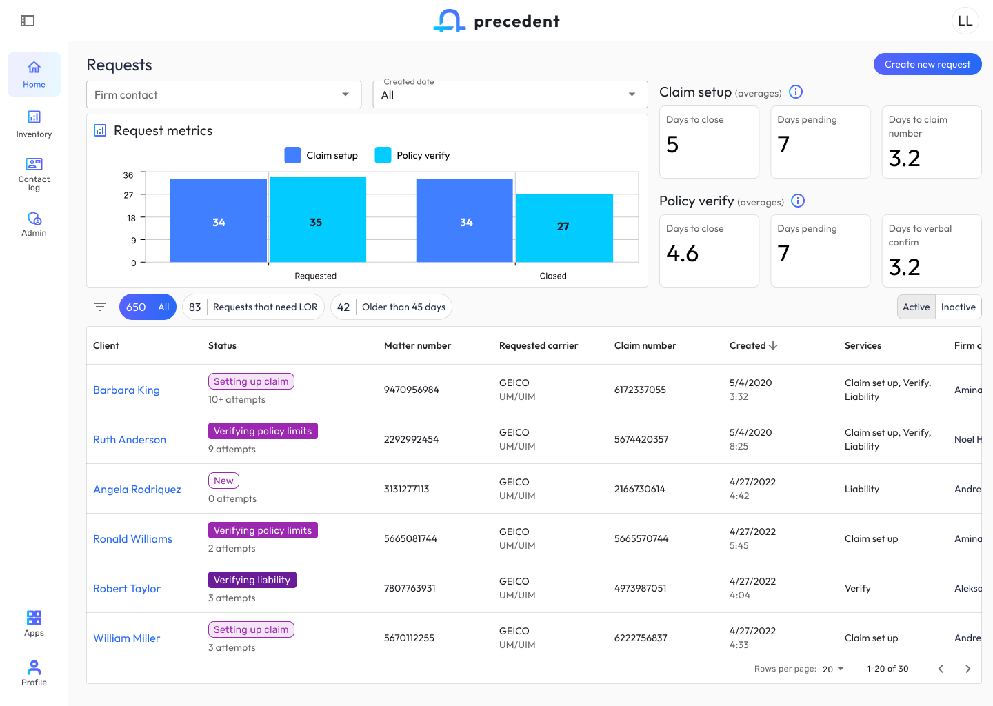
The Claim Companion home is a command center for pre-demand work. I designed the information architecture so firm contacts could scan 650+ active requests without cognitive overload: high-level request metrics and Claim setup / Policy verify averages sit above the fold, followed by quick filters (“Requests that need LOR,” “Older than 45 days”) and a dense but scannable table with status pills that encode workflow state at a glance.
I defined the left-nav pattern (Home, Inventory, Contact log, Admin) and the bottom-anchored Apps switcher, the key ecosystem-level control that lets users pivot to Demand Composer without losing their place.
4. Claim Companion: Request Detail
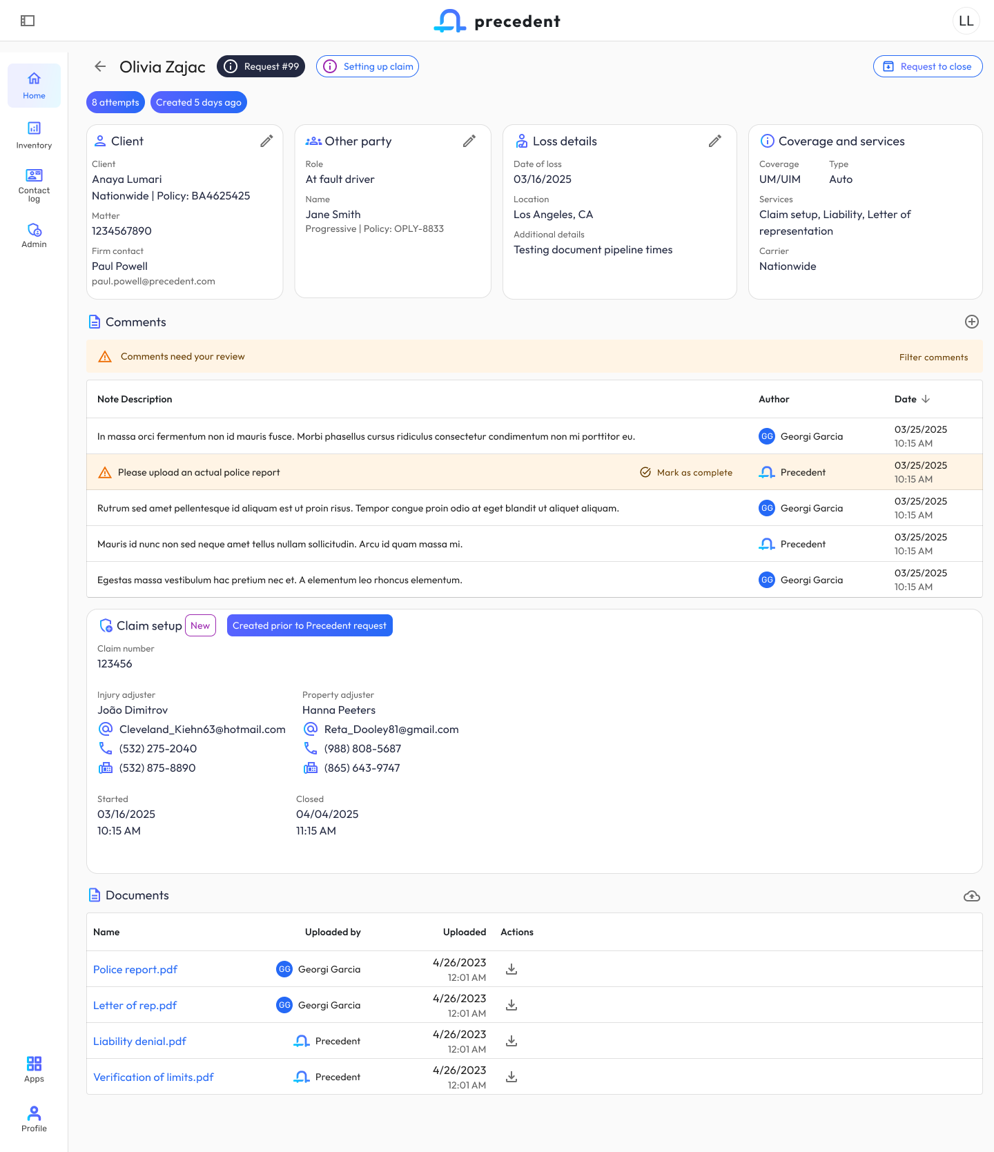
The request detail view is where paralegals do the actual work of moving a claim forward. I designed the four-card summary (Client / Other party / Loss details / Coverage and services) as an editable, at-a-glance header, then organized supporting context into progressive-disclosure sections: Comments (with a review-required banner pattern), Claim setup data, and Documents. The “Please upload an actual police report” row demonstrates the inline-action pattern I established for surfacing blockers without leaving the page.
5. Creation Forms: New Request & Compose Demand
Creation is the most error-prone moment in both apps. I designed parallel but distinct form paradigms:
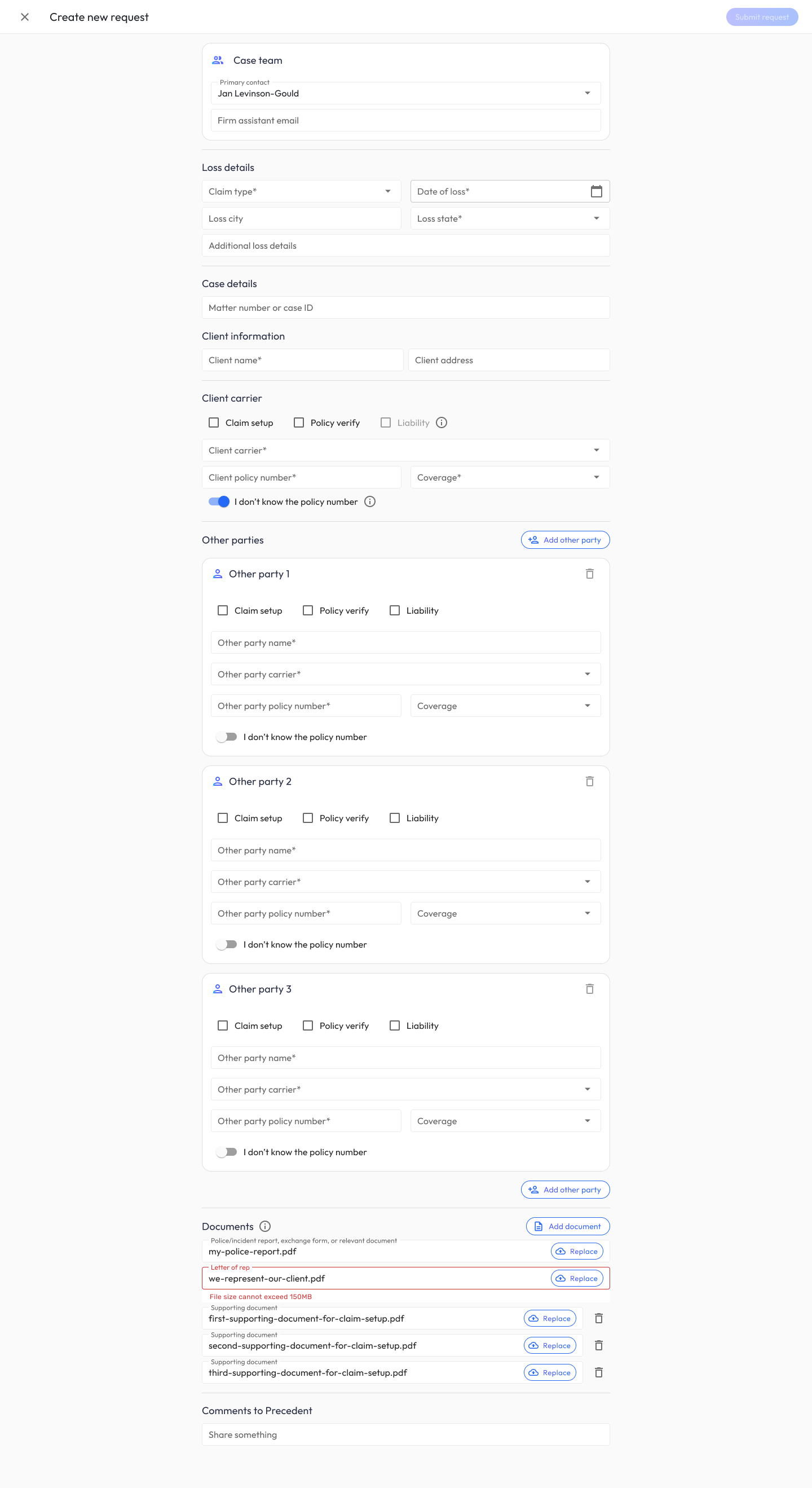
- Create New Request (Claim Companion): A long-form document capture flow with conditional “Other party” cards, inline file validation (note the 150MB error state on Letter of rep), and service-type checkboxes that drive downstream routing.
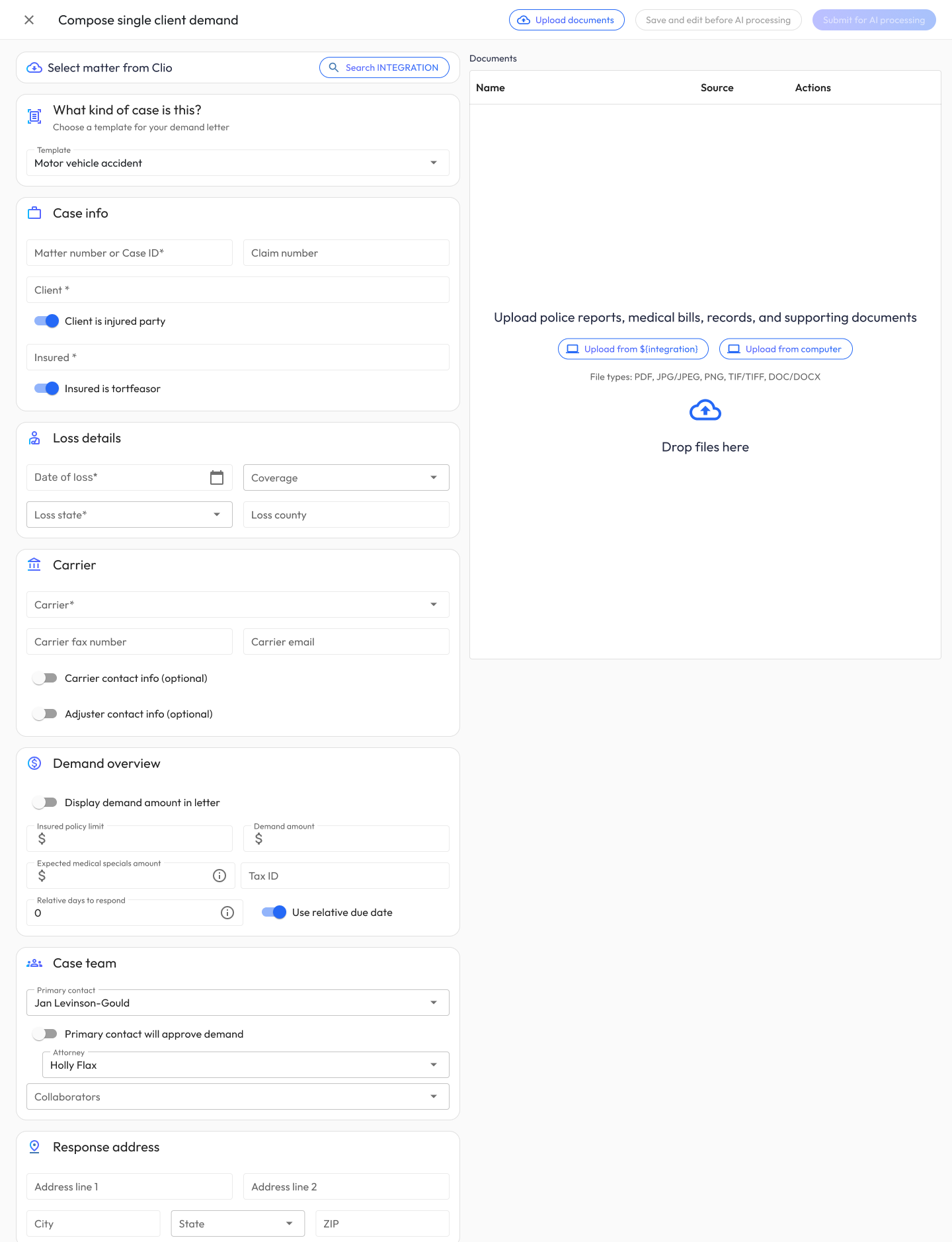
- Compose Single Client Demand (Demand Composer): A side-by-side layout (structured case data on the left, a persistent document uploader on the right), so users can build metadata and feed the AI pipeline in parallel. Integration search (e.g., Clio) lets users pull matter data without re-keying.
I aligned both forms on shared section patterns (Case info, Loss details, Carrier, Case team) so a user fluent in one form feels instantly oriented in the other.
6. Demand Composer: Inventory View
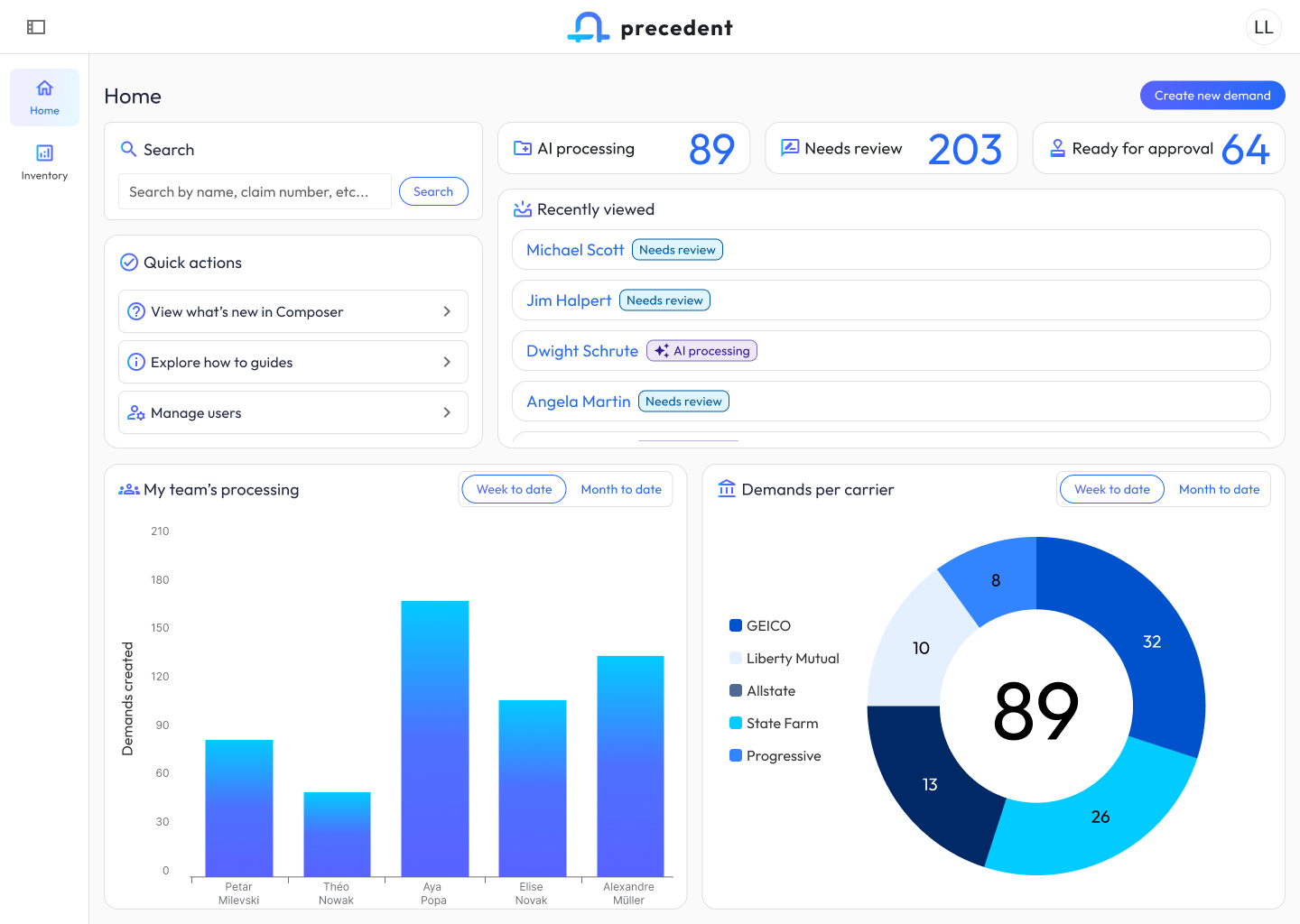
The Composer inventory shows 3,456 demands across multiple pipeline states. I designed the stateful filter chips above the table (New → Pending signoff → Pending processing → Pending review → Pending approval) as a living representation of the demand workflow, so a user can see, in one glance, where queues are backing up. Document status pills (“AI processing,” “Needs review,” “Ready for approval,” “New”) use the same color grammar as Claim Companion’s status pills, reinforcing ecosystem cohesion.
7. Human-in-the-Loop AI Review (Medicals)
This was the most consequential part of the system to get right. Hundreds of medical pages are ingested, chunked, and run through an extraction pipeline, and the attorney has to trust the output enough to stake a six- or seven-figure settlement on it.
I designed a layered review pattern that escalates from summary → evidence:
- Case health dashboard surfaces AI-derived findings as colored tags (“Positive MRI findings,” “Charges exceed demand amount,” “Treatment on date of loss”) alongside confidence indicators (“Low confidence” on bill completeness).
- Progressive-disclosure accordions for Providers, Billing timeline (log-scale chart of charges over time), Itemized charges, Diagnoses, and Imaging findings, each with “Needs review” banners that draw attention to low-confidence rows without being alarmist.
- Row-level review for ICD codes: the orange warning triangles mark exactly which codes need human judgment; everything else is quietly marked “Included” so reviewers can move fast where AI is confident and slow down where it isn’t.
- Split-pane preview on every medicals screen keeps the source document one glance away, so users can verify AI extractions against the original without losing context.
8. Case Intelligence: RAG-Powered Generative Analyses
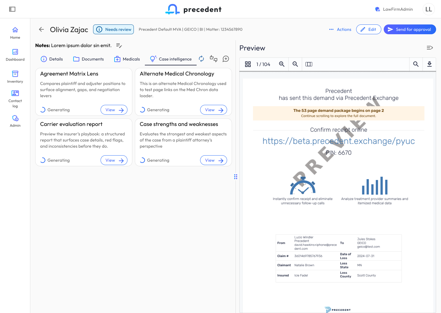
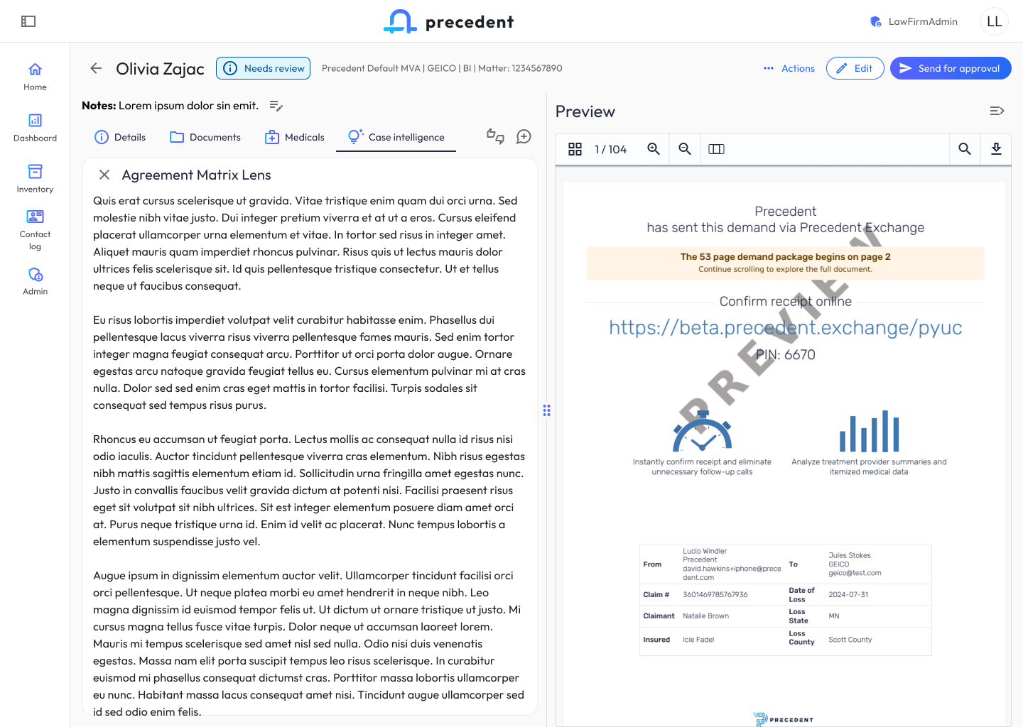
Case Intelligence is Demand Composer’s generative layer. I designed a card-based generation model where each analysis type (Agreement Matrix Lens, Alternate Medical Chronology, Carrier Evaluation Report, Case Strengths and Weaknesses) runs as its own generation with a live “Generating” state, expandable inline to read the full output.
The split-pane design keeps the evolving demand package (104 pages, PDF preview) visible on the right while the user explores AI-generated insights on the left, so the attorney can critique and revise in-context rather than toggling between screens.
9. Document Editing & Authoring Paradigms
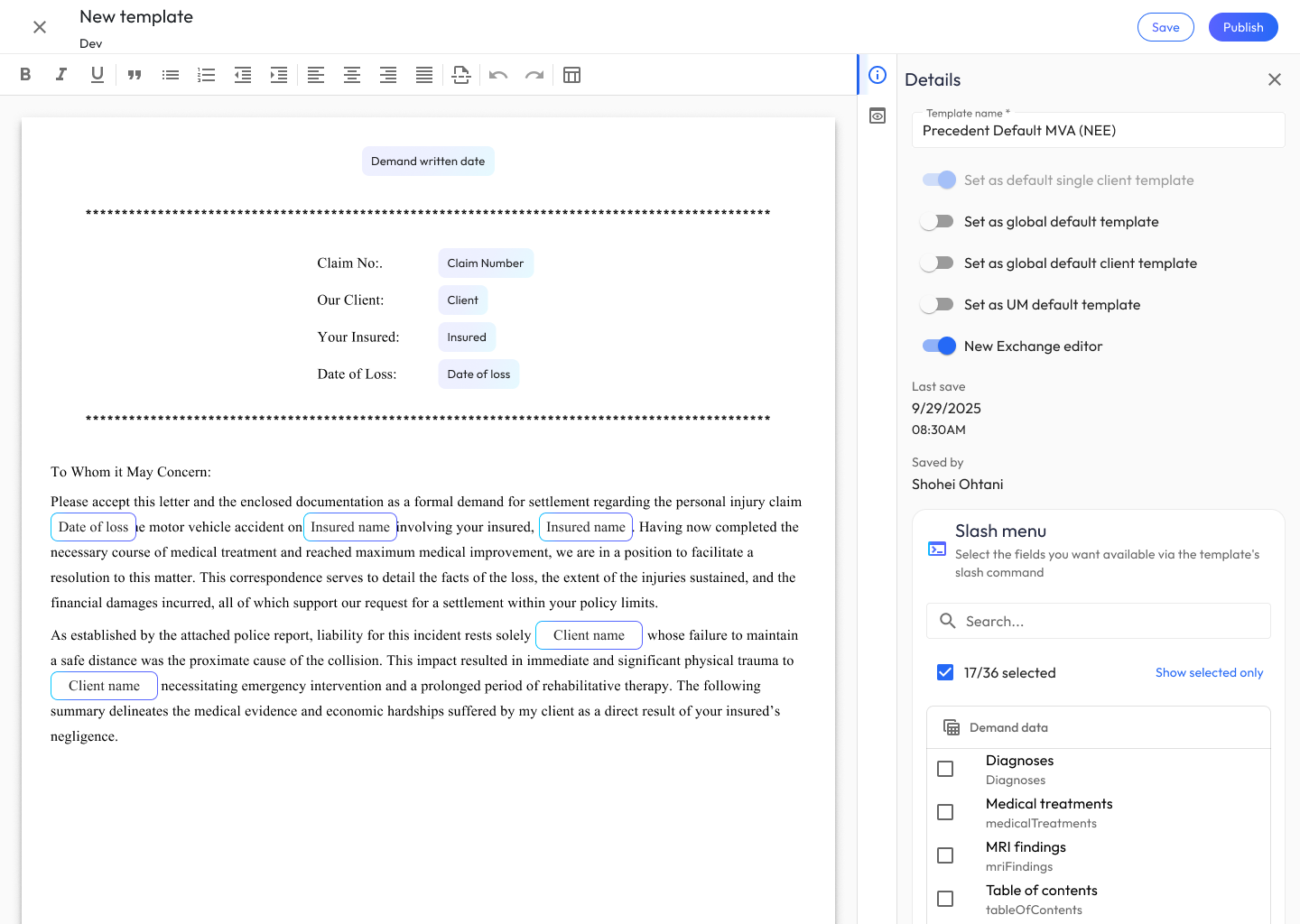
The template and document editors were the most technically ambitious UX work in the project. I defined the authoring paradigm for demand letters and reusable templates, balancing three audiences: firm admins building reusable templates, attorneys editing live demands, and the AI itself (which needs structured field anchors to generate into).
Key patterns I established:
- Dynamic variable chips that render inline but behave as first-class typed entities, not plain text.
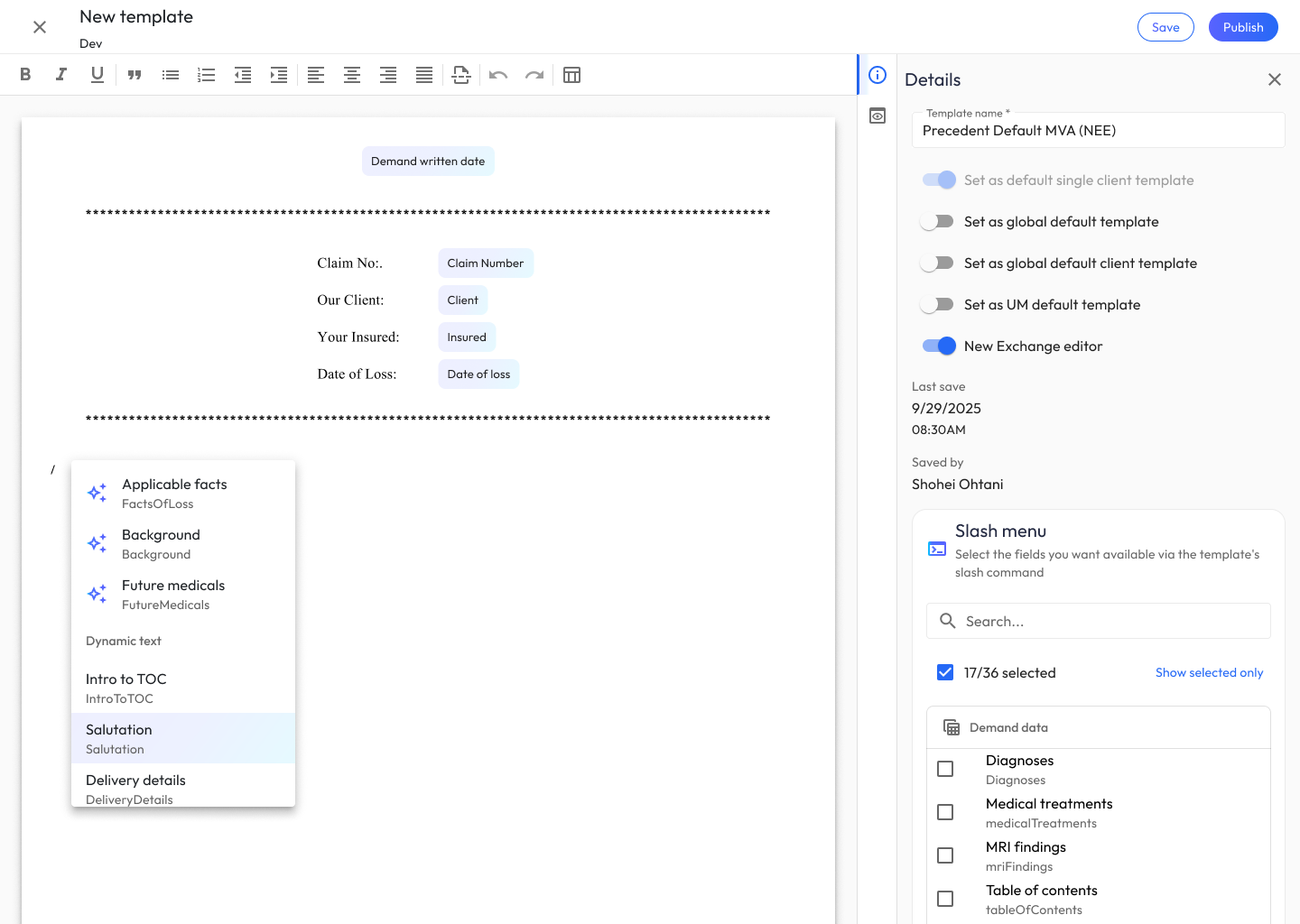
- Slash menu for inserting AI-generated sections: Applicable facts, Background, Future medicals, Intro to TOC, Salutation, Delivery details. This gave authors a consistent muscle-memory command surface borrowed from modern editors.
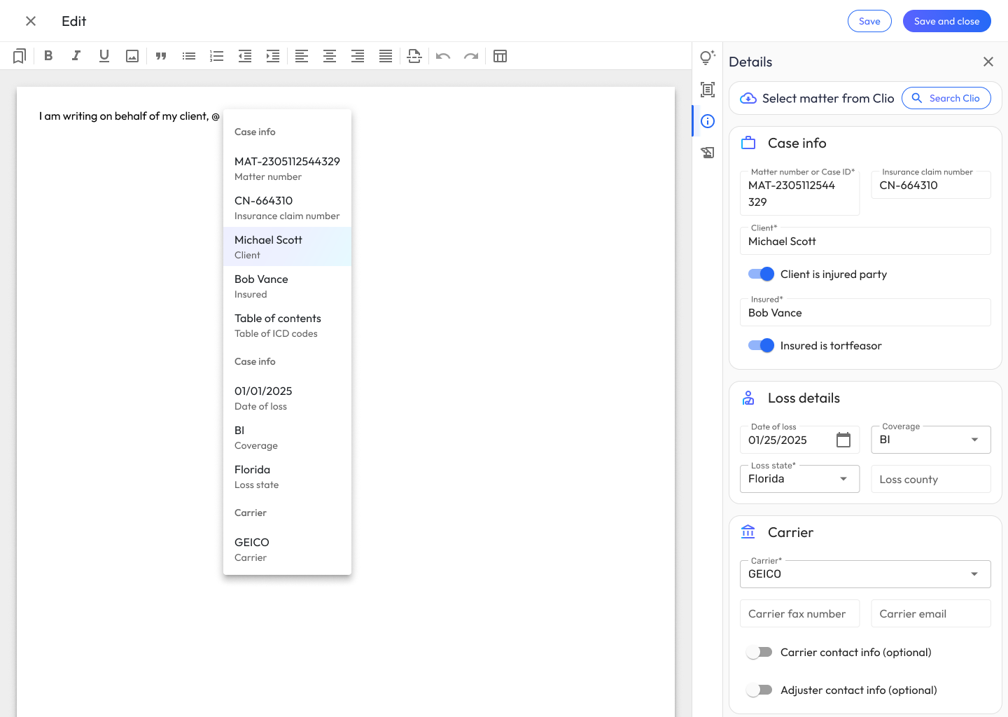
- @-mention menu for injecting case data mid-sentence: typing My firm represents @ surfaces Client, Insured, Case details, and Loss details. The same menu works in both template building and live demand editing.
- Dual-panel editor with Details (friendly name, field name, AI generation prompt, custom CSS) and a publish/save split, so template authors can iterate on AI prompts, styling, and structure in one place.
10. Exhibit Manager: Document Organization Paradigm
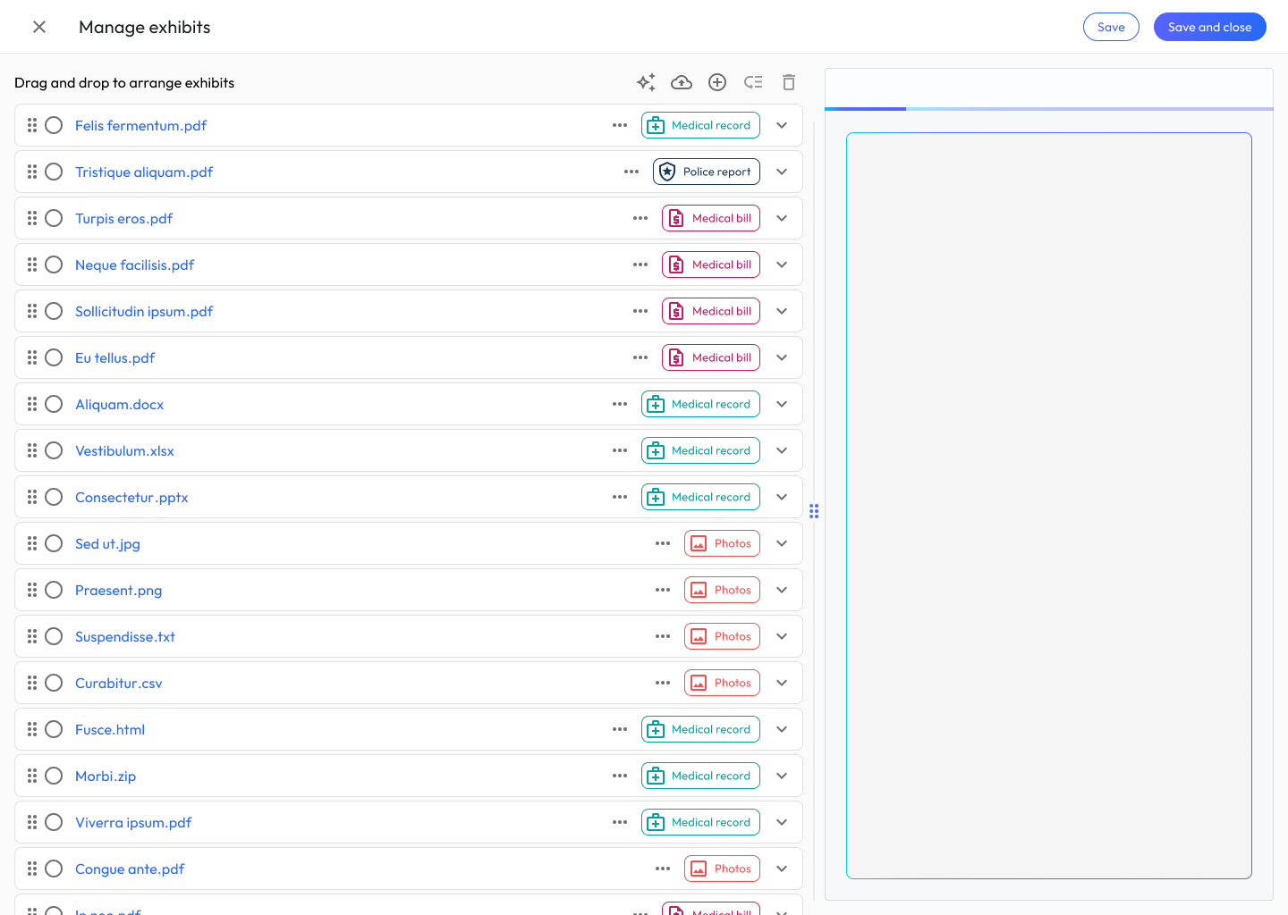
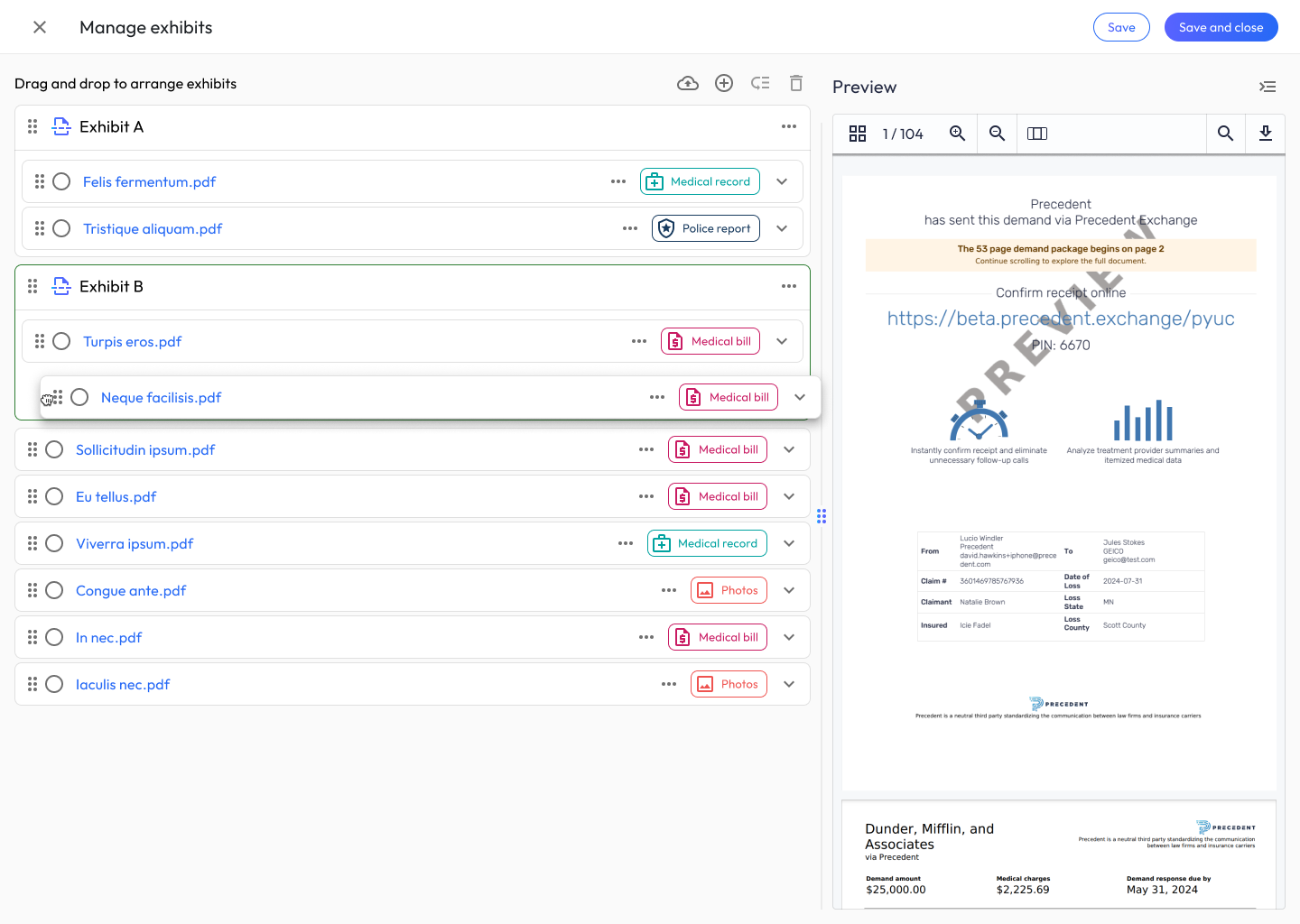
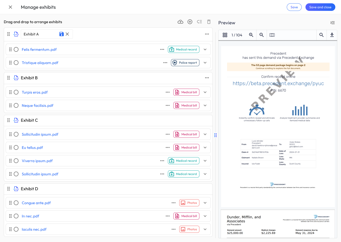
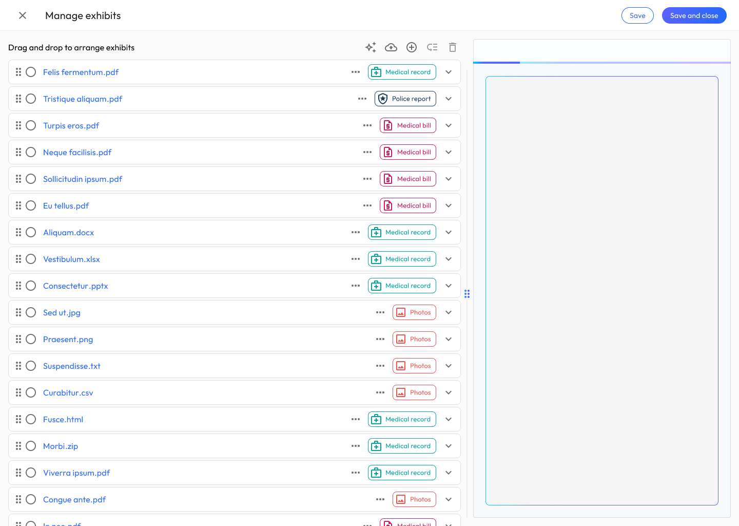
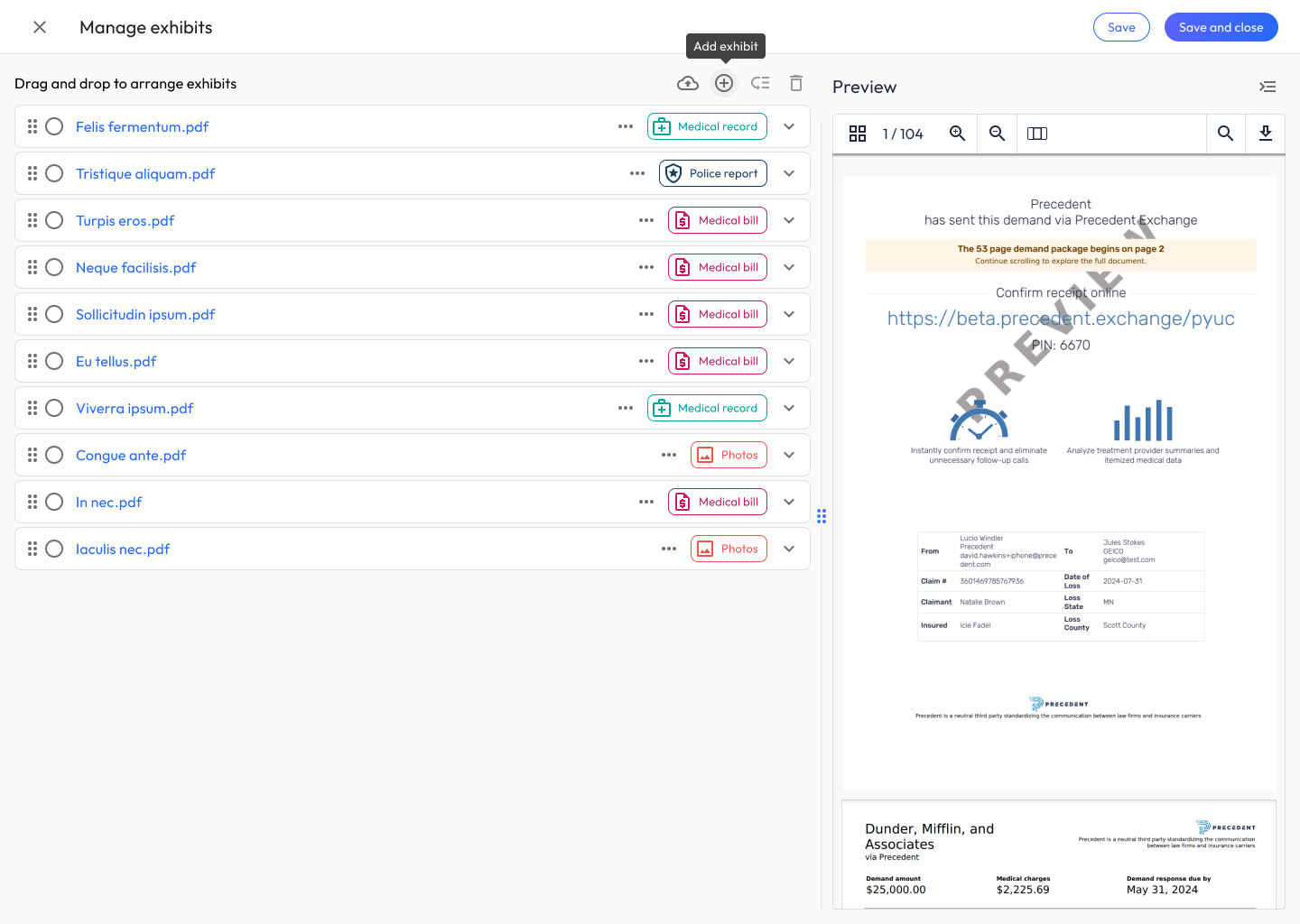
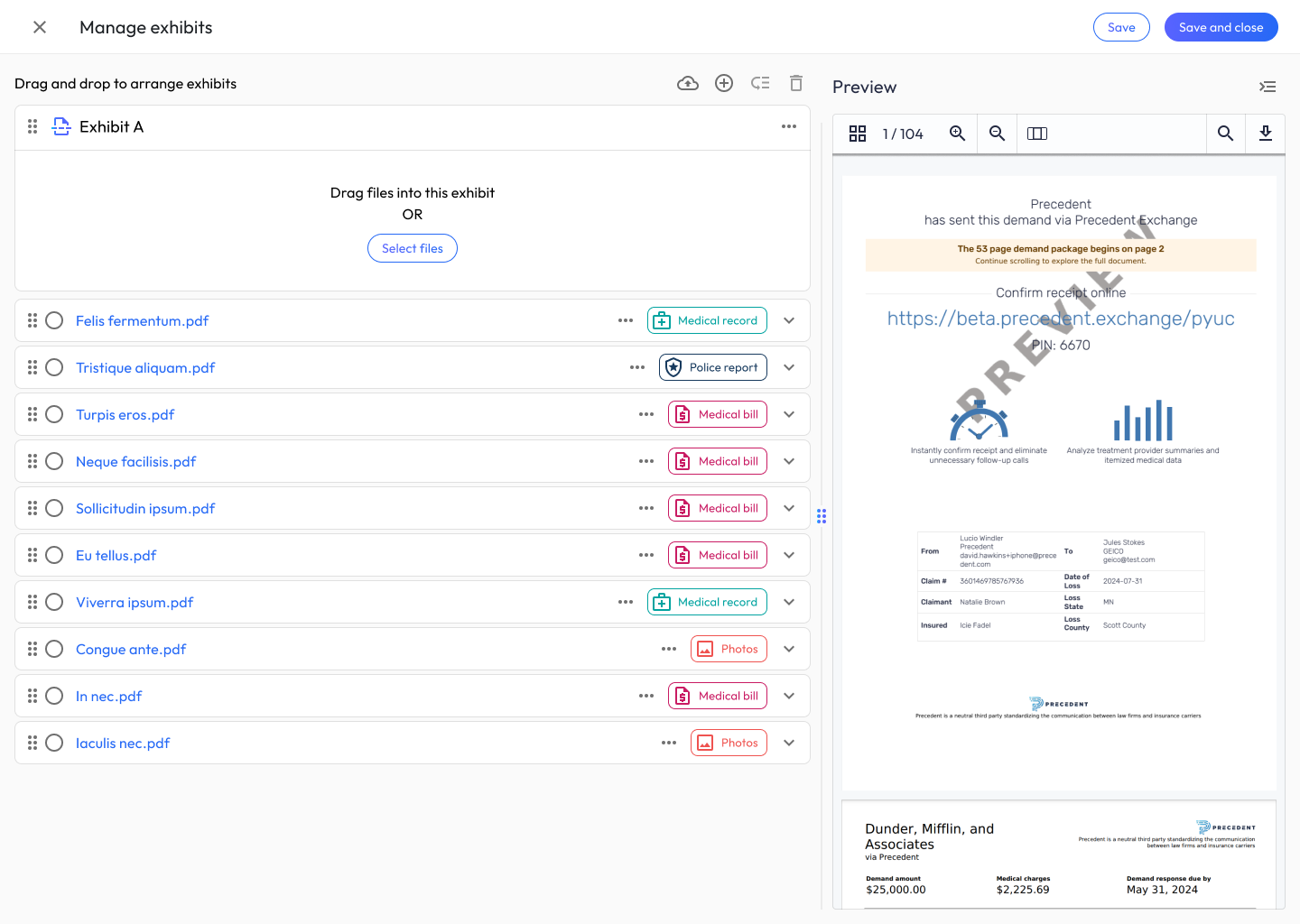
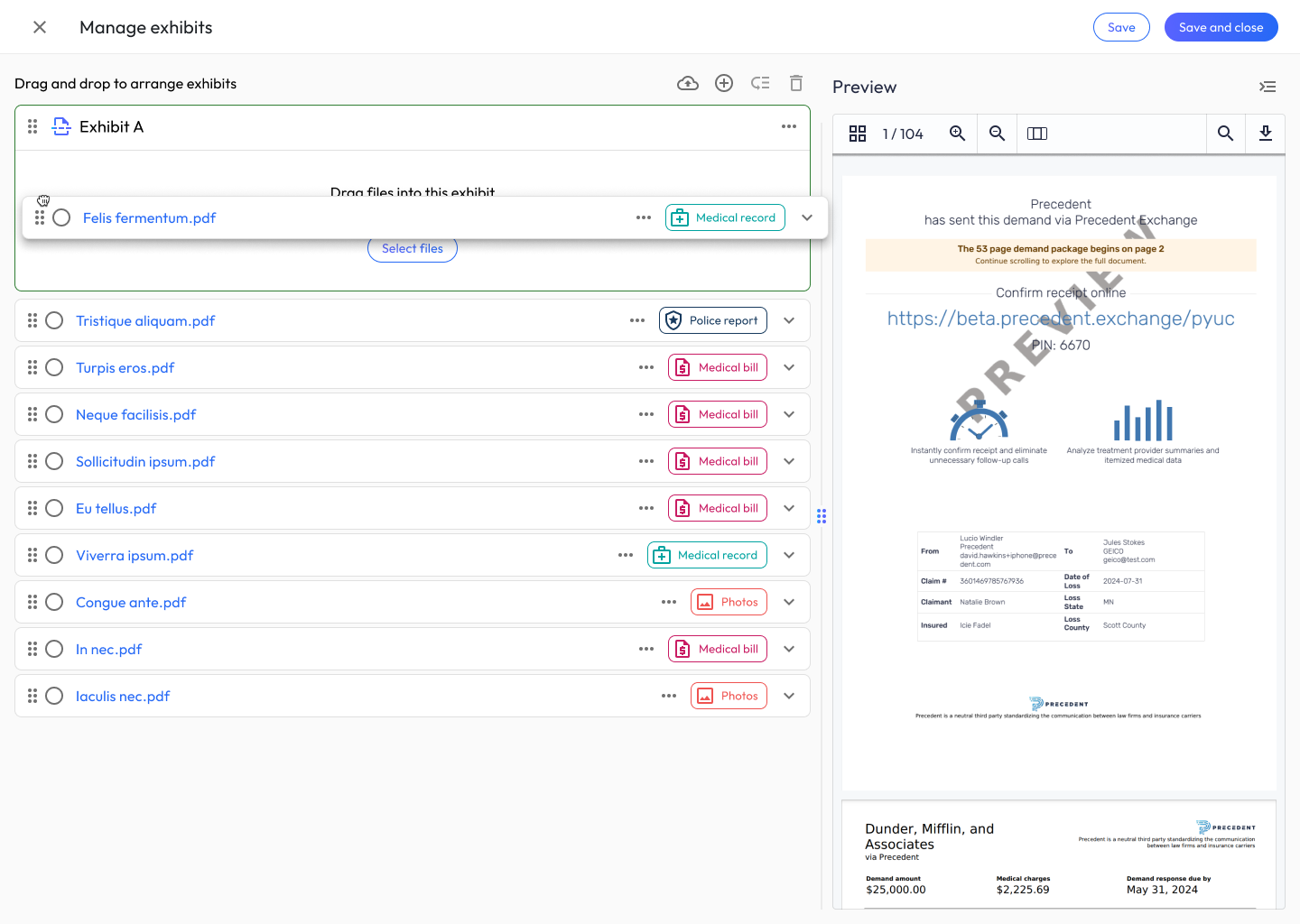
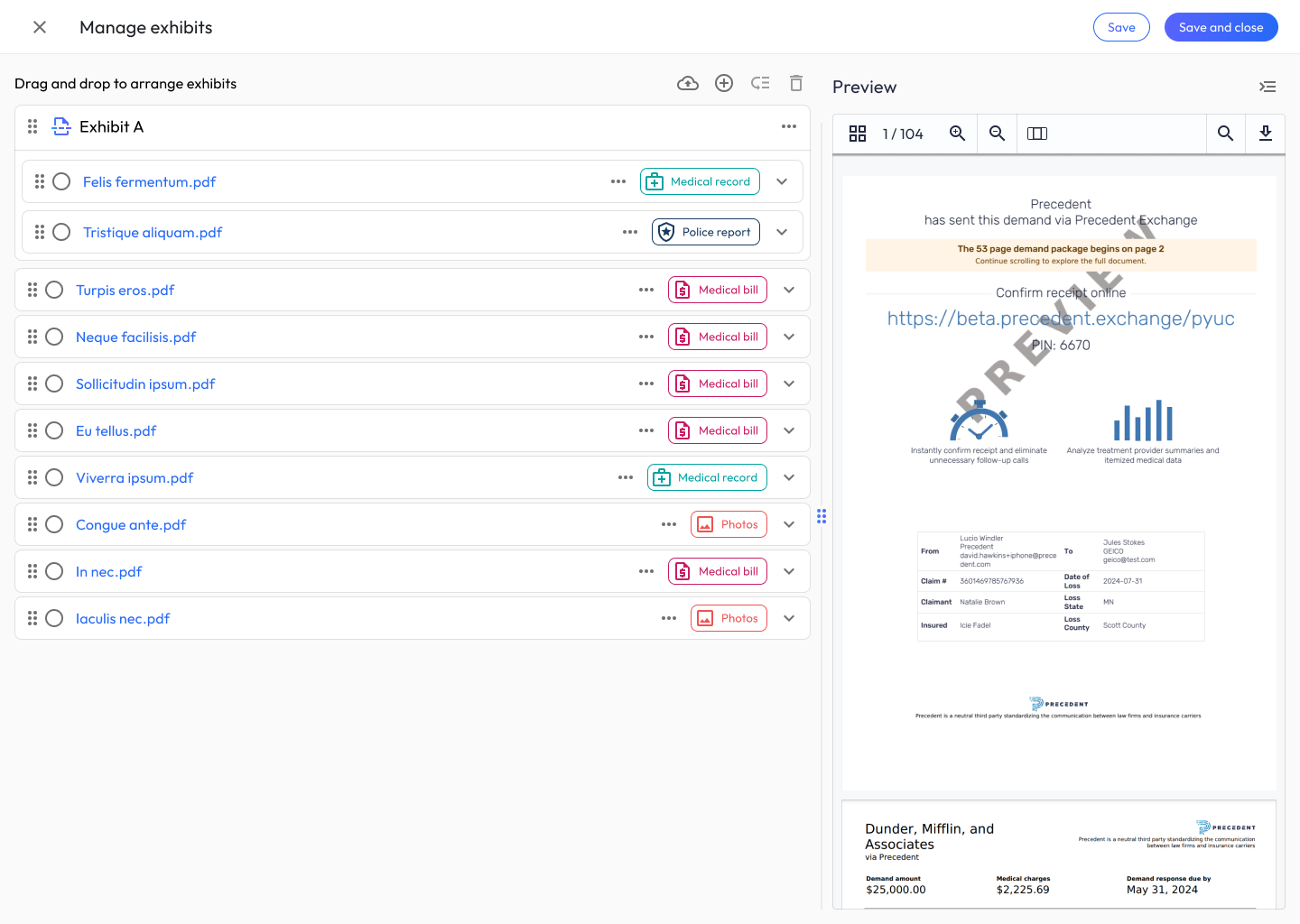
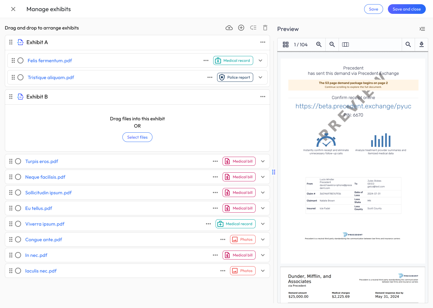
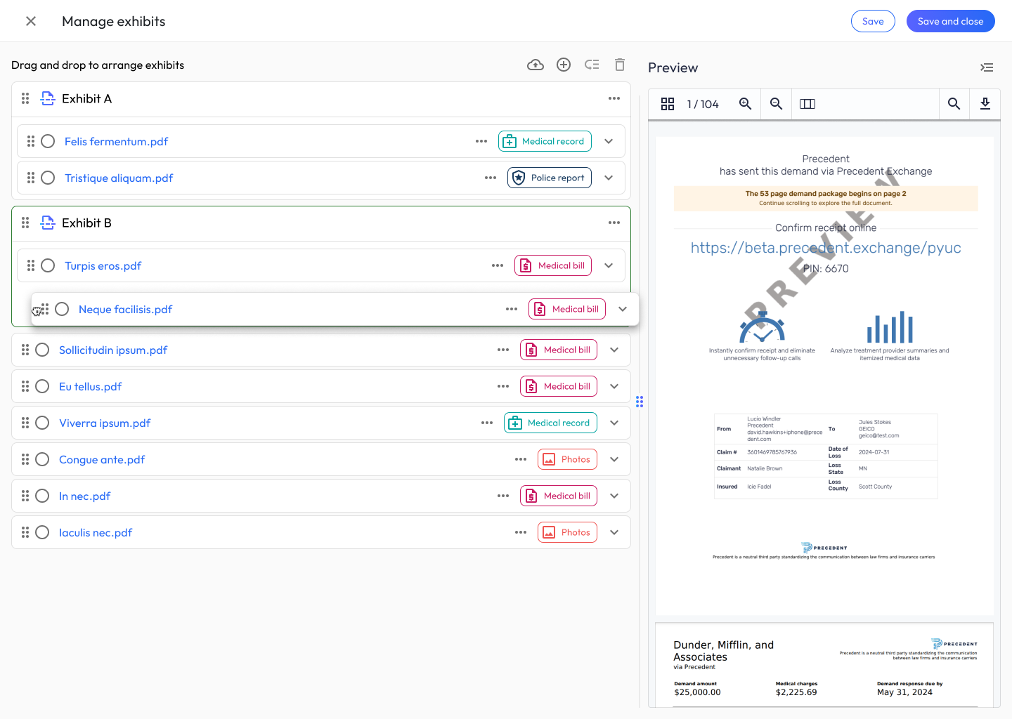
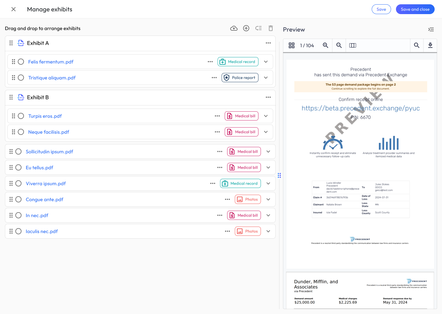
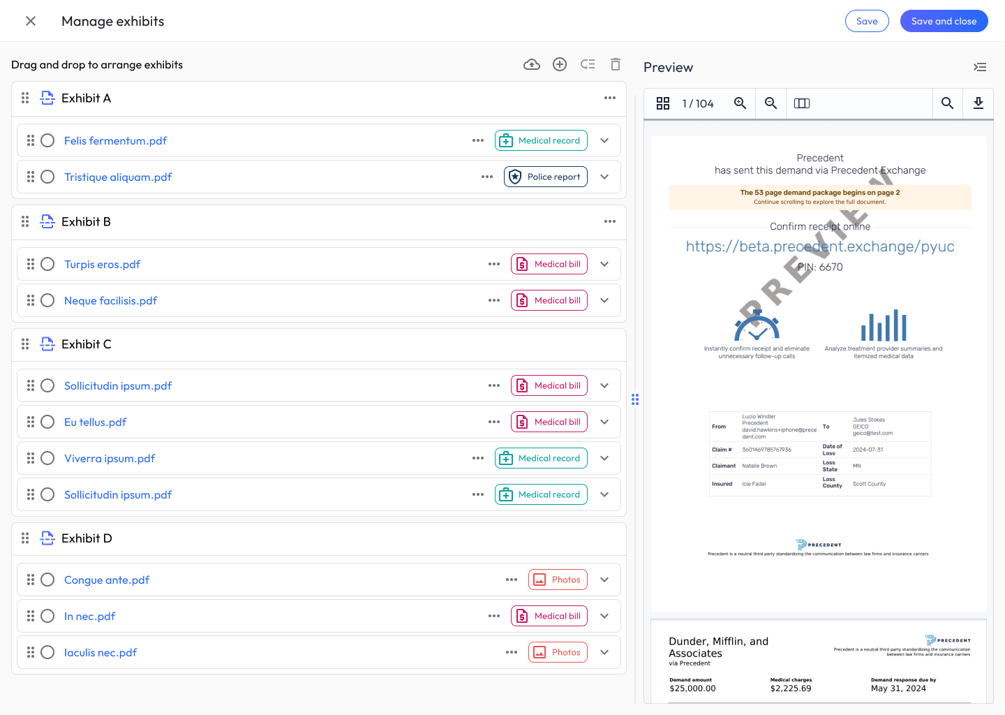
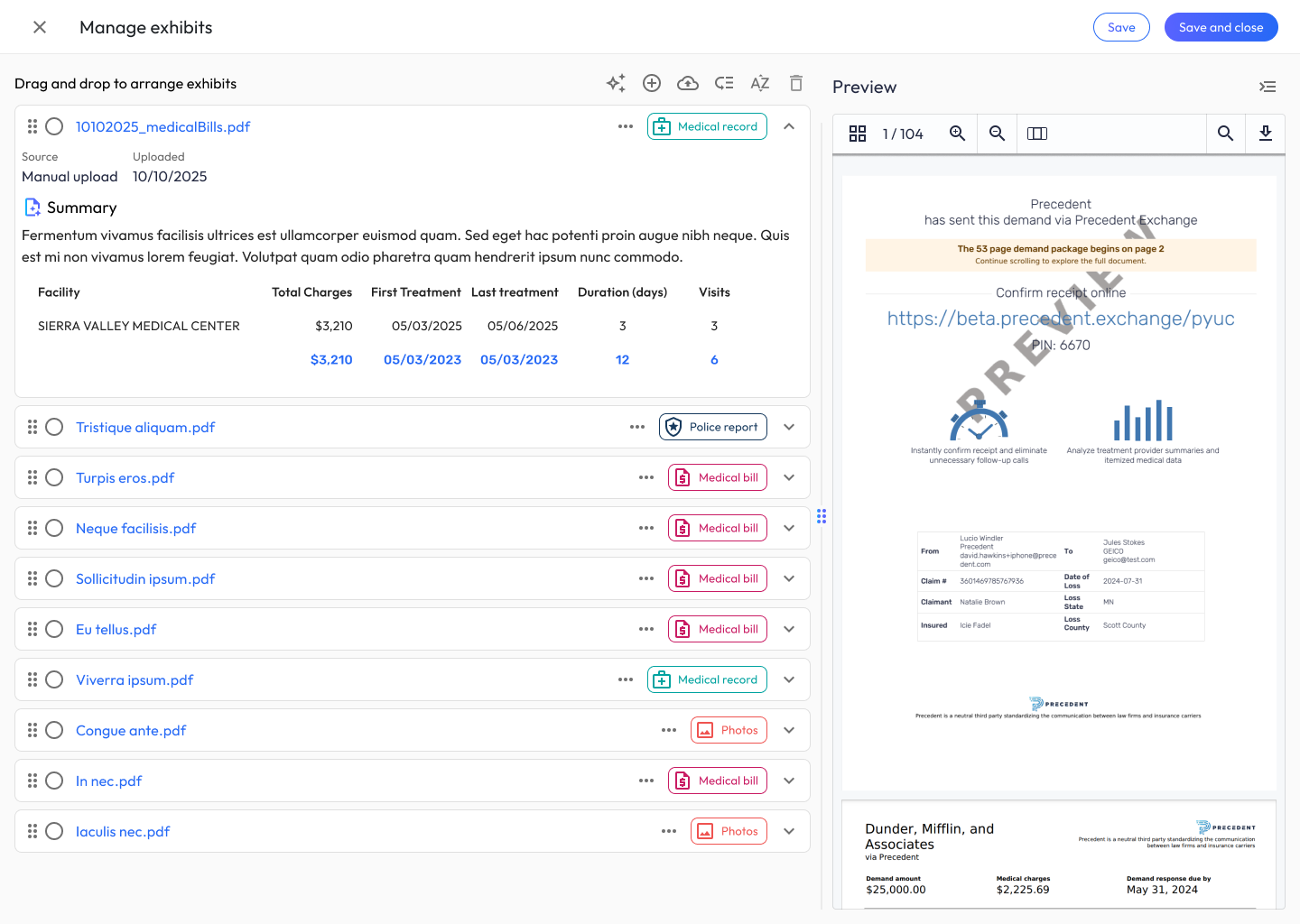
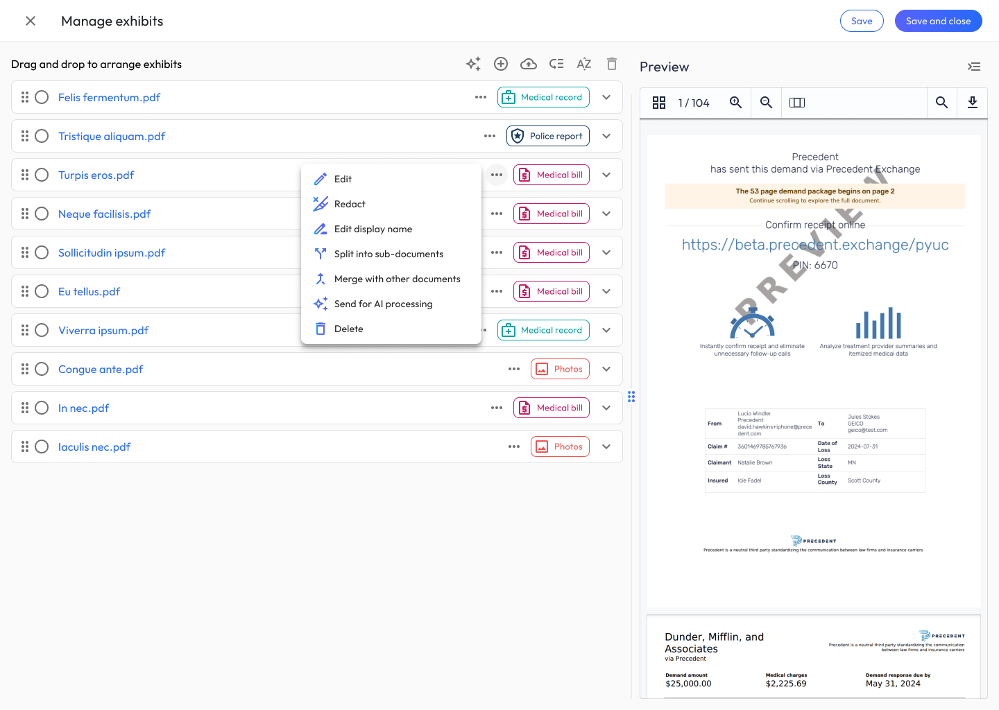
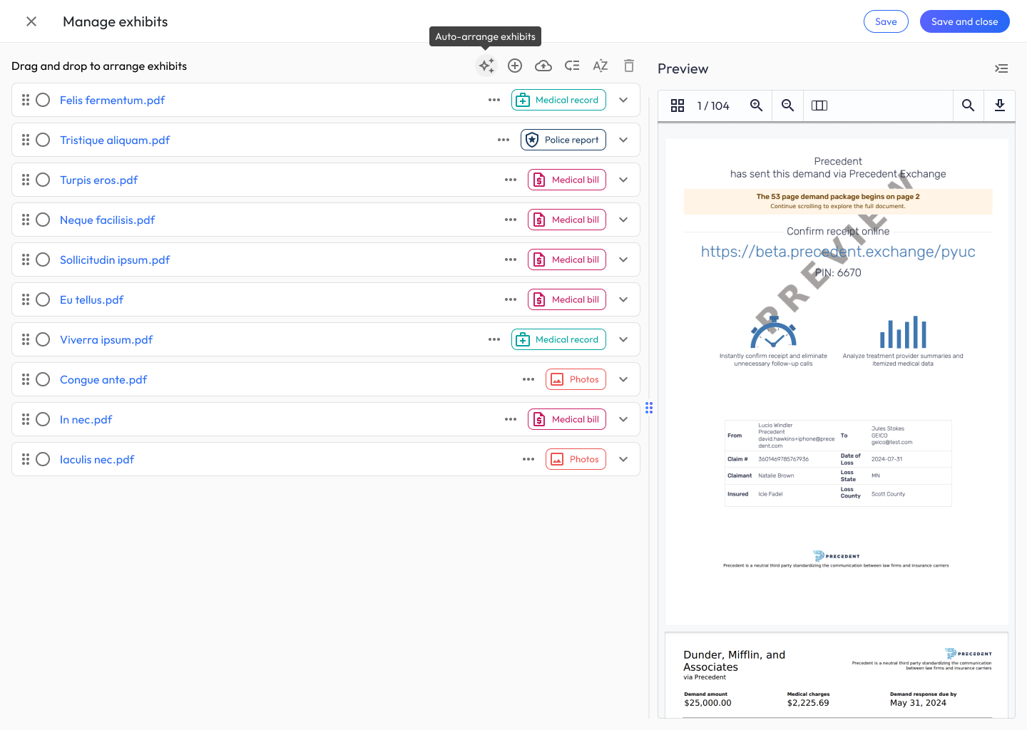
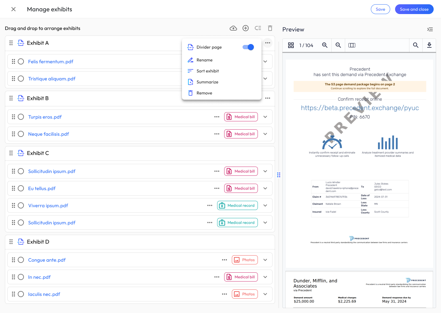
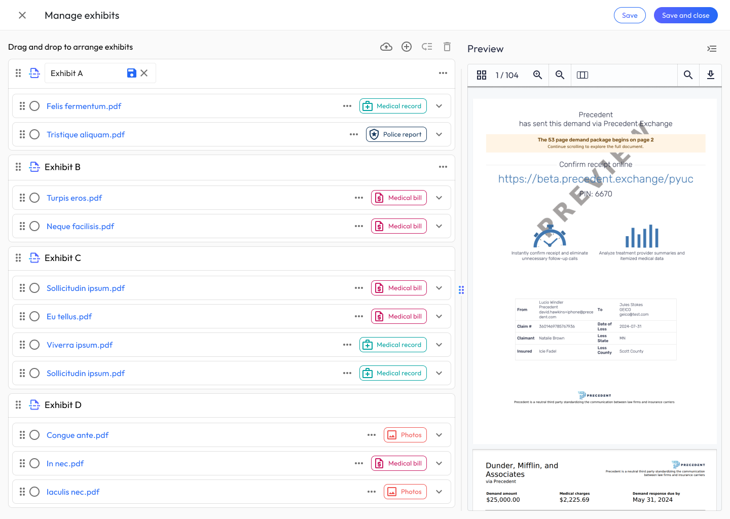
Attorneys needed to assemble the final exhibit package by grouping hundreds of underlying documents. I designed a drag-and-drop canvas with auto-grouping that combines: document-type badges (Medical record, Police report, Medical bill, Photos), multi-select actions, an AI auto-arrange action (the sparkle icon), and Exhibit grouping containers (Exhibit A, B, C, D) that users can create, rename inline, and reorder.
A persistent preview pane on the right renders the live demand package as the user reorganizes, so every reorder decision is immediately visible in the final artifact.
The sequence below walks the full arrangement journey: from a flat, ungrouped document list, through creating and naming the first exhibit container, to a complete package organized into Exhibits A–D, with the live demand preview rendering every change on the right.
11. Admin & Management Experiences
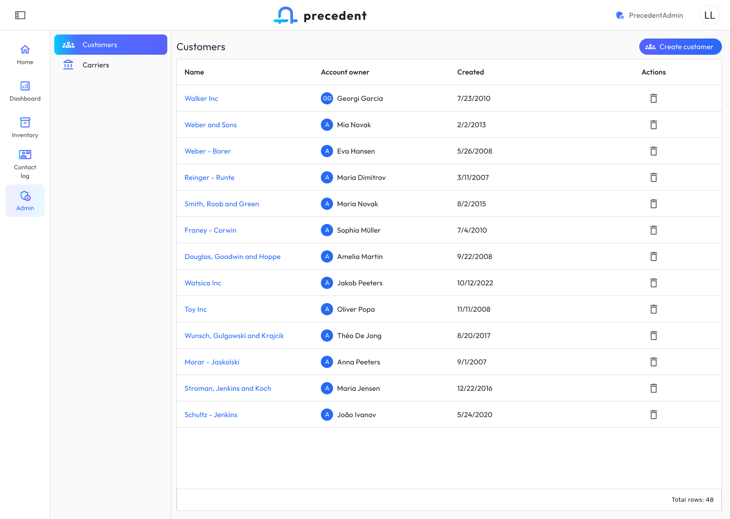
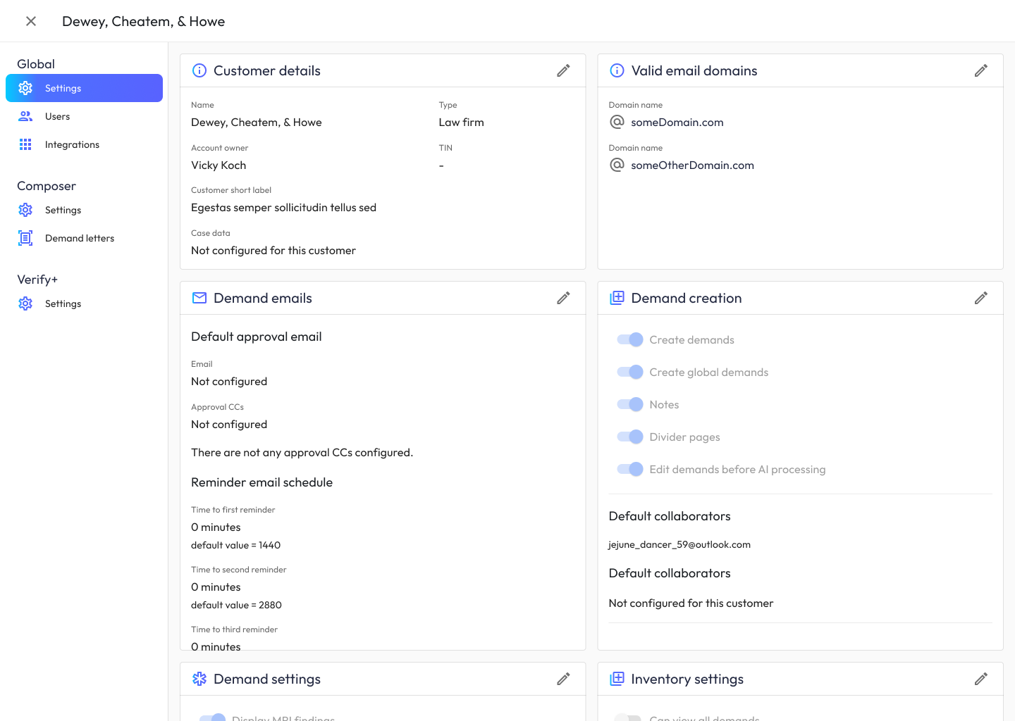
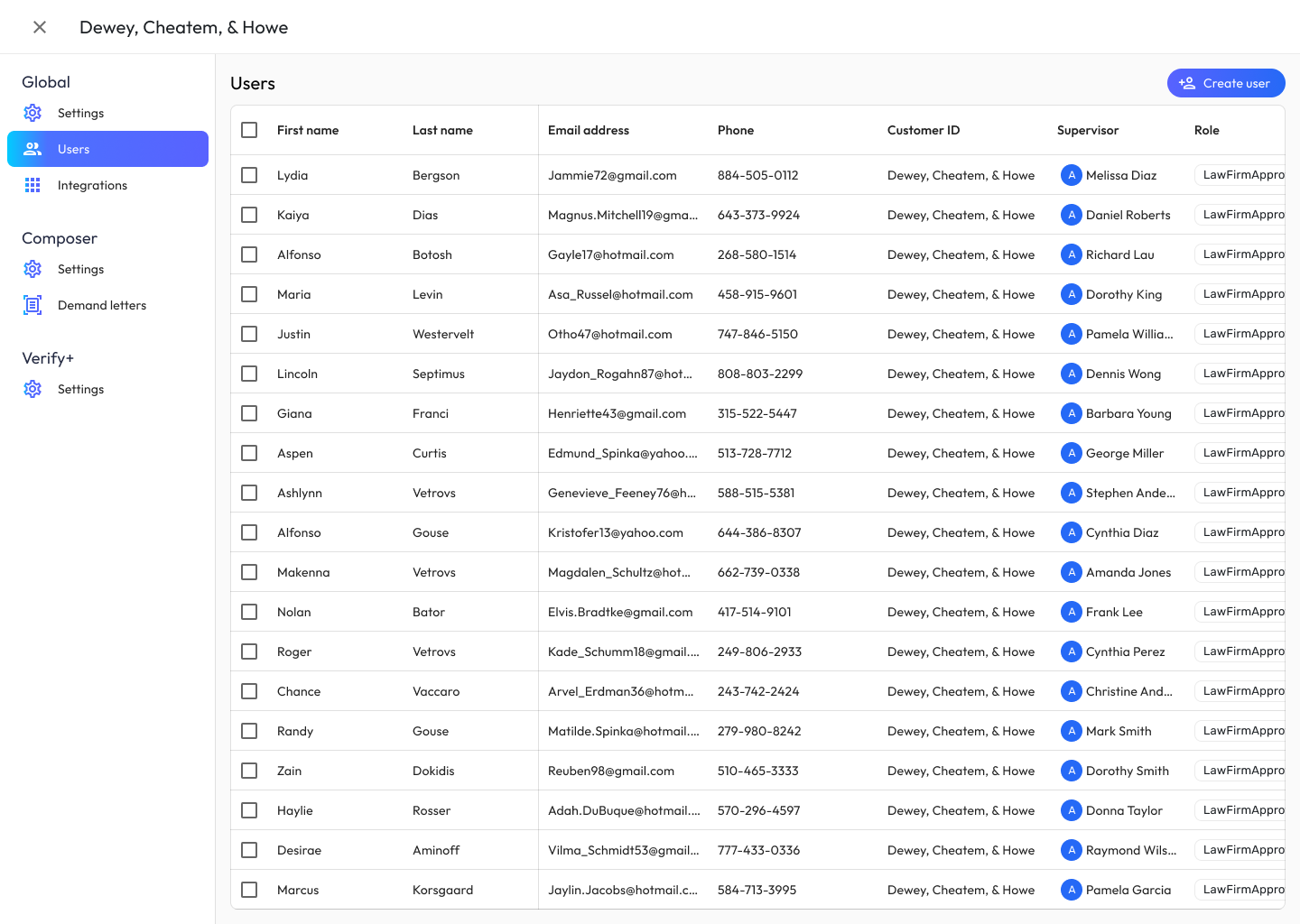
Admin surfaces serve firm administrators managing customers, users, carriers, and cross-app settings. I designed an ecosystem-wide settings taxonomy organized into Global (Settings, Users, Integrations), Composer (Settings, Demand letters), and Verify+ (Settings), so admins understand which knobs apply where.
Customer detail pages use a consistent card grid (Customer details, Valid email domains, Demand emails, Demand creation, Demand settings, Inventory settings) with inline edit pencils, and user management uses a dense table optimized for bulk actions.
Key Decisions & Pivot Points
Two apps, not one. The foundational bet was pairing two purpose-built apps instead of building one monolith, honoring the genuinely different rhythms of claim administration and demand authoring, at the cost of having to design every seam between them. The Apps switcher, shared status-pill grammar, and aligned form patterns exist because of this decision; users moving between apps dozens of times a day without friction was the proof the bet paid off.
Status color grammar as a contract. Early on, the two squads began evolving their own status colors and labels independently (reasonable in isolation, corrosive at the ecosystem level), because a color that means “needs attention” in one app and “in progress” in the other trains users to distrust both. I froze the status grammar into a shared, governed vocabulary that neither squad could extend unilaterally. It cost the squads some local expressiveness; it bought users one language for “where is my case?” everywhere.
Abandoning the top navigation bar. The early shell used a horizontal top nav, a thoroughly proven, highly usable web pattern. The feedback that killed it had nothing to do with task success: users told us it made the app feel dated. That mattered more than it might sound. This is the aesthetic-usability effect working against us: a product asking law firms to trust novel AI with their highest-stakes work can’t afford a first visual impression that reads as yesterday’s software, because “dated” quietly erodes trust before a single feature is used. The shift to the vertical left-nav pattern that now anchors both apps was easy to implement, which made it an easy call: high signal, low cost. The lesson: a pattern can pass every usability heuristic and still fail the product’s story.
Collaboration
The ecosystem’s coherence was manufactured by process, and the process was chosen deliberately. A shared Figma library both squads consumed made consistency the path of least resistance; divergence required more effort than alignment. The weekly cross-squad design review I ran was the forcing function: the one hour where Claim Companion and Demand Composer work sat side by side, which is where seams became visible before they shipped. Engineering treated the library and review outcomes as source of truth, which meant design governance had teeth without needing escalation. And attorney advisors from partner firms stayed embedded throughout rather than reviewing at milestones, because in a domain this specialized, a week of unreviewed assumptions is a week of rework.
Outcomes
Business Impact
The ecosystem compresses what used to be weeks of paralegal document review and demand drafting into days. RAG-grounded case intelligence gives attorneys negotiation leverage they didn’t have before: Agreement Matrix Lens and Carrier Evaluation Reports let them anticipate the adjuster’s playbook before the first phone call. The result is higher settlement offers, reached faster, with money landing in clients’ pockets sooner.
The platform-level numbers:
- $5M ARR in under two years, the commercial trajectory the ecosystem built, firm by firm, as the two-app platform replaced fragmented tooling.
- 68% product-market-fit score, the share of users who would be “very disappointed” to lose Composer, well clear of the 40% Sean Ellis benchmark for strong product-market fit (measured continuously in-app; see AI Ecosystem Onboarding).
- 75% of law firm demand letters authored in Demand Composer within two months of launch, displacing manual Word workflows (see AI Document Authoring).
- Time on desk cut from 9 days to 4, measured across 500+ cases post-launch (detailed in Human-in-the-Loop AI Review).
User Impact
- AI extraction of medical records, surfaced through the human-in-the-loop review pattern, means attorneys spend their time on judgment calls, not on re-keying ICD codes from PDFs.
- The inventory views and status-pill grammar give firm leadership, for the first time, a real-time picture of pipeline health across 3,000+ demands. Queue bottlenecks surface as soon as they form.
- The email lifecycle closes the loop: approvals, rejections, and AI-complete notifications all route through the same inbox, so nothing falls through the cracks.
Design Impact
- By aligning color, typography, navigation, and status semantics across Claim Companion and Demand Composer, the ecosystem feels like one product, the ultimate proof that the two-app model was the right bet.
- The shared admin taxonomy means onboarding a new customer configures both apps at once.
- The component library and status grammar became the governed foundation the Atomic Design System formalized.
What I’d Do Differently
The ecosystem’s governance worked because humans could read it: a shared Figma library, a weekly cross-squad review, documented contracts. What I’d do differently is make that governance machine-readable too. I’d bring AI prototyping into the workflow, with the system’s rules encoded in agent-readable YAML: component structure and standards, so coded prototypes come out aligned instead of needing refactoring; accessibility standards, enforced at generation rather than caught in review; and QA and test scaffolding, generated alongside the feature itself. Governance that lives in Figma and meeting notes can steer humans; governance an agent can parse steers the prototype directly. The payoff is release cadence: features and value landing in the application faster, without reintroducing the consistency tax the system existed to eliminate.