
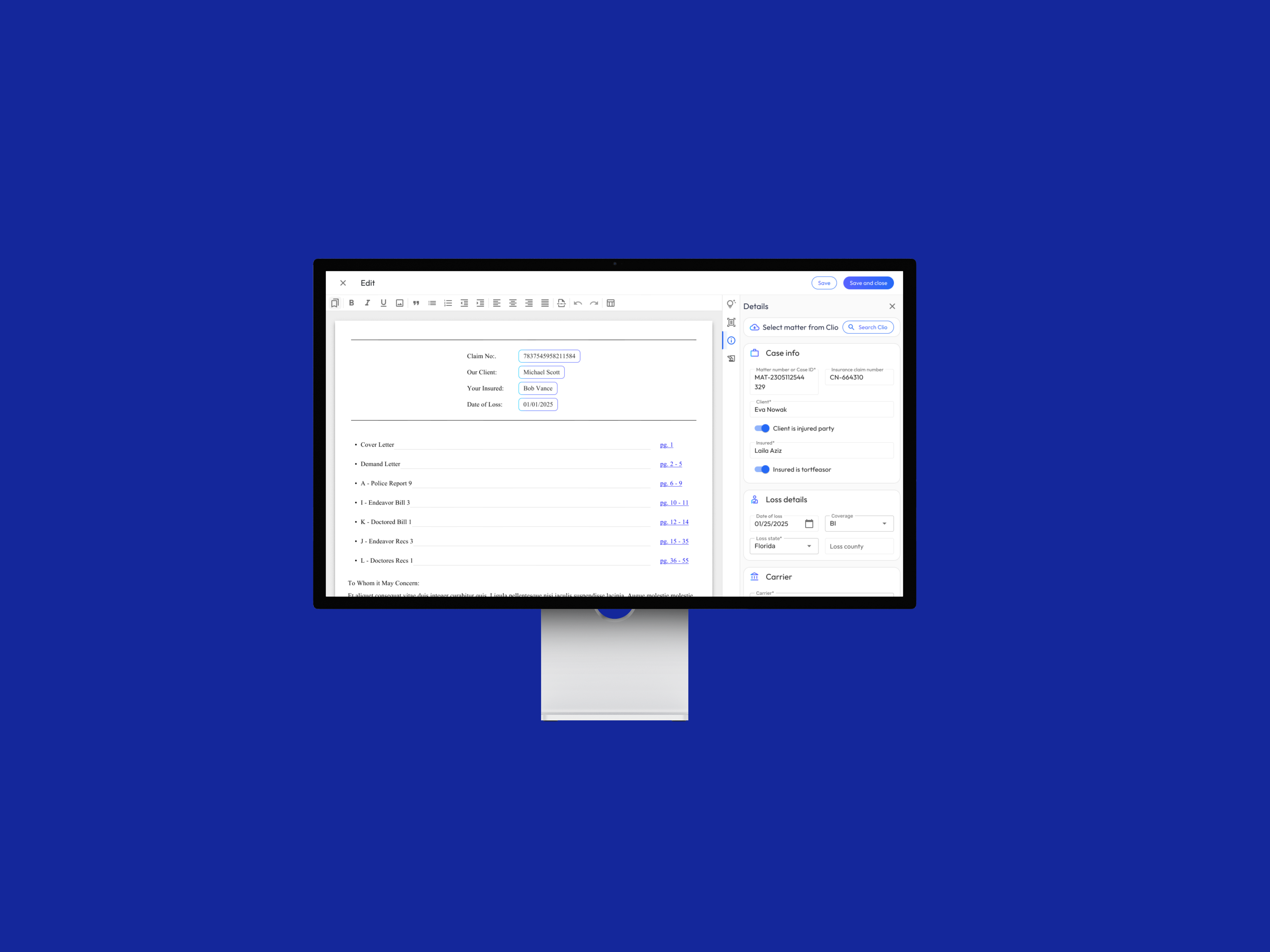
This is one of four Precedent case studies, the AI Document Authoring story. For the system-level view, see Law Firm AI Ecosystem; for the onboarding flow, see AI Ecosystem Onboarding; for data review flow, see Human-in-the-loop AI Review.
This project didn’t come from a roadmap. It came from three signals pointing at the same problem; onboarding cost, support ticket data, and user interviews all converged on one surface: authoring the demand letter was simply too hard. I didn’t wait for the project to be assigned. I built the project plan, designed the new authoring workflows, and pitched leadership to secure engineering resources. That pitch became Demand Composer, and the stakes were the product’s core promise, because a platform that automates demand letters but makes authoring them painful hasn’t automated anything that matters.
My Role & Team
I was the Principal Product Designer, and I owned this project from problem discovery through launch: the research that justified it, the pitch that funded it, the design of the authoring experience, and design QA through implementation.
I worked with 2 front-end engineers and 1 back-end engineer across sprint cycles, 1 product manager in daily alignment, the operations team during testing, and 2 sales engineers at launch. “I” below means my work; “we” means what the team shipped together.
The Problem
Three independent signals converged on the same surface:
Onboarding cost. Our customer success managers were scheduling three (sometimes four) one-hour sessions just to teach new firms how to customize and author demand letters. When onboarding requires four hours of live instruction, that isn’t a training problem; it’s a product problem.
Support ticket data. To test that hunch, I used AI to analyze our support ticket trends. The most common request, by volume, was help creating and managing the demand letter.
User interviews. Then I went to the source: in interviews with four paralegals, the most common complaint was the same: authoring the demand letter was simply too hard.
My overarching goal: create an industry-leading, AI-enabled document authoring experience that makes demand letters dramatically easier to create and manage, cutting the support and onboarding burden that was consuming customer success capacity and slowing law firms down.
Research & Process
Pattern Research & Review
A text editor is one of the most convention-bound surfaces in software. Users bring deep, hard-won expectations from years in Google Docs, Notion, and Word, and violating those expectations reads as broken, not innovative. This is Jakob’s Law in practice: users spend most of their time in other products, so they judge yours by the conventions learned there. Familiarity wasn’t a constraint on innovation; it was the foundation that let the genuinely novel part, the AI workflow, feel approachable instead of alien.
So before sketching anything, I audited how those tools handle the fundamentals of editing to understand the mental models I needed to honor. I found the best patterns for AI word processing included:
- Keyboard shortcuts for menus
- Salient edit, read only, and animation states
- Left and right drawer menus with vertical navigation
Requirements Gathering
I like to include engineering teams in my design process as early as possible. That helps create a shared language, challenges assumptions, and gets teams aligned on MVP scope.
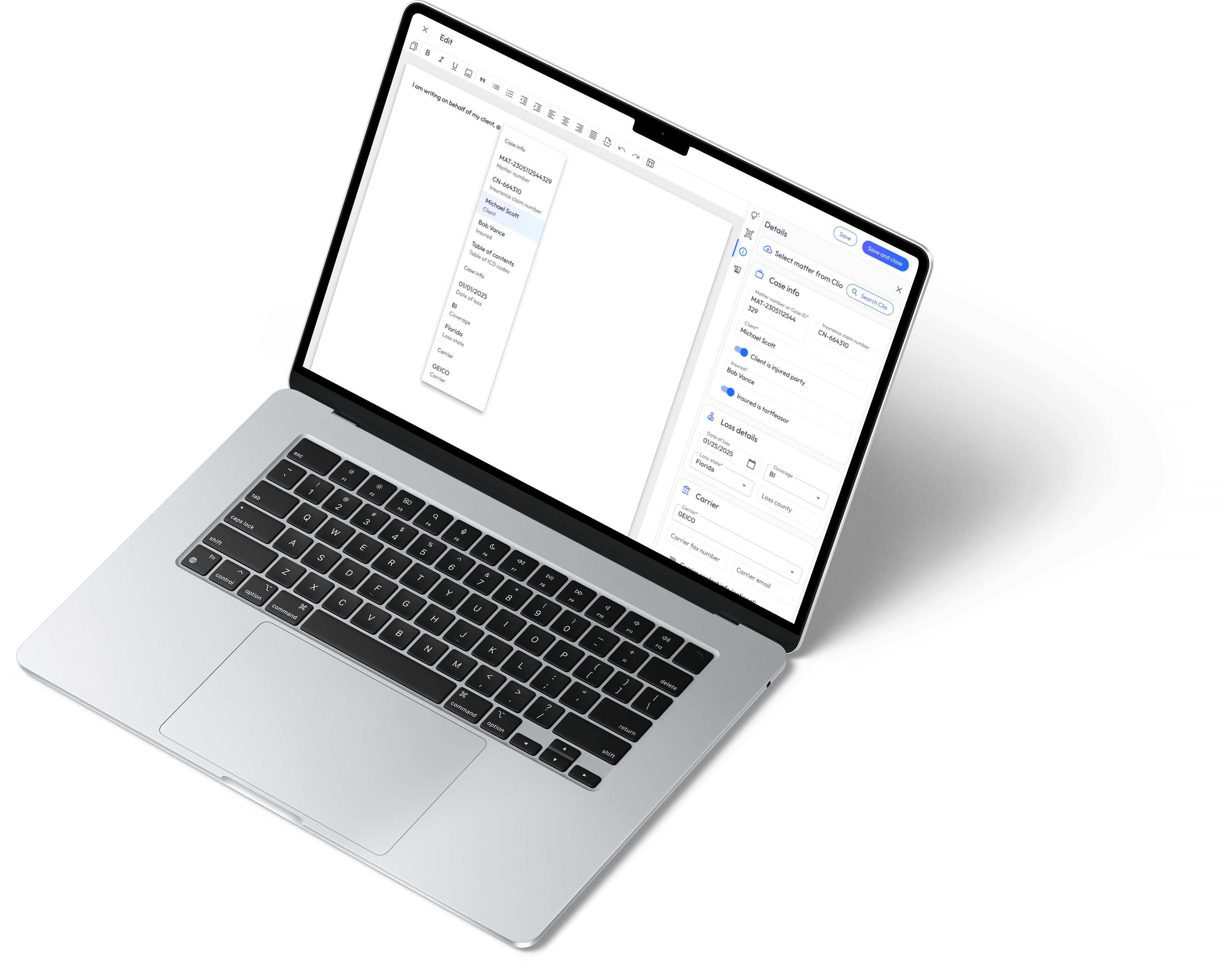
During this initial phase of collaboration, I worked with engineers to prioritize the list of features we’d need to support day 1:
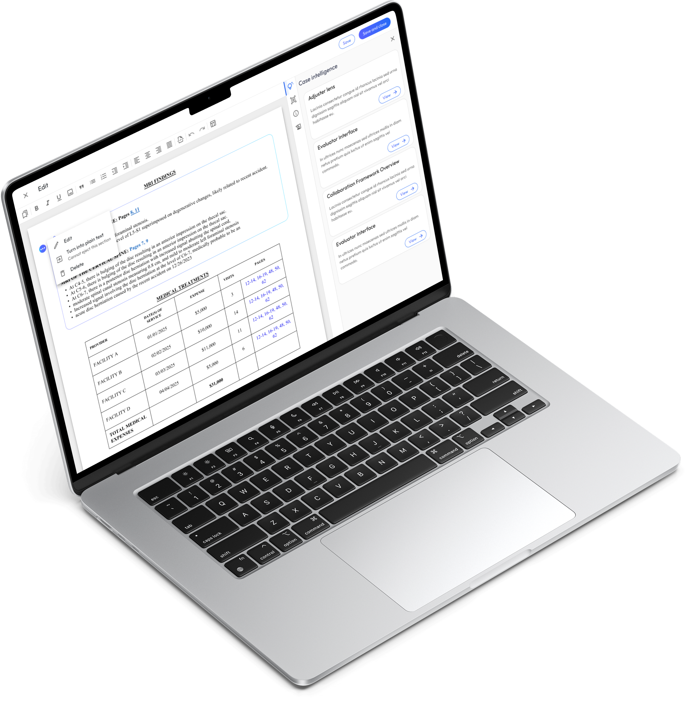
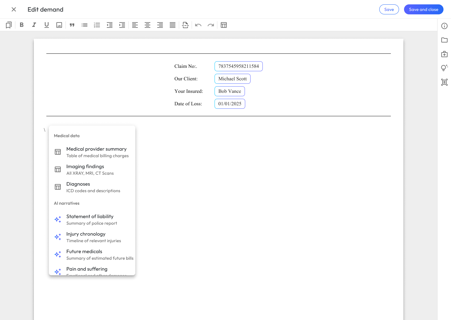
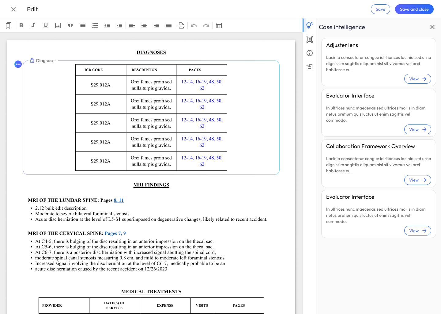
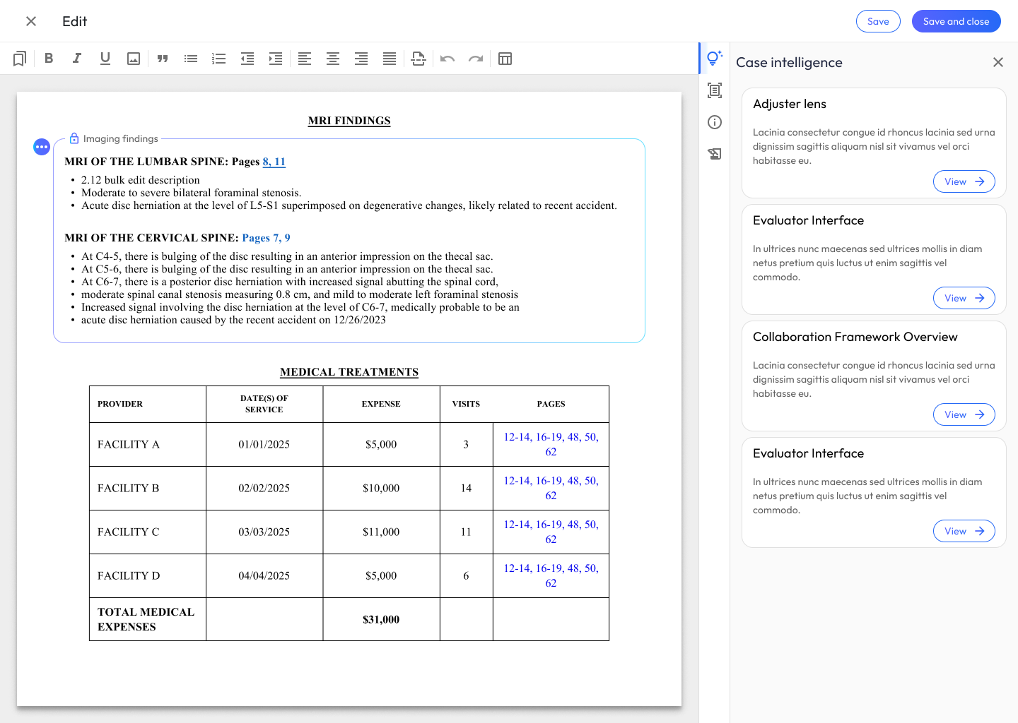
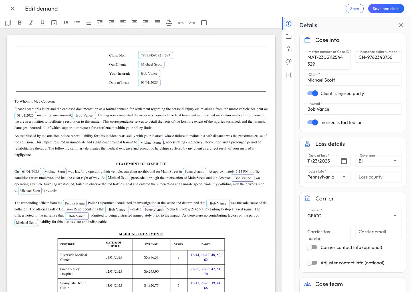
- Create tables populated with user data
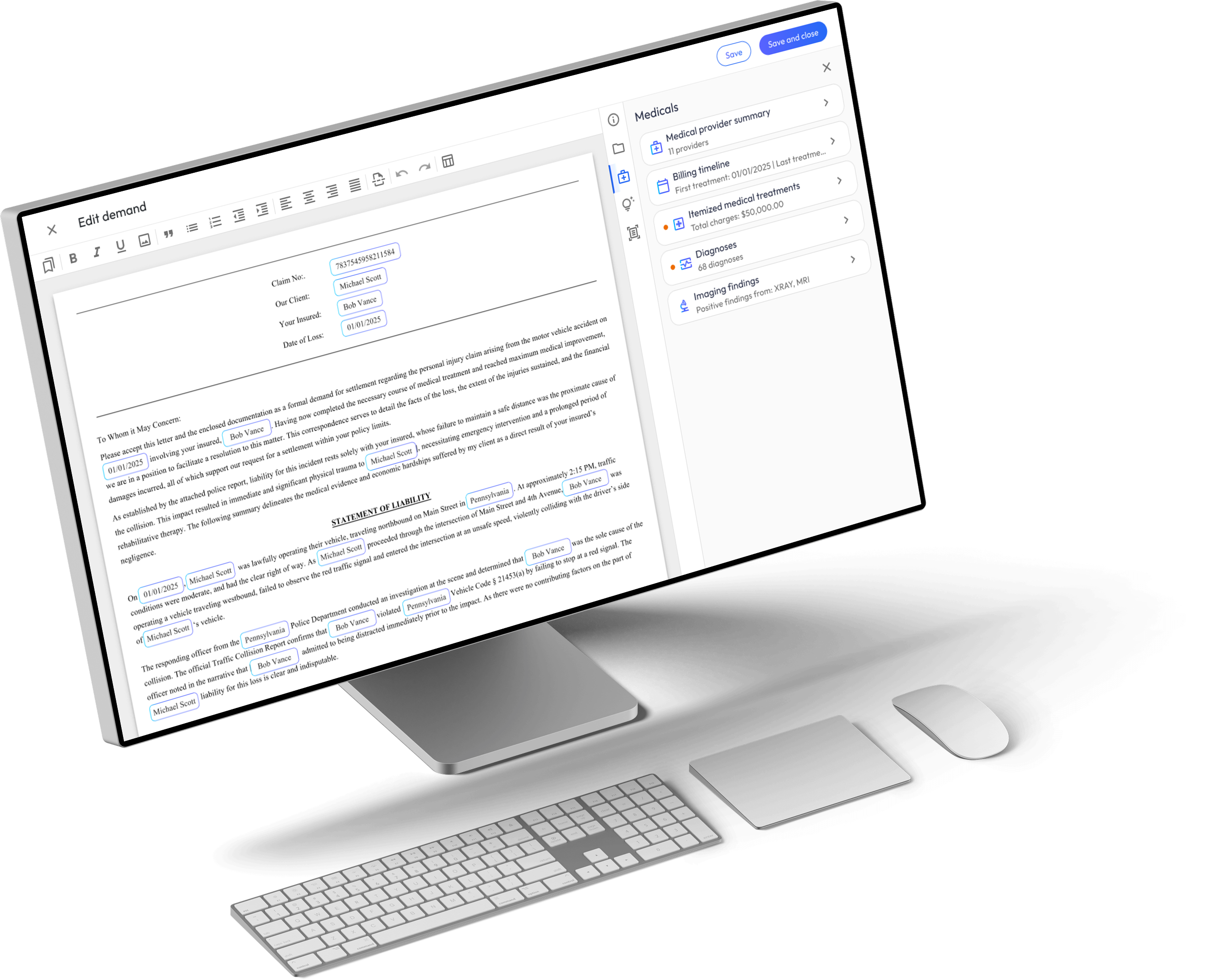
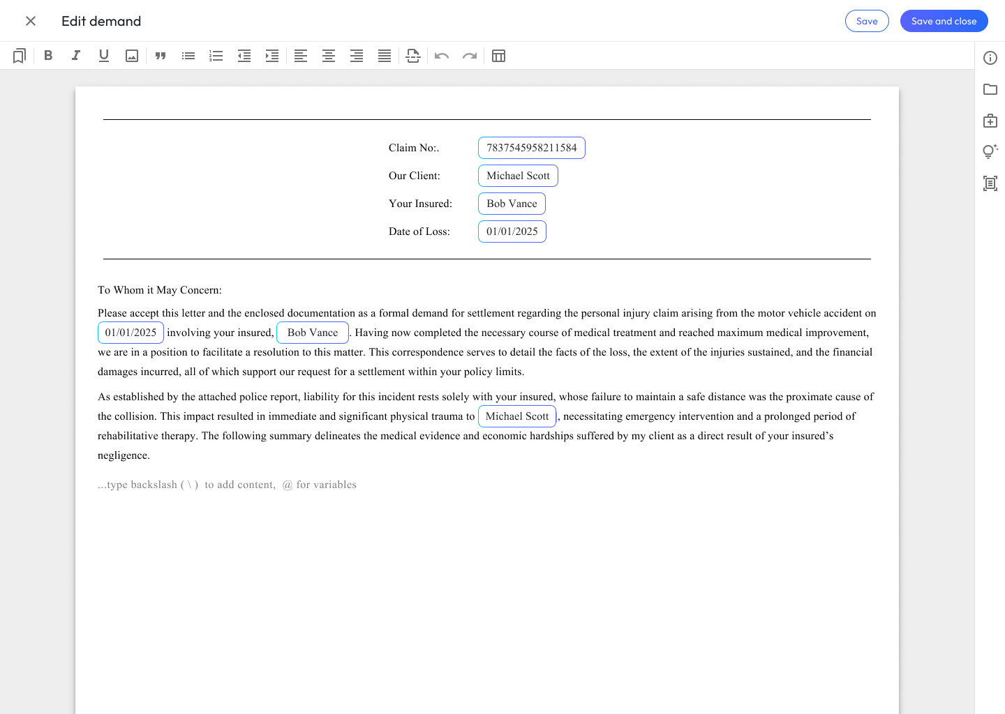
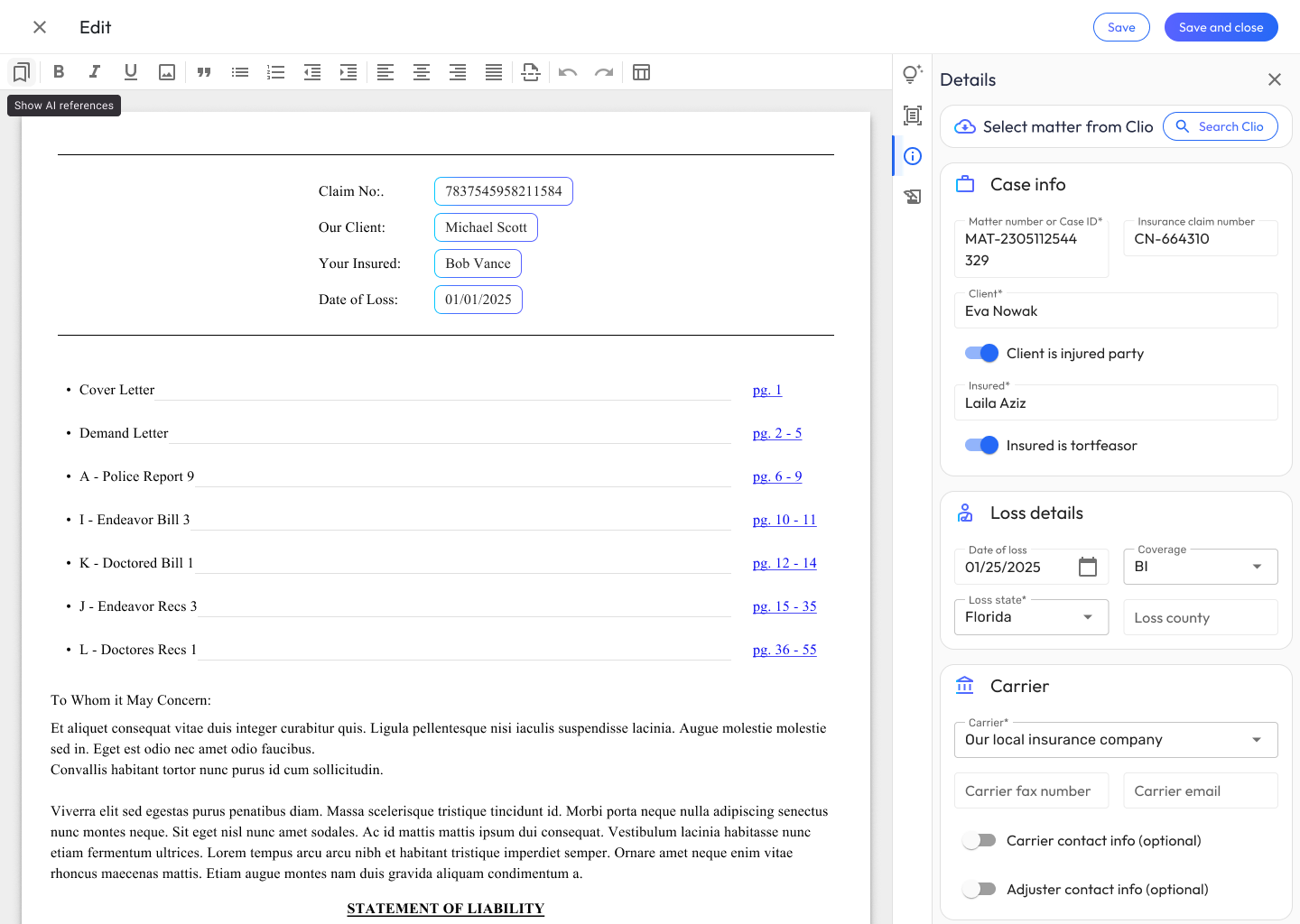
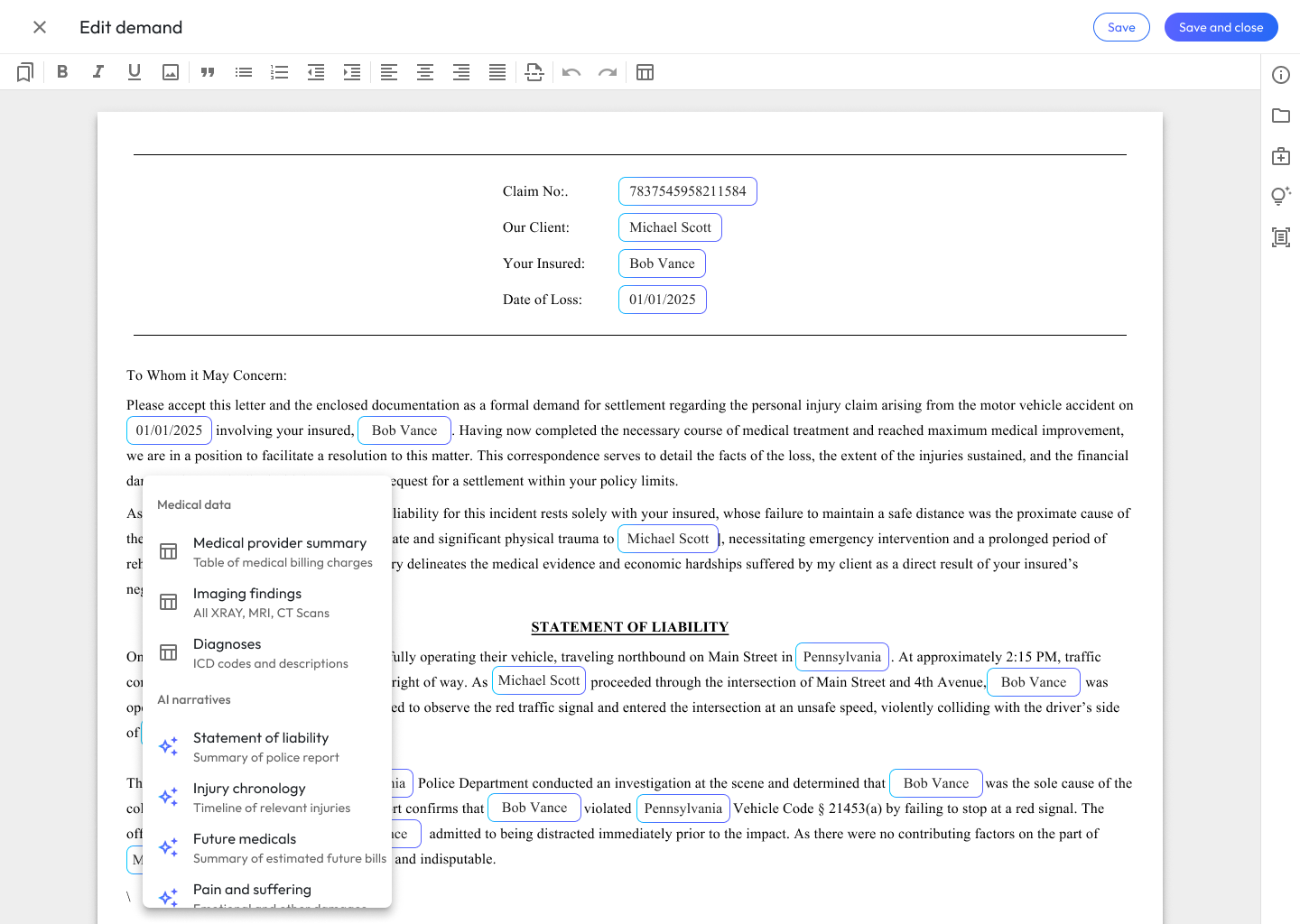
- Add AI-generated narratives
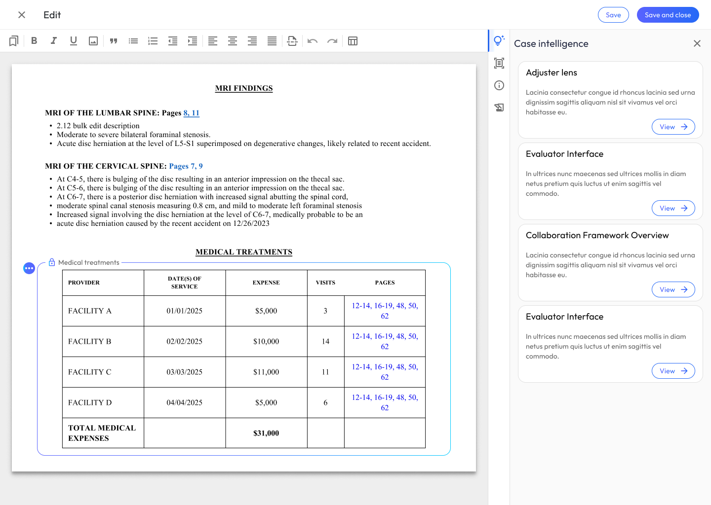
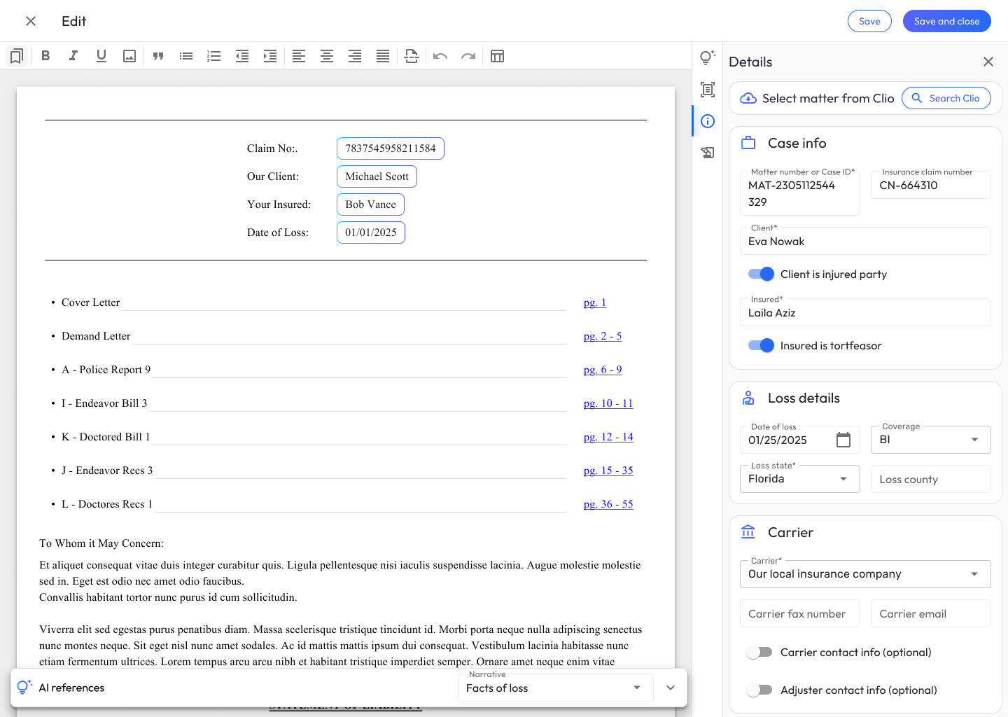
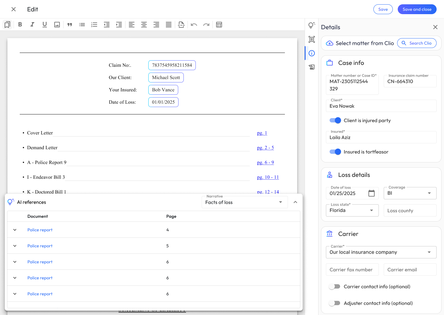
- Review & cross check data used to generate AI narratives
- Insert summaries of medical treatments
- Add templates of legal boilerplate text
Rapid Prototyping
I translated the audited patterns into interactive Figma prototypes that accurately simulated the AI-enabled word processor’s core functions. A central principle during this stage was ensuring that the AI integration felt intuitive, trustworthy, and auditable; targeted, clickable prototypes made it much easier to evaluate how naturally users could navigate the workspace without cognitive overload.
Usability Testing
I ran moderated, think-aloud sessions with 8 legal professionals (2 attorneys, 6 paralegals), each working through two realistic scenarios: drafting a Facts of Loss narrative and building a medical treatment table for a rear-end collision case. Three findings drove the next iteration:
1. Participants couldn’t tell what the AI had touched. During think-aloud, reviewers repeatedly paused to ask whether a passage was AI-generated, something a colleague had edited, or finalized text, and every moment of uncertainty about provenance made them re-read the entire section from scratch. Trust wasn’t about the quality of the prose; it was about knowing its origin.
2. Correcting the AI cost more than it should. In the table scenario, I asked participants to add a diagnosis the AI had “missed” from the orthopedist’s records. Watching them hunt through nested menus to make a two-second conceptual fix was the clearest friction in the study; 7 participants said they’d sooner rebuild the table in Word than fight the menus.
3. Confidence tracked with editability, not accuracy. The counterintuitive finding: participants didn’t trust the AI more when its output was better; they trusted it more when they could see how easily they could change it. The moment a participant successfully made their first small correction, their posture toward the entire draft shifted from skeptical audit to normal editing.
Usability Test Protocol
Goal: Establish rapport, explain the think-aloud protocol, and understand their baseline workflow.
- Before we dive into the tool, can you walk me through your current process for drafting a bodily injury demand? What are the most time-consuming parts?
- How do you currently handle summarizing medical records, like imaging findings or treatment history?
- We are going to be testing a new workspace. As you work through the tasks, please think aloud, tell me what you’re looking at, what you’re trying to do, and if anything surprises or frustrates you.
Scenario: You are starting a new demand package for a client involved in a rear-end collision. You need to draft the ‘Facts of Loss’ and the initial ‘Injury Narrative’.
- Prompting the Action: Show me how you would use Demand Composer to generate the initial draft for the Facts of Loss.
- Observation Probes:
- What are your initial impressions of the text the system just generated?
- How closely does this output match the tone and structure you would typically use?
- If you needed to expand on the client’s specific pain points in this narrative, how would you go about adjusting the AI’s draft?
- Talk to me about how confident you feel using this generated narrative in a final demand package.
Scenario: The narrative is looking good. Now, you need to add a structured summary of the client’s medical treatments, specific diagnoses, and MRI findings.
- Prompting the Action: Walk me through how you would create a table summarizing the client’s physical therapy sessions and MRI results.
- Observation Probes:
- What are your thoughts on the way the AI organized the treatment data into this table?
- Let’s say the AI missed a secondary diagnosis from the orthopedist. Show me how you would correct or add that information to the table.
- How intuitive is the process of modifying the columns or rows compared to the tools you currently use?
- If you needed to reformat this medical table to highlight the total cost of treatments, how would you approach that?
Goal: Capture overall impressions, trust levels, and perceived efficiency.
- Overall, how would you describe your experience today?
- What was the most frustrating part of interacting with the AI-generated text or tables?
- If you had a magic wand and could change one thing about how the AI generates the injury narratives, what would it be?
- How do you feel about the balance between the AI doing the heavy lifting and the amount of manual editing you had to do?
- In what scenarios would you hesitate to use this tool for a real case?
Synthesis & Story Creation
Following the usability sessions, I synthesized qualitative feedback to identify patterns in user behavior and pinpoint areas for improvement, data that directly informed the next round of Figma iterations. Once the revised designs were locked in, I deconstructed the holistic experience into logical feature categories (narrative text generation, table data manipulation, document formatting) and authored granular user stories defining specific front-end requirements (UI components, text editor interactions, state management) and back-end requirements (AI prompt handling, data processing, API integrations). This structured categorization gave the engineering team clear, testable acceptance criteria for a smooth implementation.
Flows
The authoring loop in one view. Shaded stages run automated; highlighted stages are the deliberate human decision points. Note that AI generation runs only when the author asks, with the instruct-and-regenerate path looping reviewed content back through generation on the author’s terms.
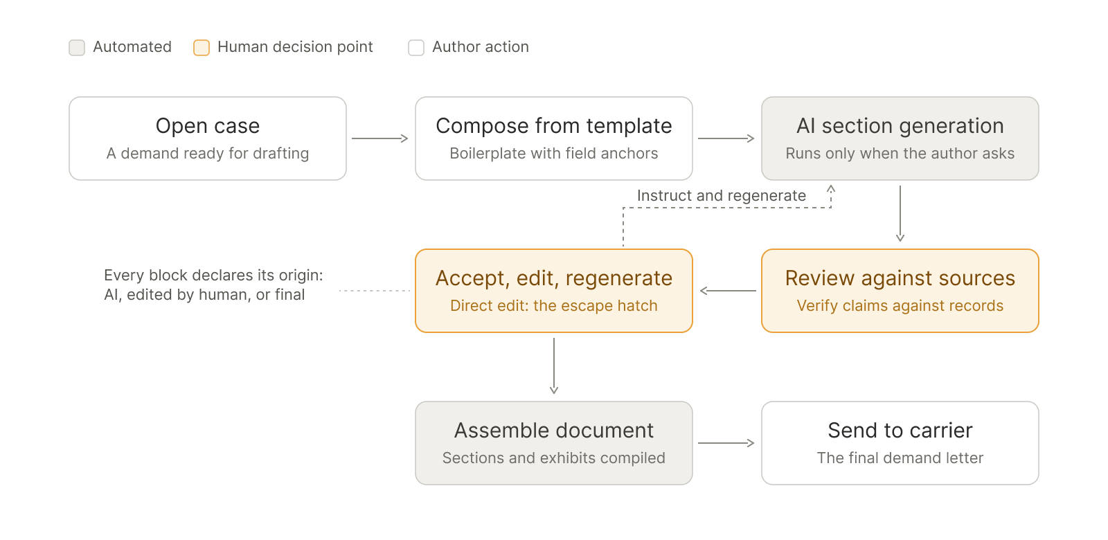
The loop above is the product thesis in miniature: the AI does the assembly, the human is always one click from control, and every piece of generated content declares its origin.
The Design
Each design decision below answers one of the three findings from testing; the solution walkthrough is organized by problem solved, not by screen.
Provenance at a glance: answering “what did the AI touch?”
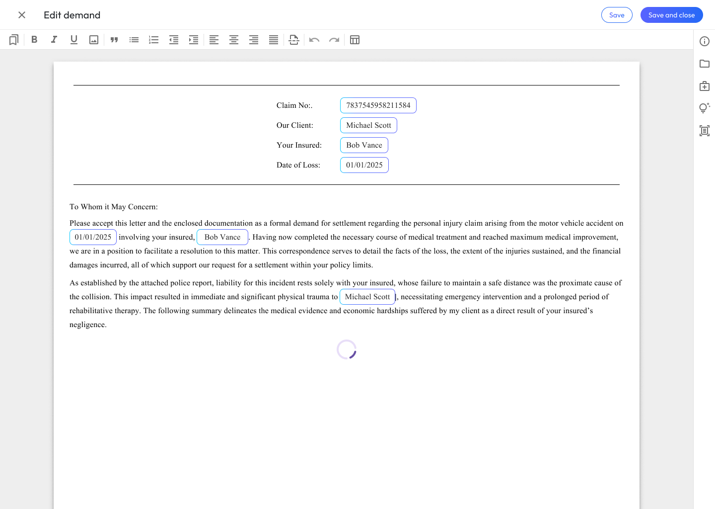
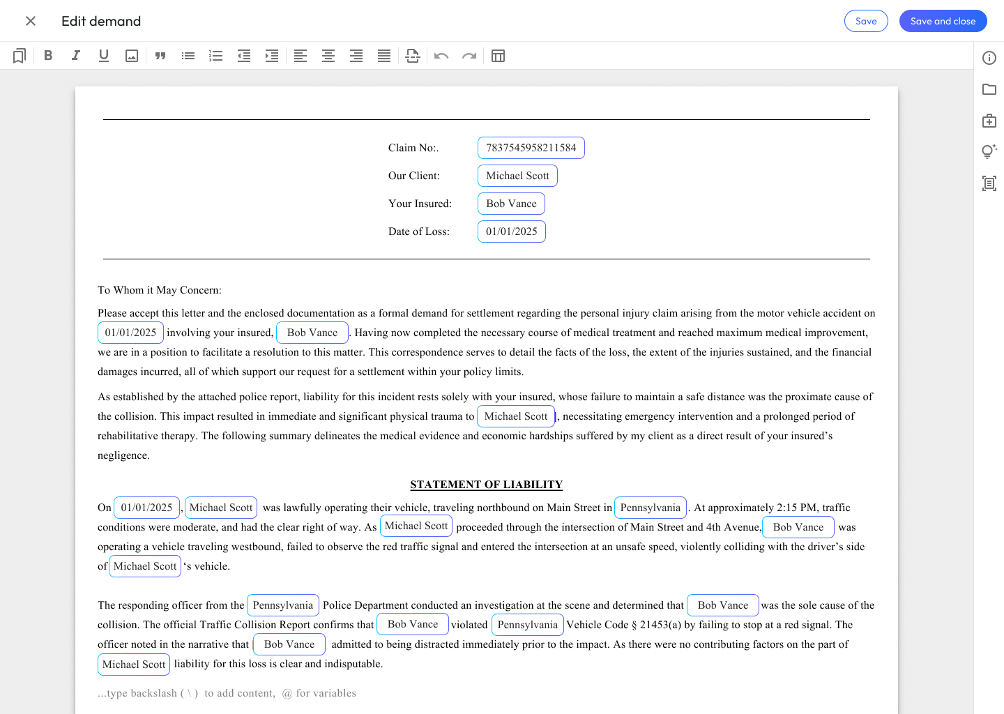
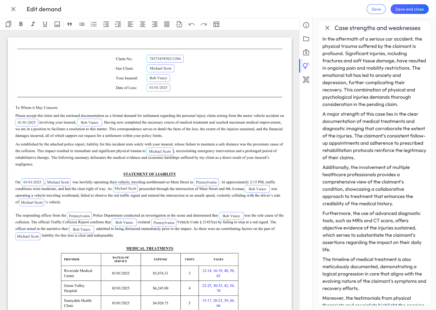
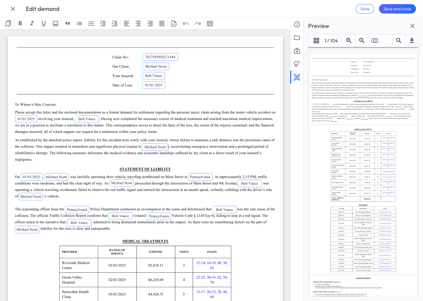
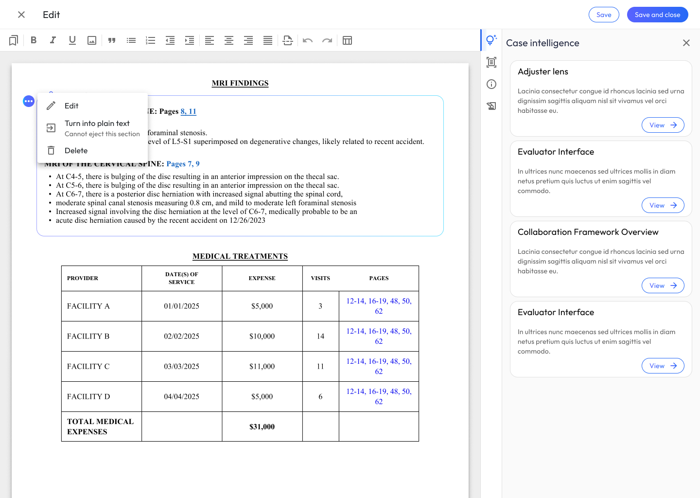
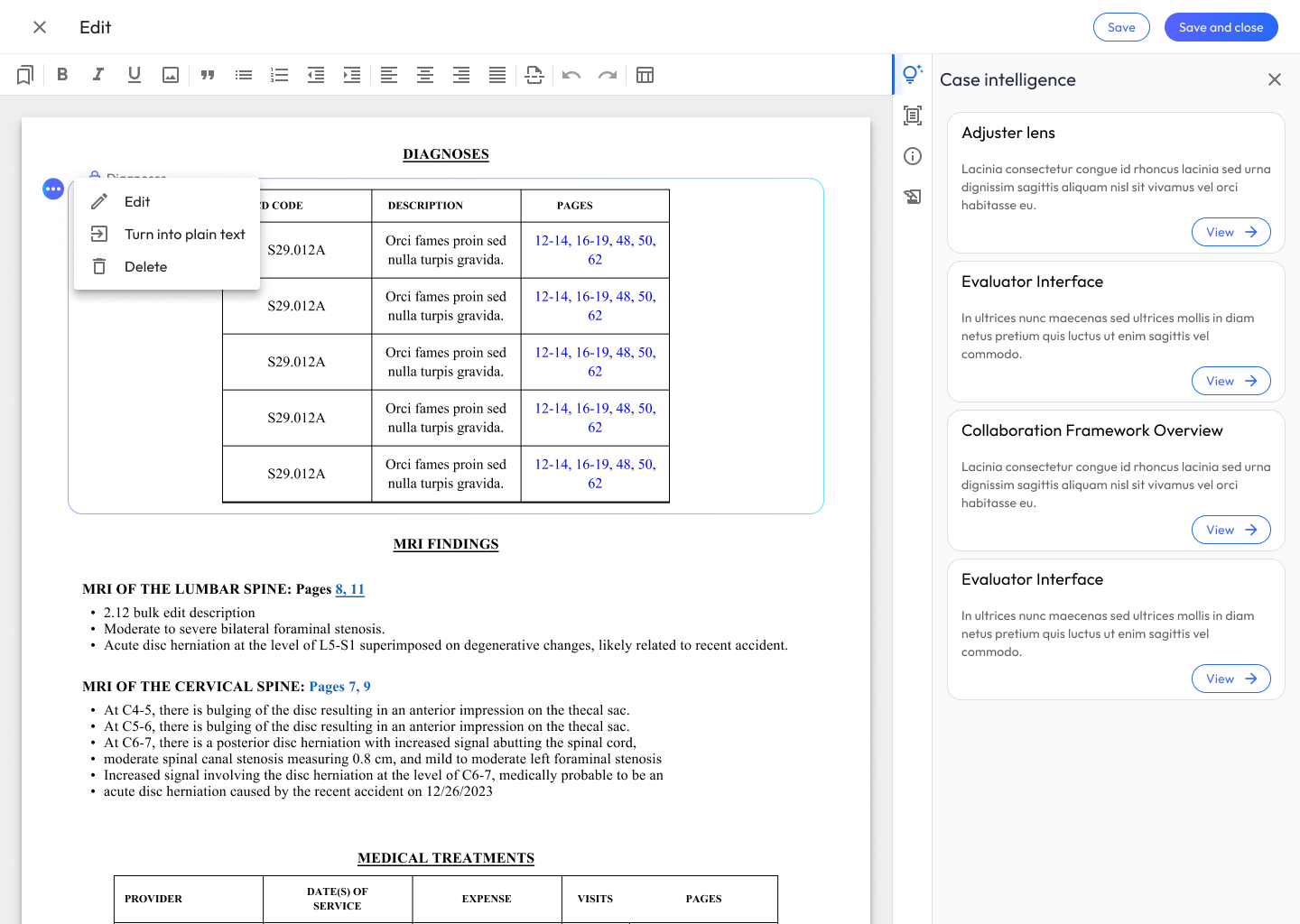
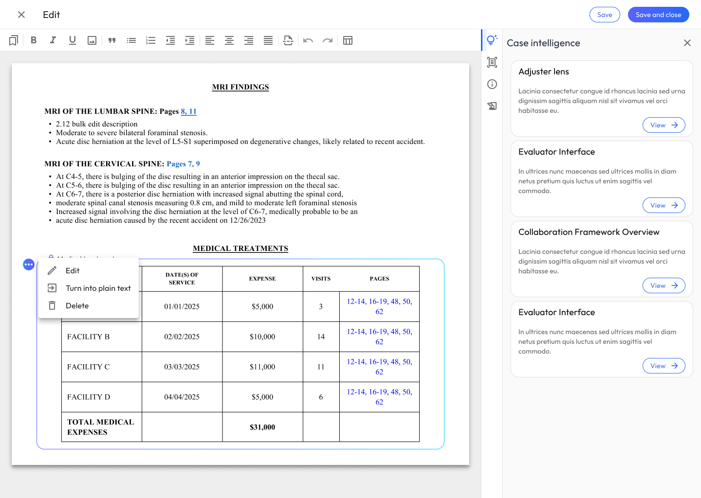
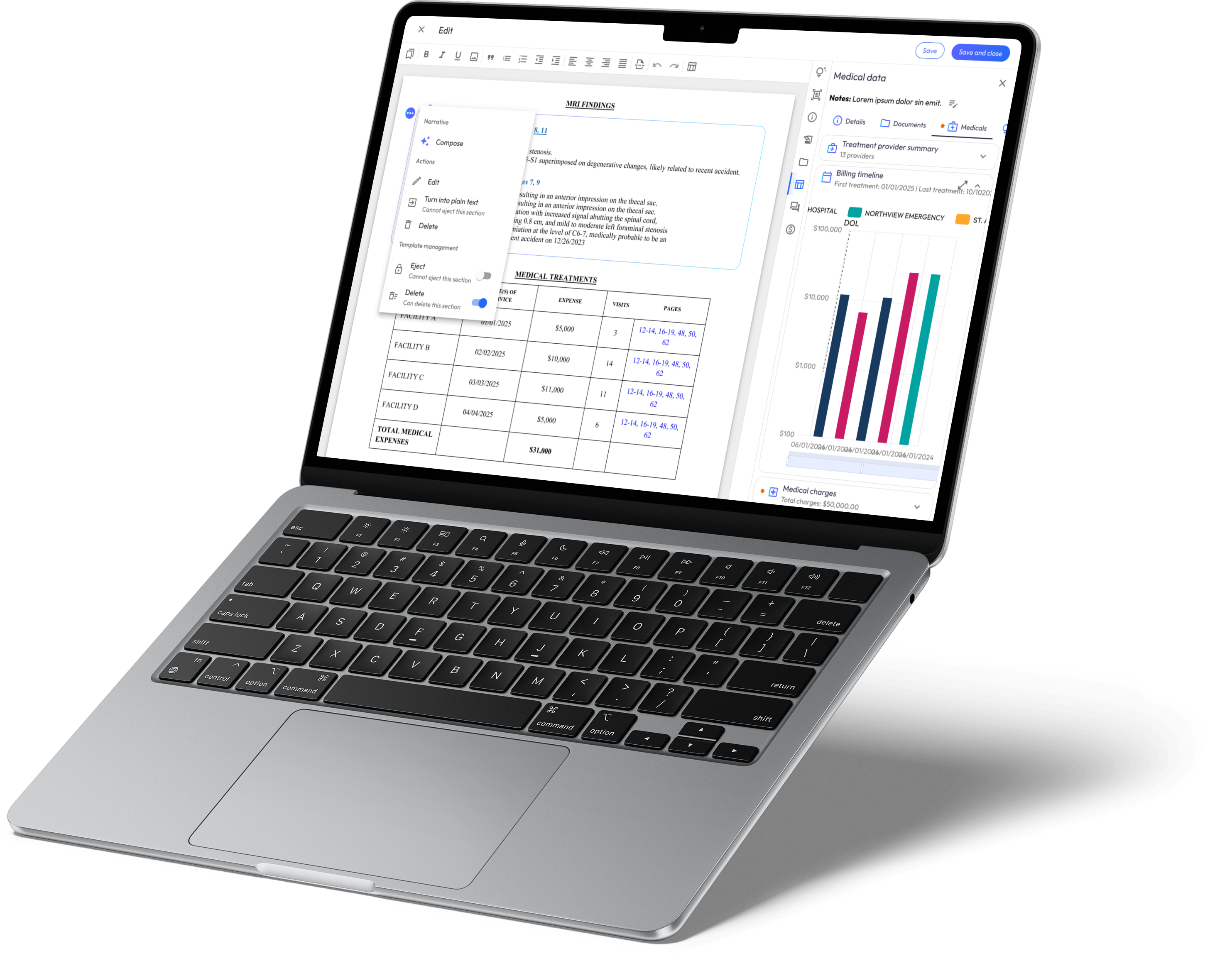
I redesigned the section blocks to include AI-status indicators so every block of content visibly declares whether it was human or AI generated. Reviewers no longer re-read sections from scratch to establish origin; the interface carries that answer for them.
Corrections one interaction away: answering “why is fixing the AI so expensive?”
I flattened and streamlined the manipulation menus for generated content, putting the most common corrections (add a row, edit a cell, adjust a column) one interaction away. The two-second conceptual fix became a two-second actual fix.
Control as the trust mechanism: answering “what makes people trust a draft?”
Testing showed confidence tracked with editability, not accuracy, so I promoted direct editing from an escape hatch to a first-class mode. That insight shaped the accept / edit / regenerate triad that defines the final product: the fastest path to trust was proving the human is always one click from control.
Final Designs
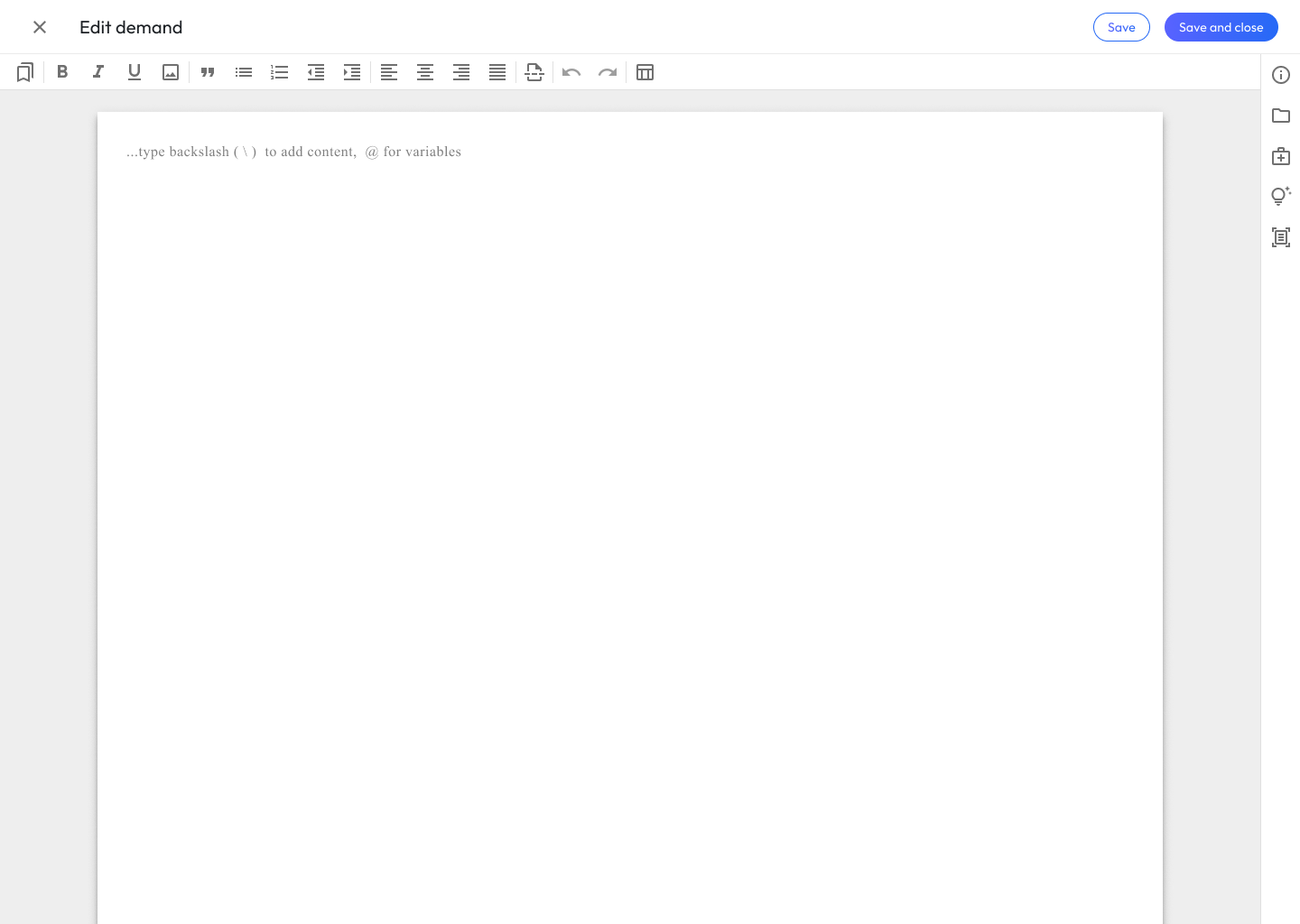
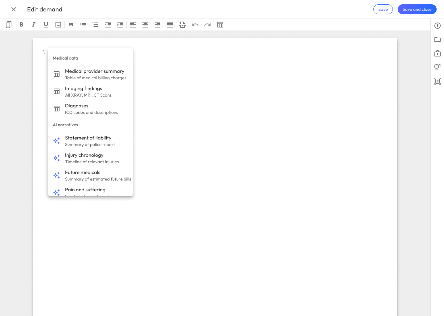
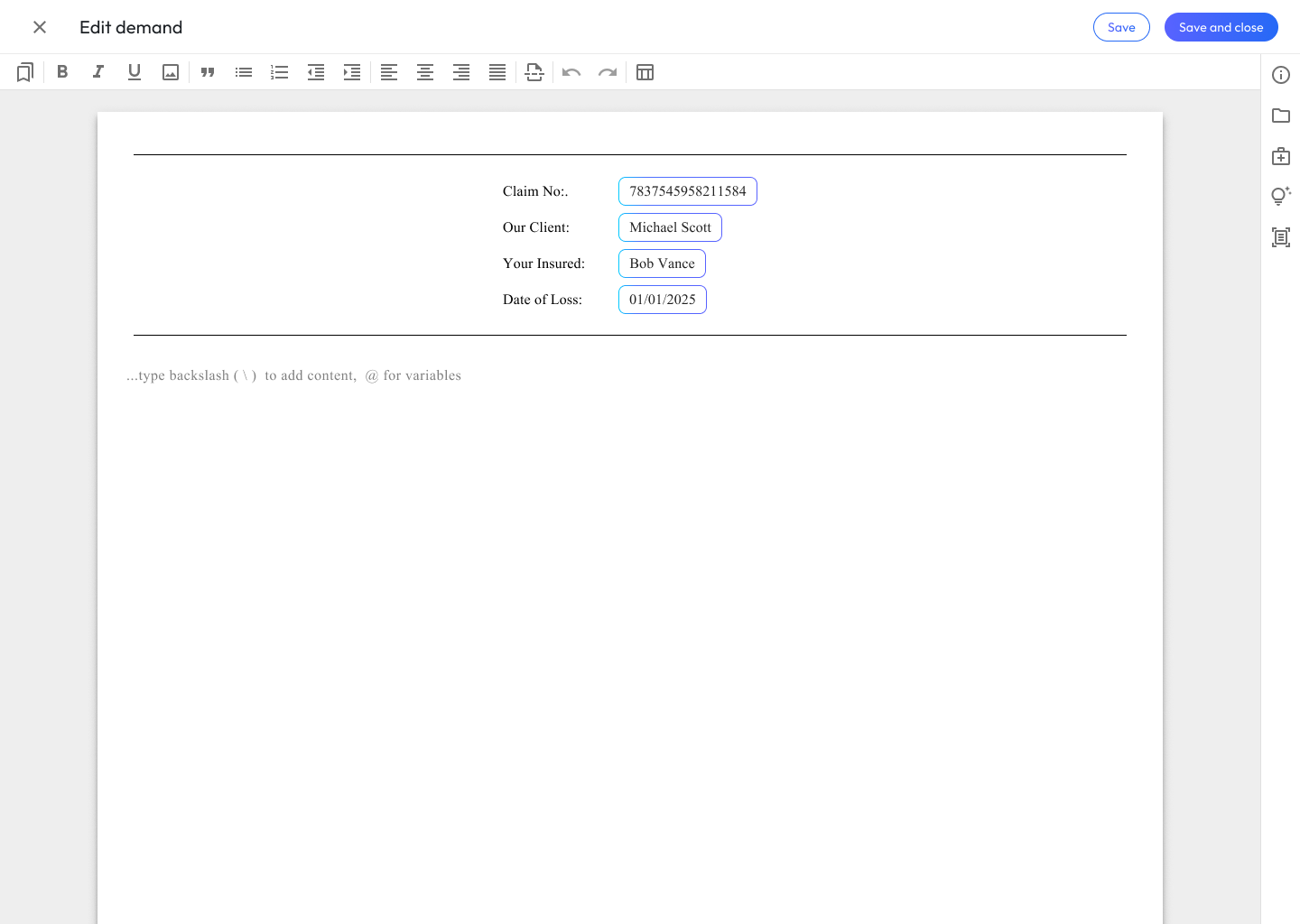
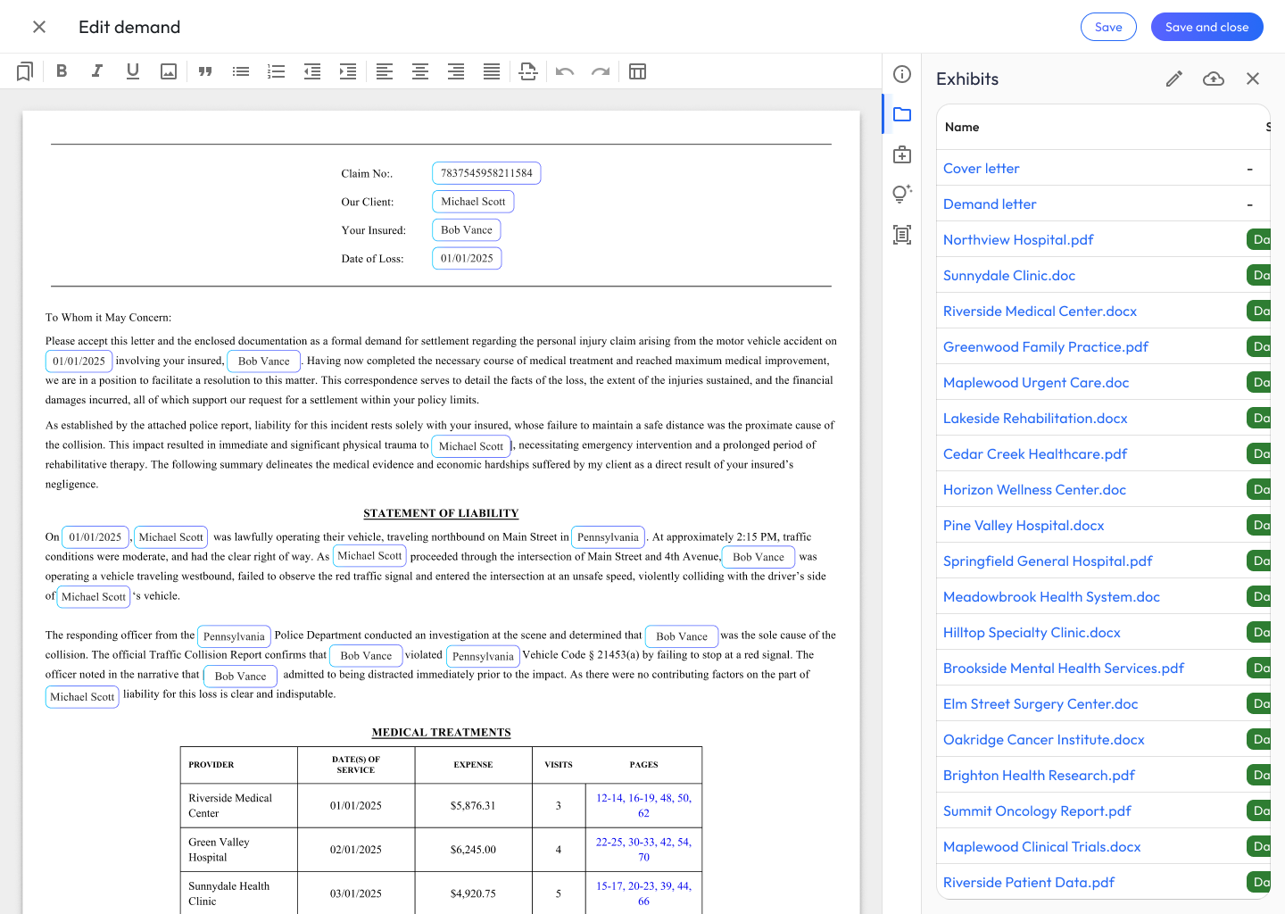
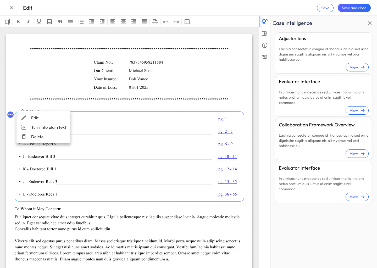
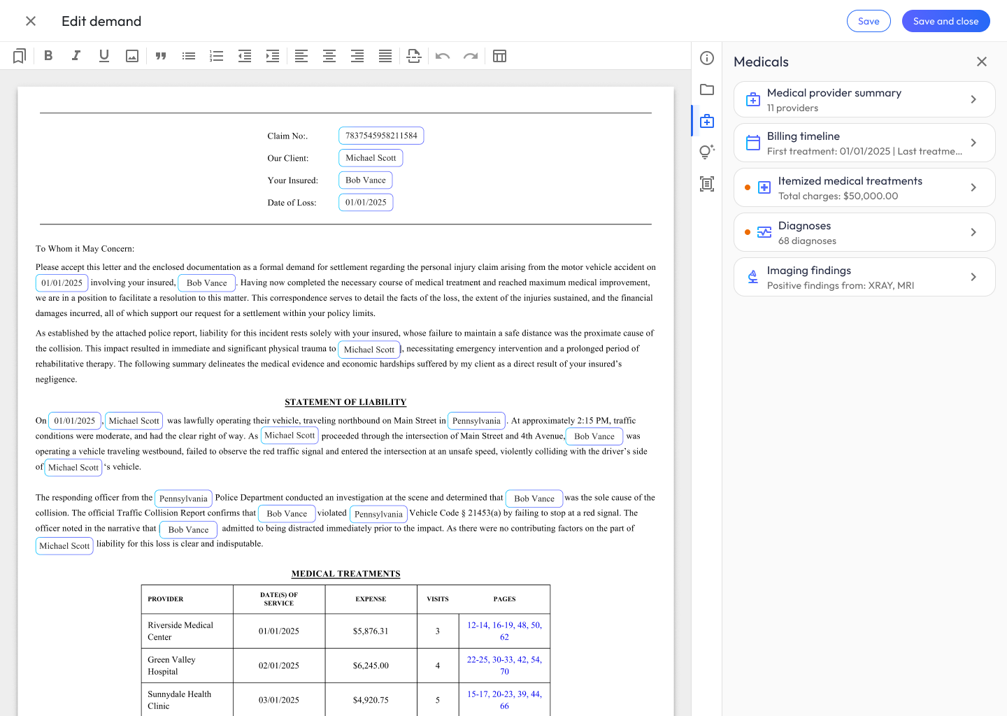
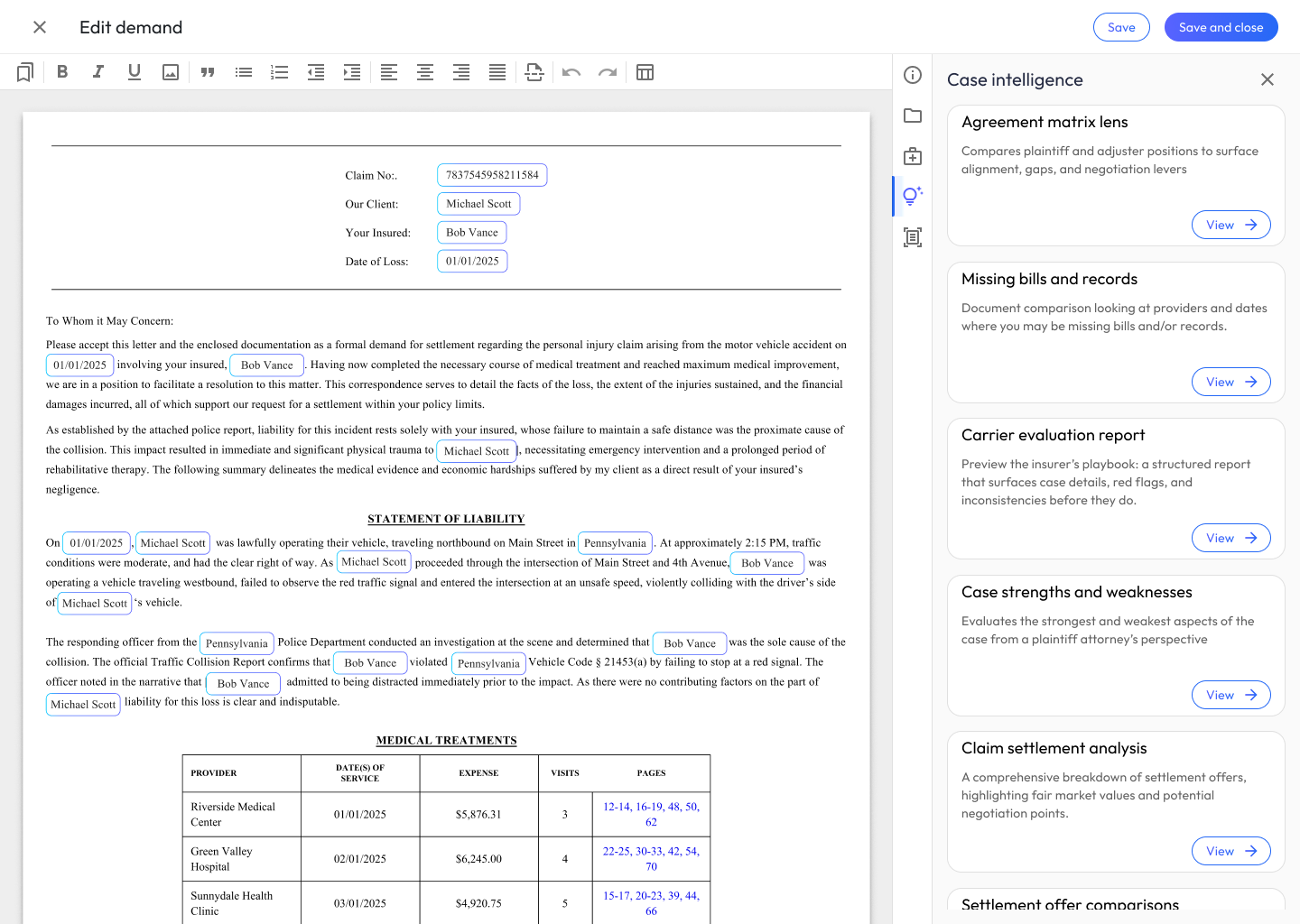
Key Decisions & Pivot Points
The menu system I got wrong. My first pass at content manipulation used nested contextual menus, a tidy information architecture that collapsed in front of real users. Seven of eight participants said they’d sooner rebuild a table in Word than fight the menus for a fix they could describe in two seconds. The evidence forced a structural choice: I flattened the menu hierarchy and rebuilt manipulation around the most frequent corrections. The tidy IA served my mental model of the content; the flat one served the user’s mental model of the fix.
Promoting direct editing from escape hatch to first-class mode. The original design treated direct editing as the fallback when AI regeneration failed, the assumption being that better generation would make editing rare. Testing inverted that: the first successful manual correction was the moment users started trusting the system. We rebuilt the interaction model around the accept / edit / regenerate triad, which meant real engineering cost (the editor had to support seamless transitions between AI and human content), and the team committed to it because the evidence said trust, not output quality, was the adoption bottleneck.
Collaboration
Why we worked this way. None of these collaboration methods were defaults; we chose them. I chose staging-environment design QA over static handoff docs because our highest-risk surface (editor states and AI interactions) only breaks in real browsers, never in Figma. Daily alignment with product management replaced a weekly sync after two mid-week scope changes cost us days of reconciliation; the rule we settled on was that any decision changing what users see gets made same-day, together. And I brought operations in during testing rather than after launch because admins were the users most likely to inherit our mistakes silently.
Engineering. I worked inside front-end and back-end sprint cycles, participating in design QA sessions and reviewing staging builds against the Figma prototypes, a tight feedback loop that mattered most for fine-tuning UI states and the interactions within AI-generated text and medical tables.
Product management. Daily prioritization of the user stories we had mapped, with strategic scope adjustments whenever technical constraints arose, keeping the integrity of the Demand Composer experience intact through development.
Operations. We reviewed the implementation to ensure the features directly enhanced admin efficiency, specifically how the tool reduced the manual overhead of processing and formatting complex injury narratives and medical records.
Sales & go-to-market. As launch approached, I provided high-fidelity visual assets, guided product walkthroughs, and clear documentation of the new AI capabilities, so external announcements were accurate and the sales team could demonstrate the workspace’s value from day one.
Outcomes
Business Impact
- Reduced onboarding support tickets by 22% in the first three months, per HubSpot data. Because the editor honored conventions attorneys already knew from Google Docs and Word, they got productive with far less hand-holding.
- Cut time to a first-draft narrative from hours to seconds, letting attorneys start from a structured draft instead of a blank page.
- 75% of law firm demand letters were authored in Demand Composer within 2 months of launch, replacing previously manual Word workflows, adoption we tracked as our primary success metric because usage, not sentiment, proves trust.
User Impact
- Attorneys draft, edit, and regenerate in a single workspace instead of managing an ecosystem with multiple touch points.
- Section-level generation gave attorneys fine-grained control, making regeneration fast and low-risk rather than an all-or-nothing rewrite.
- Auditable output let attorneys verify each generated claim against source records, so they trusted the draft enough to actually use it.
Design Impact
- Established an AI authoring pattern (section-level generation, direct edit, and instruct-to-regenerate) that became a reusable model for content creation across Precedent.
- Proved that grounding a novel AI experience in familiar editor conventions is what makes it feel trustworthy instead of alien.
- Showed that in high-stakes drafting, the win isn’t fully automated output; it’s giving experts precise, low-friction control over what the AI produces.
What I’d Do Differently
AI accelerated this project at the edges when it could have accelerated the core. I used AI agents to ideate through design layouts and to chase down bugs during QA (both genuinely useful, both peripheral). Given another pass, I’d push AI-agent-led prototyping into implementation itself: generating components directly from the app’s existing structure, theming, and interaction patterns rather than hand-building each one. The conditions were right for it (a documented pattern language, established theming, familiar interaction models), exactly the constraints that make generated components come out consistent instead of chaotic. That would have compressed the distance from validated design to staged build, and bought back more design QA cycles for the surfaces that only break in real browsers: editor states and AI interactions.