
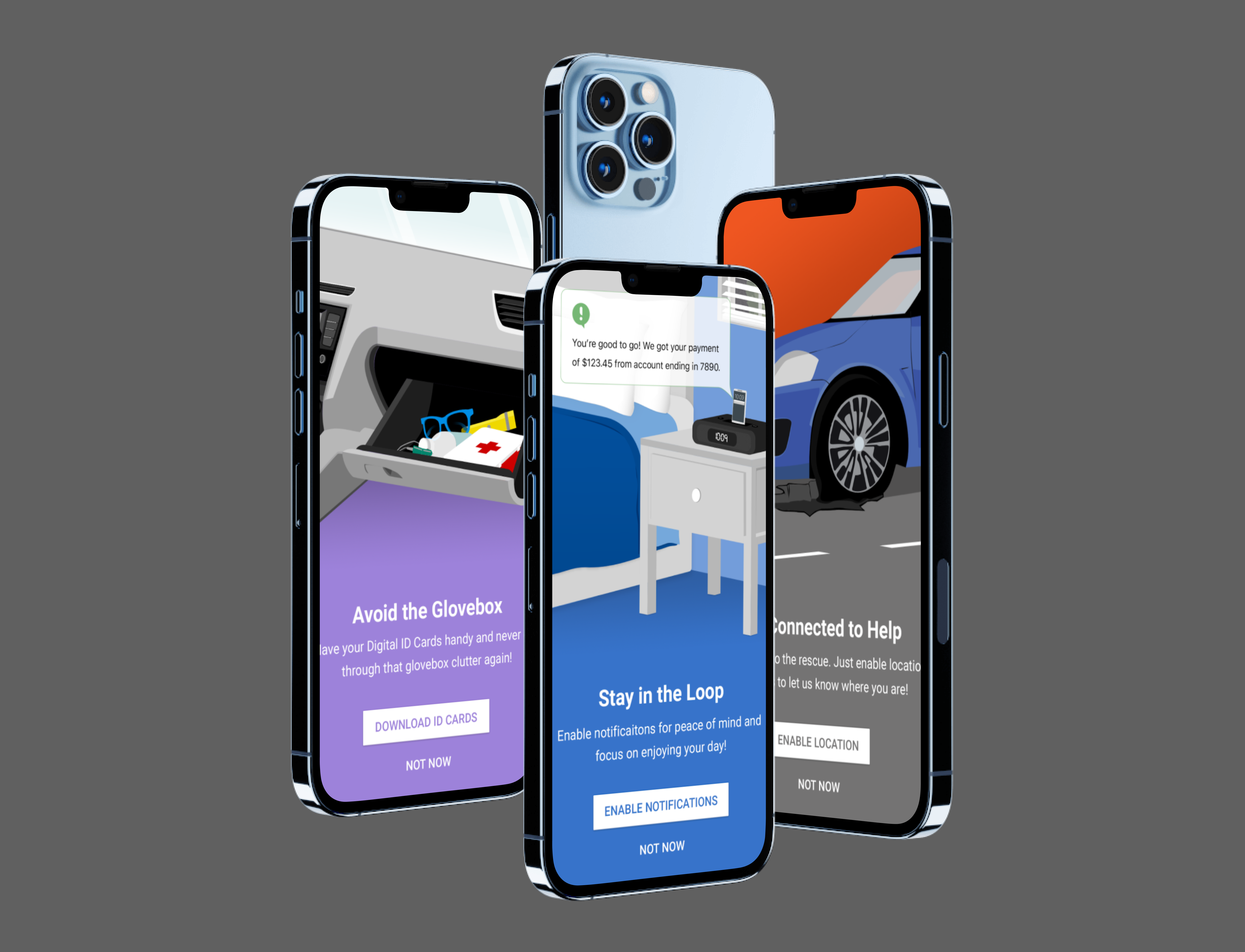
GEICO Mobile was built to be a policy management tool, and new customers weren’t using it as one. They called to make policy updates. They dialed for roadside assistance rather than initiating claims electronically. Every one of those calls represented the app failing at its job, and at GEICO’s scale, the gap between “downloaded the app” and “trusts the app” was measured in call-center volume. The project brief: create an engaging onboarding experience for new users, reduce the number of calls from new users, and increase enrollment in notifications, storage, and location services (the permissions that make the app genuinely useful in an emergency).
My Role & Team
I was the UX Researcher on this project, and the research was mine end to end: recruiting, interviews, survey design, and synthesis. I partnered with a UI designer to generate graphics, Android and iOS engineers on the registration flow implementation, and a PM serving as subject matter expert on mobile app enrollment, who supplied the call-volume data that framed the business problem. Findings were reviewed in weekly sessions with my PM and design lead.
The Problem
GEICO Mobile was not fulfilling its role as a policy management tool. New customers were:
- Calling instead of using the app to make updates
- Dialing for roadside assistance rather than initiating claims electronically
The application was falling short of its goal of 100% digital self-service. And the permission enrollments that unlock the app’s most valuable moments (notifications, storage, location for roadside assistance) were being declined by the very users who would need them most.
The most telling evidence wasn’t the volume of calls; it was which calls. The tasks new customers phoned about were tasks the app already supported. When a user pays the higher cost of waiting on hold for a job the app can do in three taps, they’re telling you one of two things: they don’t know the app can do it, or they don’t trust it to. The baseline survey (below) made the same point in numbers: our most active users scored 3.8 out of 5 on “I needed the help of a technical person to use the app,” and every new customer starts with less confidence than a power user.
Research & Process
New Customer Interviews
New policy holders were the target audience for this research. I interviewed eight customers who had purchased insurance within the past six months.
Interview objectives:
- Assess what thoughts users have after purchasing an insurance policy
- Identify user expectations and expose product gaps
Key discoveries:
- For accidents, updates, and cancellation (the big stuff), users call.
- Users wanted peace of mind: confidence and accuracy.
- New users look for confirmation first, making sure address, drivers, and vehicles were correct.
- The purchase process was overwhelming; users were hesitant to add another step to an already lengthy process with too many questions.
Existing Customers Survey
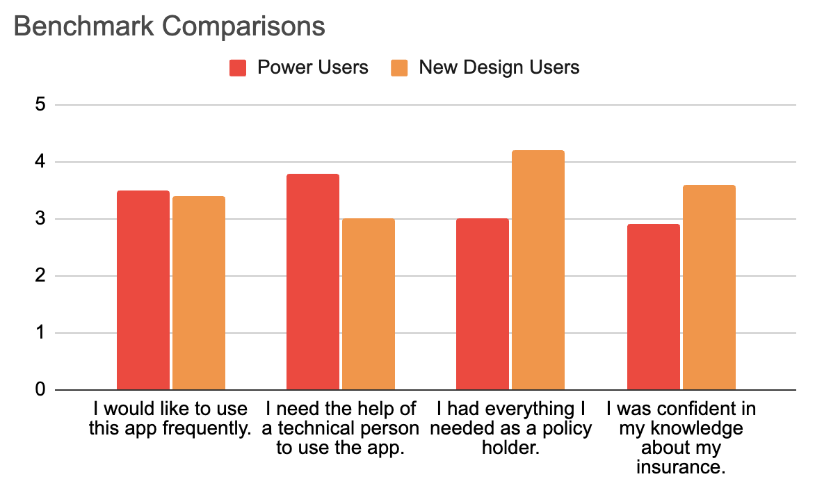
I distributed a survey to existing customers (power users) to compile data on the perceptions of active users and create a well-rounded model of what it meant to be a “new customer.” Respondents rated statements on a five-point Likert scale (Strongly Disagree → Strongly Agree).
2.9
I was confident in my knowledge about insurance.
Even tenured customers sat below neutral on insurance literacy, and new customers would start lower still. Education couldn’t be an optional extra.
3
I had everything I needed as a policy holder.
A dead-neutral score from power users meant the app wasn’t fully serving its best customers, let alone newcomers.
3.8
I needed the help of technical person to use the app.
The most alarming result in the study: our most active users agreed they needed help to operate the app. This became the project’s clearest mandate: if power users need assistance, new customers don’t stand a chance alone.
3.5
I would like to use this app frequently.
The appetite existed. The confidence didn’t. That gap (willing but unequipped) is precisely what onboarding exists to close.
Generating Personas
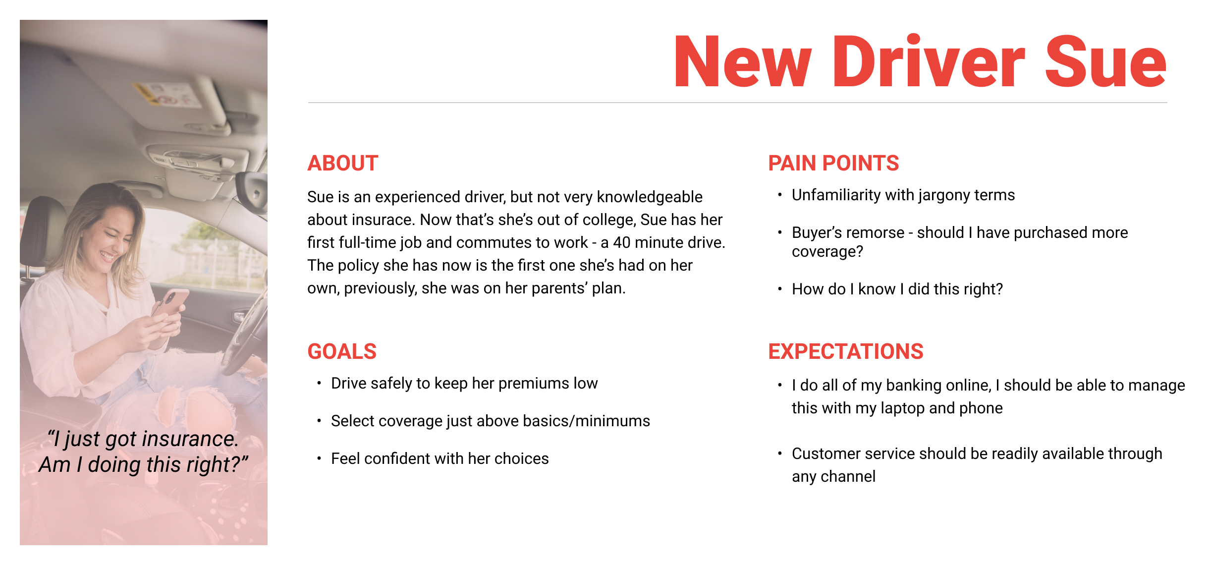
Following Nielsen Norman Group’s guidance on qualitative personas, I synthesized the eight interviews and the power-user survey into a single primary persona: Sue. Concentrating on one persona was deliberate: Sue represents the highest-risk, highest-volume new customer, and designing for her confidence gap would serve the broader population.
Usability Testing
With educational templates designed (see The Design below), I collected feedback from users about account activation and the permissions UX, sessions that produced the project’s most important finding, covered in Key Decisions & Pivot Points.
Flows
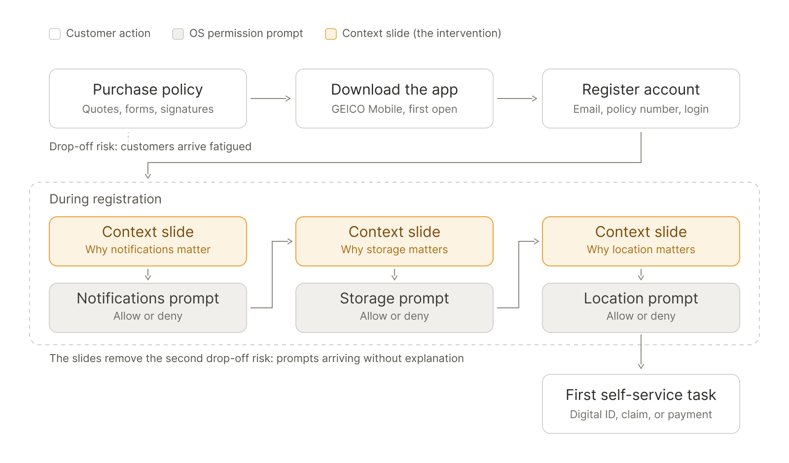
The new-customer journey in one view, from policy purchase through registration to the first self-service task. The highlighted stages are the intervention: three context slides, each arriving immediately before the OS permission prompt it explains. The two annotated drop-off risks are the ones the research exposed: customers arriving fatigued from the purchase process, and permission prompts arriving without explanation. The flow is the argument for placing context at the exact moment of the request rather than in a separate tutorial.
The Design
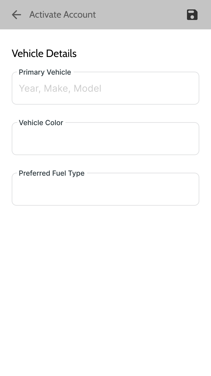
New Driver Sue needed to feel confident in her choices and have peace of mind that she’s fully covered in case of emergency.
I created context for Sue by designing templates that explained why permissions were essential. Simultaneously, Sue learned about the range of capabilities the app had.
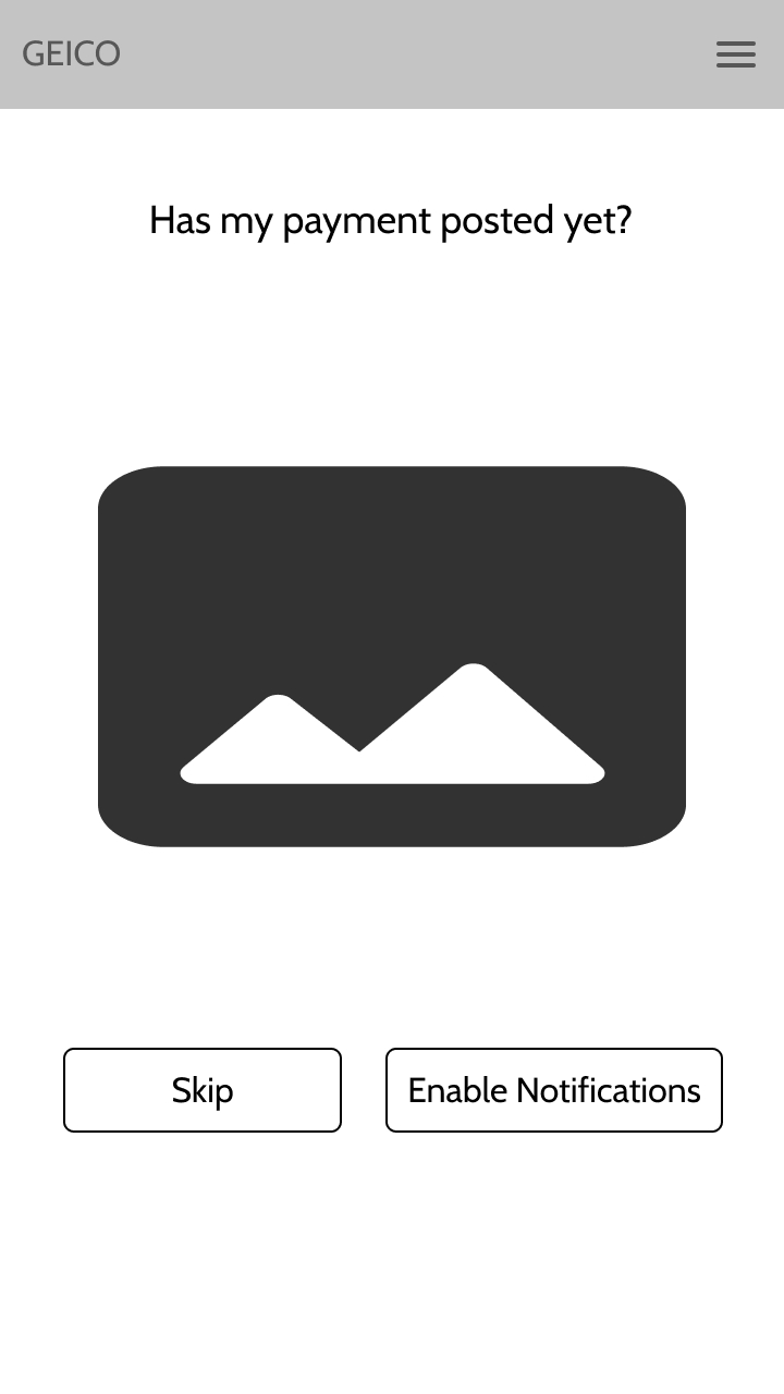
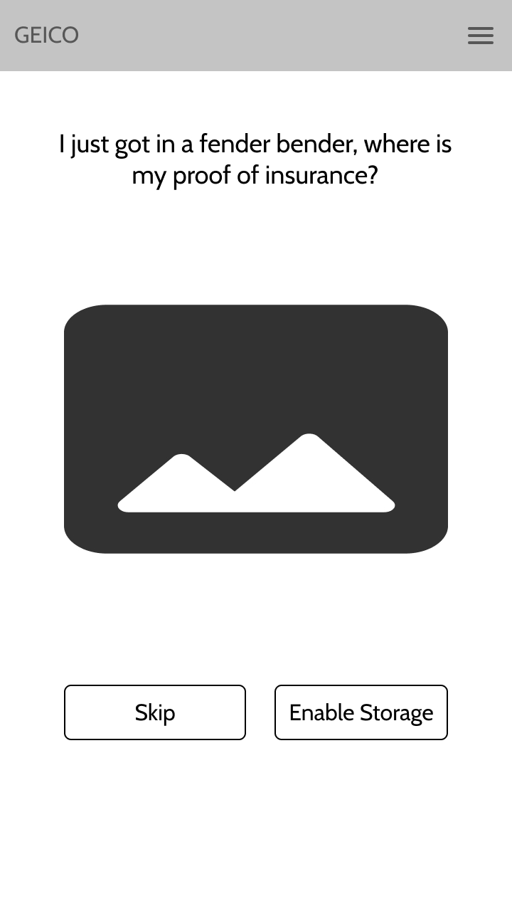
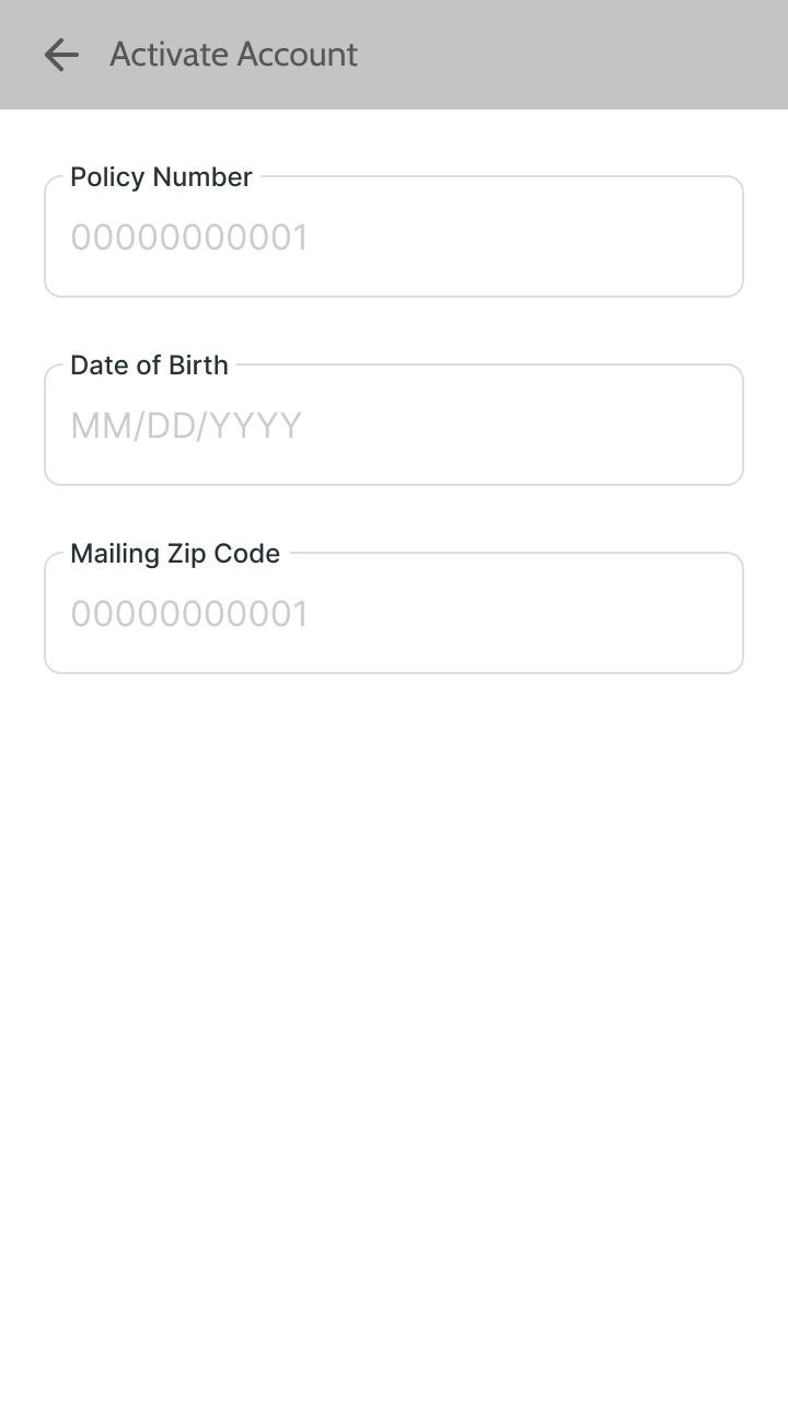
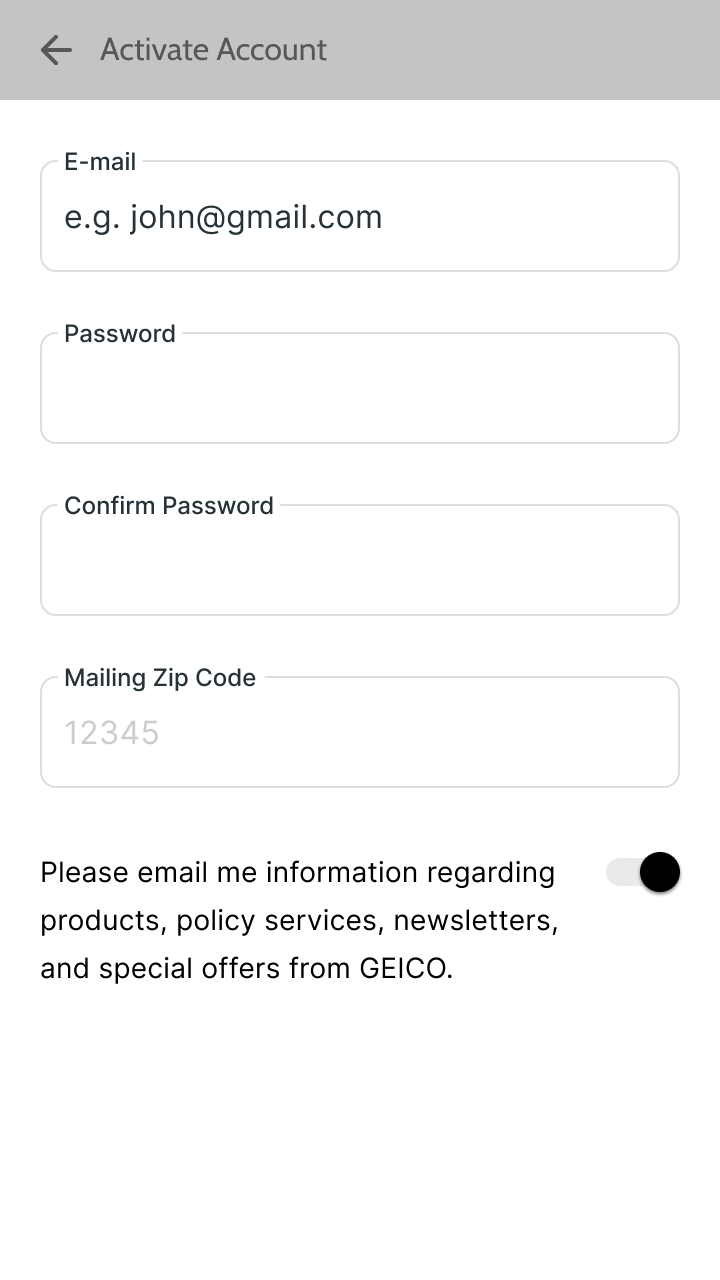
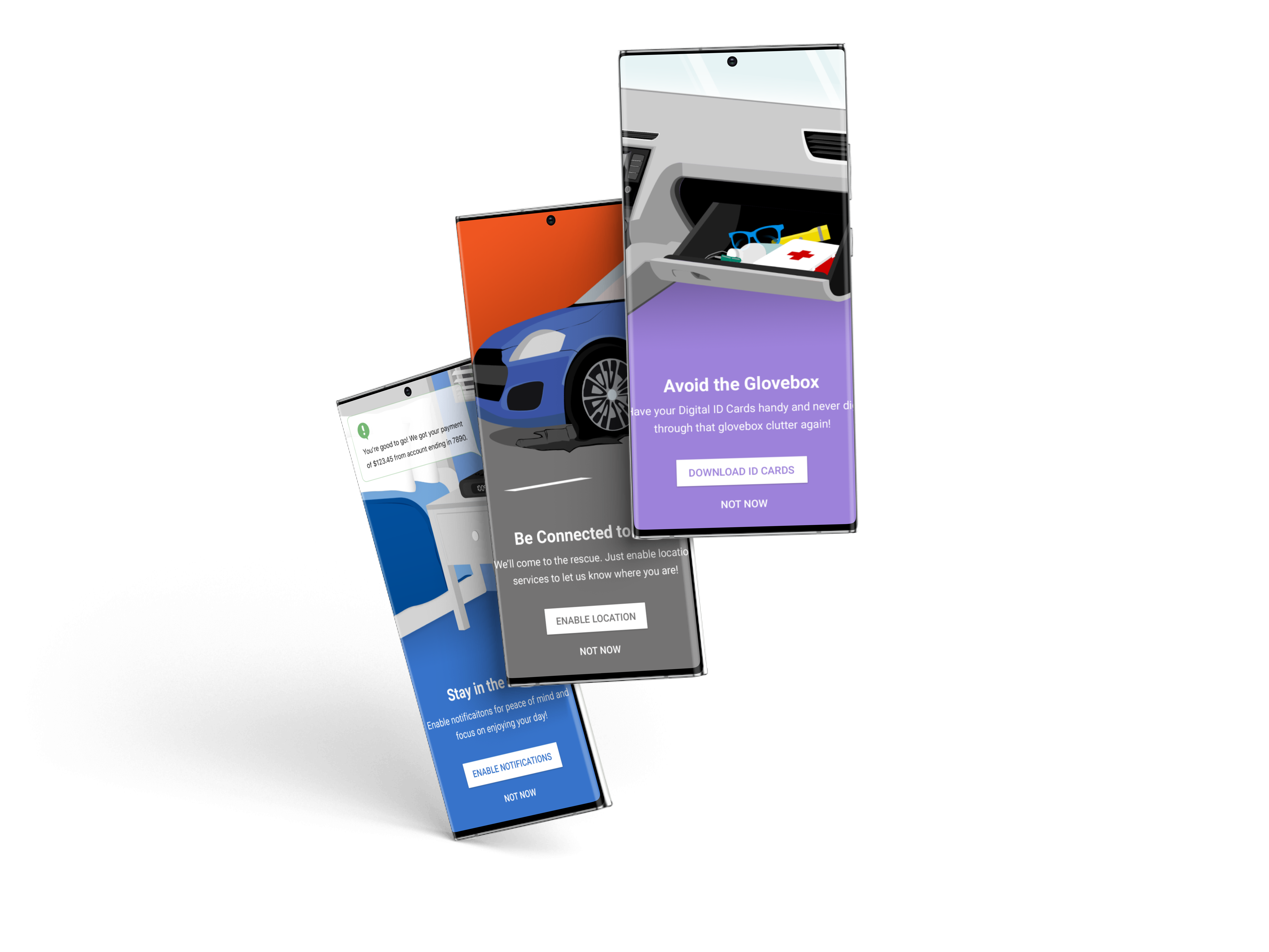
The shipped design was leaner than the templates above: three slides, shown during registration, at the exact moment permission requests appear. How it got that way is the story of the project’s pivot.
Key Decisions & Pivot Points
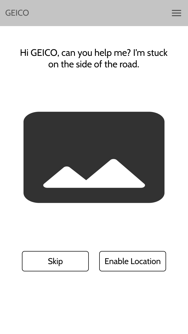
Cutting my own designs. Testing delivered a humbling finding: too much context is not a good thing. I had designed 7 full-screen educational templates, and participants, already fatigued from a lengthy insurance purchase, read them as more homework, with one participant asking me “Is this really how many questions they’re going to ask?” Rather than defend the templates, I worked with my PM and UI designer to find the smallest intervention that preserved the confidence-building goal. We landed on three slides, shown during registration, at the exact moment permission requests appear (context paid for in seconds, not minutes). The research didn’t say users don’t need context; it said context has a budget.
One persona, not a cast. The conventional deliverable would have been three or four personas spanning the customer base. I concentrated on Sue alone because the research showed the confidence gap was the problem, and Sue embodies it at its widest. Designing for the user with the least confidence and the most at stake meant every intervention that worked for Sue worked for everyone above her on the confidence curve.
Collaboration
The weekly review sessions with my PM and design lead weren’t status meetings; they were where research findings got converted into scope decisions while the findings were still fresh. I chose that cadence because onboarding touched three teams at once (research, UI design, and two platform engineering teams), and a finding that sat unshared for a sprint became a finding that arrived too late to act on. The PM’s role as enrollment SME shaped the research itself: their call-volume data defined what “success” meant before I wrote a single interview question, which is why the study could end with a business answer instead of just user insights. With the Android and iOS engineers, the three-slide solution was co-scoped directly against the registration flow’s implementation constraints, the reason the final intervention could ship at the exact moment of the permission prompt rather than as a separate tutorial no one would reach.
Outcomes
Comparing Registration Flows
Results from a satisfaction questionnaire suggested the new registration process with added context (orange) outperformed the old registration process (red).
Business Impact
- In production, context-building onboarding increased permission enrollment across all three targeted services (notifications, storage, and location) at the first login after purchase, the exact moment the redesign targeted.
- Call volume from new customers (the metric that started this project) declined over the same period.
The precise magnitudes live in GEICO’s internal dashboards, so I won’t quote numbers I can’t defend. What I can stand behind is the pattern: every metric the project targeted moved in the direction the design predicted, and none regressed. The strongest evidence is public on this page: in the benchmark comparison above, new customers in the redesigned flow reported more confidence, more self-sufficiency, and less need for technical help than tenured power users, on the same three measures the baseline survey flagged as the problem.
User Impact
- New-design users outscored even power users on confidence, having everything they needed, and needing less technical help, the exact three measures the baseline survey flagged.
- Permission requests now arrive with their reason attached, so saying yes is an informed choice rather than a reflex decline.
Design Impact
- Established “context at the moment of request” as the permission-priming pattern, replacing the up-front tutorial model.
- Demonstrated that onboarding content has a budget, a finding that shaped how the team weighed every subsequent addition to the registration flow.
What I’d Do Differently
Every participant in this study had just lived through the entire post-purchase experience, and I only asked them about a slice of it. My sessions were scoped tightly to registration and permissions, which answered the brief, but it meant the richest source of context in the room went largely uncollected. Given another pass, I’d build open-ended feedback into every session about what happens after a new customer buys a policy: the moments of confusion, the tasks they expected the app to handle, the points where they gave up and dialed. That broader signal would have surfaced more ways to streamline the post-purchase process (and more opportunities to spur new users’ engagement with the app) instead of concentrating the entire intervention on the permissions experience alone.