
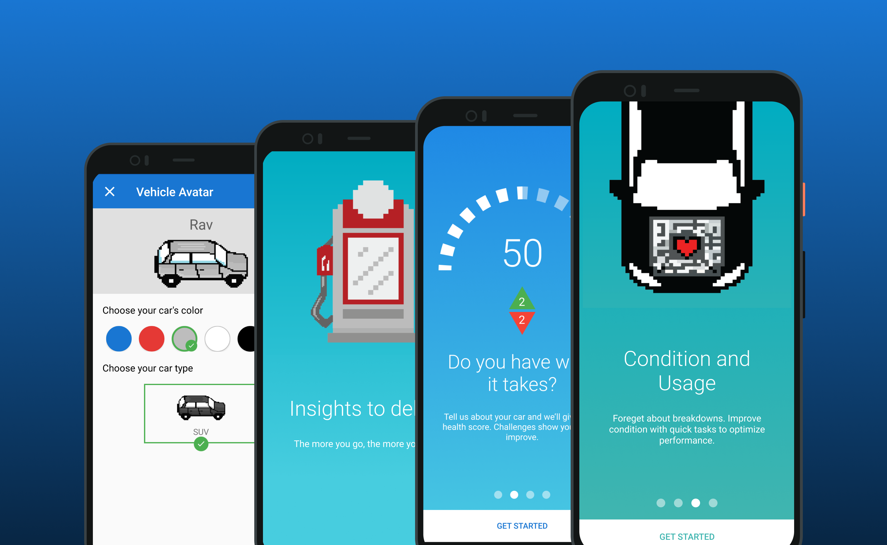
The brief had two constraints that shaped everything: deliver an Android application to the Google Play Store in under 100 days, and create a novel engagement model with opportunities to direct traffic back to the company’s primary money-making application. The outcome, up front: we shipped on day 92 of 100. On a clock that tight, every design decision had to be right the first time, or cheap to reverse.
My Role & Team
I was the sole UX designer on a four-person team: myself, 1 UI designer, 1 Android engineer, and 1 product owner. My responsibilities:
- UX research
- Usability testing
- Guiding feature direction
- Prototyping, wireframing, and designing task flows
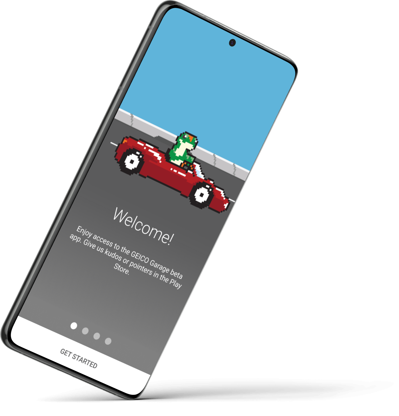
The Problem
The company’s primary app served existing customers transactionally: you opened it when something went wrong. There was no product in the portfolio that earned a place in a driver’s routine, which meant no ongoing engagement channel and no organic path for prospects and customers to deepen their relationship with the brand. The business wanted a low-risk vehicle for testing engagement models, and a deadline that made the experiment cheap: 100 days, ship to the Play Store, learn fast.
The evidence was the shape of engagement itself: GEICO users logged into the app almost exclusively to pay a bill or file a claim, and otherwise didn’t touch it. Two touchpoints, both obligations, one of them tied to one of the worst days of a customer’s year. GEICO wanted a way to draw users into its ecosystem that wasn’t so transactional (more explorative, even fun), and this app was chartered as exactly that: a reason to open a GEICO product when nothing had gone wrong.
Research & Process
Brainstorming & Ideation
I facilitated a structured brainstorming session with 6 participants across engineering, product, and marketing. The three activities were chosen deliberately: paper airplanes lowered the stakes for non-designers unaccustomed to ideation; Flip Assumptions forced the room past our first, obvious ideas; and NUF scoring gave us a defensible, numbers-based way to converge, critical on a 100-day clock, because we could not afford to relitigate the direction later.
Make a paper airplane using only one hand. It’s a fun way to get started and break people out of their shell.
Write down as many assumptions as you have about your product. Then, flip those assumptions by listing out the opposite.
Take the flipped assumptions and rate each on a one-to-seven scale as potential products using the NUF scale (New, Useful, Feasible).
Key discovery: Vehicle care provided the ideal opportunity to link between new and existing products in the ecosystem.
Customer Interviews
I built a mental model of users’ attitudes about vehicle care and evaluated their top concerns as car owners.
12 users participated in semi-structured user interviews from three distinct groups:
- Owned their first car for less than one year
- Owned vehicles for two to five years
- Owned vehicles for more than five years
Interview questions:
- What stands out to you about driving off the lot with your new car?
- What do you know now that you wish you knew before you bought your car?
- What resources have you used to help you deal with issues that have come up with your car?
- Have there been any situations where you’ve felt overwhelmed or underprepared?
Interview takeaways:
- Car owners across groups have a range of vehicle knowledge (high, medium, low) and varying degrees of willingness to work on their own cars.
- Electronic manuals are more helpful to new car owners while experienced car owners feel equally comfortable using either an electronic or glove box manual.
- People feel very attached to their vehicles across all participant groups.
Generating Personas
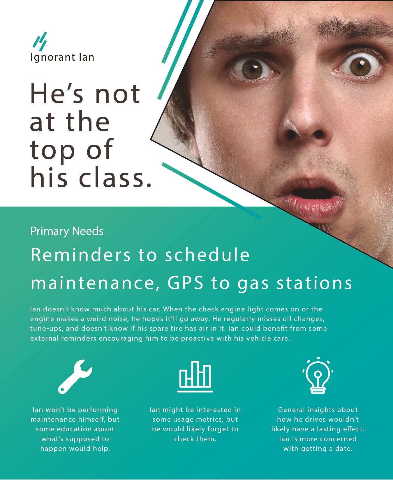
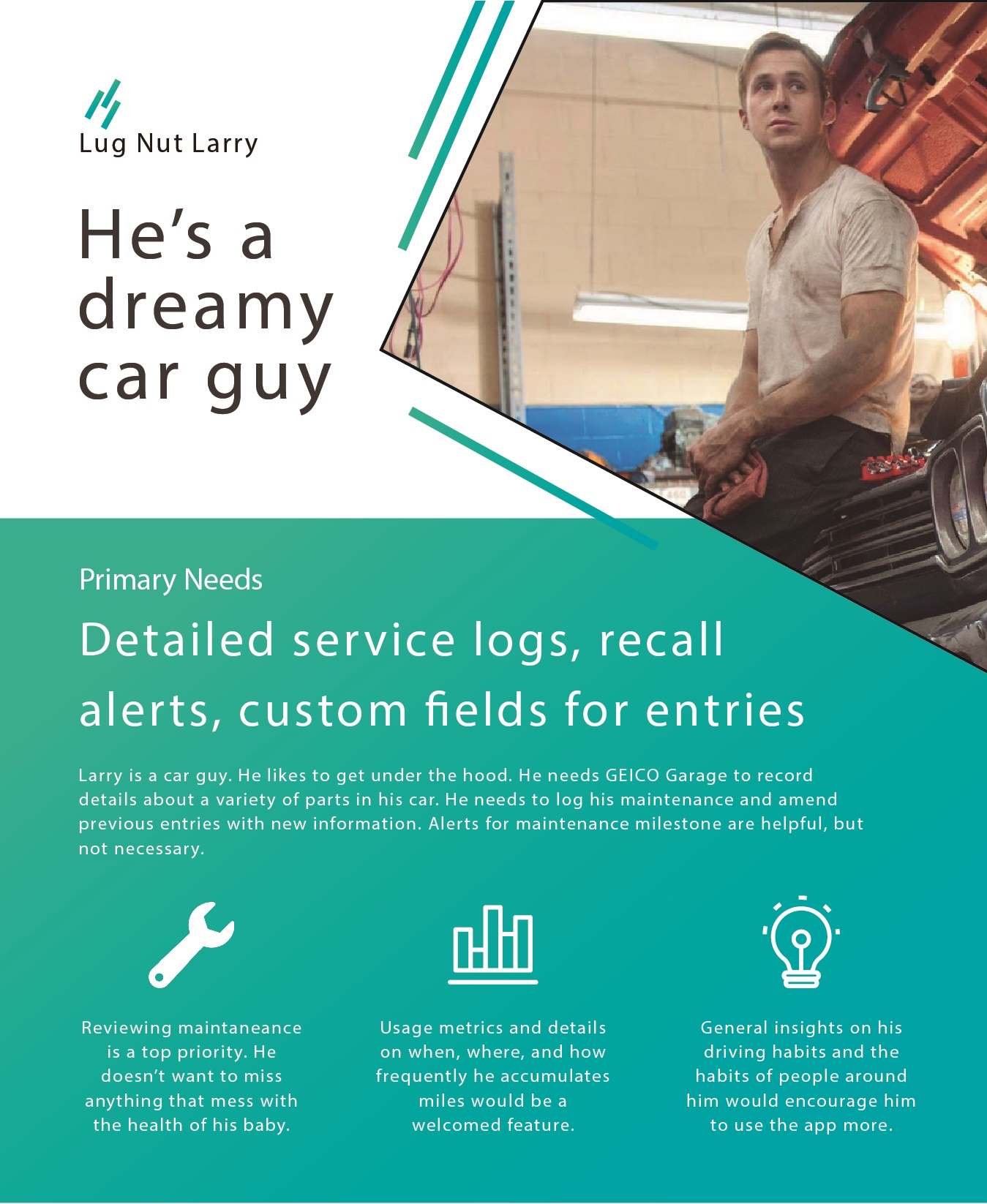
I created two personas at opposite ends of the car knowledge spectrum, because the interviews showed knowledge level, not demographics, was the variable that changed what users needed from the product.
Flows
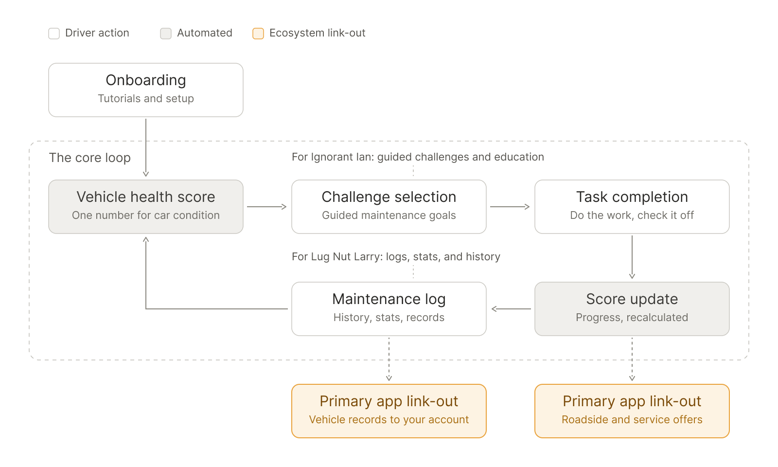
The core engagement loop in one view. Onboarding drops the driver into the loop: vehicle health score → challenge selection → task completion → score update → maintenance log, and back to the score. The persona annotations mark which stages serve whom: guided challenges and education for Ignorant Ian, logs, stats, and history for Lug Nut Larry. And the highlighted link-outs are the strategic point of the whole app: the two places the loop routes drivers back into the primary product. The loop is the engagement model; every feature exists to feed it.
The Design
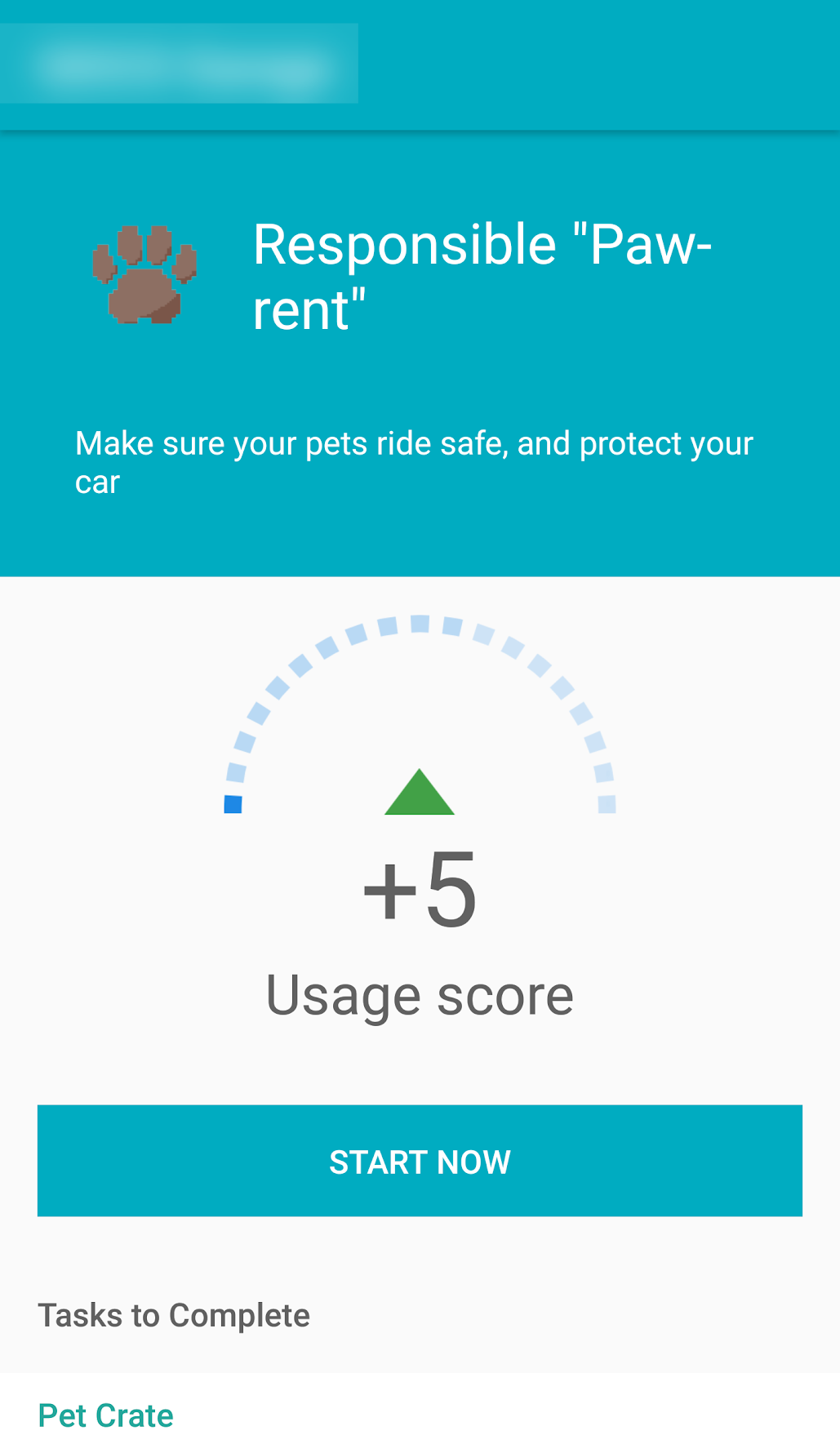
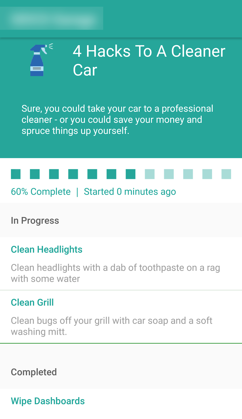
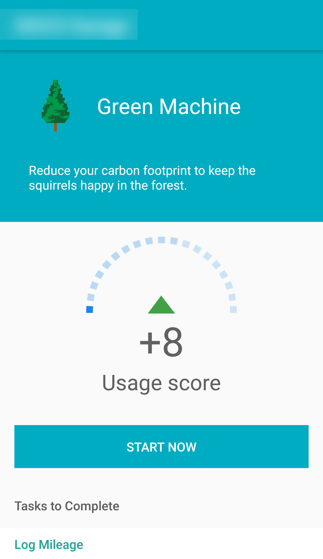
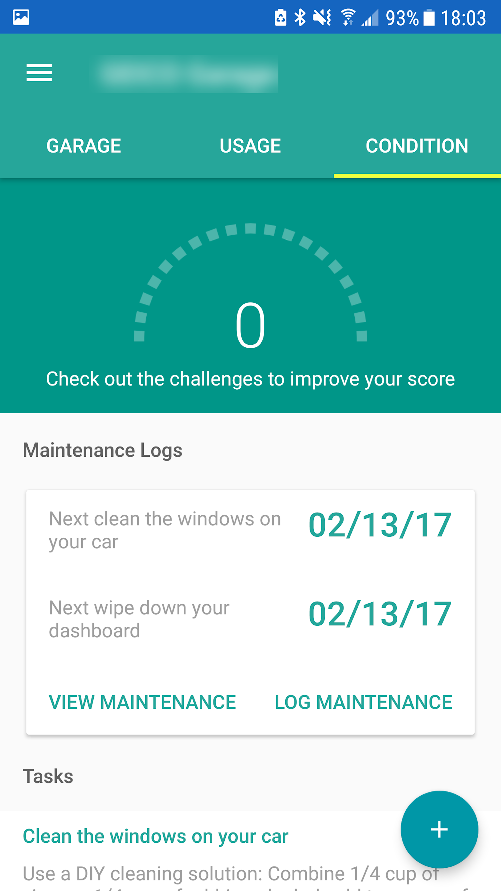
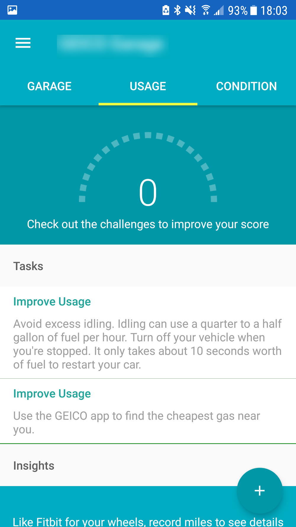
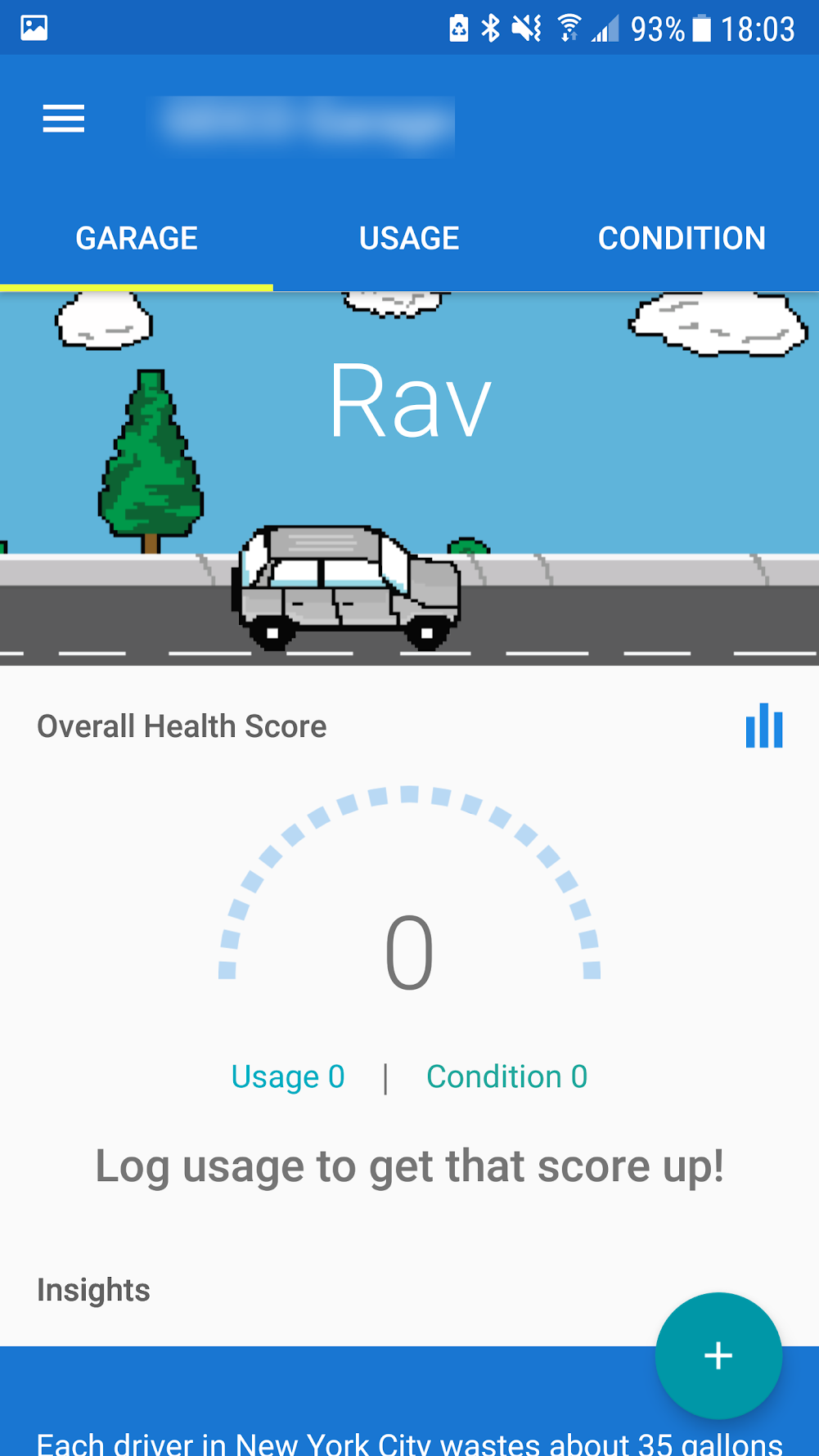
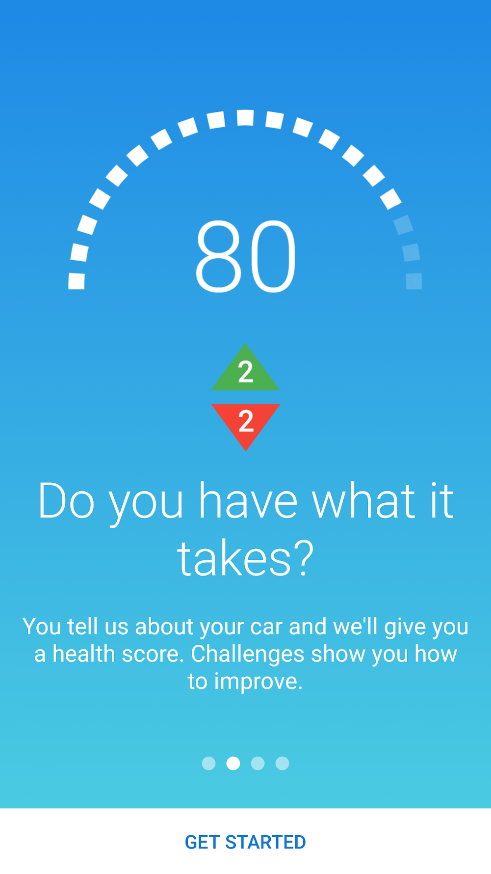
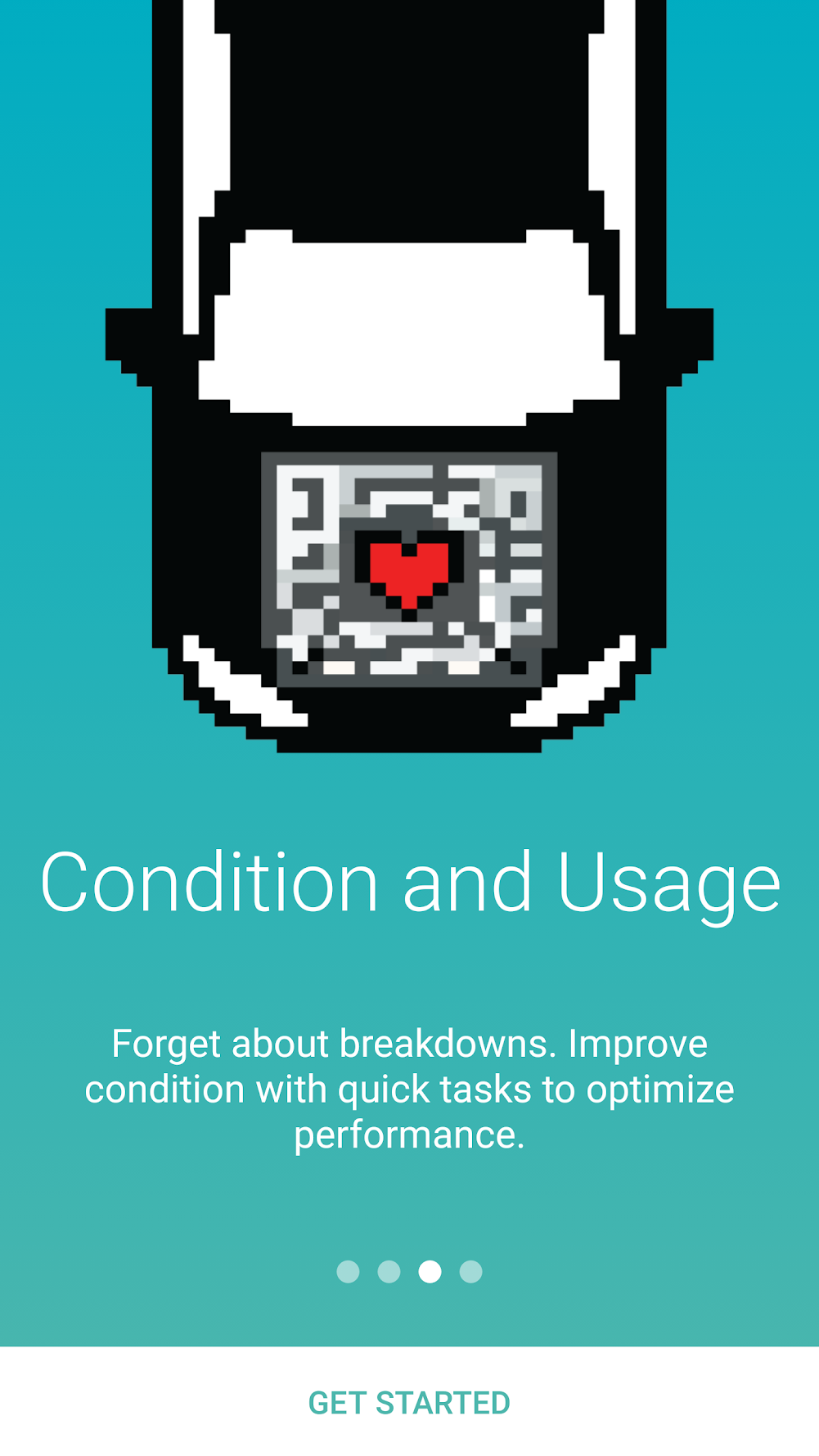
I used insights from the customer interviews to split vehicle care into a score-based model that could be updated by completing tasks and challenges, a game loop in service of the engagement mandate:
- Vehicle usage metrics
- An overarching “health” score
- Tracking reminders to achieve maintenance milestones
- Insights and statistics about driver behavior in the US
- Maintenance logs
- Trip history
Each key feature traces to the research:
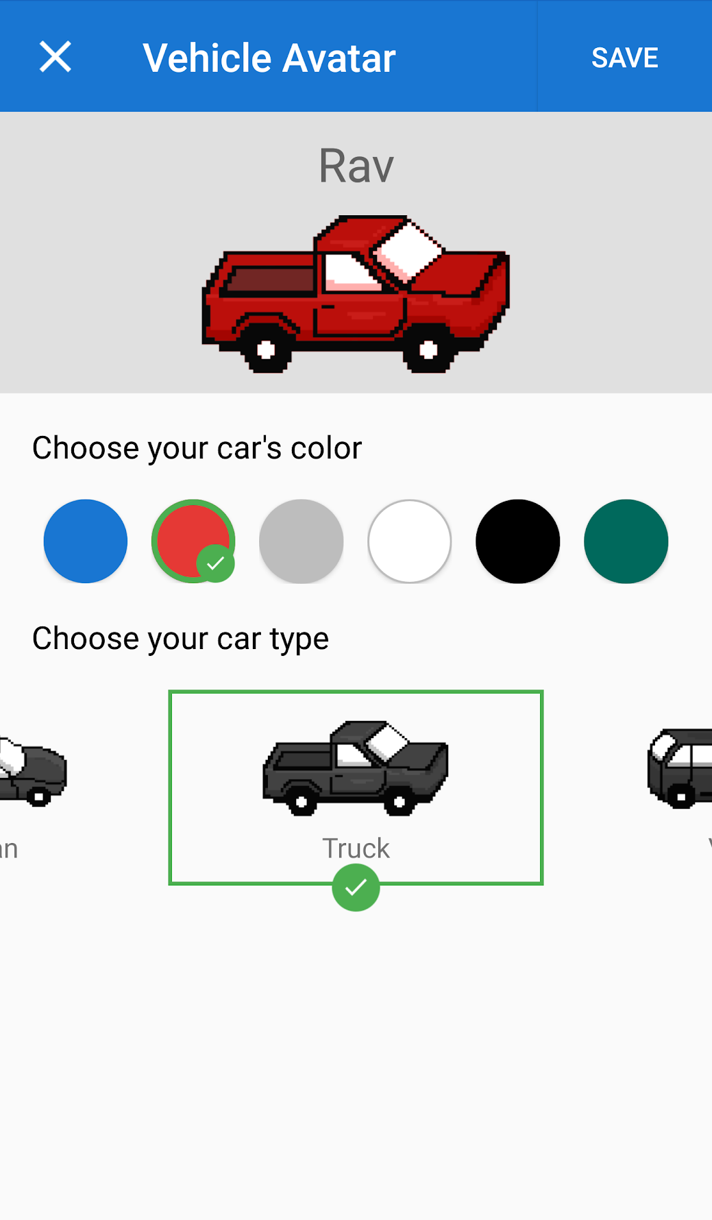
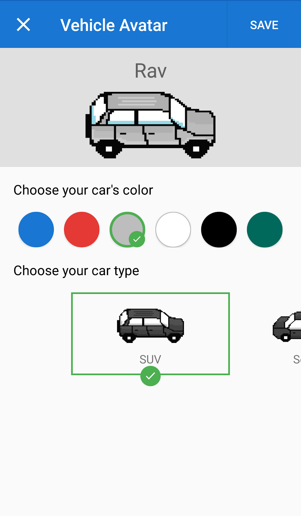
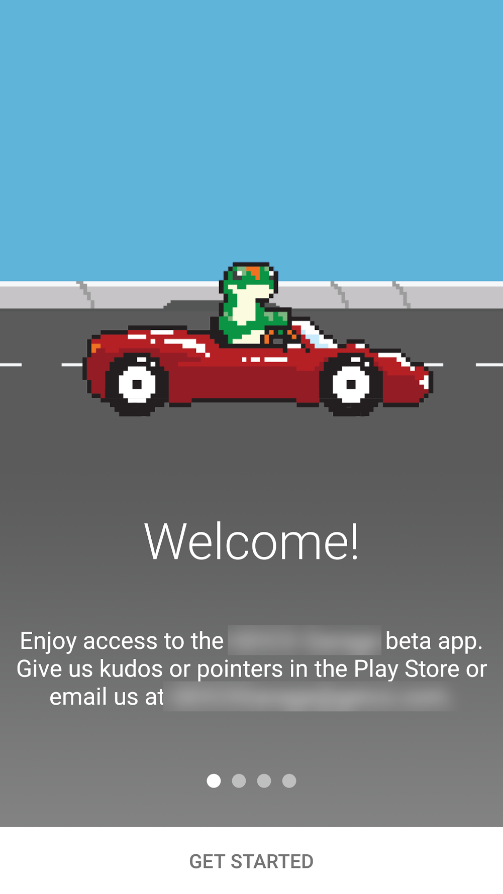
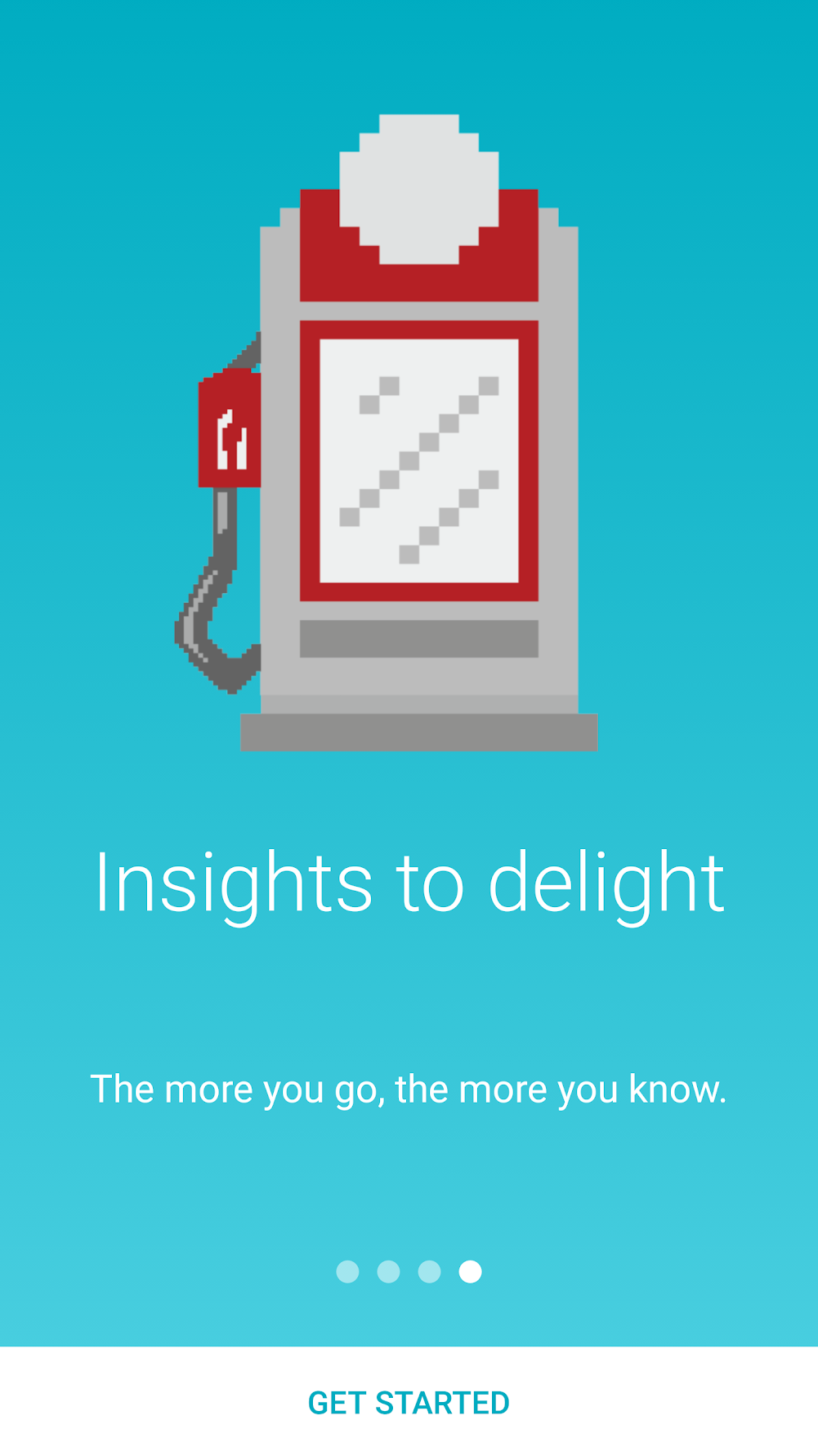
- Engaging 8-bit style UI supported gamification: making routine maintenance feel like progress in a game rather than chores on a list.
- Content supported personas’ maintenance goals: guided challenges for Ian’s confidence gap, logs and stats for Larry’s mastery.
- A variety of personalization options: serving the strong vehicle attachment every participant group expressed.
- Familiar Material Design navigation patterns: novelty spent on the engagement model, not on navigation users would have to relearn.
Key Decisions & Pivot Points
Converging by score, not by seniority. The riskiest moment in a 100-day project is the direction decision, because reversing it later costs weeks we didn’t have. That’s why the ideation session ended in NUF scoring rather than discussion: the vehicle-care direction won on rated newness, usefulness, and feasibility (numbers the whole room produced), which meant that when scope pressure arrived mid-project, nobody could reopen the “should we even build this?” question. The method was chosen precisely to make the decision durable.
Spending novelty in one place. The 8-bit gamified aesthetic and the Material Design navigation look like an odd couple, and the pairing was deliberate: a novel engagement model plus novel navigation would have doubled the learning burden and the design risk on a fixed clock. We spent our novelty budget on the score-and-challenge loop (the part that had to feel fresh) and kept navigation on rails users already knew.
Cutting the maps layer. The original concept leaned on the Google Maps API: fuel-efficient route suggestions to help drivers save gas, and directions to nearby garages when the app recommended an oil change or other maintenance. It was the feature set that connected the health score to the physical world, and we cut it, because the API was simply too costly to test and fully implement on our clock and budget. That meant shipping a vehicle-care app that couldn’t point you to a garage, which stung. But the cut was the 100-day discipline working as intended: a feature we couldn’t afford to test was a feature we couldn’t afford, and the score loop had to prove the engagement model on its own.
Collaboration
A four-person team on a 100-day clock collapses the usual handoff structure, and we leaned into that rather than fighting it. With one Android engineer, feasibility conversations happened at the sketch stage, not at handoff: anything expensive to build got redesigned before it was ever specced. The UI designer and I split the novelty budget explicitly (I owned flows and interaction patterns, they owned the 8-bit visual identity), which let both tracks move in parallel. And the product owner ran interference on scope: the NUF-scored direction gave them the artifact they needed to keep stakeholders from adding features mid-flight.
Outcomes
Business Impact
- 5,000+ downloads in the first four months against a target of 3,500.
- The app validated its real strategic purpose: a low-risk testbed for engagement models that route drivers back to the primary product.
User Impact
- 600 app users enrolled in the company-sponsored research program, creating a standing participant panel that cut recruiting time for future studies from weeks to days.
Design Impact
- The score-based interaction pattern was adopted for account setup and roadside assistance in the primary product; the engagement model outlived the app that piloted it.
What I’d Do Differently
I was so focused on hitting the release in under 100 days that I treated launch as the finish line, when for an engagement experiment it was the starting gun. Cutting scope for the MVP was the right instinct, but while I was doing it, I should have been partnering more closely with the PM on what came after: a real feedback loop with users post-release, perhaps an incentive program for participating in interviews. The 600 users who enrolled in the research program proved the appetite was there. A deliberate program would have converted that appetite into longer-term engagement and a user-driven way to prioritize the feature roadmap after the initial release, instead of leaving the first version to speak for itself.