
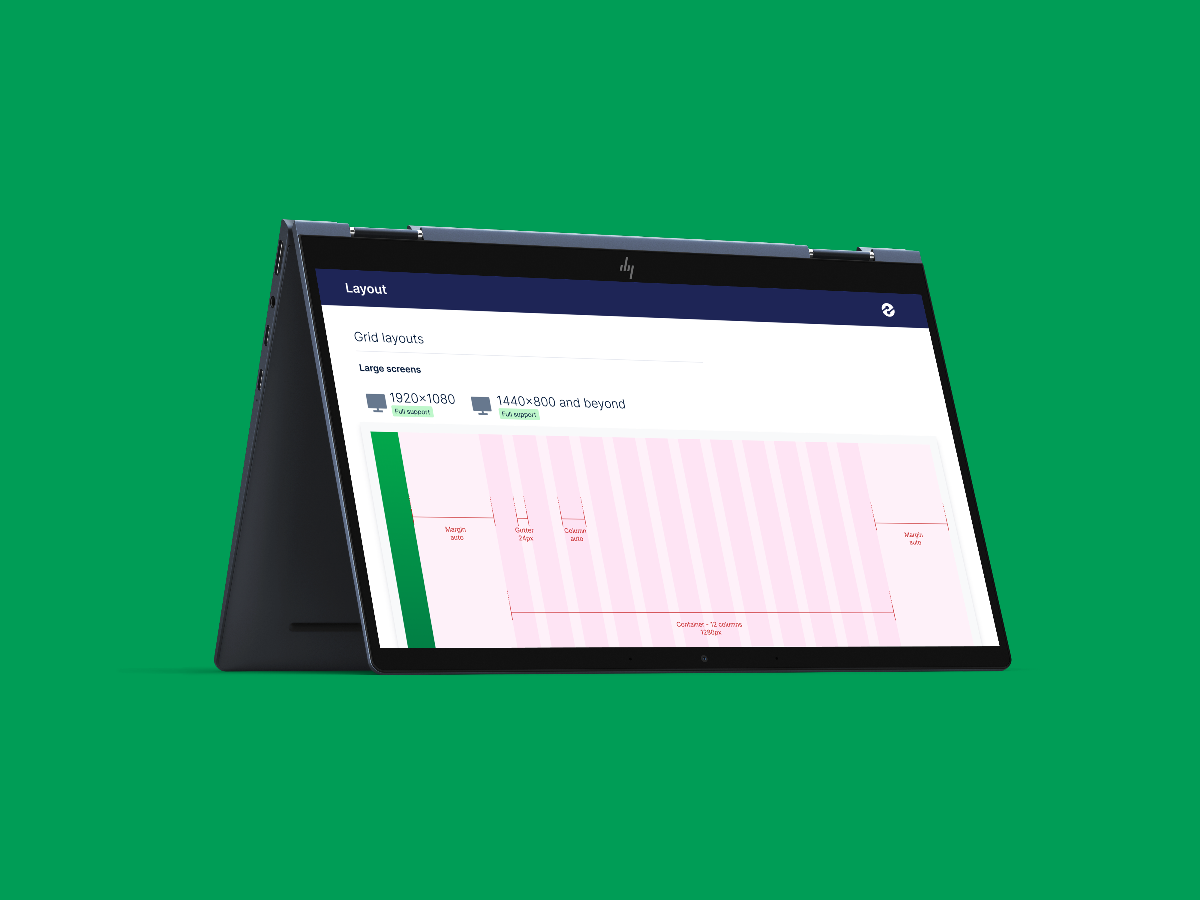
insightsoftware grew through acquisition into a portfolio of more than 17 enterprise applications across reporting, accounting, and data & analytics. Each product had been built by a different company, on a different stack, with its own navigation conventions, terminology, and visual language. Customers who licensed multiple products had to re-learn the platform every time they switched applications, and with new acquisitions arriving continuously, the fragmentation was compounding, not converging. The stakes: either the portfolio learned to feel like one platform, or every sale of a second product came with a hidden re-learning tax.
My Role & Team
Senior Product Designer for the Global Experience Platform.
I owned the design of the application shell, primary and secondary navigation, the way-finding model, and the documented UX contracts that application teams built within. As lead, I personally owned 9 of the 17 applications end-to-end and coordinated with designers on the remaining 8 to ensure system-wide consistency.
I worked directly with executive product leadership to translate platform strategy into durable UX standards, partnered with each application’s PM lead through a structured adoption process, and stayed embedded with engineering through implementation: testing edge cases, non-ideal states, and role-specific scenarios.
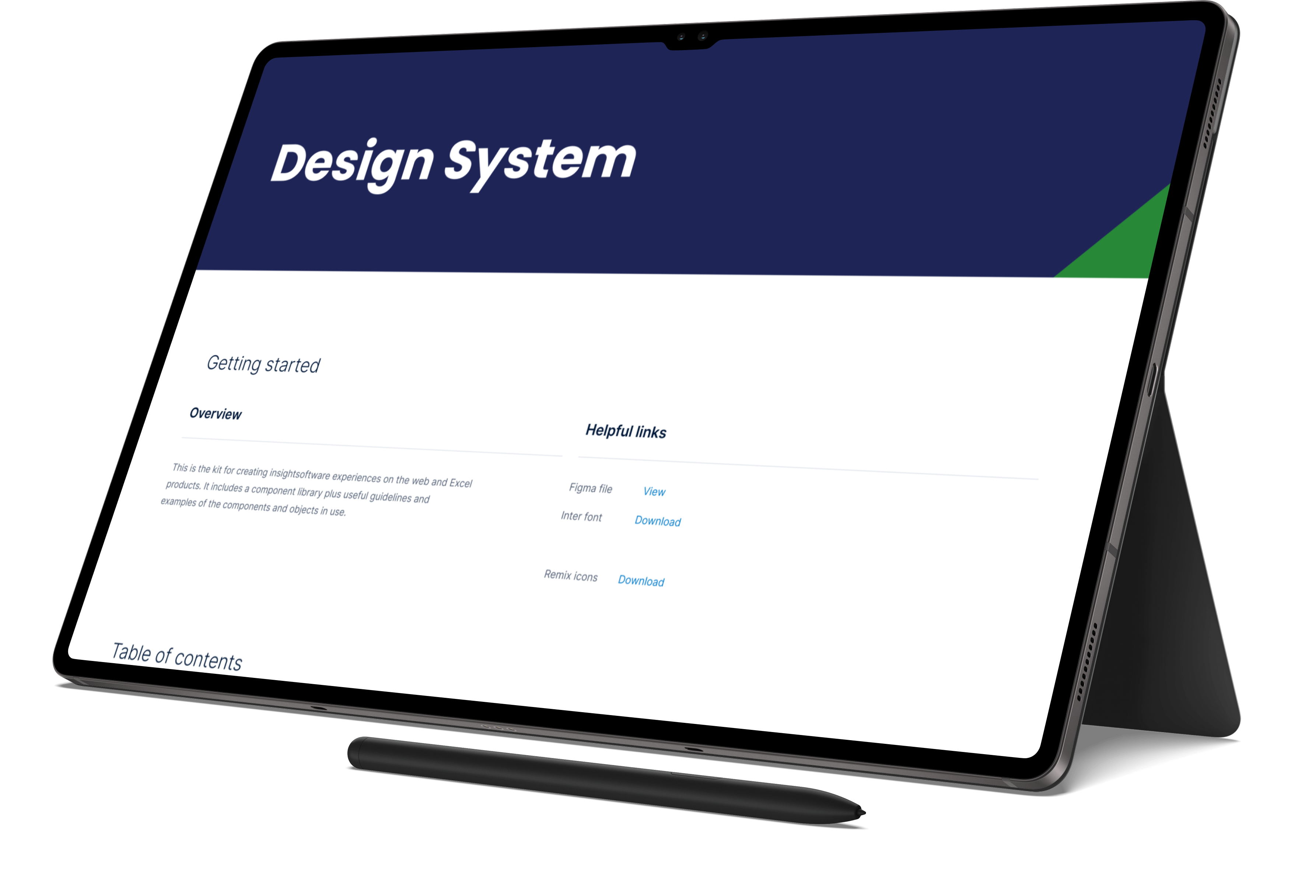
The Problem
Three problems compounded across the portfolio:
Fragmentation. Each acquired product had its own header, navigation, account menu, and notification model. Users licensing multiple products were effectively learning multiple platforms, a direct violation of consistency and standards, the Nielsen Norman heuristic this entire system exists to serve: users should never have to wonder whether different words, situations, or actions mean the same thing.
No shared interaction contracts. Common patterns for onboarding, notifications, form validation, status indicators, search, and filters were solved differently in every product. There was no governing layer.
No path to coherence at scale. New acquisitions kept arriving. Without a global framework, every new product would either be re-designed from scratch (expensive, slow) or shipped as-is (more fragmentation).
The system needed to do two things at once: prevent fragmentation, and preserve team autonomy. Application teams needed room to solve their own domain problems without re-litigating navigation, identity, or way-finding every time.
The evidence surfaced in our own UX design reviews. Review after review, different designers were solving the same problem (helping application teams redesign UI components and sharing CSS between products) while none of those teams pulled from a shared code base. Every review was simultaneously proof of demand for a system and proof of its absence: we were hand-delivering consistency one component at a time, building UX debt into the portfolio and accelerating the very UI drift the reviews existed to catch.
Research & Process
The standards weren’t designed in a vacuum; they were derived from the portfolio itself, one application at a time:
- Audit. Partner with the application’s PM lead to inventory existing IA, navigation, and core workflows, building, app by app, a portfolio-wide map of every navigation pattern in use.
- Map. Identify which user journeys mapped cleanly to global patterns and which would need product-specific accommodation. The contracts were shaped by what the mapping revealed: patterns that survived contact with 17 different products became standards; patterns that kept needing exceptions got redesigned.
- Prototype. Design updated navigation patterns against the structural standards, including non-ideal states and role-specific scenarios.
- Validate. Test against role-based access scenarios, multi-tenant data, and the full state matrix.
Working directly with executive product leadership meant the standards carried strategic weight; working through each PM lead meant they carried domain reality. Both were necessary: a contract that only leadership endorses gets routed around, and a contract that only one team likes never becomes a contract.
Flows
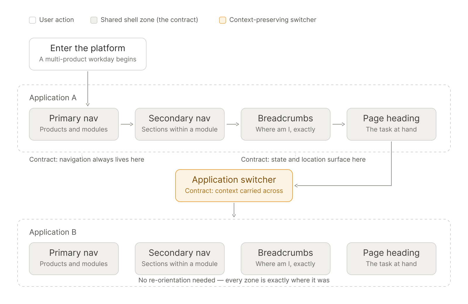
The cross-application way-finding journey in one view. A multi-product user orients in Application A through the shared shell zones (primary nav → secondary nav → breadcrumbs → page heading), then crosses to Application B through the context-preserving application switcher and lands already oriented, because every zone is exactly where it was. The annotations name the contracts at work: where navigation always lives, where state and location surface, and where context is carried across. This diagram is the visual argument for the whole system.
The Design
1. Foundational Styles
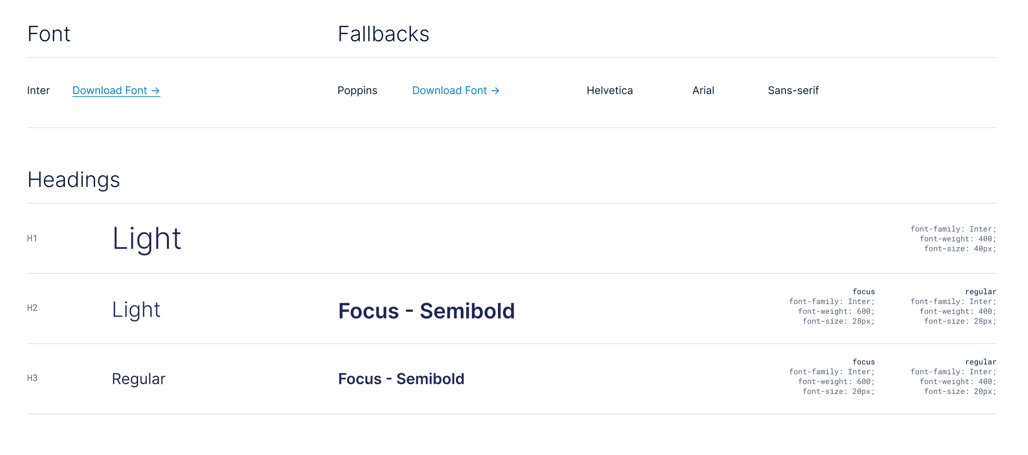
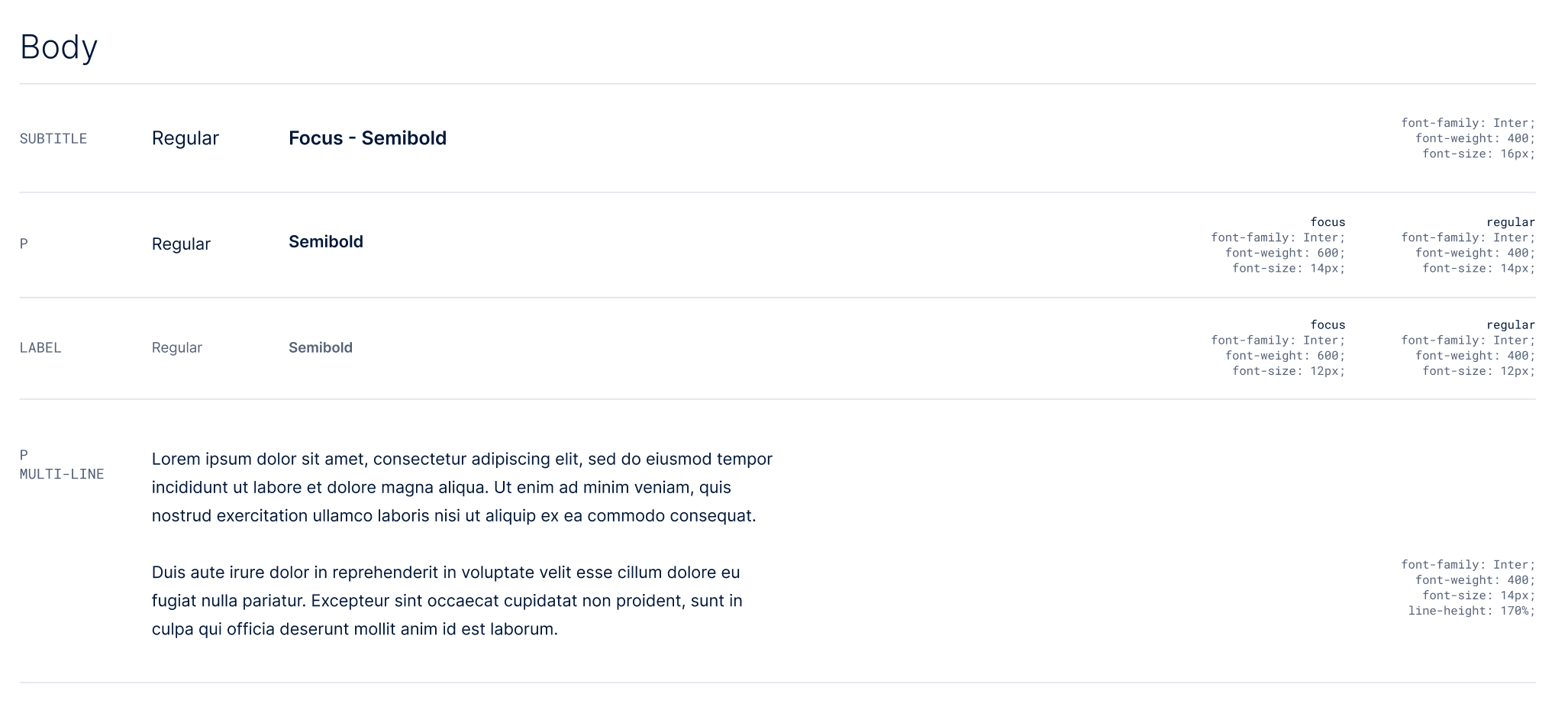
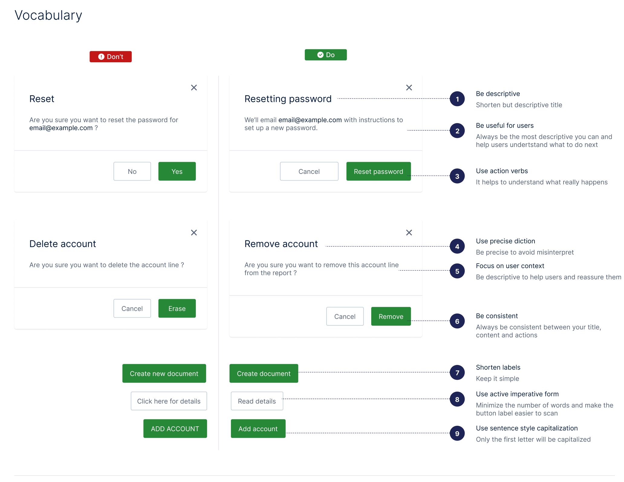
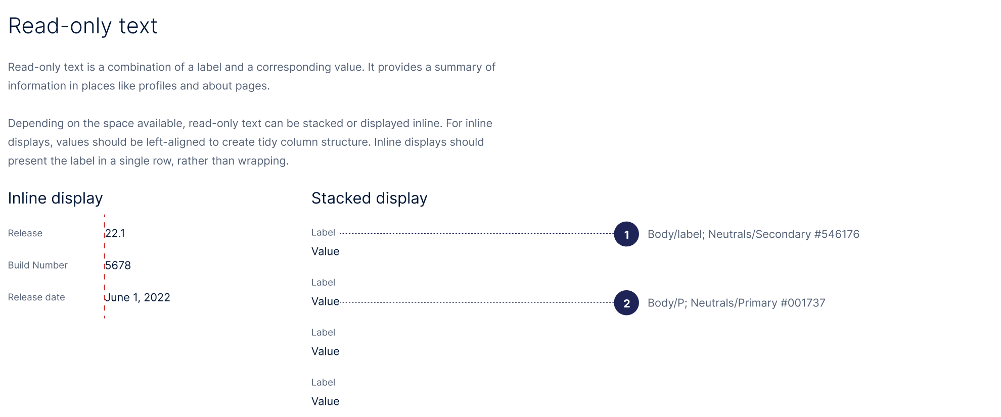
The foundations gave every application the same visual and verbal baseline before any product-specific design began. Typography is Inter (with a documented fallback stack), with a defined scale for headings, body, subtitles, and labels, each level specified down to weight, size, and line-height. A vocabulary guide set the platform’s voice through do/don’t examples: descriptive titles, action verbs, precise diction, short labels, and sentence-style capitalization.
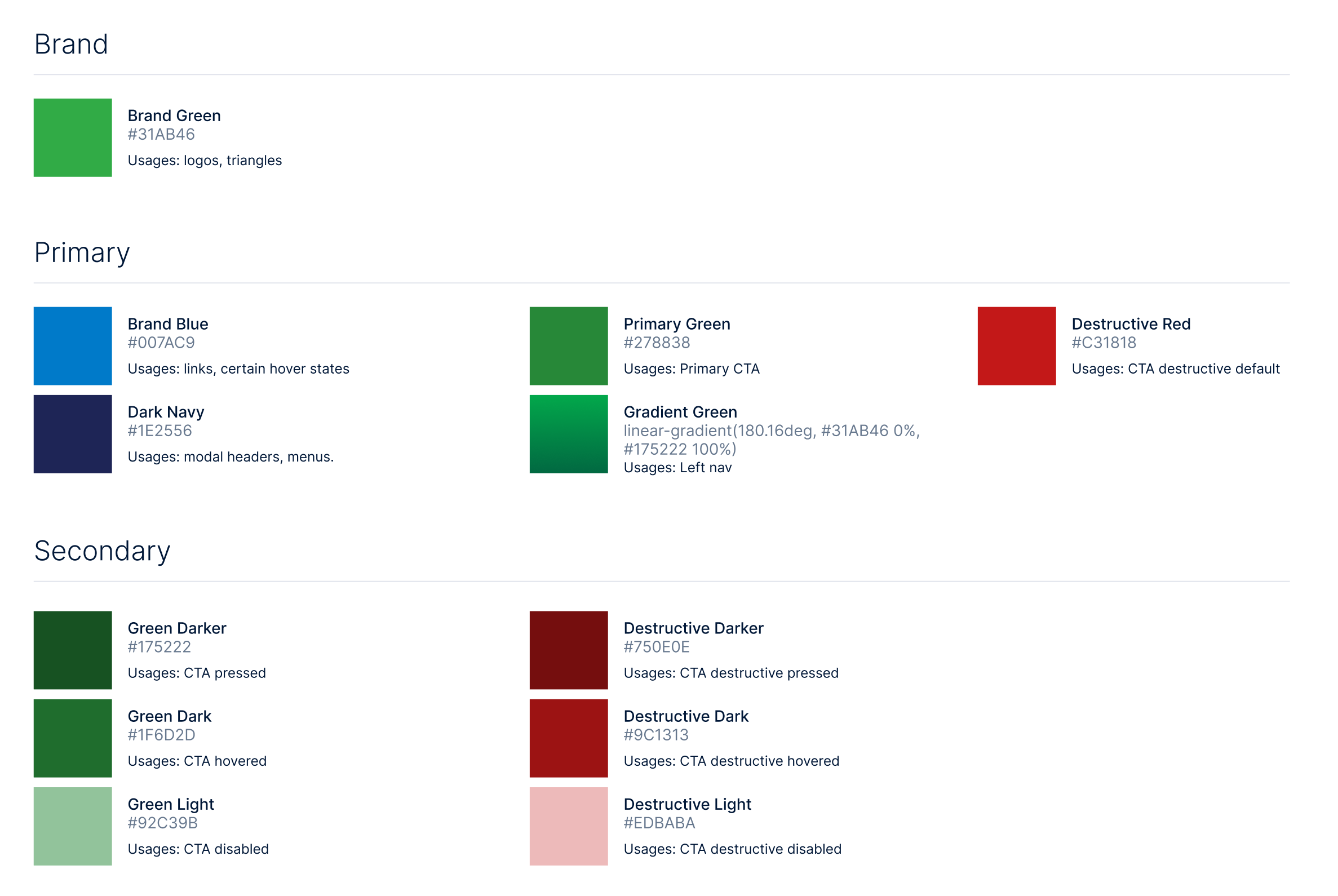
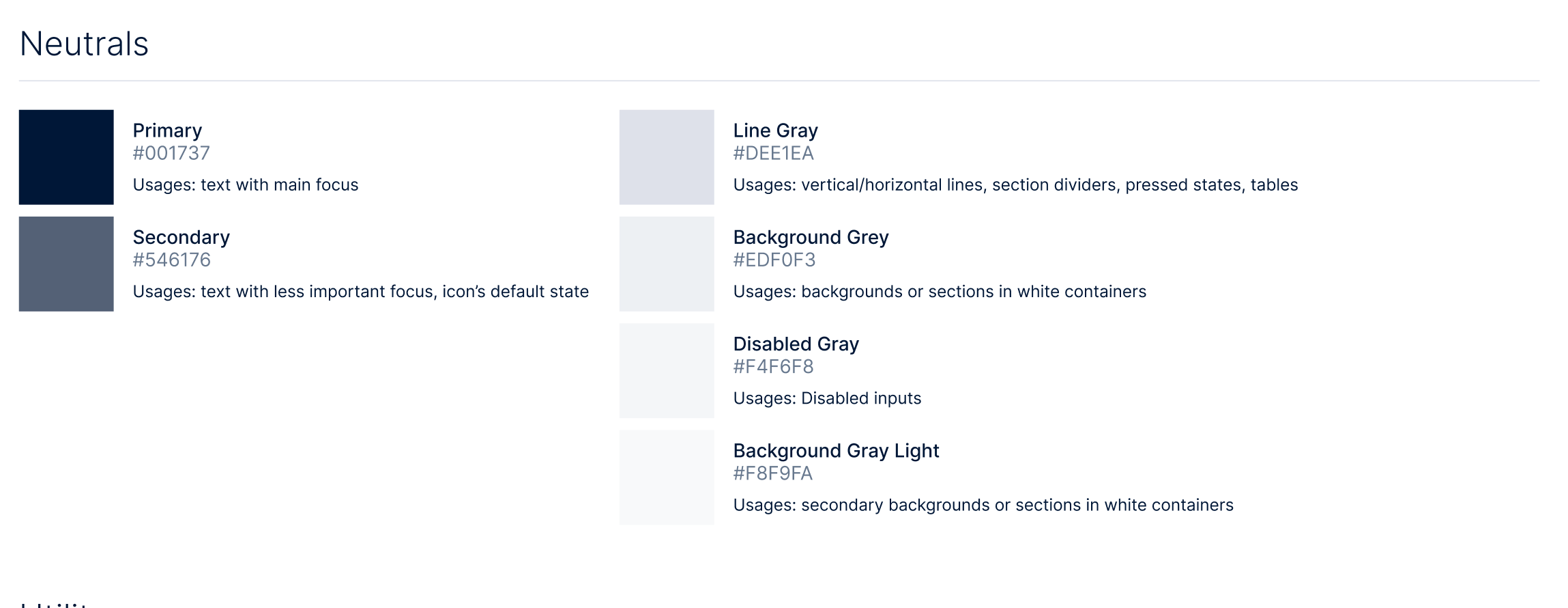
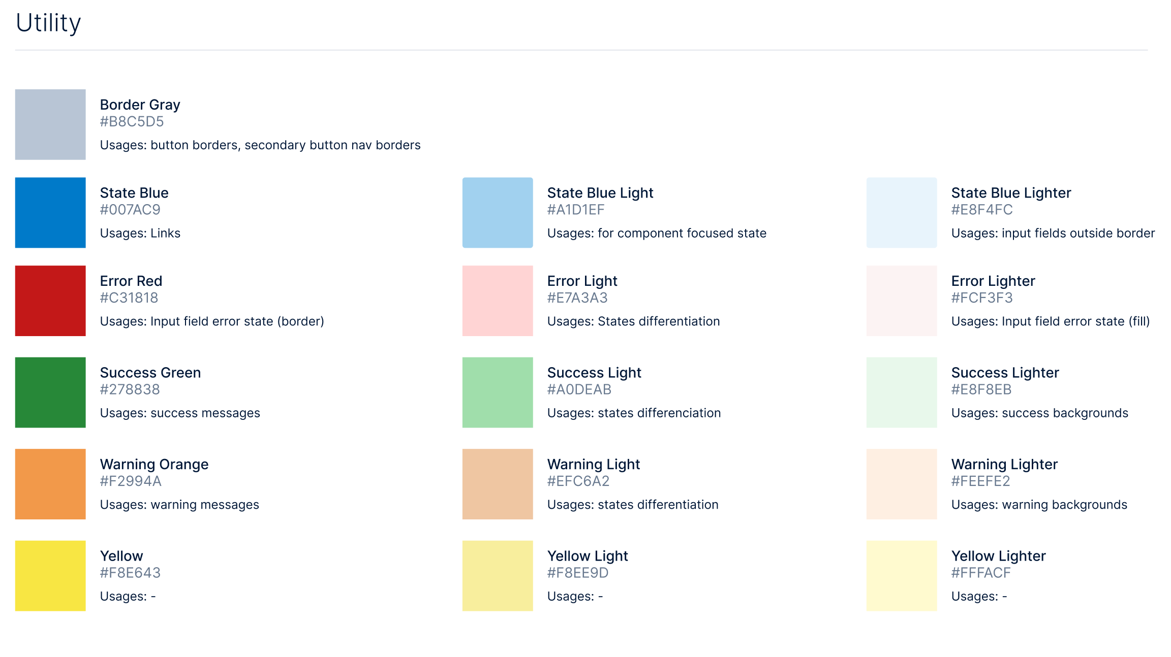
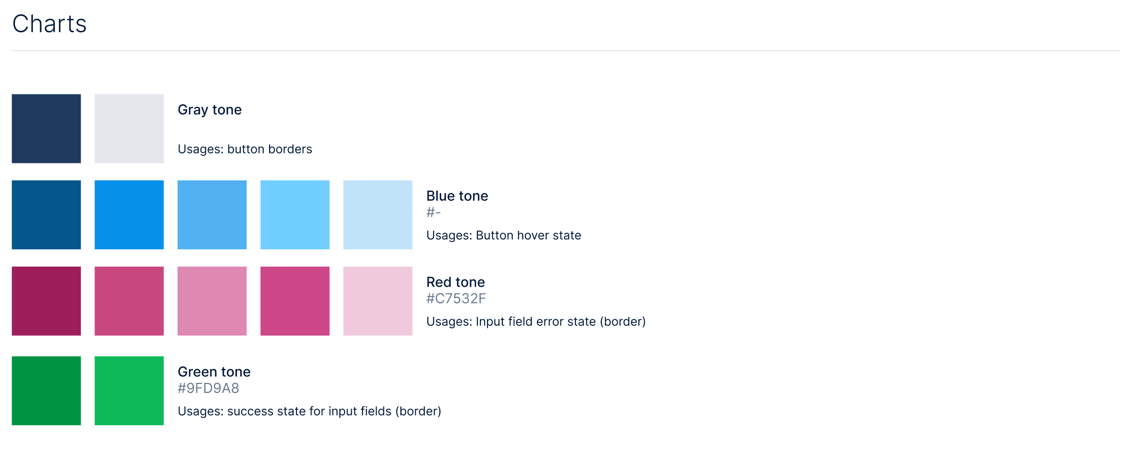
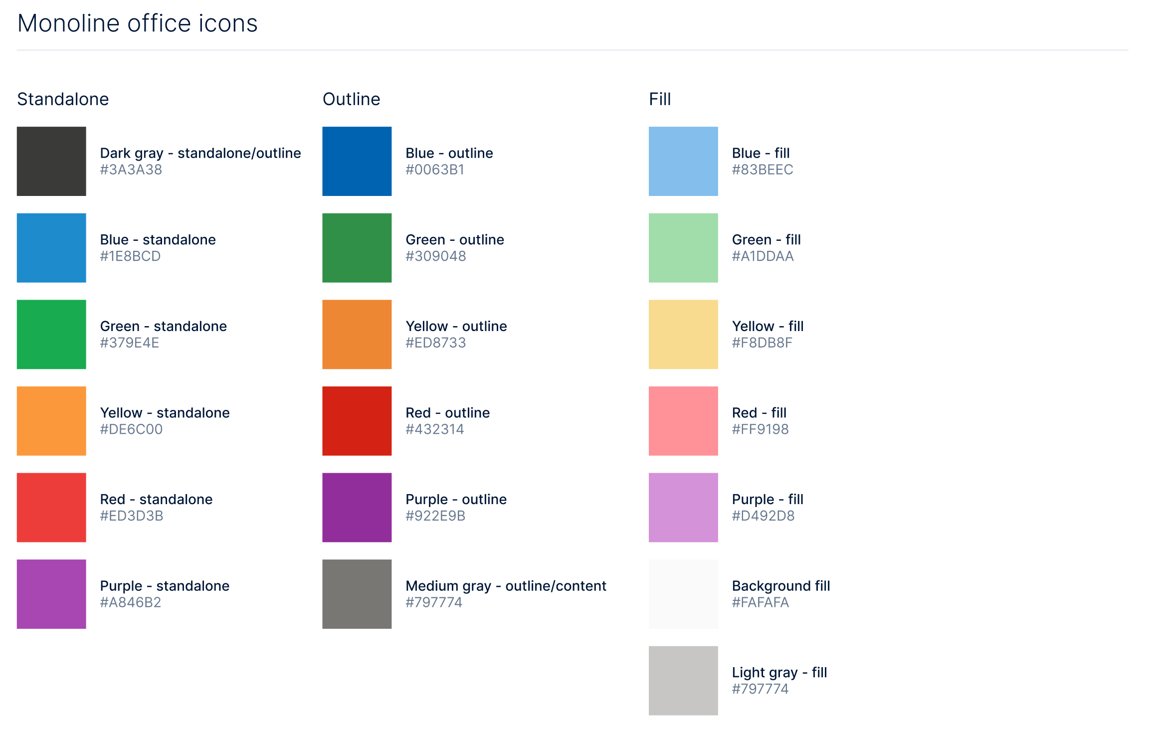
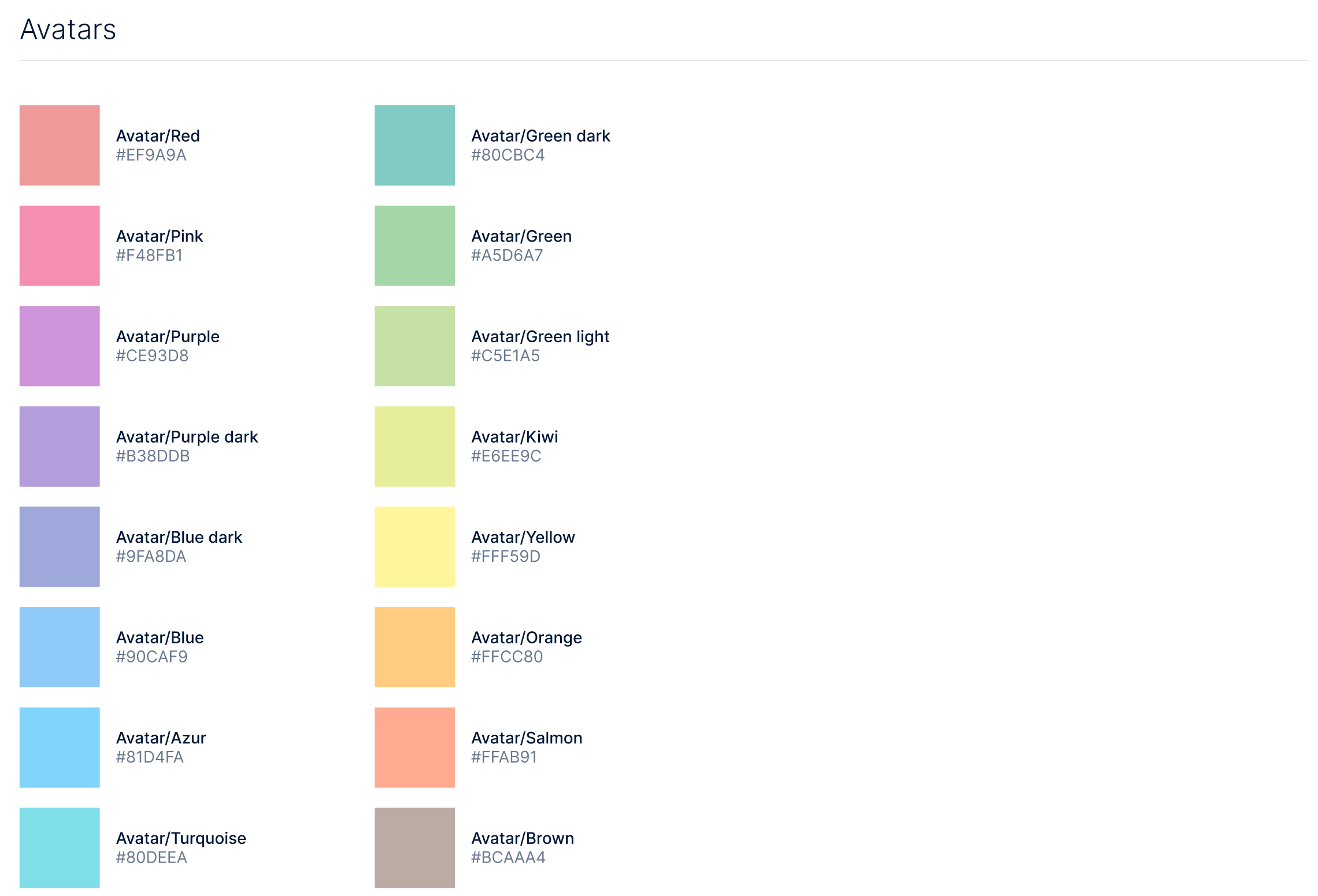
The color architecture spans brand, primary, secondary, and neutral palettes, plus utility colors for error, success, warning, and focus states, every swatch documented with its hex value and intended usage. Dedicated palettes cover chart tones, monoline icon colors, and avatar colors, so even data visualization and identity surfaces stayed consistent across products.
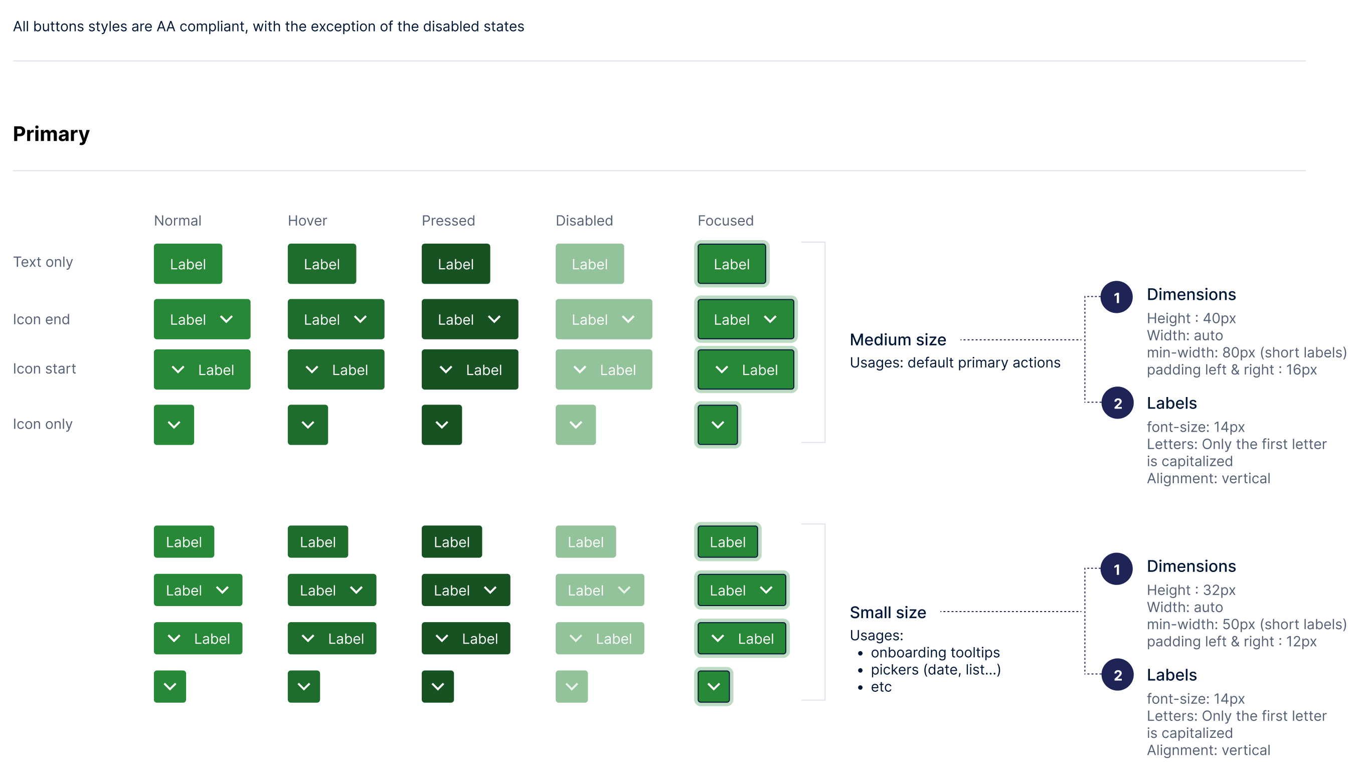
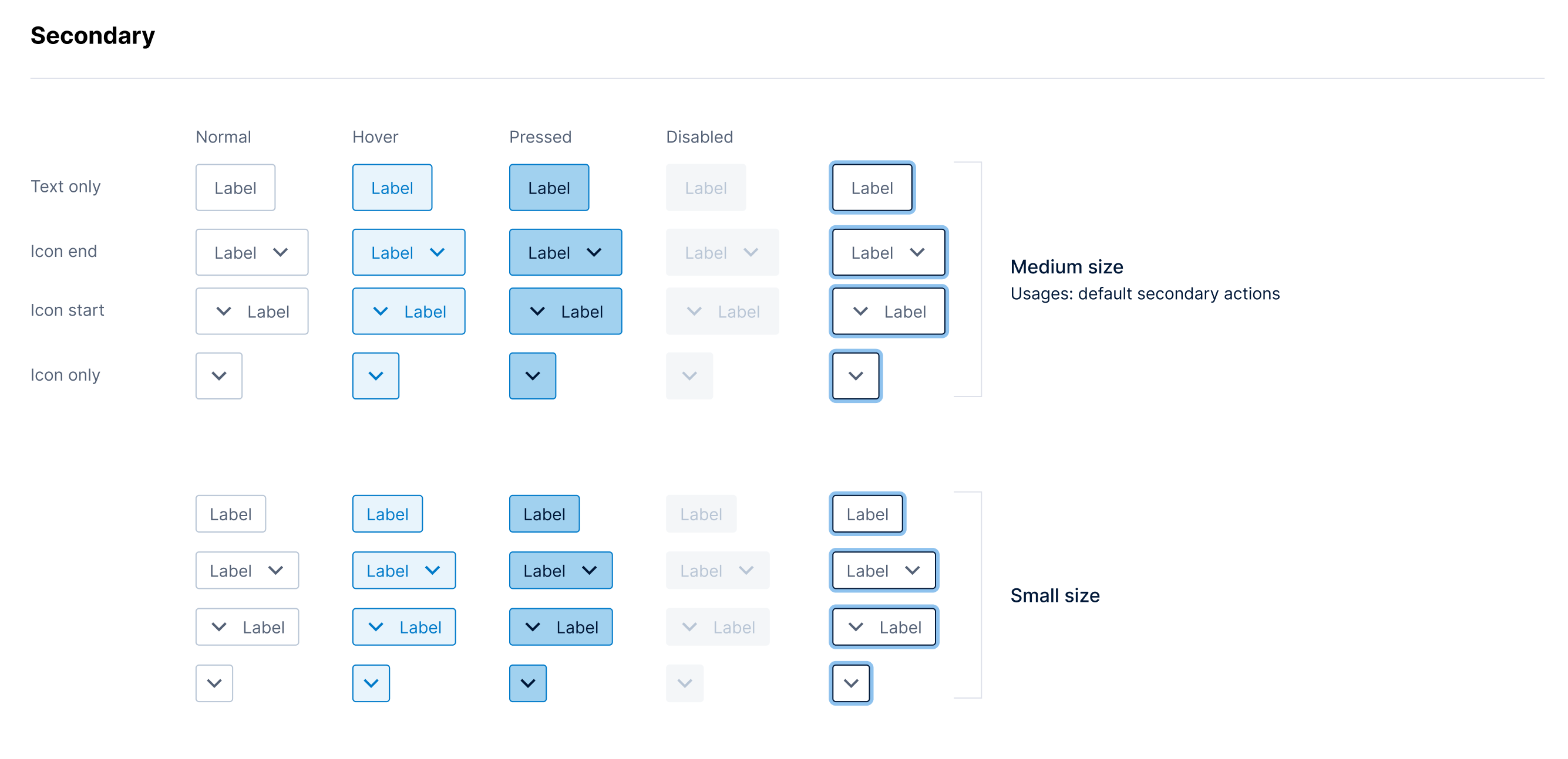
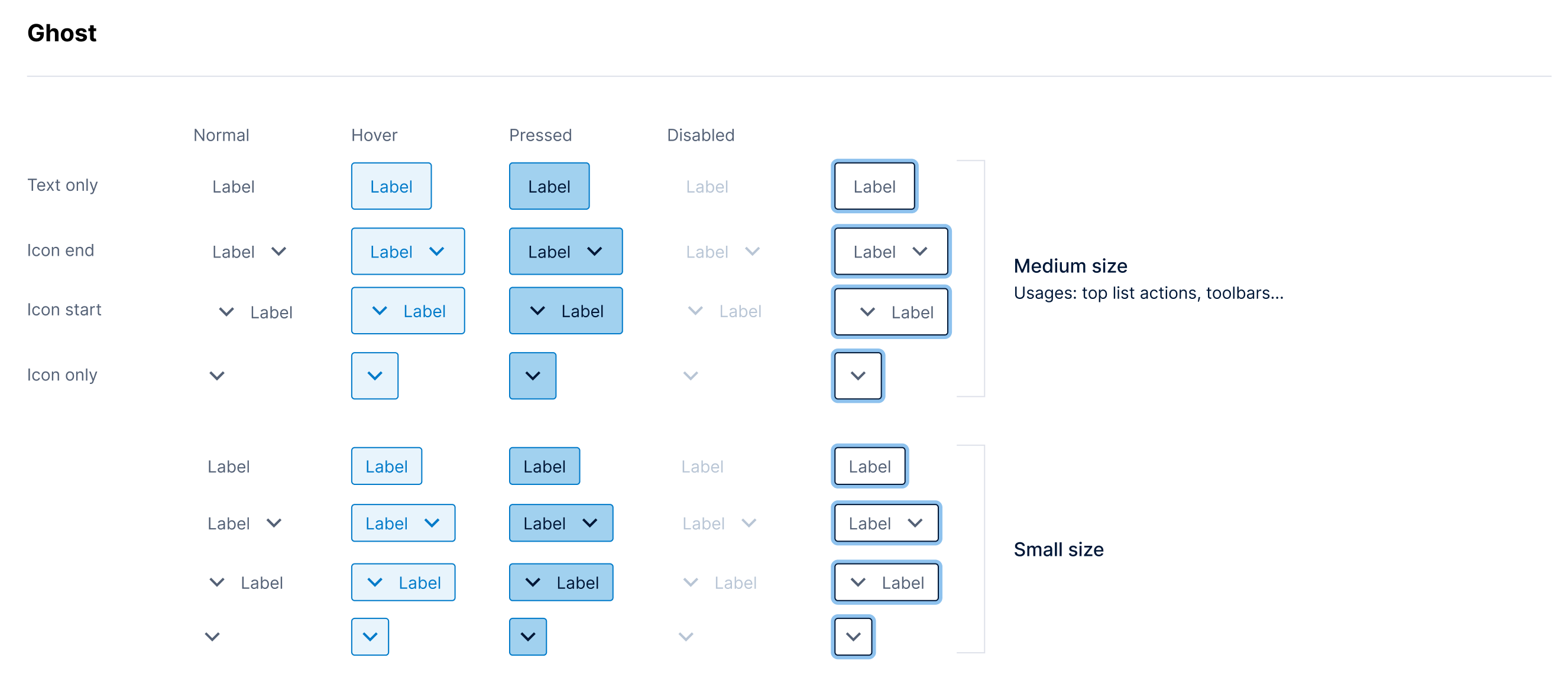
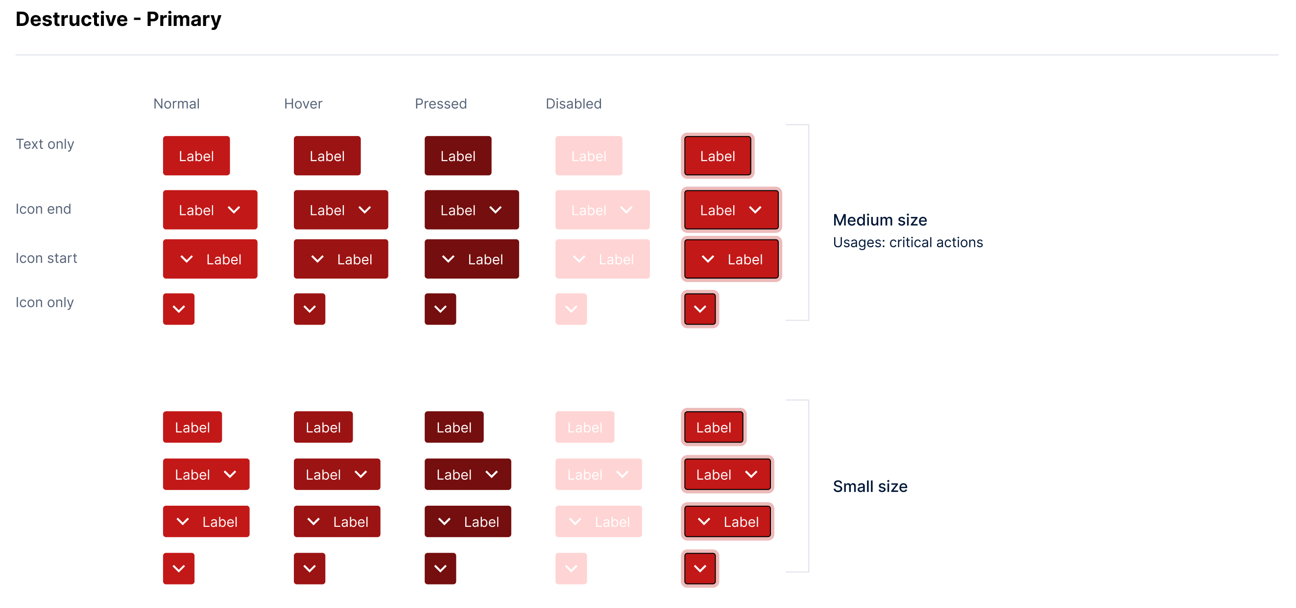
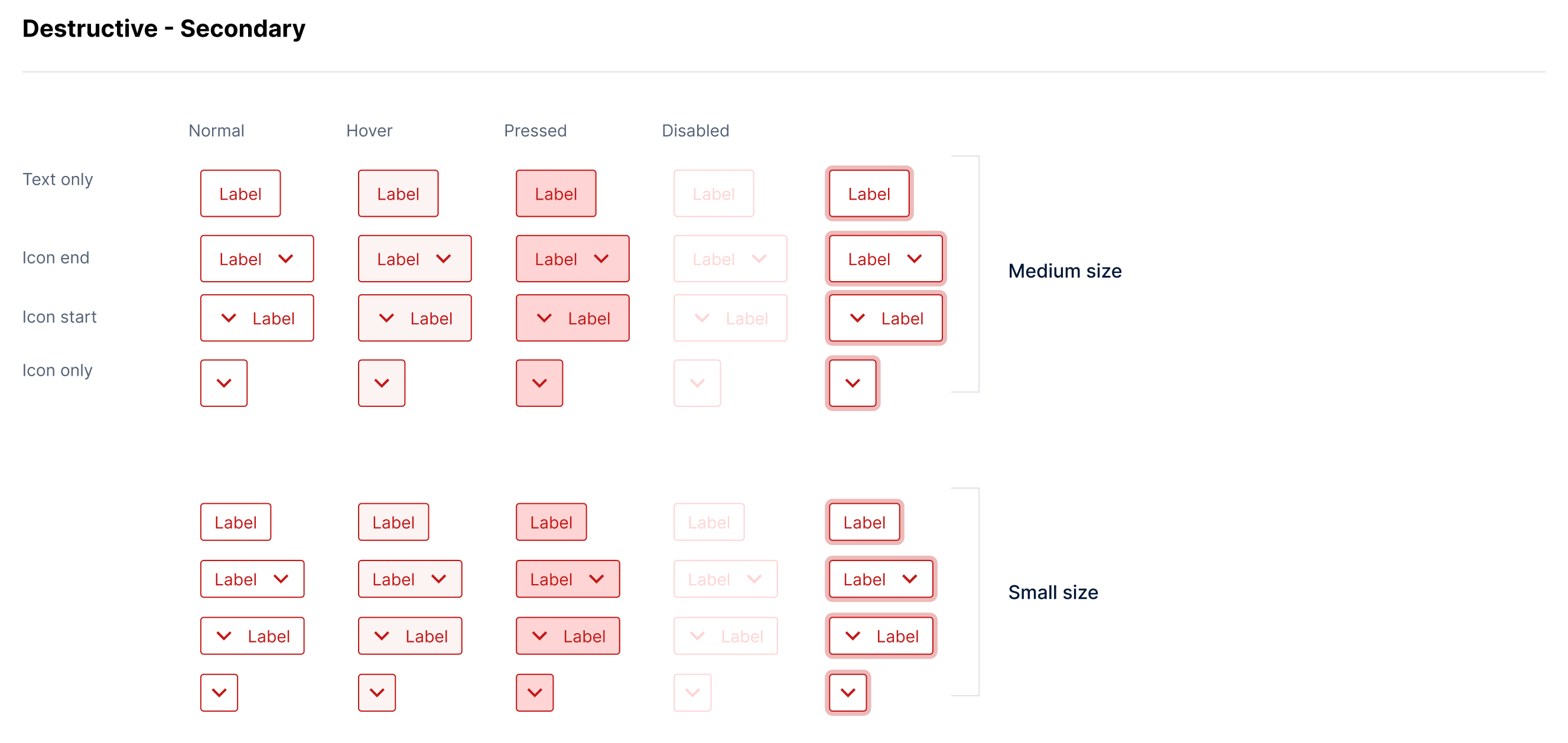
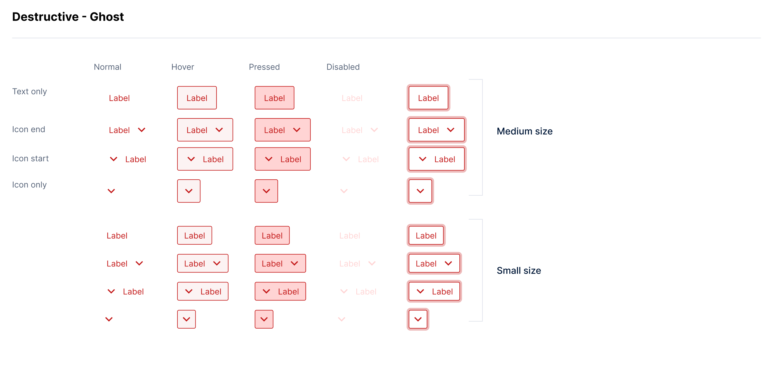
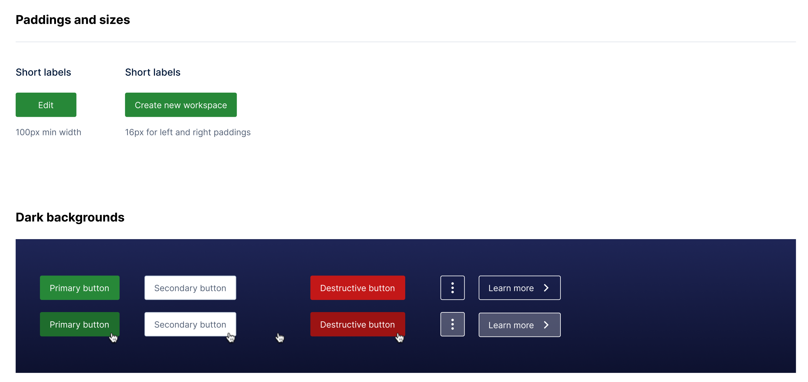
The button system rounds out the foundations: primary, secondary, ghost, and destructive variants, each specified across normal, hover, pressed, disabled, and focused states in two sizes, with icon placements, padding and min-width rules, and dark-background treatments. All button styles meet WCAG AA contrast except disabled states.
2. Information Architecture & Way-Finding
I defined the IA standards every application had to honor:
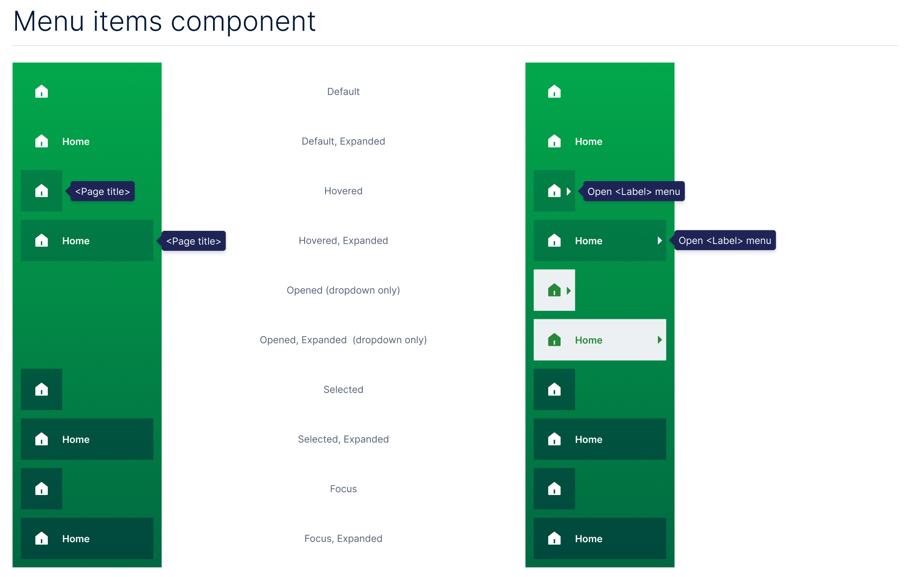
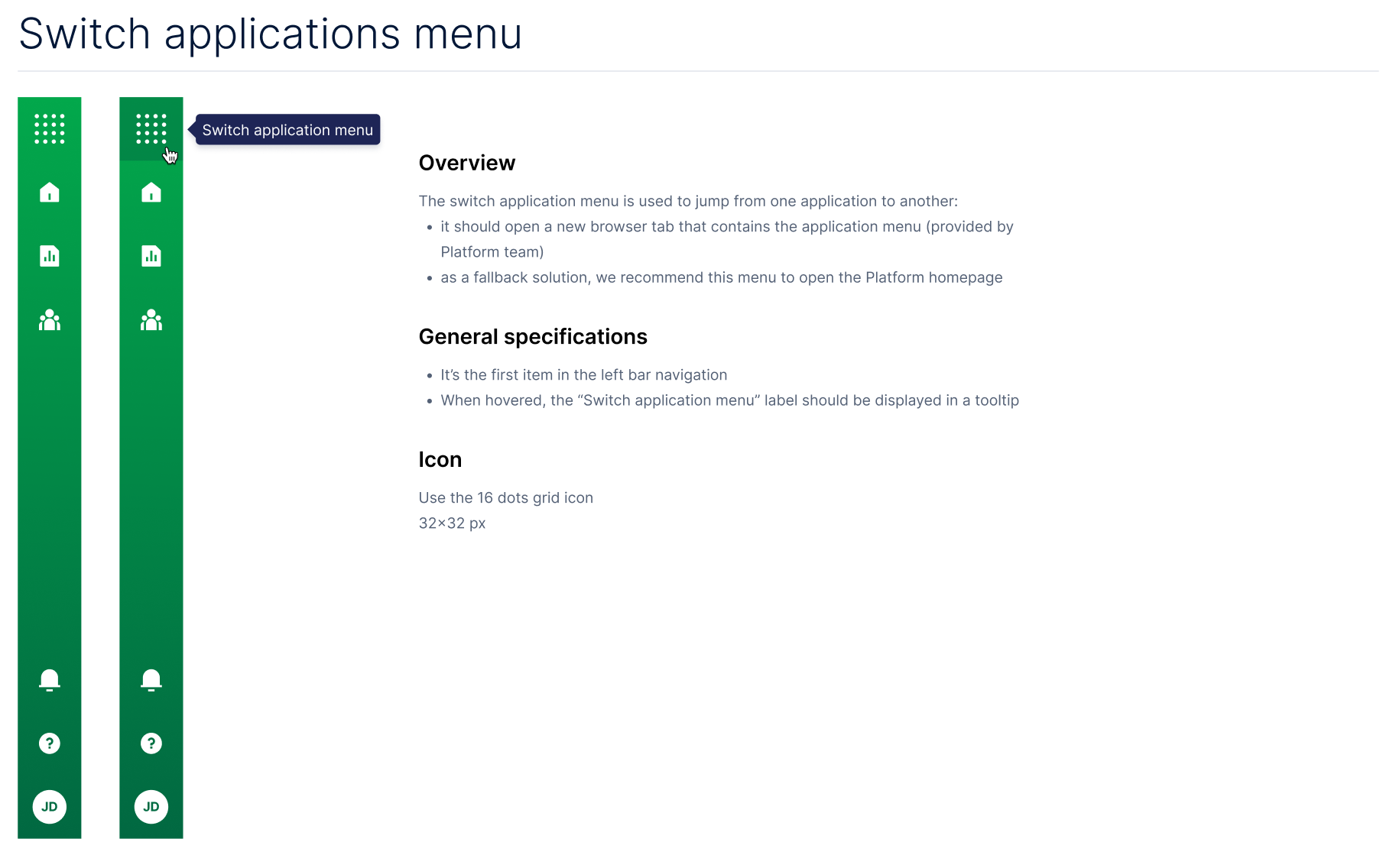
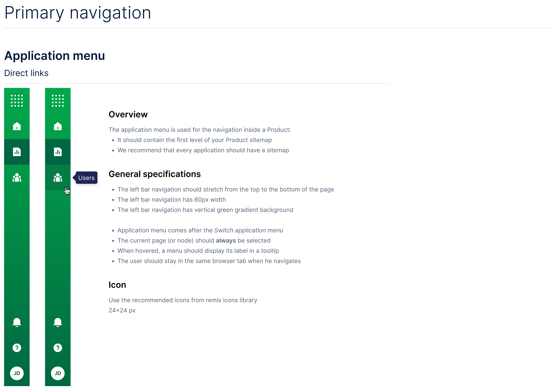
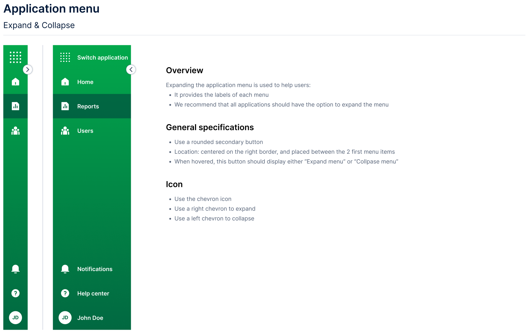
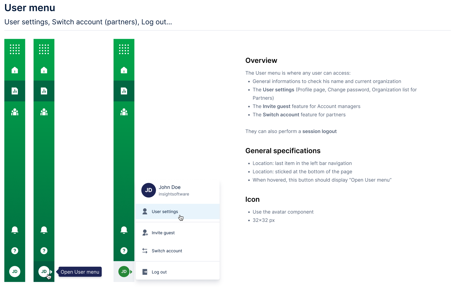
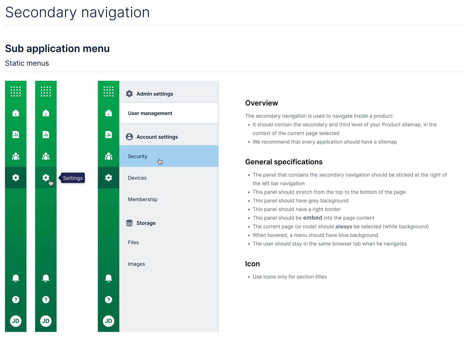
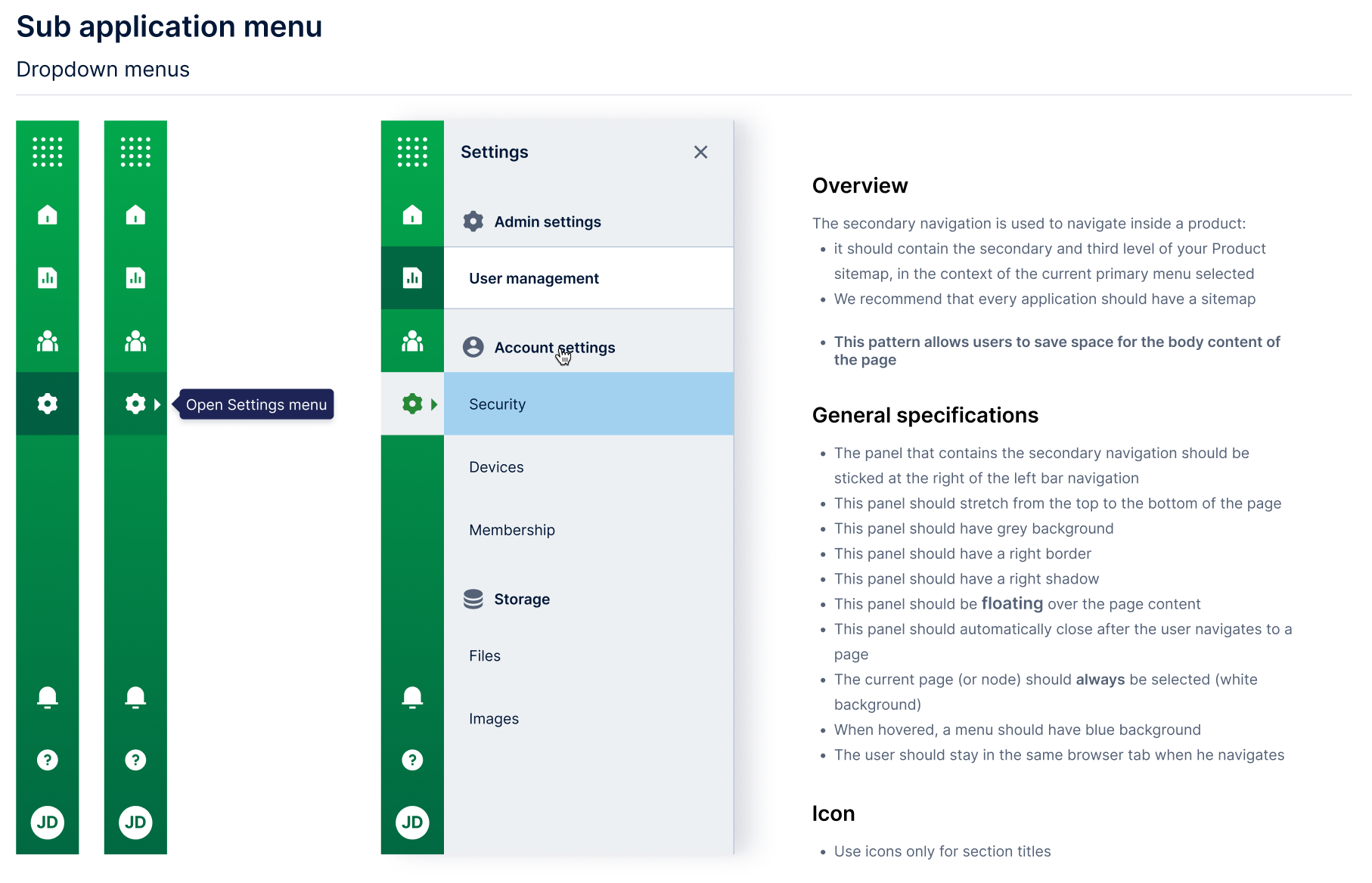
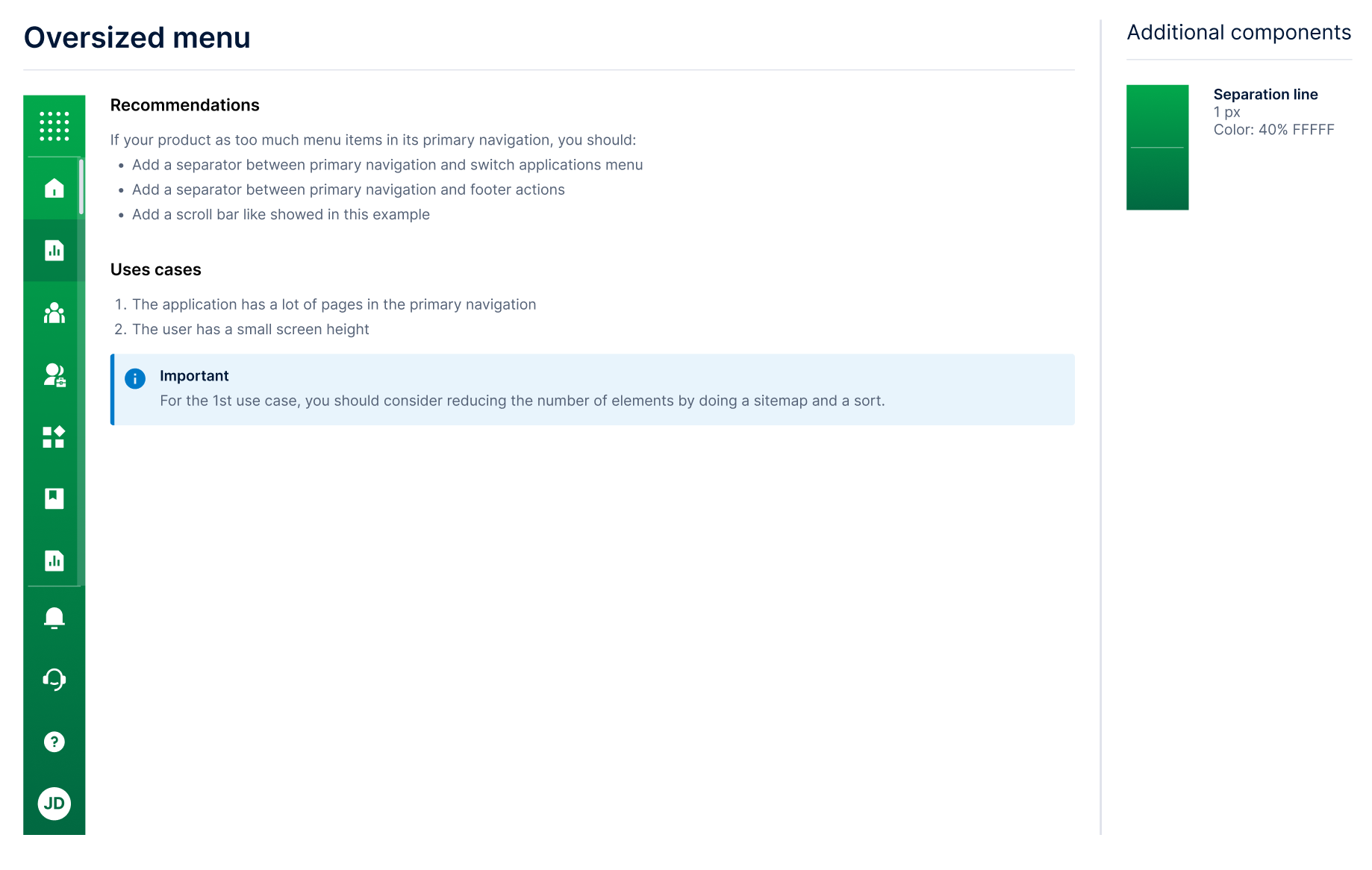
- Primary navigation: top-level sections of an application, anchored to the left rail with consistent iconography.
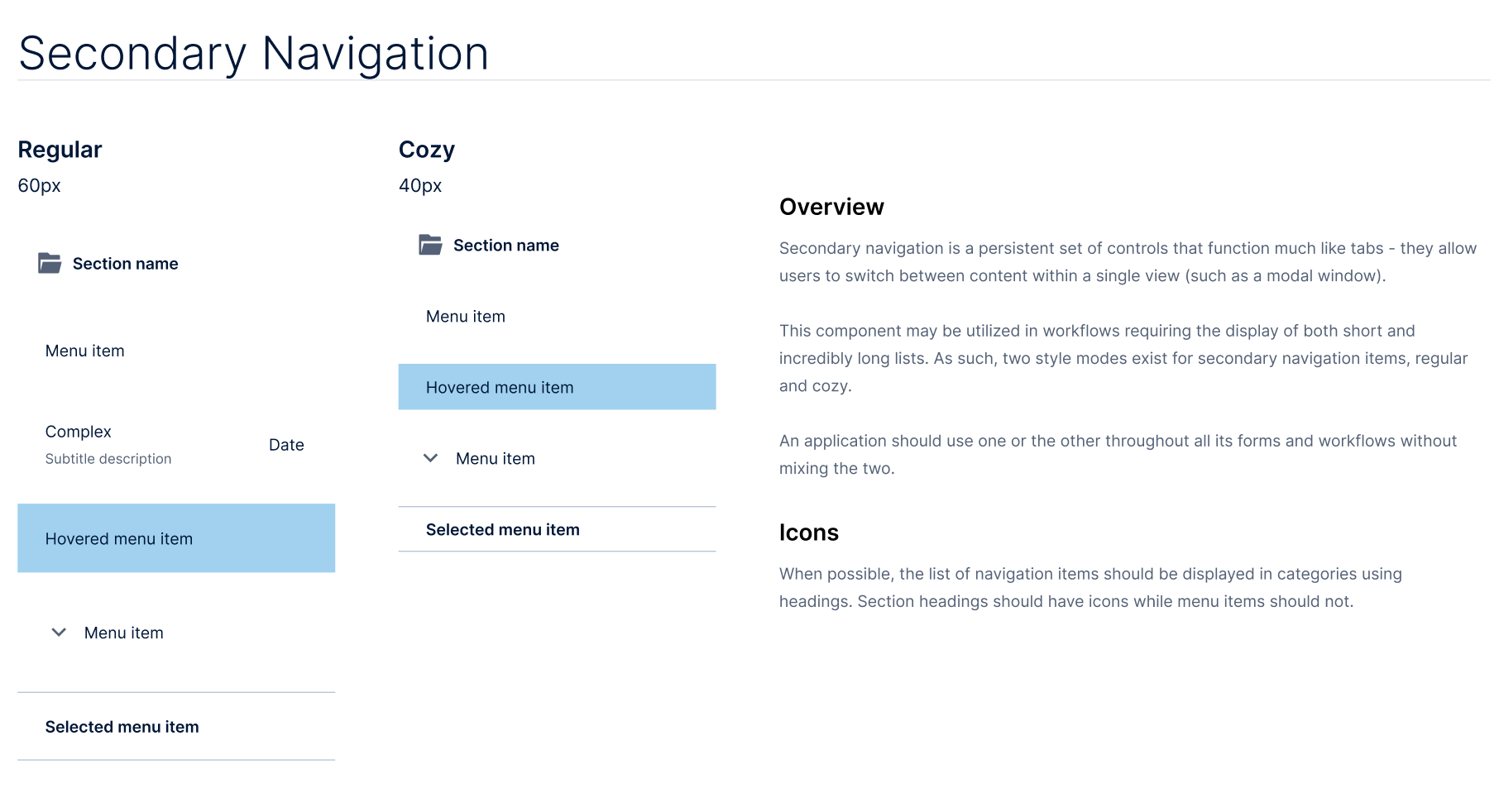
- Secondary navigation: sub-sections, surfaced contextually based on the primary section selected.
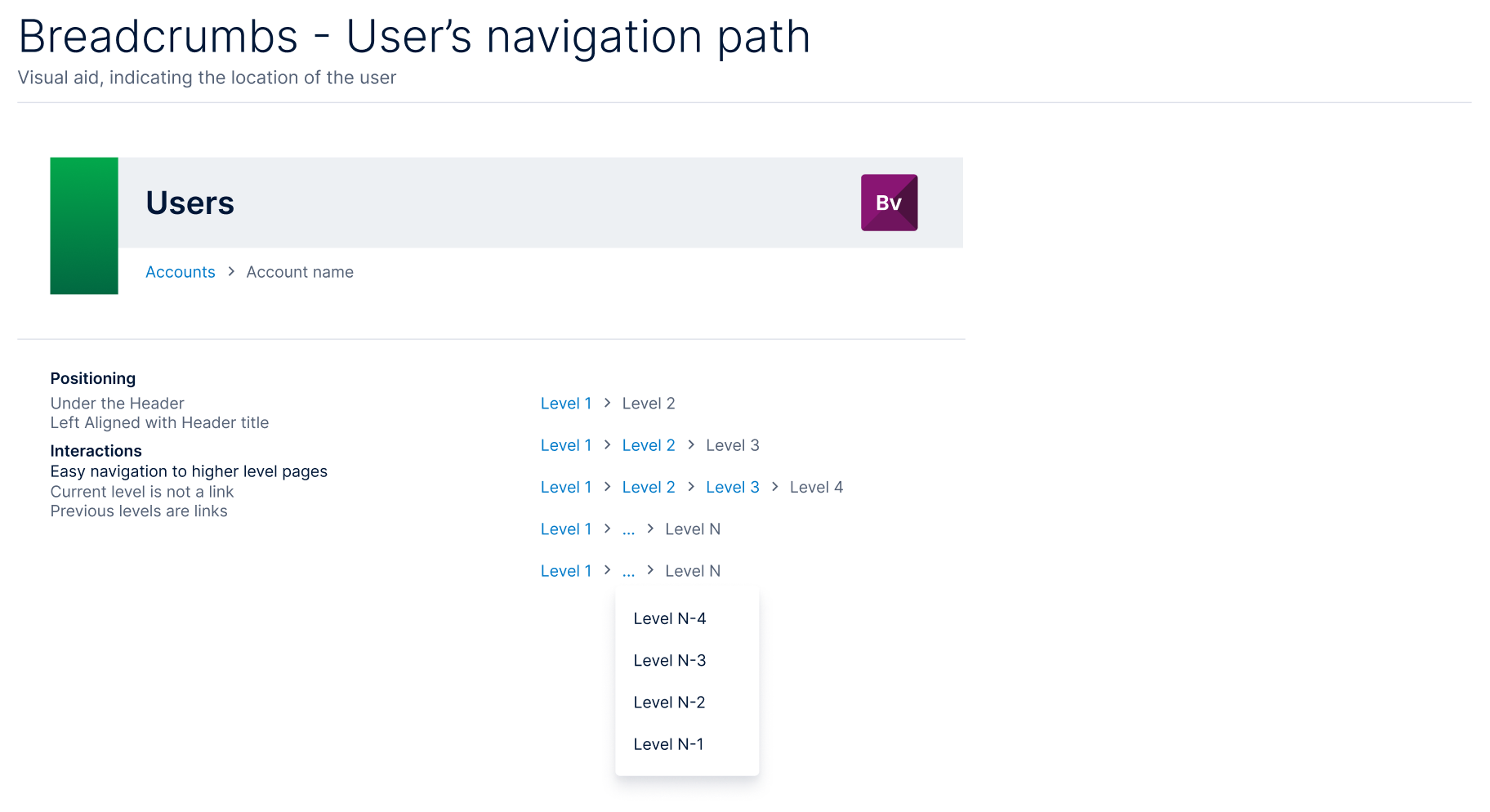
- Breadcrumbs: the user’s location-trail through deep hierarchies, with documented truncation rules.
- Page headings: standardized layout and metadata zones so users could orient themselves on any screen in any product.
- Workflow state surfaces: where, when, and how to expose task state, claim status, or pipeline progress.
These were not suggestions. They were contracts. Application teams had latitude inside their primary sections to solve their domain problems, but they could not redefine where navigation lived, how it behaved, or how state was surfaced to the user.
3. Announcements & Notifications
Keeping users informed was a contract, not a per-product decision. I designed a coordinated notification architecture with a distinct surface for each level of urgency, used identically in every application:
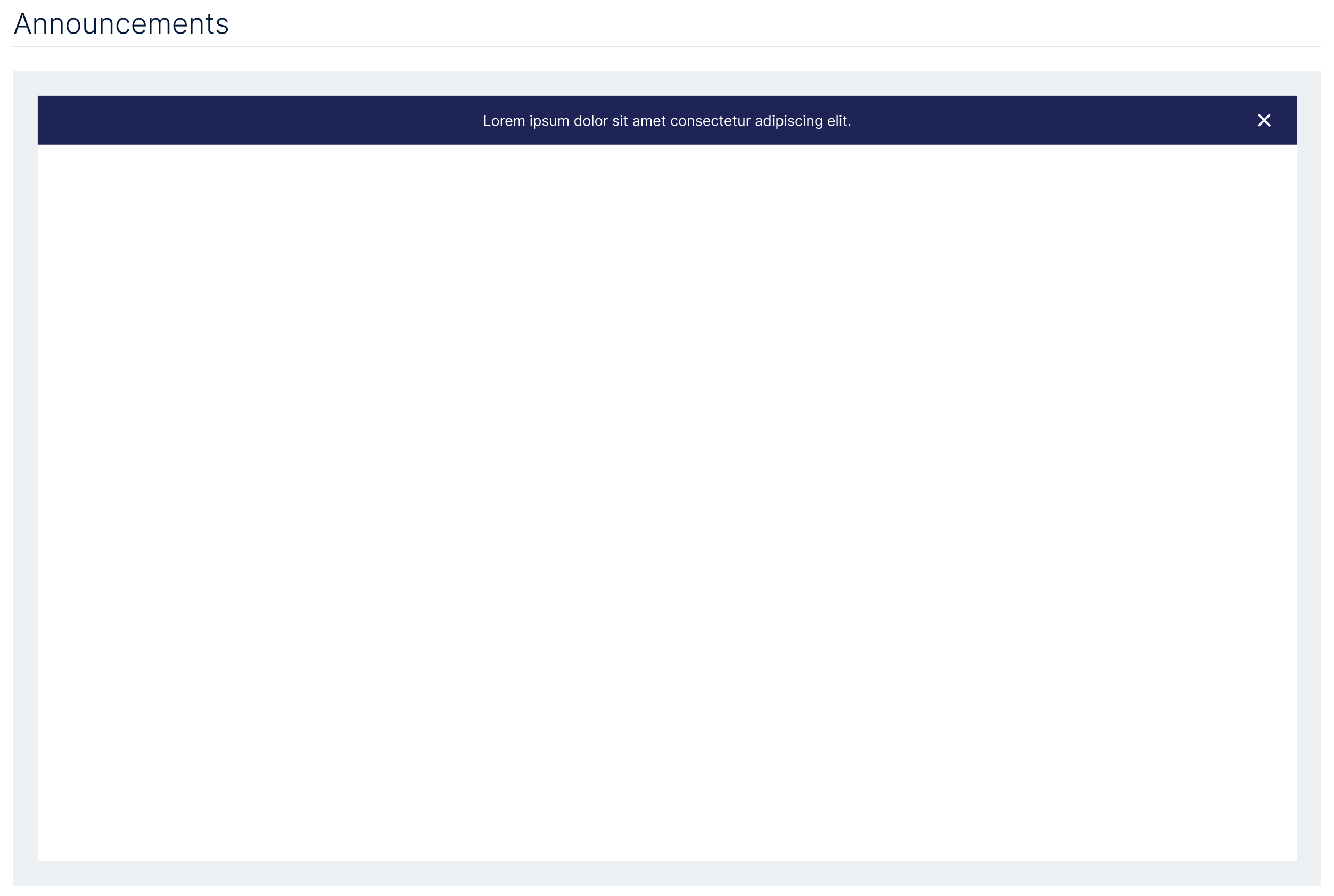
- Announcements: a dismissible platform-level banner for system-wide messages.
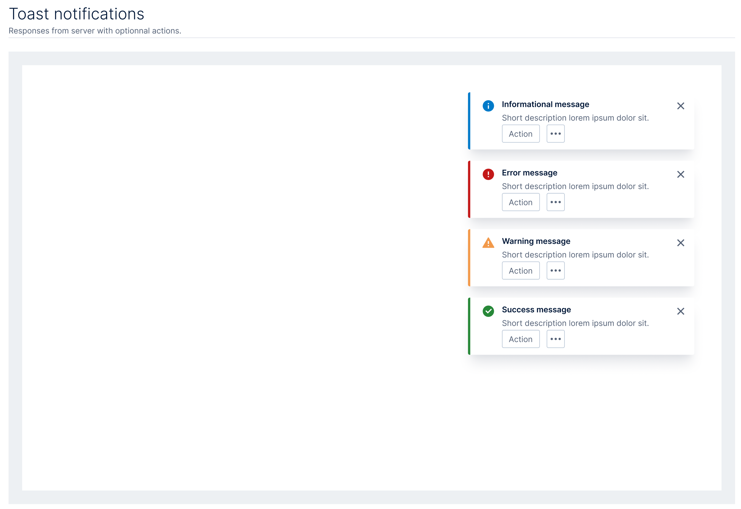
- Toast notifications: transient responses from the server (informational, error, warning, success) with optional actions.
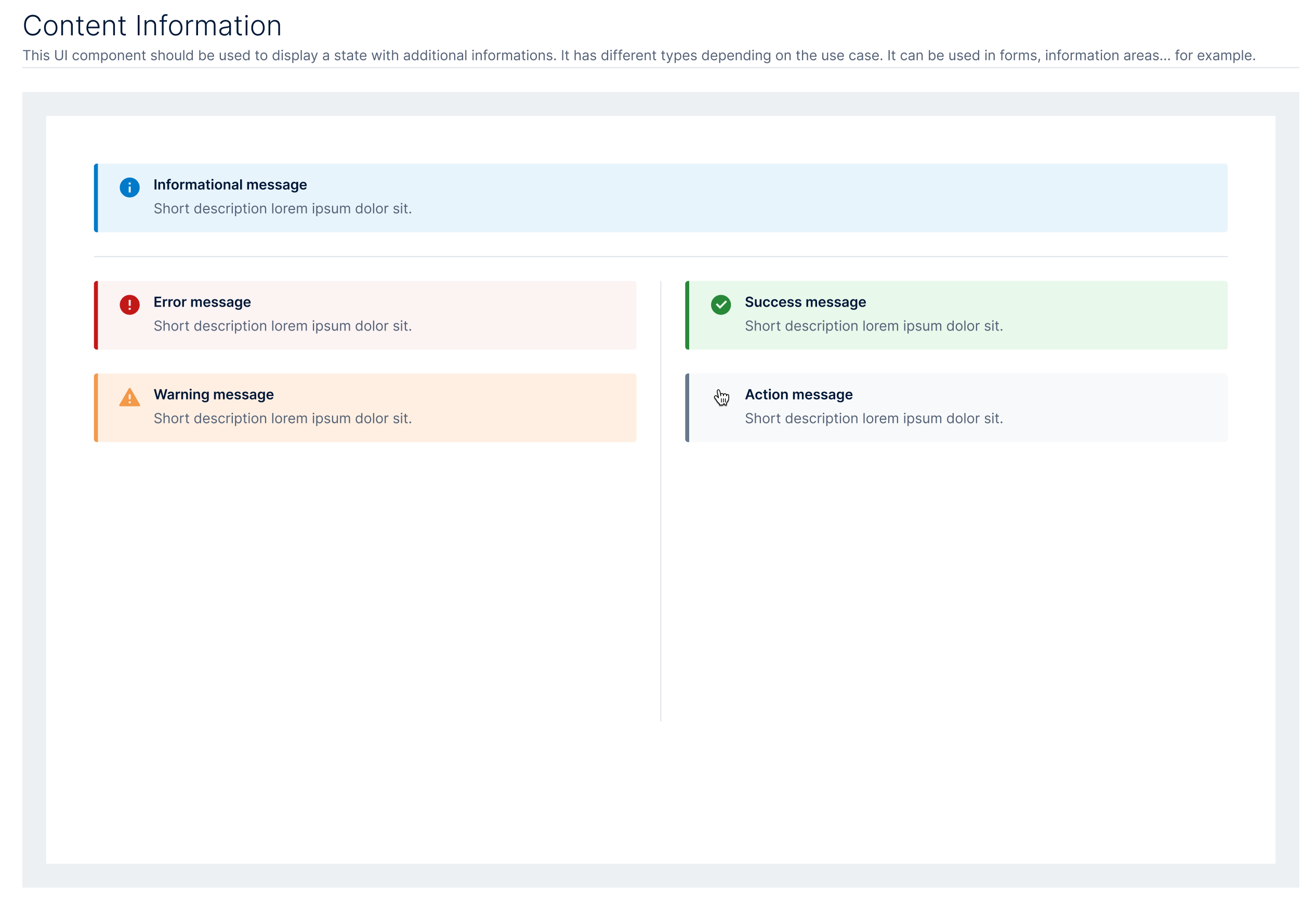
- Content information: persistent inline messages that surface state inside forms and information areas.
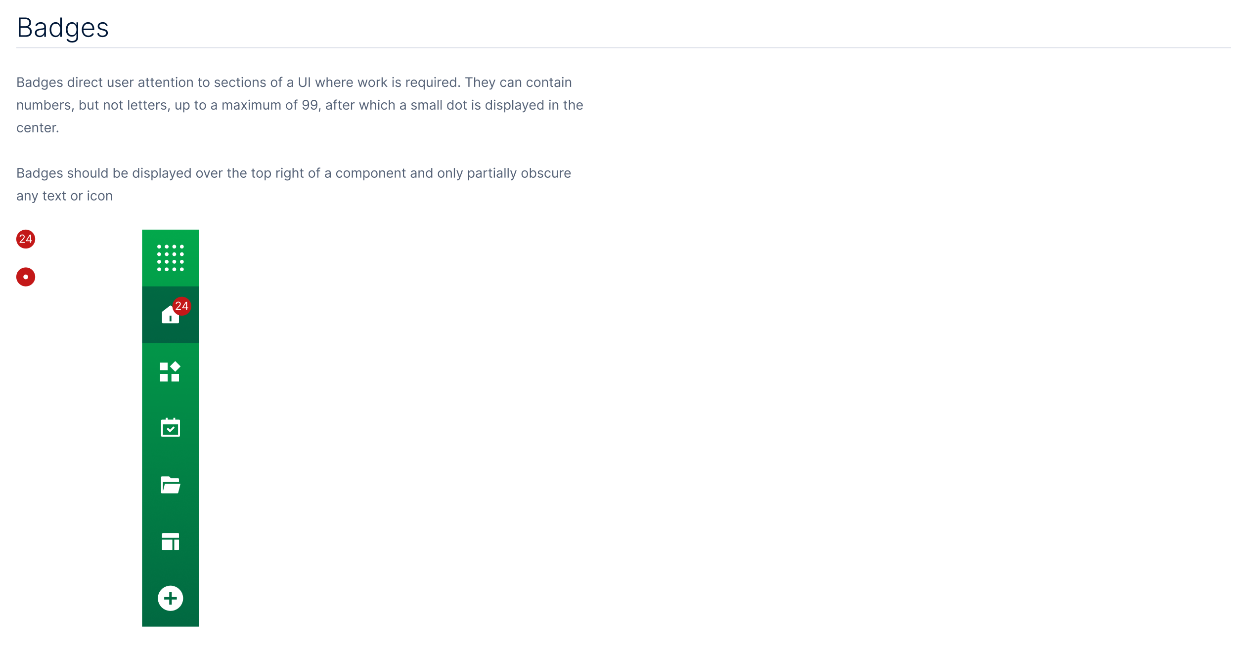
- Badges: numeric counters on the navigation rail that direct attention to where work is required (up to 99, then a dot).
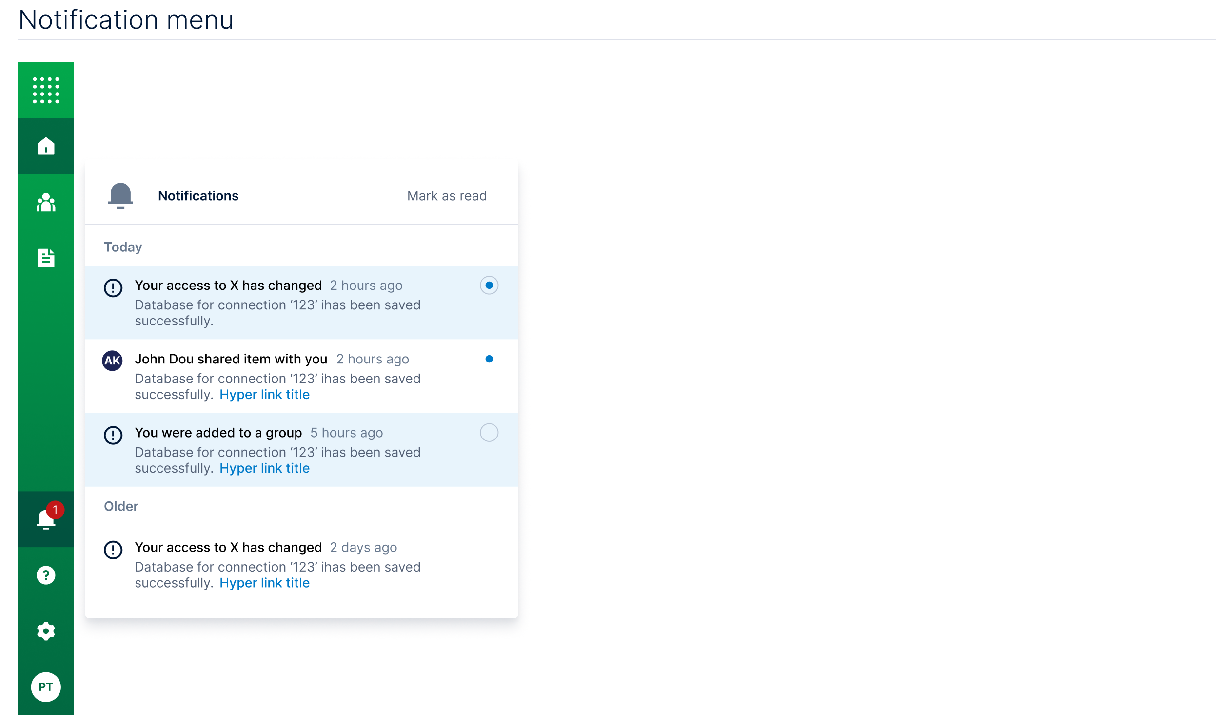
- Notification menu: a persistent inbox on the rail, grouped by recency, with unread indicators and mark-as-read.
Because the surfaces and their meanings never changed between products, users always knew where to look for what mattered, and application teams never had to re-invent messaging patterns.
4. Data Tables
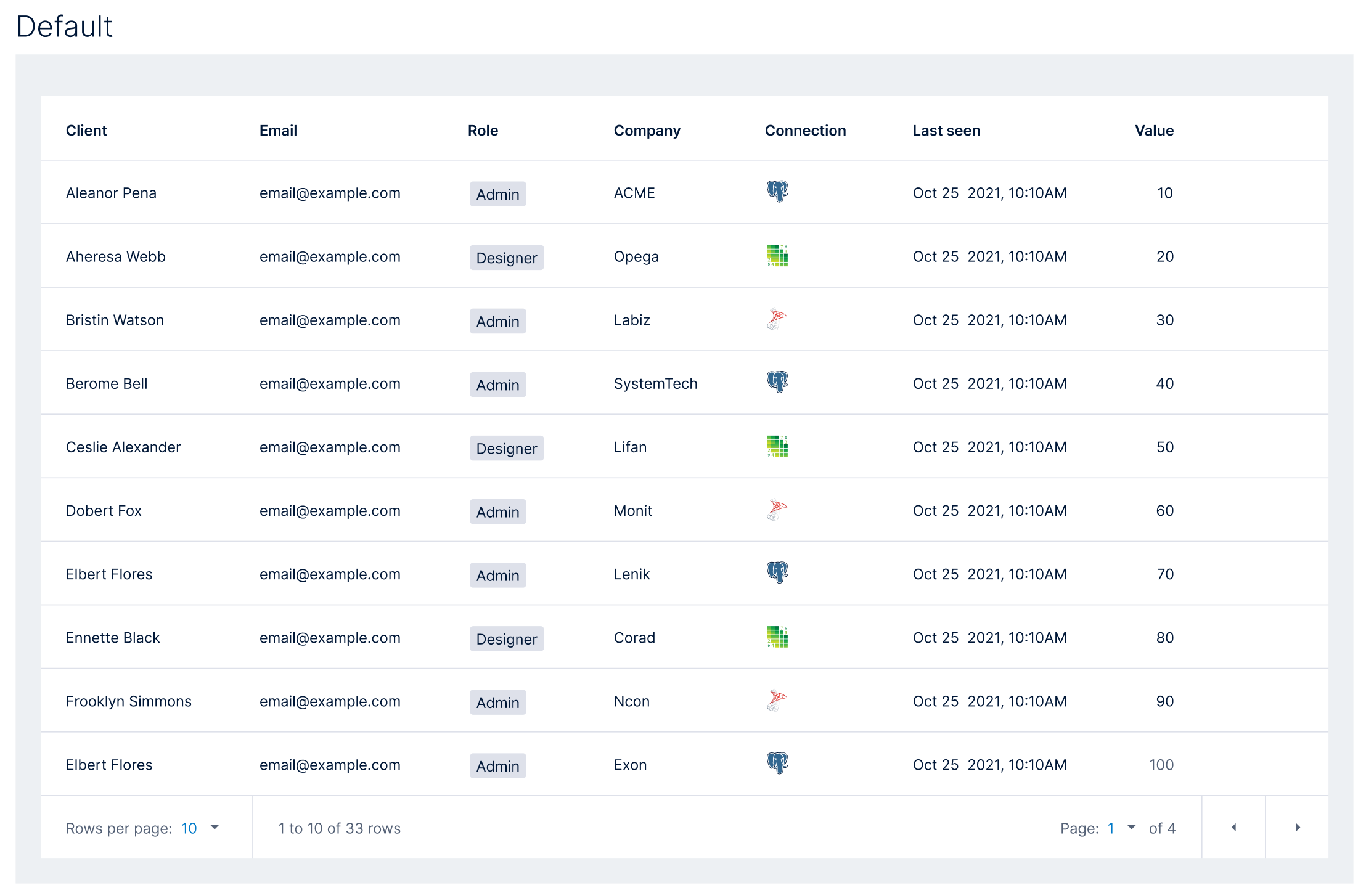
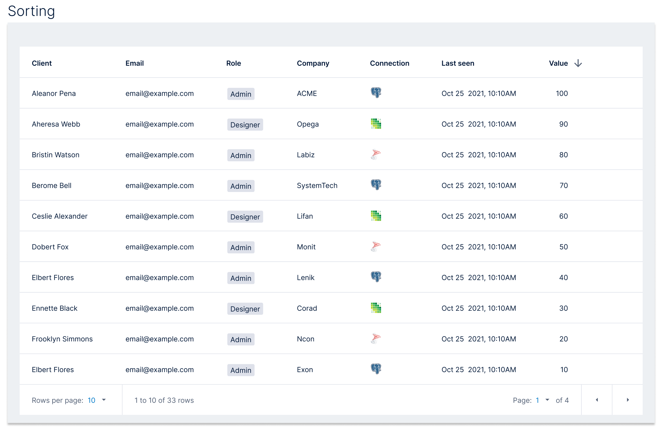
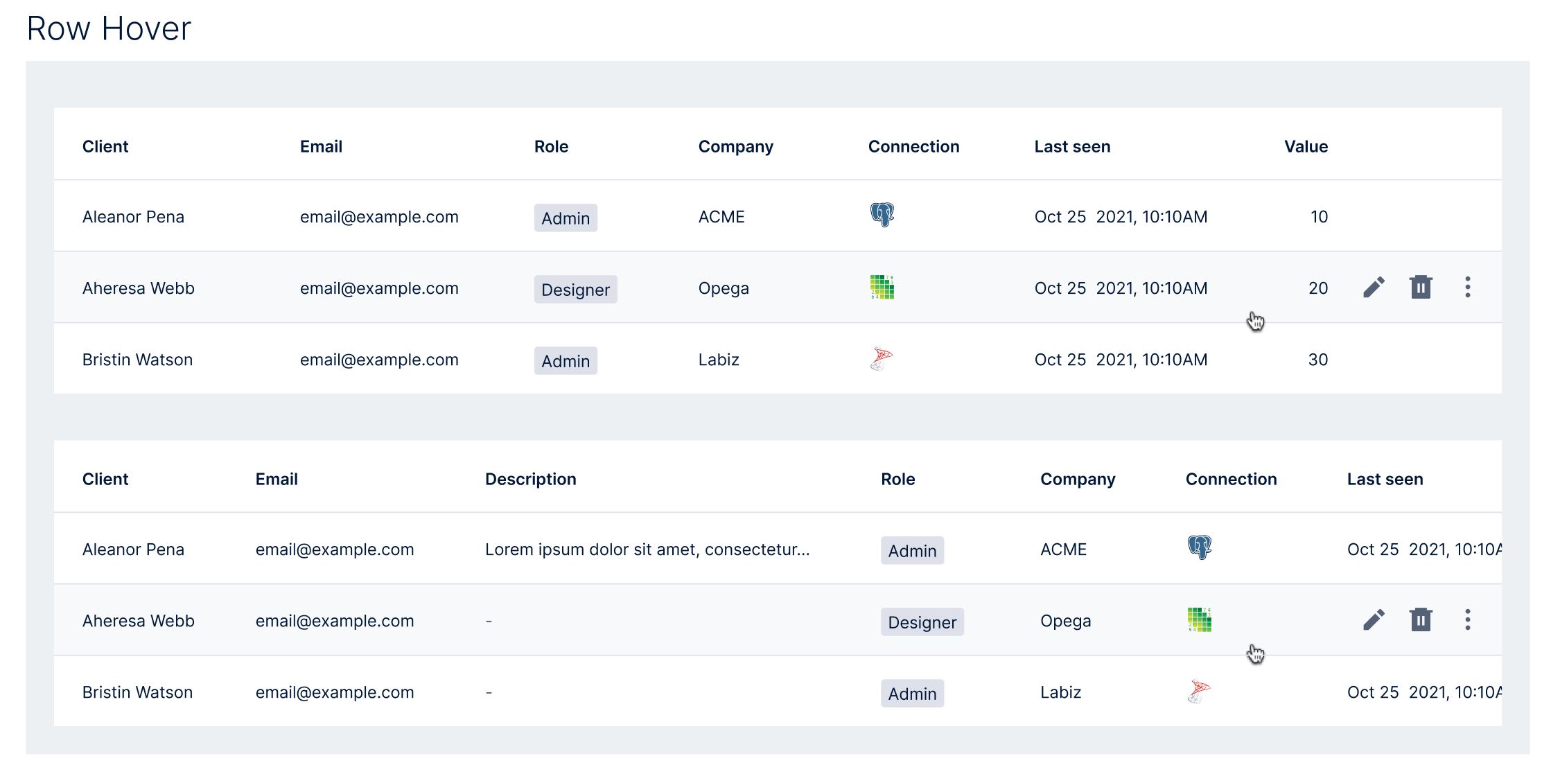
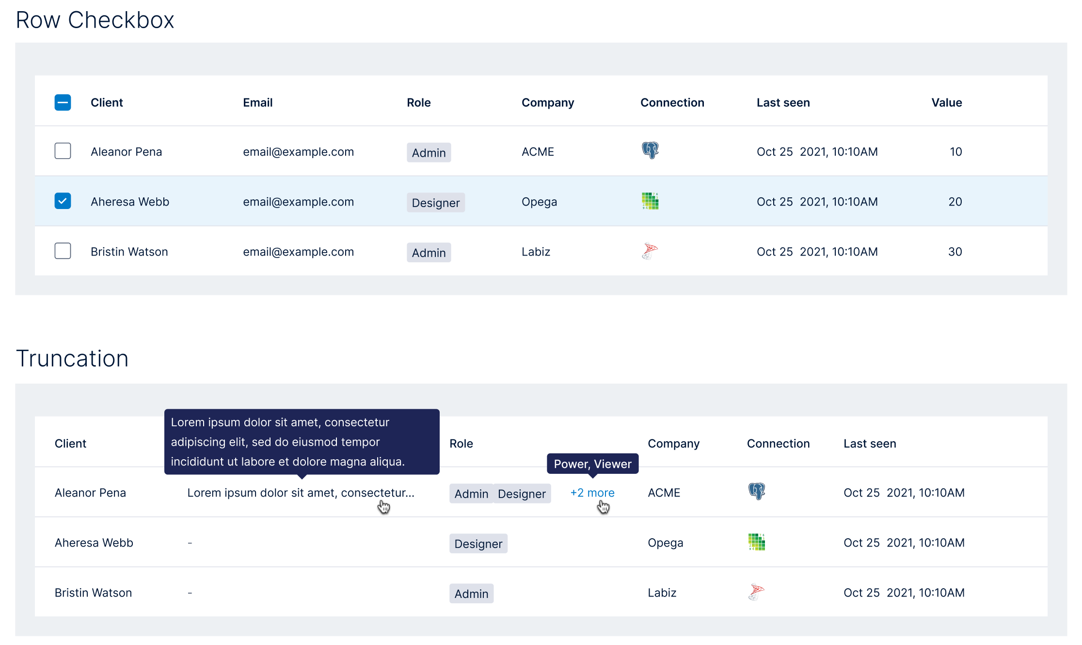
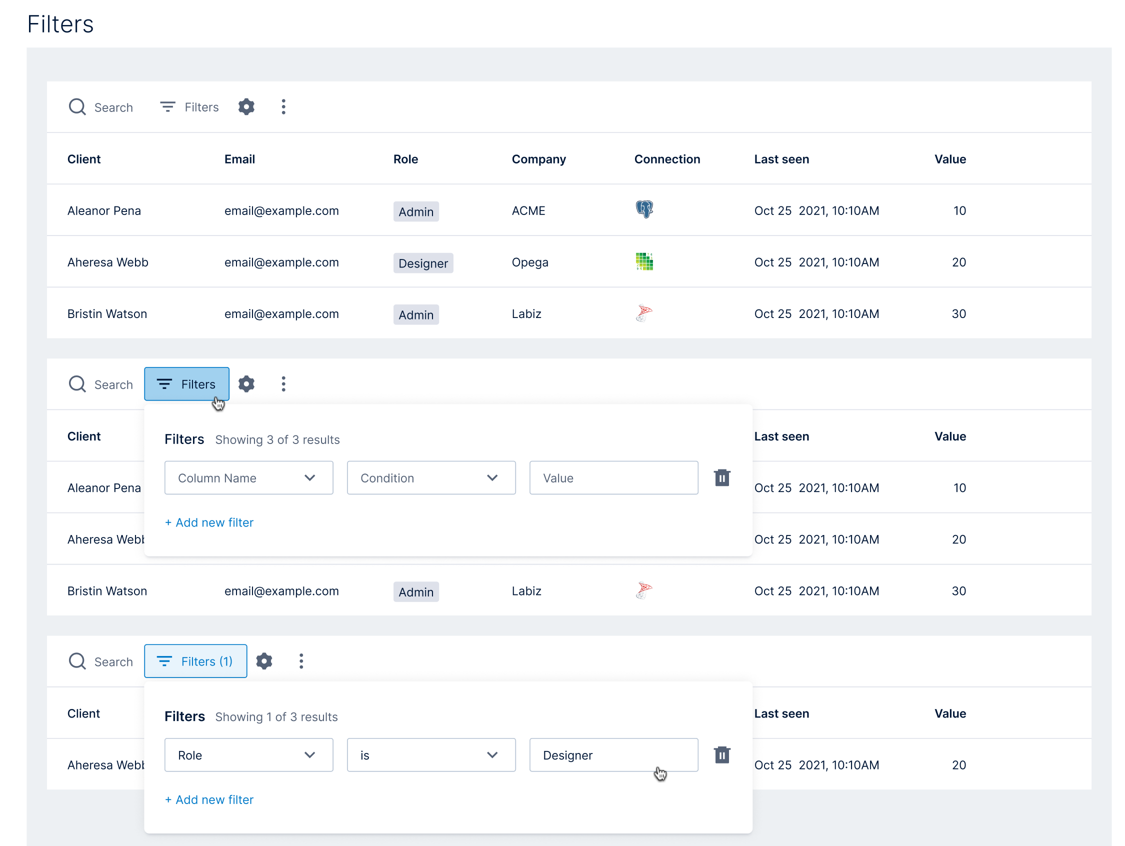
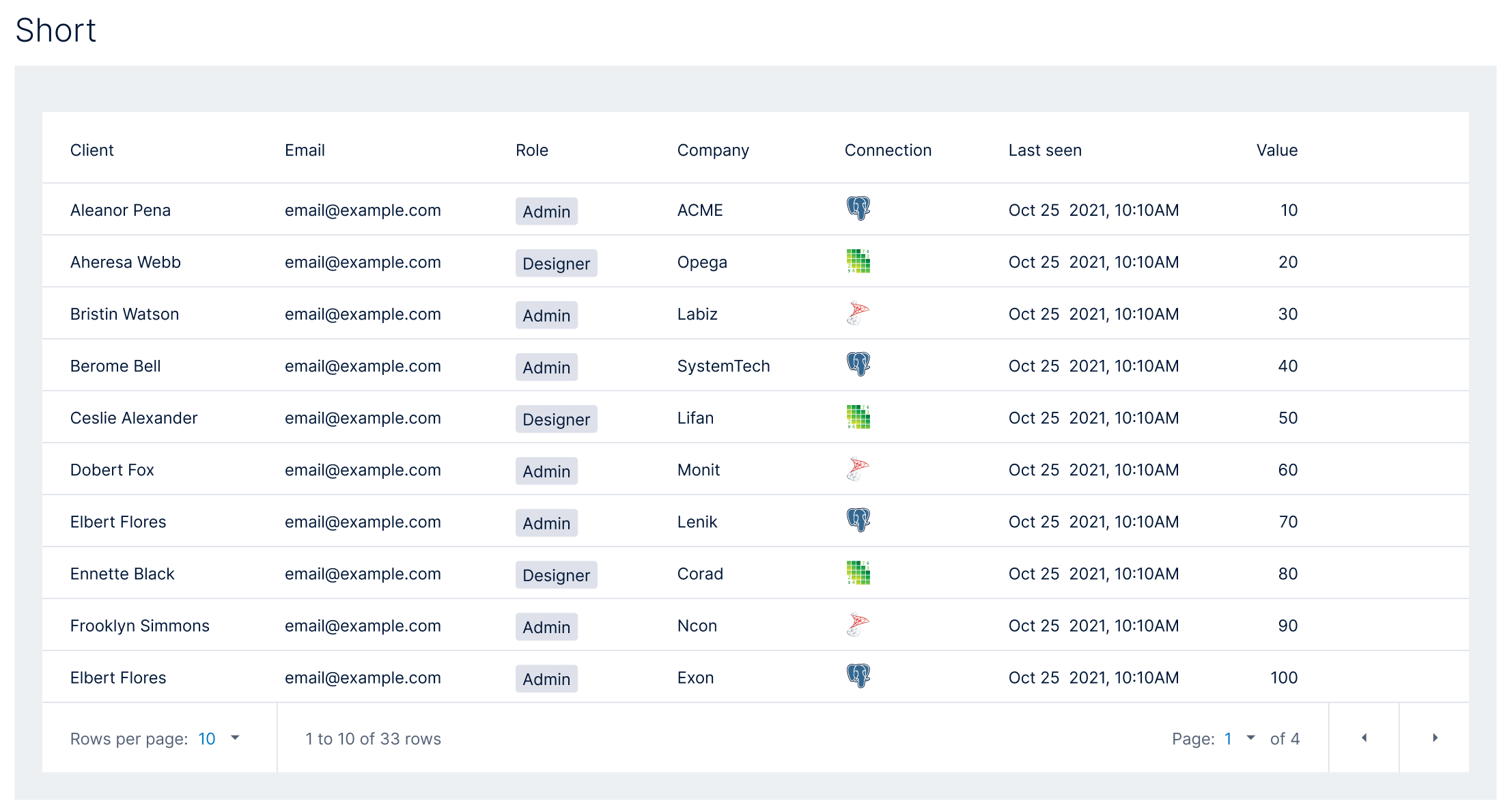
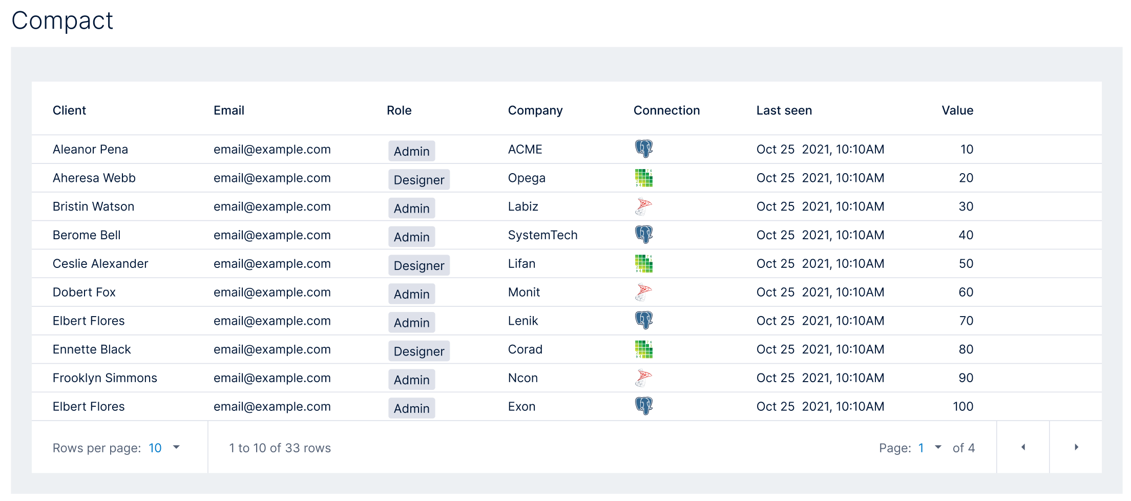
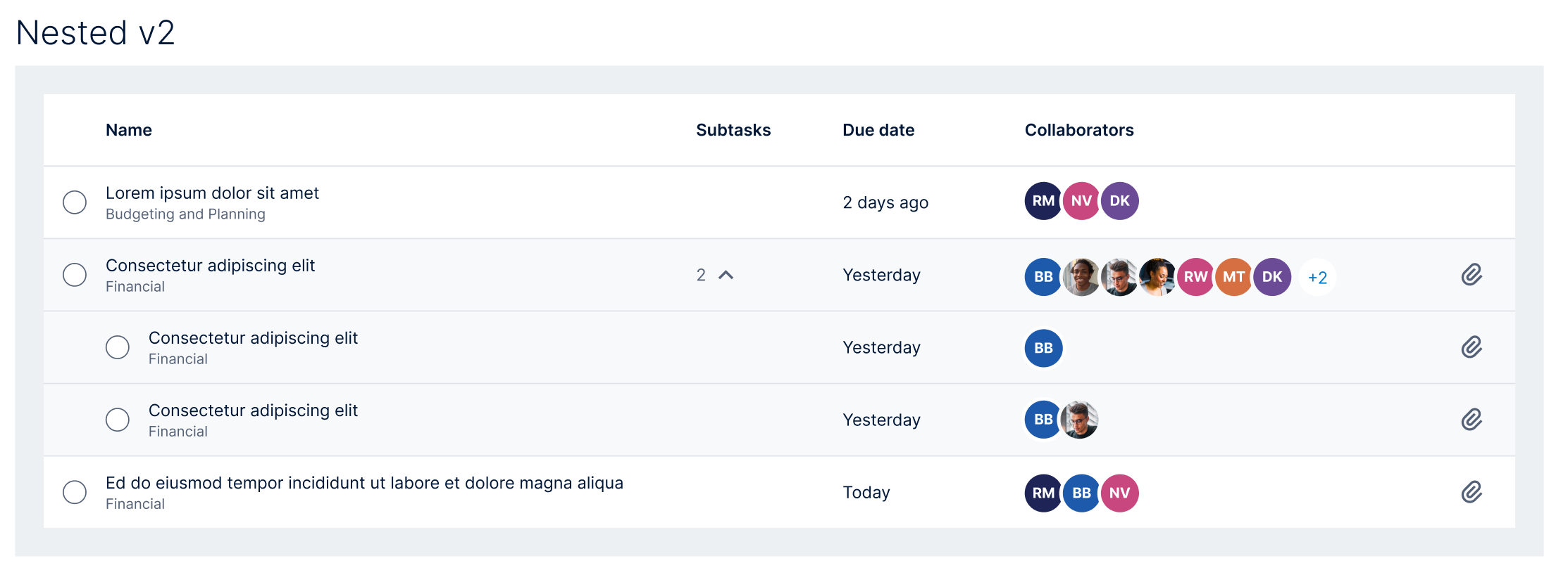
Data tables were the workhorse of the portfolio: nearly every application presents records in a grid, so the table had to be the most thoroughly specified component in the system. I designed a single table component with three density modes (default, short, and compact) and documented every behavior application teams needed:
- Sorting on any column, with clear directional indicators.
- Row hover actions: edit, delete, and overflow actions revealed in context.
- Row selection: checkboxes with an indeterminate select-all state for bulk operations.
- Truncation: long text and overflowing tag sets collapse gracefully, with tooltips revealing the full content.
- Search & filters: a filter builder (column, condition, value) with result counts and stackable criteria.
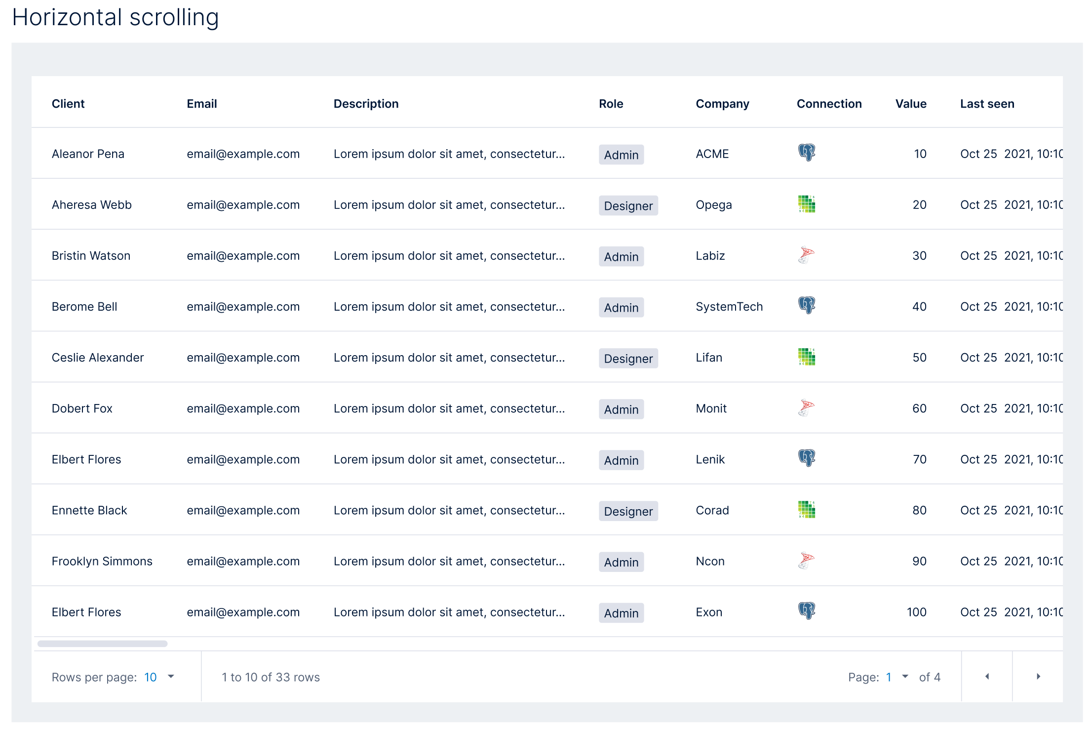
- Horizontal scrolling for wide datasets, and pagination with configurable rows per page.
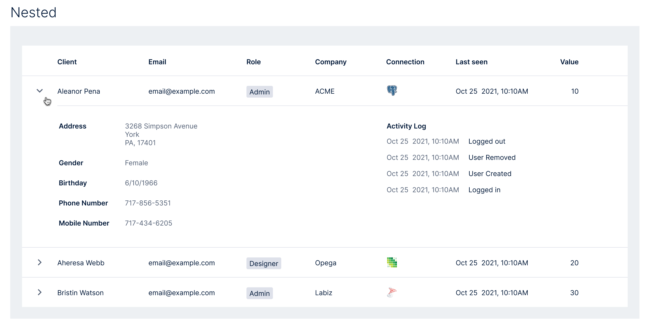
- Nested rows: expandable records that reveal detail panels or subtasks inline, without leaving the grid.
Key Decisions & Pivot Points
Contracts, not guidelines. The pivotal strategic decision was drawing a hard line between what application teams must honor (navigation placement, way-finding behavior, state surfacing) and what they fully own (everything inside their primary sections). A softer “recommended patterns” posture would have been easier to socialize and would have failed; acquired teams with existing roadmaps rationally deprioritize recommendations. Making the small set of structural rules non-negotiable, and everything else autonomous, is what made both halves credible.
Three table densities instead of one. The table component originally specified a single density. Application teams with data-heavy domains pushed back; their users live in grids all day and a comfortable default wasted their screen. Rather than let each team fork the table (the exact drift the system existed to prevent), I absorbed the requirement into the contract: three documented density modes, one component. The lesson generalized: when a team pushes back on a standard, the standard is usually missing a variant, not an enforcement mechanism.
The pattern that stalled: vertical navigation affordances. The state matrix for navigation buttons (hovered, selected, focused, enabled, disabled) was the easy part. What stalled us was the behavioral variety hiding inside the portfolio’s vertical navs: some teams had calls to action living in the nav that functioned like context menus; others had items that opened sub-pages. Same rail, same visual container, fundamentally different affordances, and no way for a user to tell them apart before clicking. Shoe-horning chevrons and carets into the vertical nav to signal those differences was a creative challenge we did not take lightly, because navigation is the one surface every user of every product touches, and once implemented, the affordance language would become an enduring pattern that every future application inherited. We deliberately moved slowest exactly where a quick answer would have standardized ambiguity.
Collaboration
The system was only valuable if application teams adopted it, so the adoption process was the collaboration method, built deliberately, and repeatable:
- Audit existing IA, navigation, and core workflows with the application’s PM lead.
- Map which user journeys fit global patterns and which needed product-specific accommodation.
- Prototype updated navigation against the structural standards, including non-ideal states and role-specific scenarios.
- Scope & prioritize: hand engineering a clear, sequenced backlog tied to release planning.
- Implement: stay embedded through development, reviewing builds against spec and resolving edge cases.
- Validate against role-based access scenarios, multi-tenant data, and the full state matrix.
I designed the process this way because of what adoption efforts usually die of: application teams were not asked to absorb a 200-page guideline document and figure it out. They were given a partner, a sequence, and a clear definition of done. Resistance dropped because the process respected their roadmap and their domain expertise; and because I stayed embedded through implementation rather than handing off at spec, the teams never faced a gap between what the standard said and what their edge cases needed.
Outcomes
Business Impact
- Adopted across all 17 enterprise applications spanning three business units (reporting, accounting, data & analytics), including subsequent acquisitions, which onboarded against the framework without bespoke design re-litigation.
- The strategic outcome was cohesion itself. The portfolio stopped presenting as a collection of acquisitions and came together as one platform, repositioning the company to compete as an integrated platform leader rather than a bundle of point products. For a business whose growth model is acquisition, that coherence compounds: every future product inherits it on arrival.
User Impact
- Users licensing multiple products now orient instantly in any application: navigation, notifications, and state surfaces live in the same place with the same meaning, everywhere.
- WCAG AA accessibility baseline with documented contrast pairings for every neutral, brand, and utility color.
Design Impact
- 28+ documented component and pattern categories shipped in a single source-of-truth Figma library paired with engineering-ready specs.
- Reduced design drift across a large, distributed product organization through governance documentation that codified interaction contracts at the pattern level.
- Established a repeatable adoption framework (the audit → map → prototype → scope → implement → validate sequence) that became the standing playbook for bringing new acquisitions into the platform.
What I’d Do Differently
The system’s Figma library told application teams exactly what to build; it couldn’t hand them the build itself. What I’d do differently is develop Storybook components to accompany the Figma mockups, so applications onboarding into the ecosystem could pull from a shared code base rather than pick and choose how to implement UI styles, or come back to the design team, again and again, for specs on colors and spacing. That would have been the true operational win: specs document contracts, but shared components enforce them. Still, starting with a manual process is how teams learn what the contracts actually need to be, so I was happy to begin with a Figma-based interaction model; it’s a lesson I carried directly into my next design system, where Storybook was the source of truth from day one.