
Precedent’s ecosystem is two purpose-built apps (Claim Companion and Demand Composer) built by two squads, with one designer across both: me. That arithmetic is the origin of this project. Two squads shipping in parallel against one designer’s attention means drift isn’t a risk, it’s the default outcome, unless a system makes consistency cheaper than divergence. The component library existed to make the right way the fast way, and the stakes were the ecosystem’s core promise: two apps that feel like one product.
My Role & Team
I was the Principal Product Designer and the sole designer across both applications, working with 6 engineers split across 2 squads and 2 product managers. I owned the system end to end: the token architecture, the component designs in Figma, the governance process, and (unusually) a working presence in the codebase, building and reviewing components in Storybook myself.
The Problem
Before creating this system, Precedent’s two apps were accumulating UI debt: components rebuilt per-squad, styles drifting between Claim Companion and Demand Composer, and handoffs that leaned on redlines and memory. Every new feature paid a consistency tax: engineers rebuilding patterns that already existed, re-specifying states that had already been decided. Users paid it too: a platform whose two halves disagree on color, status, and controls trains people to distrust both.
The clearest evidence sat in my own backlog: a recurring stream of “UI polish” stories I kept having to write against features front-end developers had already shipped, going in after implementation to clean up the slop. Every one of those stories was a double payment. The hours went to rework instead of design, and the release cadence slowed to absorb cleanup that a shared source of truth would have made unnecessary.
Research & Process
Auditing the debt. The starting point was an inventory of both codebases and Figma files: every button, form field, table, and status indicator in production, catalogued by app and by squad, making the duplication visible and giving the system a prioritized build order (highest-traffic, most-duplicated components first).
Why atomic? The library follows Brad Frost’s atomic design methodology: atoms (tokens, icons, base inputs) compose into molecules (form fields, table cells), then organisms (tables, cards, navigation), then templates. I chose it because a two-app ecosystem needs guaranteed consistency at the lowest level: if the atoms match, the apps can’t drift far.
Component APIs agreed before build. For each component, the engineers and I aligned on props, variants, and states before either Figma or Storybook work began, eliminating the class of handoff mismatch where the designed component and the built component share a name but not a shape.
Flows
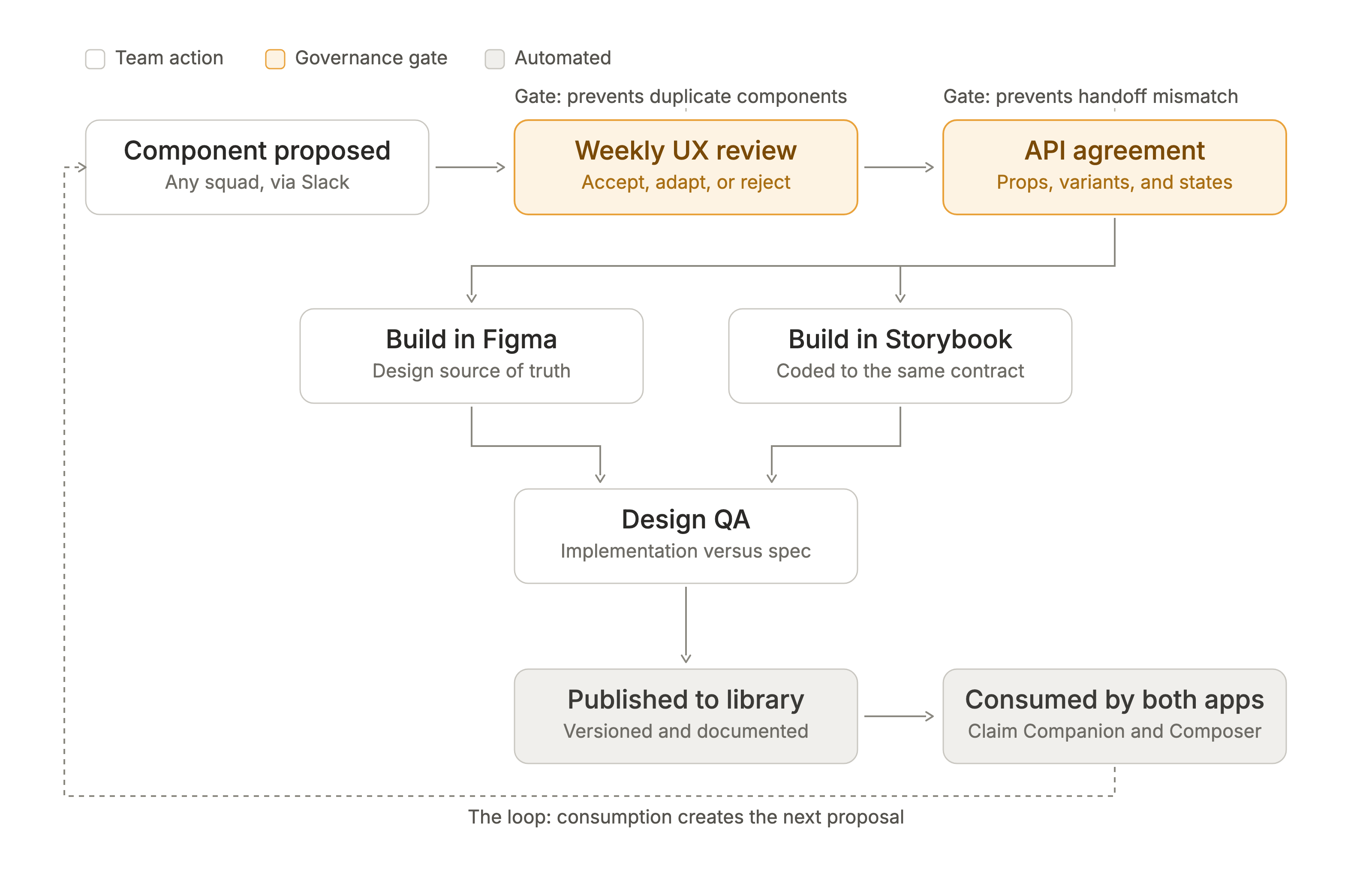
The governance loop in one view. Any squad proposes a component via Slack; the weekly UX review accepts, adapts, or rejects it; design and engineering agree the API; the component builds in parallel (Figma and Storybook, to the same contract), and design QA checks implementation against spec before it publishes to the versioned library both apps consume. The two highlighted gates are what keep the system healthy: the review gate prevents duplicate components, and the API-agreement gate prevents handoff mismatch. The dashed return path is the point: consumption creates the next proposal, so the system grows with the product instead of forking under it.
The Design
Tokens as the contract. Color, type, and spacing tokens were defined once in Figma and mirrored in code, so a token change propagated to both sides. Design and engineering could disagree about many things, never about the base values.
45 components across 4 categories, composed atomically from those tokens and consumed by both Precedent applications: from base inputs and status pills through the data tables, cards, and navigation organisms that define the ecosystem’s surfaces. The status-pill color grammar and shared navigation patterns documented here are the same ones that keep Claim Companion and Demand Composer legible as one product.
Storybook as the source of truth. I built and reviewed components in Storybook myself, testing implementation directly against design specs. “1:1 design-to-development alignment” was verified, not assumed, and having a designer in the codebase meant discrepancies got fixed in minutes, not tickets.
Explore the library directly:
Key Decisions & Pivot Points
Designer in the codebase. The unconventional call was spending my design hours in Storybook. The orthodox model (designer specs, engineer builds, designer reviews screenshots) was exactly the handoff structure that had produced the drift in the first place. Verifying components against spec in the code itself cost me design time every sprint and repaid it by collapsing the discrepancy loop from tickets to minutes. It also changed the conversation with engineering: system rules argued from inside the codebase carried more weight than rules argued from Figma.
Making consistency cheaper than divergence. I chose this governance model because our two-squad structure made drift the default outcome. The system had to make consistency cheaper than divergence, or it would be routed around; that single economic test drove the lightweight Slack proposal process, the pre-agreed APIs, and the atomic structure itself.
Collaboration
A lightweight contribution process. Squads proposed new components via Slack; we reviewed them in weekly UX reviews, so the system grew with the product instead of forking under it. The bar for proposing had to stay low: a heavyweight intake process would have made “just build it locally” the cheaper path, and the system would have lost the economics that made it work.
API agreement as the collaboration ritual. The pre-build alignment on props, variants, and states was where design and engineering actually negotiated: not at handoff, when positions have hardened, but before either side had invested work. Those conversations were short precisely because they happened early.
Weekly UX reviews as the governance surface. The same session that reviewed cross-app feature work (see Law Firm AI Ecosystem) governed the system: deliberately one meeting, not two, because the people who spot a needed component are the same people shipping the features that need it.
Outcomes
Business Impact
- 80% of production UI built from system components within four months, engineering time redirected from rebuilding patterns to shipping features.
- Visual QA defects reduced by 30% after adoption.
User Impact
- Both applications draw from the same atoms, so users experience one visual and behavioral language across the ecosystem: status colors, controls, and tables that mean the same thing everywhere.
Design Impact
- 45 components across 4 categories, consumed by both Precedent applications, with 1:1 design-to-development alignment verified in Storybook.
- The governance loop (propose → review → API agreement → parallel build) became the standing process by which the system grows with the product instead of forking under it.
What I’d Do Differently
The system measured its health in adoption (80% of production UI) and defects (down 30%), both proxies for the thing I actually cared about, which was speed: how much faster a squad ships a feature when every component it needs already exists. I never baselined feature cycle time before the system, so its strongest business argument stayed anecdotal. Given another pass, I’d capture per-feature build time for a quarter before launching the library, because “engineers stopped rebuilding tables” is a story, and “feature UI build time dropped N%” is a budget line.