
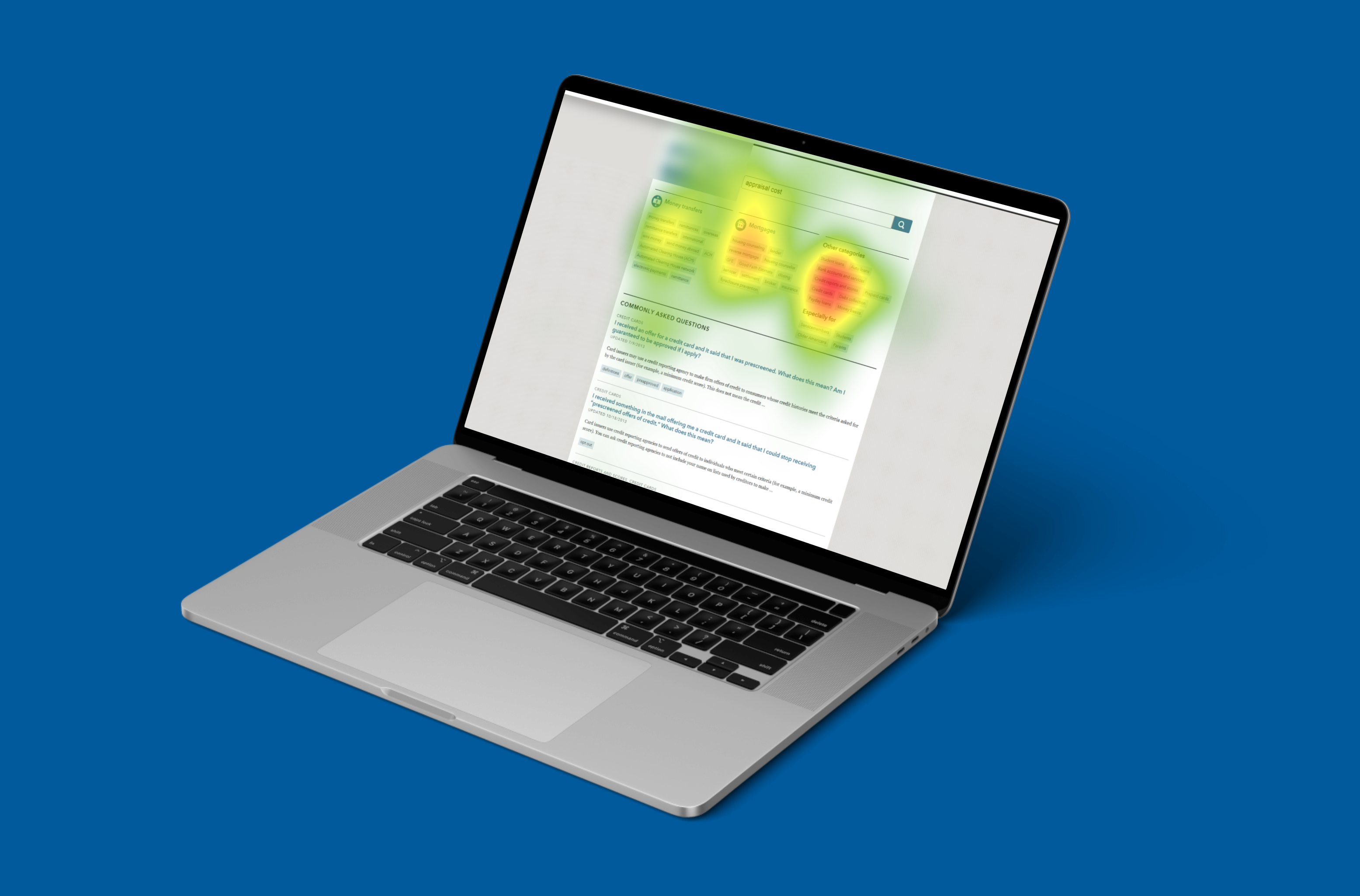
A US government financial website existed to help ordinary people navigate some of the highest-stakes moments of their financial lives: buying a home, dealing with debt collectors, disputing a credit report. But the agency had limited evidence about how visitors actually moved through the site: what drew their attention, what they skipped, and whether the most important content was even being seen. Self-reported feedback couldn’t answer those questions; attention had to be measured directly. That’s where this study came in, combining moderated usability testing with Tobii eye tracking to capture objective attention data alongside subjective experience.
My Role & Team
I wore four hats on this study:
- Moderator for the in-person usability testing sessions
- Tech lead for the Tobii eye tracking hardware and software
- Analyst for the behavioral and eye tracking data
- Author, synthesizing findings into a summative report for the client
The Problem
The directive: identify opportunities to improve the website by collecting objective and subjective UX data, and by evaluating navigation patterns and the usage of the most salient UI controls.
Behind that directive sat a genuine measurement gap. Traditional usability testing tells you what users did and what they say they experienced, but a content-heavy site lives or dies by attention: whether users actually read the guidance, notice the navigation aids, and find the controls designed to help them. Eye tracking closes the gap between what users report and where their eyes actually went.
Research & Process
- Data collection via in-person moderated usability tests
- Participants recruited through local advertisements and screened with a financial literacy survey
- 60 minute sessions
- Think aloud protocols
- Tobii eye tracking capturing gaze data throughout task performance
These tasks gave users the opportunity to interact with a variety of functions within the application without focusing on one area for too long.
Q1 Imagine you are looking for financial advice on how to buy a home. Locate the section of the site that would help educate you.
Q2 You have heard about a lot of credit card scams in the news. Locate the section of the site that would help you learn about common scams and how to avoid them.
Q3 A friend of yours has been receiving calls from a debt collector. Please find a piece of information that would help them deal with a debt collector that is being aggressive.
Q4 Please submit a complaint about a bank that you believe is violating its terms of service with you as a customer.
Q5 Search through the site until you believe you’ve located the most important information about how to resolve issues with your credit report.
Q6 What advice does this app have about the use of money transfer apps like PayPal and Venmo?
Users responded to Likert scale questions to share their perceived difficulty ratings, overall satisfaction, and confidence during their interactions. The Nielsen Norman Group’s guide to measuring perceived usability was a great survey design resource.
Q1 I thought there was too much inconsistency in this system.
Q2 I had to work hard to complete each of my tasks.
Q3 Overall, the app was easy to use.
Q4 I was able to successfully accomplish what I was asked to do.
Results indicated the site had room for improvement in terms of its perceived usability. Survey results, combined with eye tracking, suggested long, dense blocks of content were a pain point for users.
Flows
[FLOW DIAGRAM PLACEHOLDER] Spec: one diagram of the participant’s journey through the study: recruitment via local ads → financial literacy screening → in-lab session (calibration → warm-up → six task scenarios with think-aloud + gaze capture → satisfaction questionnaire) → analysis (heat maps, gaze plots, survey data) → summative report. Annotate where objective data (eye tracking) and subjective data (think-aloud, Likert) enter the pipeline, since triangulating the two was the study’s method argument.
The Findings
(This research engagement’s deliverable was evidence, not interface design, so this section walks through what the eye tracking data showed, organized by finding.)
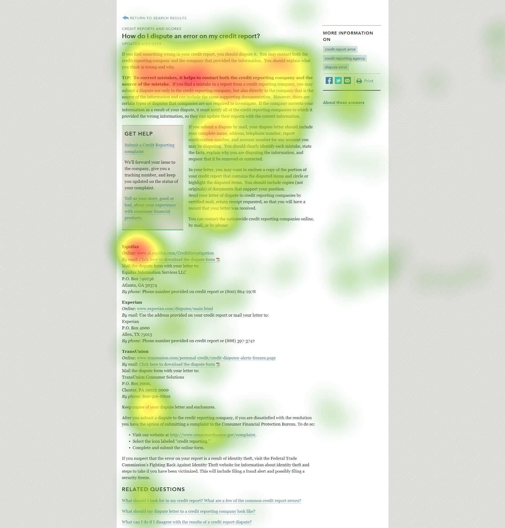
Reading Pattern
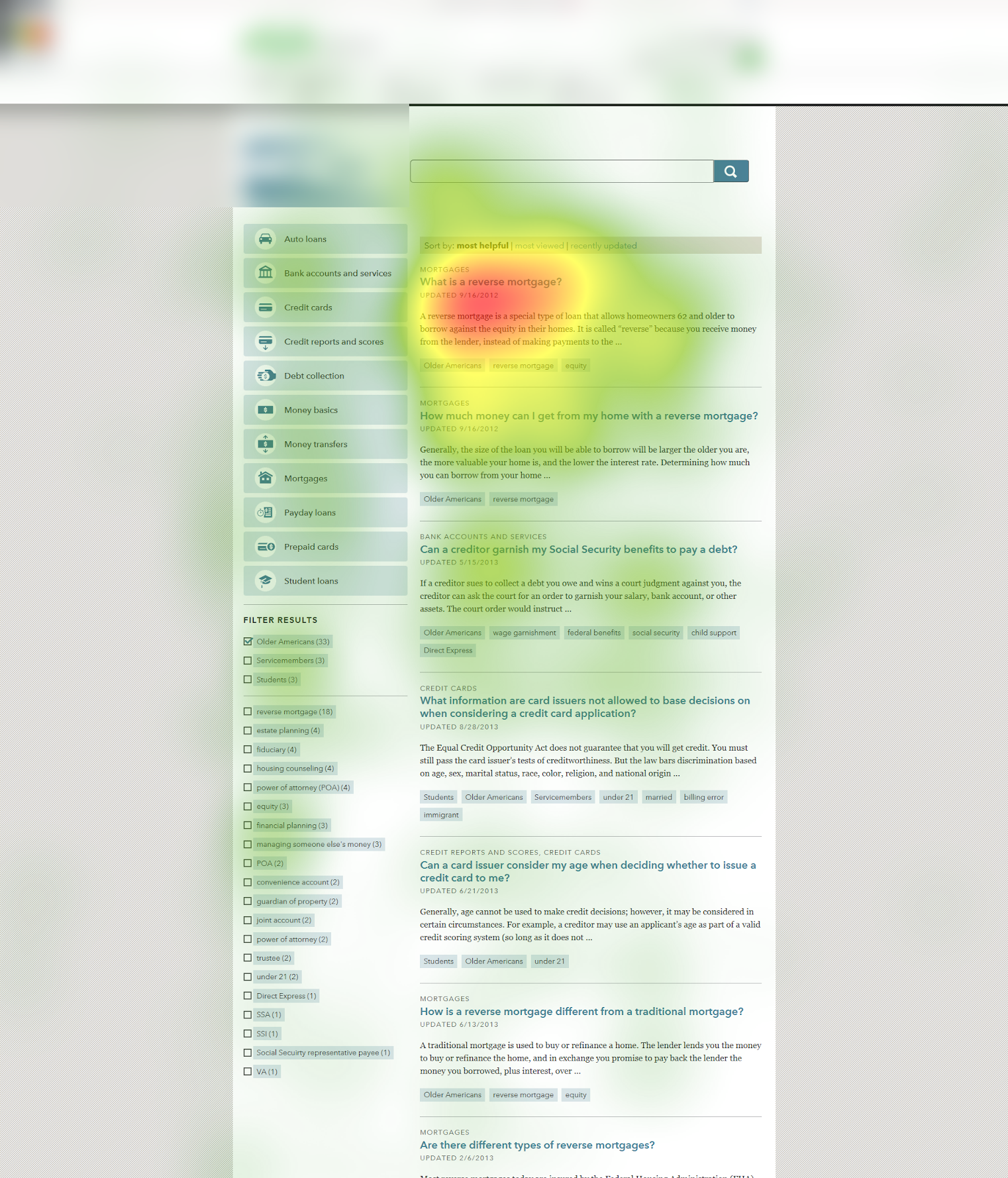
- Attention dissipates as users progress down the page.
- Users focus on paragraph content, rather than UI elements like tags, social links, and call outs.
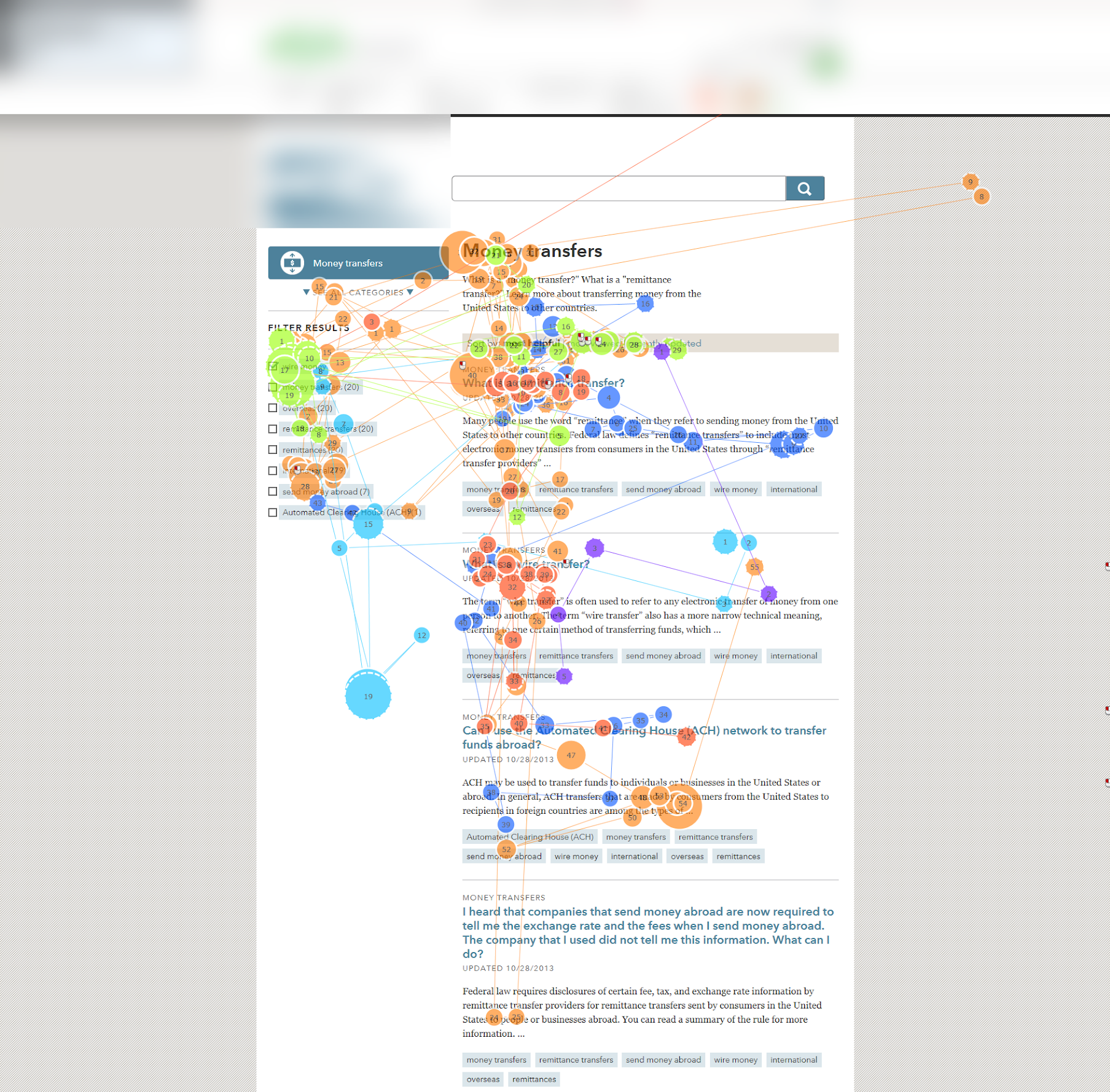
Gaze Plots
- On search pages, tags and filters receive a great deal of attention.
- Users pay little attention to search results further down the page.
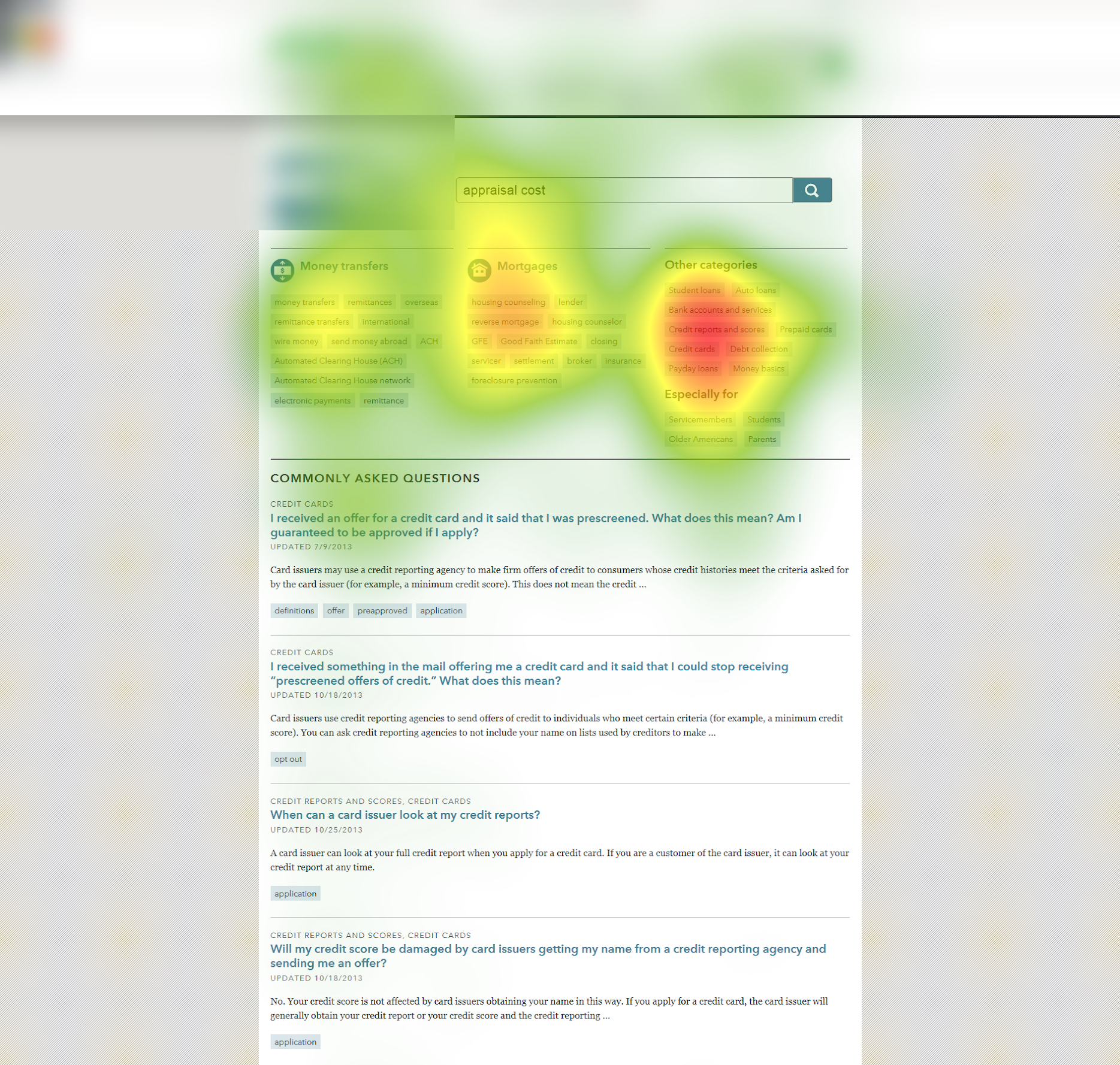
Salient UI Elements
- The preferred method to navigate to specific content is with tags, not FAQs.
- “Other Categories” should be broken into additional sections for clearer IA.
Scanning Search Results
- The first few search results receive the bulk of attention.
- Users pay partial attention to left-margin filters. They conduct a new search rather than interact with the filters.
Key Decisions & Pivot Points
Designing tasks for coverage, not depth. The six scenarios were deliberately spread across the site’s functions (education, scams, debt collection, complaints, credit reports, payment apps), so no single area monopolized gaze data. Eye tracking findings are only as generalizable as the surfaces they sample; a study that spent all six tasks in one section would have produced a confident, narrow answer to the wrong question.
Triangulating attention with perception. Pairing the eye tracking with a satisfaction questionnaire was a methodological decision, not a formality: gaze data shows where attention went, but only self-report shows whether users experienced the effort as reasonable. The study’s headline finding (dense content blocks as a pain point) emerged precisely from combining the two, where fading attention (objective) met “I had to work hard” agreement (subjective).
Treating eye tracking as the bolster, not the base. The honest tension in this study: its most impressive instrument was also its most dispensable. Eye tracking is a wow factor (heat maps command a room in a client readout in a way task-completion tables never will), but gaze data layered over a shaky study design is just beautifully visualized noise. So the priority order ran opposite to the glamour. We made sure the foundational usability structure (the tasks, the surveys, the interview prompts) stood as a solid study in its own right, one that would have delivered defensible findings with the eye tracker unplugged. Only then did the gaze data get layered on to bolster the results. That discipline is why the headline finding held up: the heat maps illustrated it; the fundamentals proved it.
Collaboration
The collaboration that shaped this study happened before a single participant sat down. I partnered with the client (the CFPB) to identify the research questions the study had to answer, select the survey questions, and finalize the task-based usability scenarios. We then conducted pilot tests together, confirming their research and investigation requirements were fully addressed before sessions ran at full scale. Working this way meant the client’s decision-making needs were built into the instrument itself rather than reverse-engineered from the findings later; the final readout answered questions the agency had already agreed were the right ones to ask.
Outcomes
The deliverable was an evidence base, built to outlast the study. The summative report gave the CFPB data and evidence about how real users navigated the site and read its content, so that future product managers and their internal designer could structure pages, information architecture, and content to align with user needs and expectations, and ultimately deliver on the agency’s mission of helping people through high-stakes financial decisions. Findings like fading down-page attention, tag-first navigation, and the untouched left-margin filters translated directly into that kind of structural guidance.
The outcome I’m proudest of has no metric attached: this study helped bring user research into a young government agency for the first time. Establishing that evidence about user behavior, not internal assumption, should shape a public-serving website was itself the win. Every research question the agency asks after this one builds on that precedent.
What I’d Do Differently
The study established where attention went; it couldn’t establish what that cost users in outcomes, because tasks were scored by completion rather than by the quality of what participants took away. A user can “find” the debt collection guidance while their gaze data shows they read a third of it. Given another pass, I’d add brief comprehension probes after content-heavy tasks (pairing “did they see it” with “did it land”), and I’d push for a follow-up study after the client’s changes shipped, so the heat maps could show a before-and-after instead of a diagnosis alone.