Overview

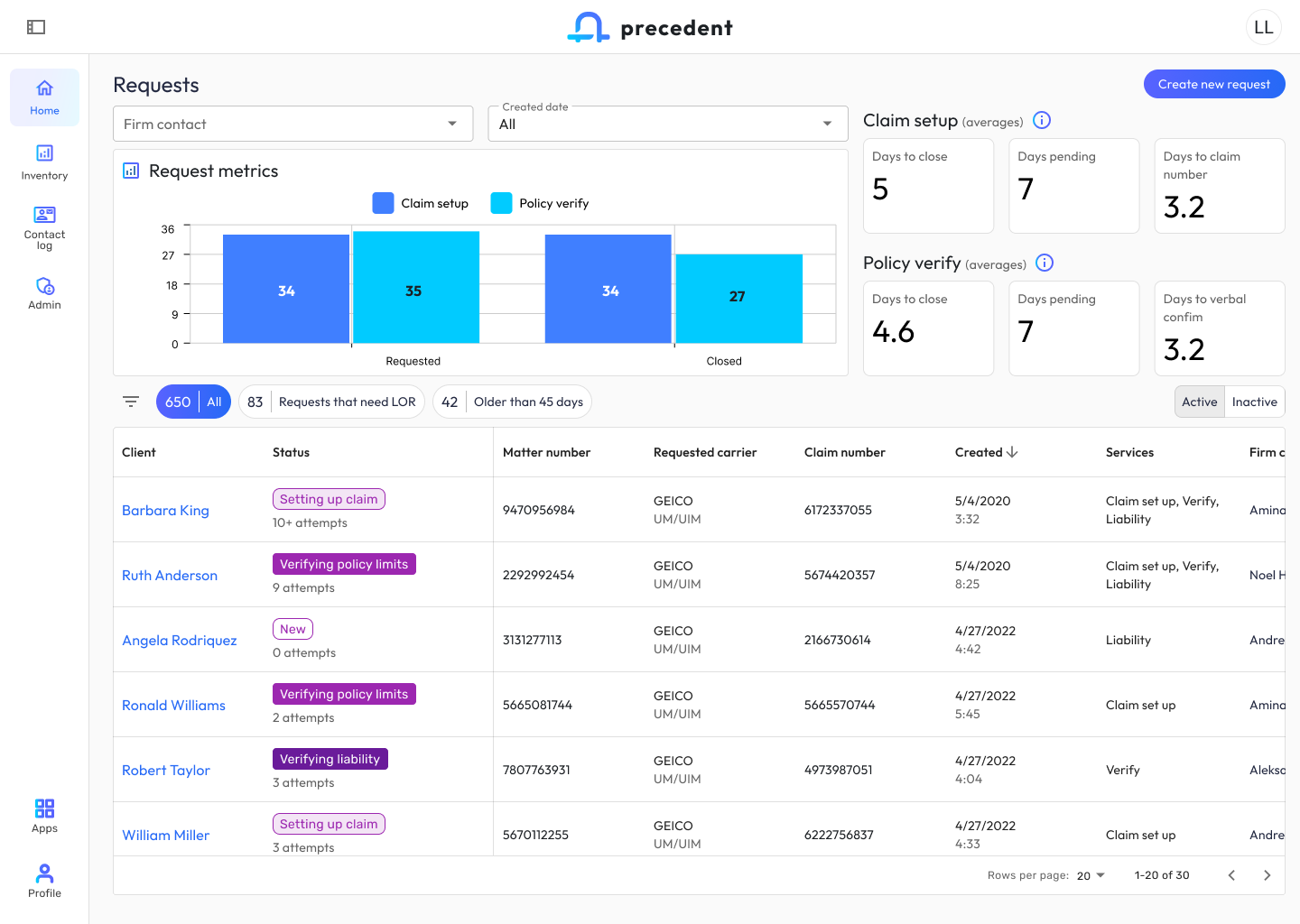
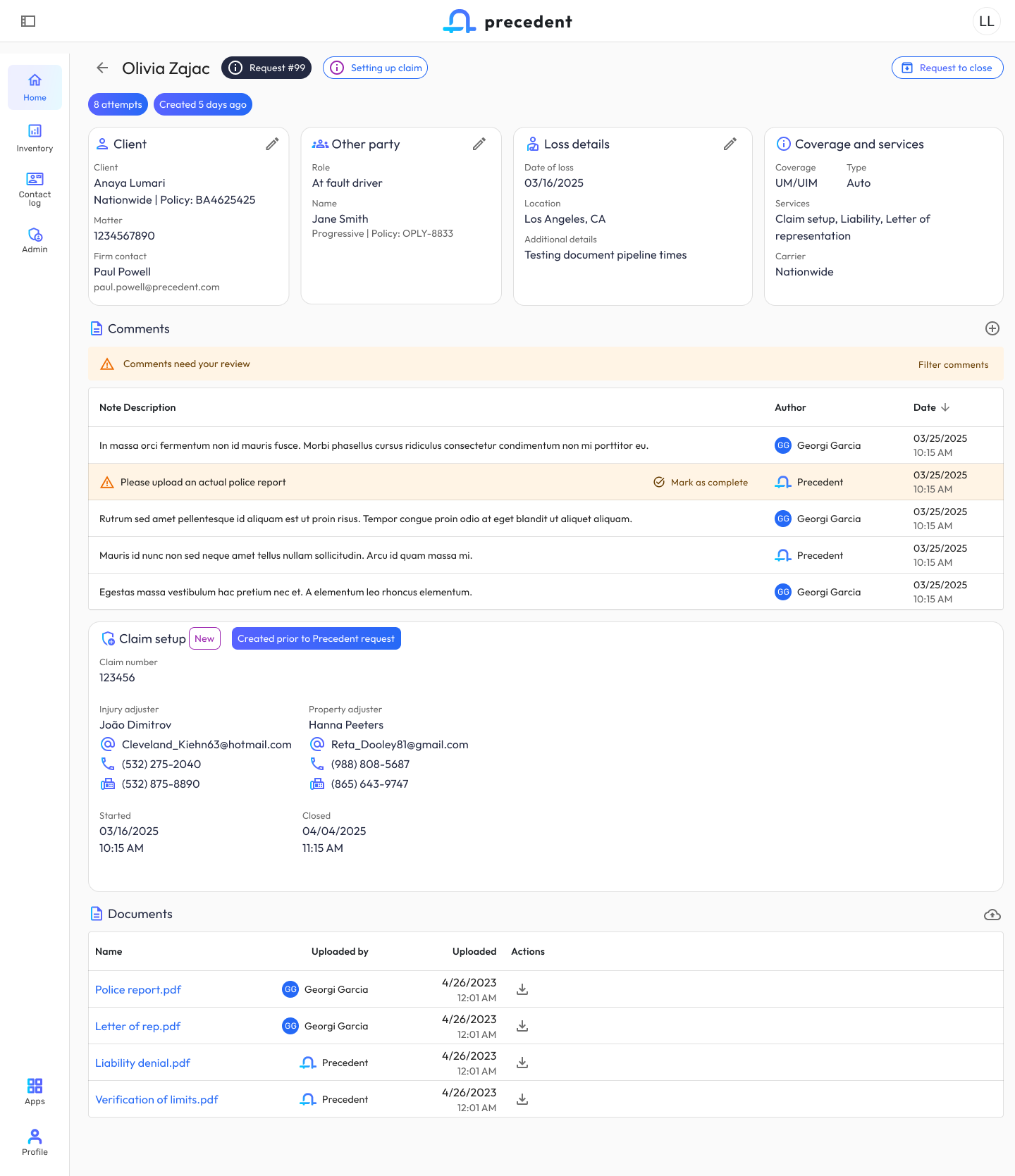
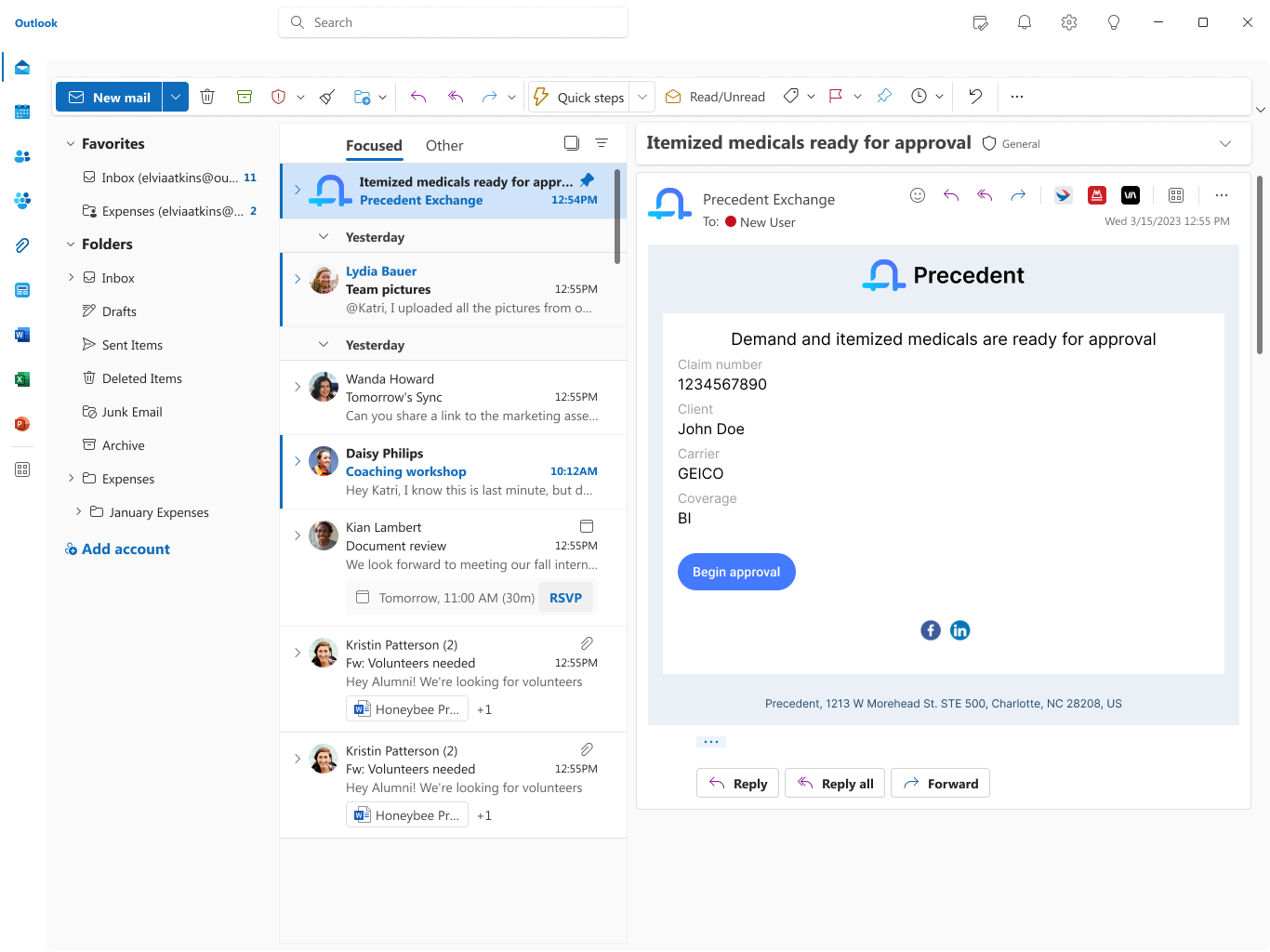
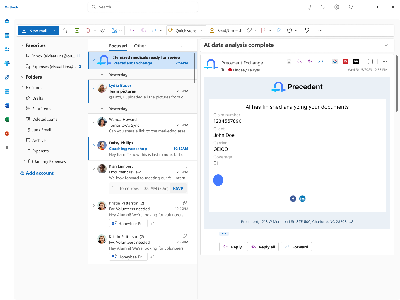
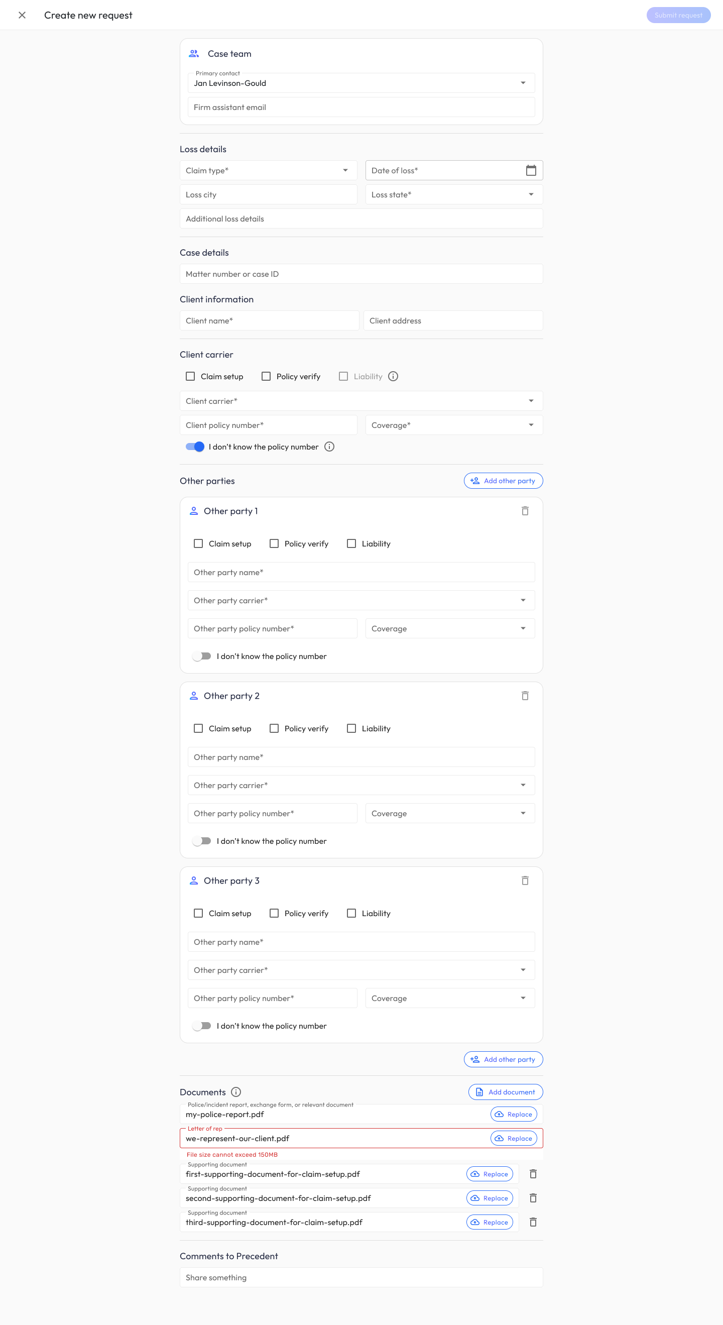
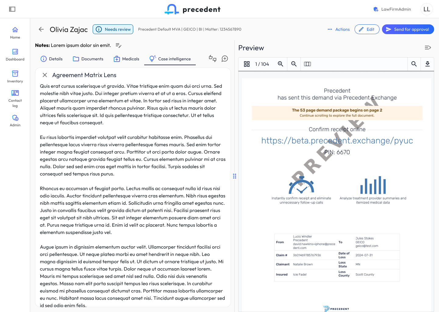
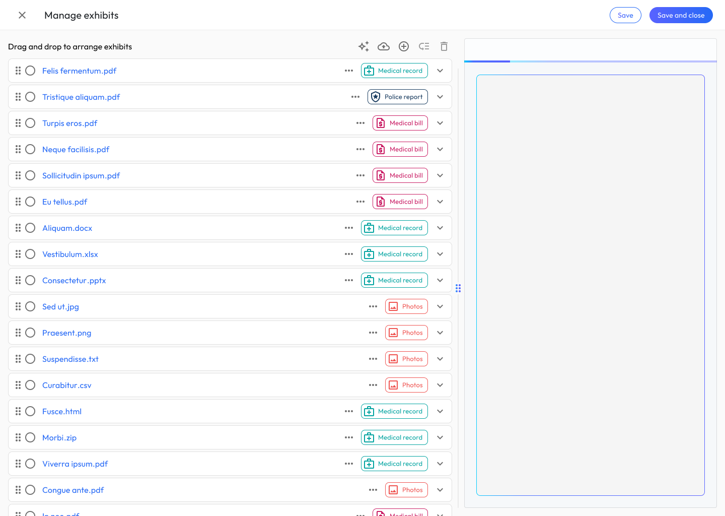
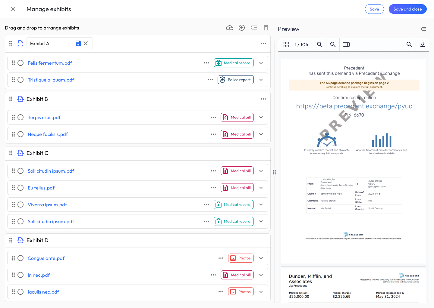
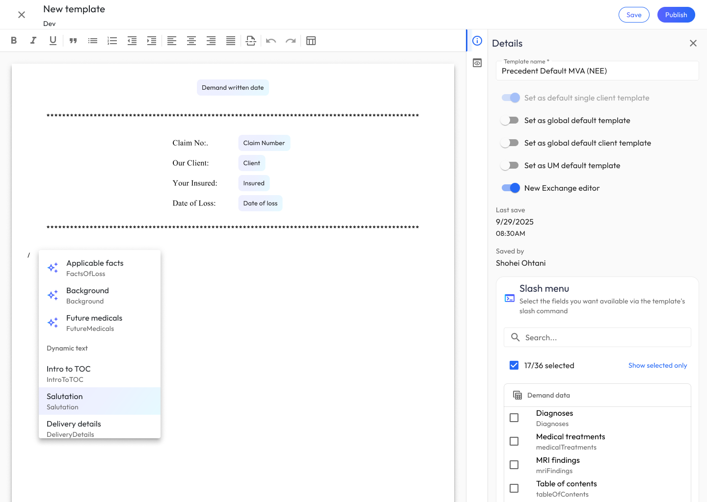
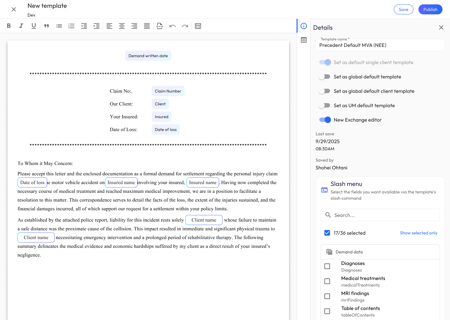
Precedent is a one-stop platform for personal injury law firms. The ecosystem pairs two purpose-built apps: Claim Companion, which handles the front-end of the case lifecycle (filing claims, verifying policy limits, liability workflows), and Demand Composer, which transforms hundreds of medical records into settlement-ready bodily injury demands through an AI data extraction pipeline.

The core design challenge: law firms live between two worlds — administrative claim management and the high-stakes, AI-assisted composition of demand letters. The ecosystem had to feel like one product with two specialized modes, while honoring each app’s distinct rhythm of work. Paralegals, attorneys, and admins needed to move fluidly between apps, manage context across hundreds of documents, confidently review AI-extracted medical data, and author persuasive demands grounded in RAG-LLM content that maximizes settlement likelihood — all without losing trust in the system or slowing down.

Role

UX Designer & UX Engineer

Scope

End-to-end experience design, UX engineering, and cross-app systems thinking

1. Onboarding Email Campaigns

I designed the transactional and lifecycle email system that carries users through every meaningful state change in the ecosystem — from first welcome, to AI analysis complete, to demand submitted, to action-requested loops. Each email had to (1) respect Outlook/Gmail rendering constraints, (2) maintain brand parity with the web app, and (3) give the recipient one unambiguous next action.

I mapped the full lifecycle alongside product and engineering, defined the content hierarchy (case identifiers → status → single CTA), and authored templates that templatize dynamic fields like user, comments, reject_reason without compromising legibility.

2. Sign In Flow

A focused, single-purpose authentication screen anchored by the Precedent wordmark. I tuned the form for speed (username + password, show/hide toggle, forgot-password recovery) and established the gradient primary button that became the ecosystem’s signature interaction affordance.

3. Claim Companion — Inventory View

The Claim Companion home is a command center for pre-demand work. I designed the information architecture so firm contacts could scan 650+ active requests without cognitive overload: high-level request metrics and Claim setup / Policy verify averages sit above the fold, followed by quick filters (“Requests that need LOR,” “Older than 45 days”) and a dense but scannable table with status pills that encode workflow state at a glance.

I defined the left-nav pattern (Home, Inventory, Contact log, Admin) and the bottom-anchored Apps switcher — the key ecosystem-level control that lets users pivot to Demand Composer without losing their place.

4. Claim Companion — Request Detail

The request detail view is where paralegals do the actual work of moving a claim forward. I designed the four-card summary (Client / Other party / Loss details / Coverage and services) as an editable, at-a-glance header, then organized supporting context into progressive-disclosure sections: Comments (with a review-required banner pattern), Claim setup data, and Documents. The “Please upload an actual police report” row demonstrates the inline-action pattern I established for surfacing blockers without leaving the page.

5. Creation Forms — New Request & Compose Demand

Creation is the most error-prone moment in both apps. I designed parallel but distinct form paradigms:

  • Create New Request (Claim Companion): A long-form document capture flow with conditional “Other party” cards, inline file validation (note the 150MB error state on Letter of rep), and service-type checkboxes that drive downstream routing.
  • Compose Single Client Demand (Demand Composer): A side-by-side layout — structured case data on the left, a persistent document uploader on the right — so users can build metadata and feed the AI pipeline in parallel. Integration search (e.g., Clio) lets users pull matter data without re-keying.

I aligned both forms on shared section patterns (Case info, Loss details, Carrier, Case team) so a user fluent in one form feels instantly oriented in the other.

6. Demand Composer — Inventory View

The Composer inventory shows 3,456 demands across multiple pipeline states. I designed the stateful filter chips above the table (New → Pending signoff → Pending processing → Pending review → Pending approval) as a living representation of the demand workflow — so a user can see, in one glance, where queues are backing up. Document status pills (“AI processing,” “Needs review,” “Ready for approval,” “New”) use the same color grammar as Claim Companion’s status pills, reinforcing ecosystem cohesion.

7. Human-in-the-Loop AI Review (Medicals)

This was the most consequential part of the system to get right. Hundreds of medical pages are ingested, chunked, and run through an extraction pipeline — and the attorney has to trust the output enough to stake a six- or seven-figure settlement on it.

I designed a layered review pattern that escalates from summary → evidence:

  • Case health dashboard surfaces AI-derived findings as colored tags (“Positive MRI findings,” “Charges exceed demand amount,” “Treatment on date of loss”) alongside confidence indicators (“Low confidence” on bill completeness).
  • Progressive-disclosure accordions for Providers, Billing timeline (log-scale chart of charges over time), Itemized charges, Diagnoses, and Imaging findings — each with “Needs review” banners that draw attention to low-confidence rows without being alarmist.
  • Row-level review for ICD codes: the orange warning triangles mark exactly which codes need human judgment; everything else is quietly marked “Included” so reviewers can move fast where AI is confident and slow down where it isn’t.
  • Split-pane preview on every medicals screen keeps the source document one glance away, so users can verify AI extractions against the original without losing context.

8. Case Intelligence — RAG-Powered Generative Analyses

Case Intelligence is Demand Composer’s generative layer. I designed a card-based generation model where each analysis type (Agreement Matrix Lens, Alternate Medical Chronology, Carrier Evaluation Report, Case Strengths and Weaknesses) runs as its own generation with a live “Generating” state, expandable inline to read the full output.

The split-pane design keeps the evolving demand package (104 pages, PDF preview) visible on the right while the user explores AI-generated insights on the left — so the attorney can critique and revise in-context rather than toggling between screens.

9. Document Editing & Authoring Paradigms

The template and document editors were the most technically ambitious UX work in the project. I defined the authoring paradigm for demand letters and reusable templates, balancing three audiences: firm admins building reusable templates, attorneys editing live demands, and the AI itself (which needs structured field anchors to generate into).

Key patterns I established:

  • Dynamic variable chips that render inline but behave as first-class typed entities — not plain text.
  • Slash menu for inserting AI-generated sections: Applicable facts, Background, Future medicals, Intro to TOC, Salutation, Delivery details. This gave authors a consistent muscle-memory command surface borrowed from modern editors.
  • @-mention menu for injecting case data mid-sentence: typing My firm represents @ surfaces Client, Insured, Case details, and Loss details. The same menu works in both template building and live demand editing.
  • Dual-panel editor with Details (friendly name, field name, AI generation prompt, custom CSS) and a publish/save split — so template authors can iterate on AI prompts, styling, and structure in one place.

10. Exhibit Manager — Document Organization Paradigm

Attorneys needed to assemble the final exhibit package by grouping hundreds of underlying documents. I designed a drag-and-drop canvas with auto-grouping that combines: document-type badges (Medical record, Police report, Medical bill, Photos), multi-select actions, an AI auto-arrange action (the sparkle icon), and Exhibit grouping containers(Exhibit A, B, C, D) that users can create, rename inline, and reorder.

A persistent preview pane on the right renders the live demand package as the user reorganizes — so every reorder decision is immediately visible in the final artifact.

11. Admin & Management Experiences

Admin surfaces serve firm administrators managing customers, users, carriers, and cross-app settings. I designed an ecosystem-wide settings taxonomy organized into Global (Settings, Users, Integrations), Composer (Settings, Demand letters), and Verify+ (Settings) — so admins understand which knobs apply where.

Customer detail pages use a consistent card grid (Customer details, Valid email domains, Demand emails, Demand creation, Demand settings, Inventory settings) with inline edit pencils, and user management uses a dense table optimized for bulk actions.

Outcomes

For attorneys and their clients

The ecosystem compresses what used to be weeks of paralegal document review and demand drafting into days. AI extraction of medical records, surfaced through the human-in-the-loop review pattern, means attorneys spend their time on judgment calls — not on re-keying ICD codes from PDFs. RAG-grounded case intelligence gives attorneys negotiation leverage they didn’t have before: Agreement Matrix Lens and Carrier Evaluation Reports let them anticipate the adjuster’s playbook before the first phone call. The result is higher settlement offers, reached faster, with money landing in clients’ pockets sooner.

For firm operations

The inventory views and status-pill grammar give firm leadership, for the first time, a real-time picture of pipeline health across 3,000+ demands. Queue bottlenecks surface as soon as they form. The shared admin taxonomy means onboarding a new customer configures both apps at once. And the email lifecycle closes the loop — approvals, rejections, and AI-complete notifications all route through the same inbox, so nothing falls through the cracks.

For the design system

By aligning color, typography, navigation, and status semantics across Claim Companion and Demand Composer, the ecosystem feels like one product. The Apps switcher and shared left-nav pattern let users move between apps dozens of times a day without friction — which was the ultimate proof that the two-app model was the right bet.